

Adelle Sans Condensed
14 OTF Fonts | 1.18 MB RAR
Regular, Bol, ExtraBold, Heavy, Light, Semibold and Thin with Italic Types
- Adelle Sans Condensed is part of the flexible and personable Adelle Sans family. These new condensed weights have the same flavour and OpenType features as Adelle Sans, including icons and other typographic niceties one would expect, and they excel in providing superior readability in short texts. With seven styles plus matching italics, Adelle Sans Condensed is primed to save space and keep legibility high — both nonnegotiable when it comes to an editorial’s voice and look.

Otari Font Family - 10 Fonts for $150
10 OTF | 10 TTF | 10 WEB FONTS | 3.5 Mb RAR | SALE PAGE
- Otari is vibrant and contemporary, but serious and built to last. Its character shines in display type, but doesn’t interfere at text sizes. Otari aims to capture the essence of Wellington, New Zealand in a single typeface. The contrast of a colorful art scene and the conservative colonial British aesthetic, which is still evident in the capital city, laid the groundwork for this design.

Troia Font Family - 12 Fonts for $60
OTF | 12 Fonts | JPEG Preview | 0.15 Mb RAR | SALE PAGE
- Troia Font Family comes in three weights; normal and italic. In addition, with rounded corners, each weight has its own smoother version. Thanks to its large letters and added spaces between the letters, this font can be used to get perfect results and create great works such as web typography, banners, logos, texts, t-shirts and printings, and also presentations. Troia’s eye-pleasing and nice-looking style makes writing much more pleasant.

Dorica Font Family - 14 Fonts for $250!
OTF | 14 Fonts | 0.79 Mb RAR | SALE PAGE
- Dorica is a serif font family optimized for small sizes. It is very sober and simple, with a classic appearance at first sight but the curves and details like the serifs make it very different. The name is inspired by Doric, the simplest of the three orders of organizational systems of ancient Greece. The large x-height makes it perfect for use in magazines and every context which calls for text in small sizes. Dorica comprises 14 styles, from Thin to Black with their corresponding italics. Each font includes small caps, very useful for books, plus OpenType features such as proportional figures, stylistic alternates, tabular figures, numerators, superscript, denominators, scientific inferiors, subscript, ordinals, fractions and many ligatures. The extended character set supports Central, Eastern and Western European languages. The range of styles provides great flexibility for both text and titling, and the ligatures make for an original and creative appearance.

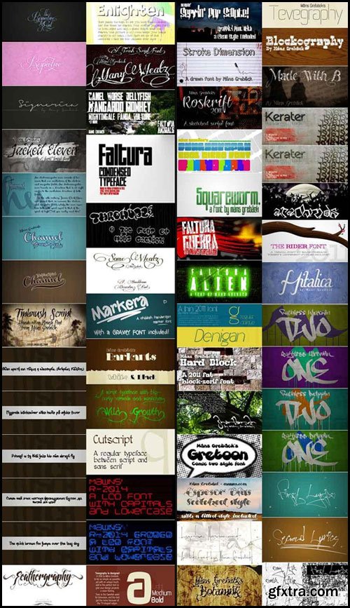
51 Awesome Fonts
51 Fonts | 39 TTF | 12 OTF | 2.2 MB
AK my princess | AlexBrush | ART BREWERYART | Baron Neue | Braxton | Budmo
Cat Basah Kental | Coolvetica | Dextera | DK Early Morning Coffee | Dolce Vita
Dubiel | Fortuna Dot | Frontage | GhostOfMars | HoneyScript | KGOnlyHuman
Jellyka Bees Antique Handwriting | Jellyka Saint-Andrews Queen | JellykaKingsHat
Lovelo | Pea Aimee | Razor | Sail | Silent Reaction | SpringAway | Tall Film
Walker on the Moon | Xtreem | Znikomit | Angelique ma douce Colombe
Ballerina Script | Before The Rain | Bodoni | Chalk Hand Lettering | Cute Cartoon
EcuyerR | Eternal Call | FabricsLight | Janda Stylish Scripts | KGALittleSwag
Lemon Yellow Sun | mathilde | Neoteric-Light | Neoteric-Regular | NOVABOLD
Penelope Anne | Screaming Color | Scriptina | Sweet Pea | TravelingTypewriter

Fine Bundle Of Display Fonts

Mega 384 Fonts Pack
88 OTF | 295 TTF | 17.8 MB RAR
In this collection everyone will find the font that it is looking for!

WeGraphics - Handy Icons Vol2 Web Font Kit
OTF & TTF | Web Fonts EOT, WOFF, SVG, OTF, WOFF | 380 Kb RAR
This resource includes 99 hand drawn icons that have been converted to
a webfont for use in your online applications. Simply load the font and
use letters in place of icon .png files. Using font icons is a great step to
make your website retina ready.

WeGraphics - Monsters - A Broken and Shattered Font Face
OTF | TTF | 101 Kb RAR
Monsters is a broken style font face. Its creepy style is perfect for book covers,
album designs, or movie posters. The letters are random sizes
and tilted at different angles, which results in words that seem scattered and hand placed.

WeGraphics - Blocked - A Fixed Width Title Font
OTF | TTF | 83 KB RAR | SALE PAGE
Blocked Letter is a fixed width bold title font.
Download it and use it to create a uniquely styled header.

CreativeMarket - Bundle Script Typeface 456405

30 Custom Fonts
Aventura | Banthers | Barbaro | Christamstime | Chubby | Curely | Dpopper | DreamersBrush
Fabfelt | Fonarto | Furgatorio | Grothika | IkraSlab | JakesFuzzyFelt | Kagura
Kohta | Kontainer | Mechano | Melma | Mom | Pelemeshka | Plume | RepoPocket
RepoPocketSeriF | Scratch | Scritch | Signify | Tostada | VarianeScript | Xplor

Velik Font - The Northern Block
OTF | TTF | WOFF | WOFF2 | 300 Kb | SALE PAGE
Velik is a hand drawn typeface, originally painted in ink and translated into a digital format for work.
Velik can be used across various projects, suitable for display and text.
Details include 445 characters and manually edited kerning.

GraphicRiver - Frye 8842092
- Fresh handwriting TrueType fonts. The package contains three fonts of TTF (TRUE TYPE FONT) called Frye, Frye Black and Frye Ornaments. Also web font files are included. The fonts contain the normal set of latin characters. Frye comes with a normal license for up to 5 users.

GraphicRiver - Graphite Typeface 8762893
- Graphite is a pencil hand-drawn font ideal to use in projects related with sketching. The glyphs are inspired from the slab-serif Clarendon typeface, a classic 19th century design, making it suitable for prints. It features both hollow and filled letters to suit your needs.

GraphicRiver - Moonface Script 8319434
- Moonface Script from TypeFaith Fonts is a flowing script with lovely swashes. It is based on the 20th Century Packaging typo. Moonface Script is a characteristic font with a retro feel. It contains a full set of ligatures, alternatives, swashes and special characters to end. You have to use the Opentype features and Glyph pallet of your application to explore the complete font.

.otf file, “How to install” instruction, .jpg preview and .psd glow example.
You can use any format: .otf or .fft


Core Magic Rough Font Family - 18 Fonts $140
18 OTF | 18 WOFF | 18 TTF | 52 MB | Sale Page
- Core Magic Rough is a texturized version of Core Magic which is a layered type family consisting of seven 3D effect layers, eight 2D effect layers and one shadow effect layer. Uppercase and lowercase letters are separated by such features that counters are opened or closed. Core Magic provides other closed counter styles such as numbers with opentype feature (Stylistic Alternatives). Using Core Magic Rough with Core Circus Rough could make your works more charming and special with endless combinations (at least 262,551 kinds). This family is really nice for book titles, headlines, logotypes and any artworks.
126,000 Royalty-Free 3D Model

Udemy Türkçe


Top Rated News
- CreativeLive Tutorial Collections
- Fasttracktutorials Course
- Chaos Cosmos Library
- MRMockup - Mockup Bundle
- Finding North Photography
- Sean Archer
- John Gress Photography
- Motion Science
- AwTeaches
- Learn Squared
- PhotoWhoa
- Houdini-Course
- Photigy
- August Dering Photography
- StudioGuti
- Creatoom
- Creature Art Teacher
- Creator Foundry
- Patreon Collections
- Udemy - Turkce
- BigFilms
- Jerry Ghionis
- ACIDBITE
- BigMediumSmall
- Globe Plants
- Unleashed Education
- The School of Photography
- Visual Education
- LeartesStudios - Cosmos
- Fxphd
- All Veer Fancy Collection!
- All OJO Images
- All ZZVe Vectors
- CGTrader 1 CGTrader 2


