

Castor Font Family - 8 Fonts for $49
8 OTF Fonts | +Previews | 6.7 Mb RAR | SALE PAGE
- Castor is a woodtype and letterpress hybrid based on grotesque letterforms. It’s a vintage decorative bold distressed display with 3 options for each letter; Uppercase, lowercase, and alternates. Castor comes complete with 4 styles plus catchwords, unique ‘catchword dividers’ (horizontal rules), ornaments, as well as a free set of extras! (grunge, dividers and bullets) The catchwords, ornaments, and dividers are designed to compliment the font family giving it a ton of diversity, and the designer unlimited creative options. Opentype features include alternate letters and numbers, double letter ligatures for realism, subscript numbers,and superscript numbers.
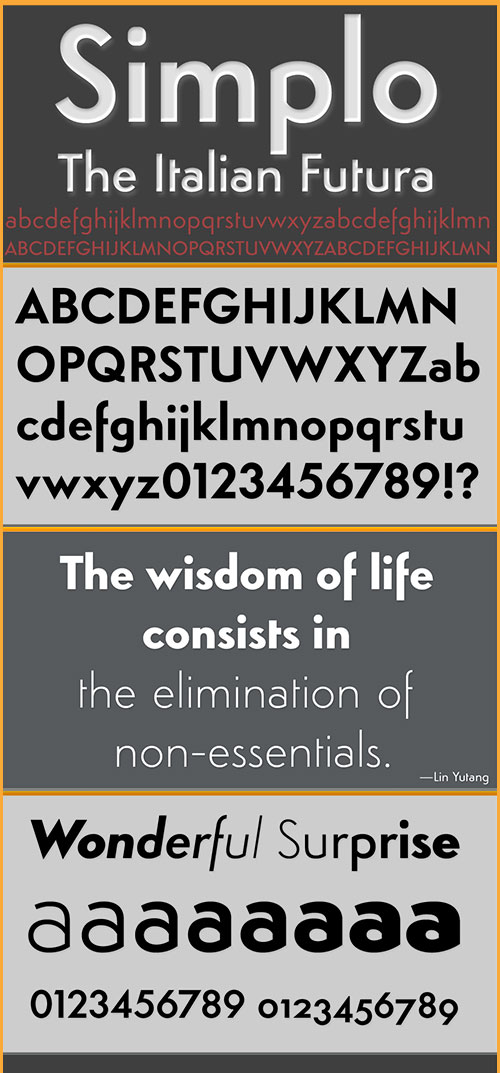
Simplo Font Family - 16 Fonts for $279
16 OTF Fonts | +Previews | 2.7 Mb RAR | SALE PAGE
- Simplo is a geometric sans serif typeface, built in sixteen styles. It is a tribute to the 1930s typeface Semplicita, designed by Nebiolo’s Alessandro Butti. Although many details of Simplo differ from Semplicita, it preserves the spirit of the original. Simplo is ideal for use in display sizes. It is also quite legible in text, and is well suited for graphic design and corporate identity design. Simplo has sixteen styles, extensive language support, eight different kinds of figures, sophisticated OpenType features — so it’s ready for advanced typographic projects. The most notable characteristics of this typeface are the t and the f. The t is the culmination of simplicity: a vertical line with just a simple right-side crossbar. The f also has just a right-side crossbar, and is really tall: it reaches both the highest and lowest vertical position of the typeface. The top of the distinctive s, is much narrower than its bottom. The a, b, d, g, p, q, and u are spurless, and show a family resemblance with Hans Reichel’s 1990s typeface Dax. However, these letters are rounder and more geometric than Dax’s counterparts, because of Dax’s higher x-height and narrower design. In Paul Shaw’s Imprint article about typefaces that have been overlooked and/or underappreciated, “Overlooked Typefaces”, he concluded his discussion of Semplicita as follows: “These idiosyncrasies suggest that Semplicita might find a warm reception today, given the current love affair with Gotham, Neutraface and Proxima—and the resurgence of ITC Avant-Garde Gothic.”

FM Valentines Pro Font for $29
OTF | +Previews | 2.96 Mb RAR | SALE PAGE
- FM Valentines Pro consists of 50+ hand-lettered love expressions and sentiments for various romantic purposes: from St.Valentine’s greeting cards to email/ letter signatures, to engagement, wedding and anniversary accessories and gifts. Most of the expressions are in English, with some additions in other languages, such as French, Spanish, Italian, German (for example ‘Te quiero’, ‘Amore’, 'Je t'aime', ‘Ich liebe dich’, etc.). All the words and phrases are original and handwritten - a high quality calligraphy for your projects. In addition there are 10 hand-drawn heart icons in the digits' glyphs.

Equip Extended Font Family 16xOTF $198
16 OTF Fonts | 0.81 MB | SALE PAGE
- EquipExtended is the next complement for the Equip family and with its 16 fonts together with EquipCondensed, it extends the family to 48 styles. While developed from the same basic shape as the rest of the Equip family, it has its own particular friendly and warm appearance. With its wide and open proportions, EquipExtended makes a grand entrance for your headlines, subheads and even for the body of text. Try it out, the light style is free. EquipExtended is very well suited for ambitious typography. The EquipExtended family comes in OpenType format with extended language support. All weights contain semi-ligatures (design optimized single characters), proportional lining figures, tabular lining figures, proportional old style figures, lining old style figures, matching currency symbols, fraction- and scientific numerals and arrows.
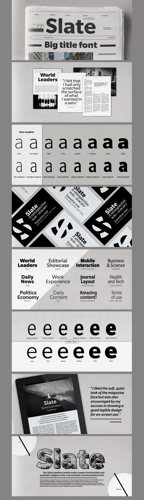
Slate Pro Font Family - 18 Fonts 1170$
18 OTF | 1.12 MB | SALE PAGE
- A typeface of grace, power and exceptional versatility, the Slate collection is a truly beautiful design that achieves stellar levels of readability, both in print and on screen. Created by the award winning type designer Rod McDonald, this six-weight sans serif family is a rare example of sublime aesthetics meeting world-class functionality. The typeface’s legible letterforms embody an amalgam of the best traits of both humanistic and grotesque letterforms. “I didn’t want a face with an ‘engineered’ look, or with any noticeable design gimmicks or devices,” admits designer McDonald. “I wanted a pure design. I confess that I was ruthless with any character that wanted to stand out from the rest.” The Slate collection is available in six weights with complementary italics, with slight changes in structure from the light to the black weights. Its light weight is reminiscent of early American sans. Whether for use in display work or in longer-form settings, few typefaces possess the beauty and power of this design, leaving the Slate family an excellent addition to any designer’s typographic quiver.


Saya FY Font Family - 12 Font $600
- Saya FY is a fresh sans serif font suitable for text and display use. The lightly condensed letterforms are built up of a harmonized mix between well rounded curves and pointed endings. These calligraphic details afford a unified structure in small size and elegant shapes in larger sizes. Saya FY comes out with 5 weights, roman and italic.Saya was co-created by Adrien Midzic, Jérémie Hornus & Alisa Nowak on fontyou.com, the first collaborative type foundry. [/center]


Nelson Font Family - 4 Fonts $116
- This design took me on a voyage across continents and cultures, its look taking shape in many forms. Western, tropical, and vintage old-world with a modern touch, Nelson is perfectly suited for headlines and logos, packaging and advertising. Featuring four sizes of capital letters – large, standard, petite and small, over 150 alternates and swashes and two sets of decorated initials (Nelson Rugged & Bold) – this titling font makes crafting a headline or logo a fun and interesting pursuit.Nelson is named after and dedicated to my friend, fellow instructor and former design professor, Gary P. Nelson. Designer, watercolorist and avid hiker, ‘Rugged Nelson’ opened my eyes to the world of lettering and type design and has been the ultimate friend and mentor.
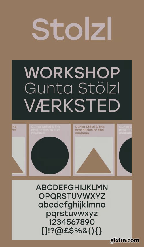
Stolzl Family Fonts - 6 Fonts $200
6 OTF | 6 TTF | WEB FONTS | Style Sheet | SALE PAGE
- Stolzl Text is the companion of Stolzl Display type family by The Northern Block, which was optically tailored to perform as a functional addition to this concept steered font collection. Stolzl Text is the latest addition to the Stolzl type collection. As a strongly modernist interpretation of the first release, stripped of the primary stylised attributes, it is highly readable in print and on screen. Designed to perform at various sizes, Stolzl Text is a great addition to the type collection.
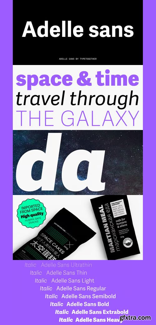
Adelle Sans Font Family - 14 Fonts for $599
14 OTF | +Previews | 1.02 Mb RAR | SALE PAGE
- This sans serif counterpart to the award-winning Adelle type family proposes a cleaner and more spirited take on the traditional grotesque sans. As typical with TypeTogether fonts, the most demanding editorial design pieces were taken into consideration when engineering Adelle Sans. The combination of its lively character and unobstrusive appearance that is inherent to grotesque sans serifs make it an utterly versatile tool for any imaginable graphic application, whether it is branding, signage or advertising. Without any doubt, the key word behind Adelle Sans' design is “flexibility”. Adelle Sans is available in seven weights with their matching italics. Each one of these 14 styles is a perfect match in terms of weight and vertical proportions to its slab serif equivalent. This ensures a graceful fit between both font families in the same block of text, and a subtle, but noticeable change of texture when used as similar point sizes. The 900-character set in includes typographic niceties, small caps, several sets of figures, and support for over 90 languages. It also includes a set of 35 icons specially designed for electronic publications.

Elemental Sans Pro Font Family - 8 Fonts for $256
8 OTF | +Previews | 2.18 Mb RAR | SALE PAGE
- Elemental is a font created in 1997 and launched in 2001. It is a Sans Serif of humanist type and its principal characteristic is a hybrid between different form of calligraphic outlines. In 2010 it was redesigned for Chile’s bicentenary in Opentype version and an improved italic. It is offered in eight weights: Light, Regular, Bold and Extrabold and small capitals for each one of them.

Boxed Font Family - 18 Fonts for $98
18 OTF | 2.2 Mb RAR | SALE PAGE
- Boxed typography is a new and extensive 18 weight typeface, brightly conceived and designed to look good on small screen devices, but offering also enlightened looks on paper. The semi-modular geometric font shapes seek to be fully responsive to the grid of screen«s pixels to deliver a crisp, fluid reading rate. Due to its extensive range of weights and subtle difference in thickness, compensating for the stain of characters between different CSS styles is really easy. It offers an extensive set of Latin characters, even the Cyrillic.

Yapa Font Family - 2 Fonts for $50
2 OTF | +Preview | 7.8 Mb RAR | SALE PAGE
- Yapa is a display font. Ideal for eye-catching titles, logos and labels, based on the Arya and Prevya typefaces. It is based on Roman proportions, but is accompanied by swashes and decorative ornaments.
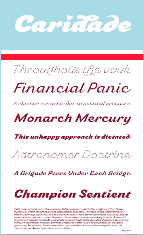
Caridade Font Family - 6 Fonts for $82
OTF | 6 Fonts | JPEG Preview | 2.67 Mb RAR | SALE PAGE
- Caridade is a bold and powerful script face. It draws some inspiration from heavy brush drawn vintage hand lettering but its heavy weight is much thicker with plenty of impact and more contemporary letterforms. The face offers a wide array of weights, from the powerful Heavy weight to the graceful Thin. Caridade can get the job done for many unique design tasks. Caridade includes many useful OpenType features, including a set of non-connecting alternates, 40 ligatures, and two types of end letterforms. OpenType features include ornaments, swash endings, ending contextual alternates, discretionary ligatures, ligatures and three different stylistic sets filled with alternates. In total, there are over 60 alternate letterforms. Please see the sample .pdf to see these features in action. OpenType capable applications such as Quark or the Adobe suite can take full advantage of the automatically replacing ligatures and alternates. This family also includes the glyphs to support a wide range of languages.

Espuma Pro Font Family - 14 Fonts for $260
OTF | 14 Fonts | 0.94 Mb RAR | SALE PAGE
- Espuma Pro is a soft and friendly humanist sans-serif font family with strong calligraphic aftertaste. Presented in 7 weights, with true italics each, it features the traditionally rich language support, small caps, 6 sets of figures and a bunch of ligatures. Its delicate flavor is suitable for brands that wish to communicate friendliness and openness. This typeface is especially good for FMCG and packaging, but it can be used virtually anywhere thanks to its extreme legibility.
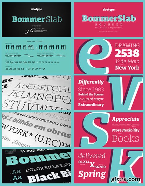
Bommer Slab & Bommer Slab Rounded Font Family $420
28 OTF | 28 WOFF | RAR 3.24 MB | Sharp & Rounded
- BommerSlab & BommerSlabRounded includes 14 weights - being seven uprights and seven italics.These fonts have a strong personality, that makes it perfect for use in headline sizes but means it also works gracefully within text blocks. Designed by Eduilson Coan. Seven uprights and seven italics and opentype features such as: all caps, ligatures, ordinal, fractions, numerator, denominator, superscript and subscript.

Typograph Pro Font Family - 7 Fonts for $113
7 OTF | 7 TTF | 0.3 Mb RAR | SALE PAGE
- Note: The 'Pro' in the name of this font should not be interpreted as having OpenType features. It has none. What was the inspiration for designing the font? Inspired from the basic shapes like circle, cube and triangle. Closer to basics means more useful in various projects. What are its main characteristics and features? Clean graphic shapes. Usage recommendations: Graphic design, Motion design, 3D, Posters, Magazine covers, Outdoor.

Barata Display Font Family - 3 Fonts for $45
OTF | 3 Fonts | JPEG Preview | 9.54 Mb RAR | SALE PAGE
- Barata Display is an all caps script family font inspired by the street vendors and informal commerce in Latin countries. A condensed defined and thick stroke evokes the chalk signs that are made in “tianguis”, markets, greengrocers, barbecues and flea markets from Los Angeles to Buenos Aires. It is a typeface that “SCREAM” buy me, save money, discounted, almost Free, opportunity! What distinguishes the New Barata Display from Estudio Arellano Type Foundry is the expressive power of its structure. The Alphabet is built on the geometric principle of free traces from freehand writing. Composed of 236 capital Roman characters, Barata Display includes most common accents and diacritics. Barata Display can be used in any kind of commercial or personal promotion, in graphic design, web, print, animation, etc. Perfect for price labels, tags and other applications such as posters and t-shirts. It is a typeface ideal for headlines and Lettering.

Pincoya Black Pro Font Family - 2 Fonts for $98
OTF | 2 Fonts | JPEG Preview | 3.6 Mb RAR | SALE PAGE
- Pincoya Black Pro is a font based on lettering found on a poster from the Spanish Civil War, complemented with graphics developed in “La Unidad Popular” (Chilean political coalition) during the seventies. Pincoya has many alternate characters in Opentype format that provide multiple options when composing a text. It is an ideal font for high impact sentences, logotypes, magazine layouts, poster designs, etc. Languages include: Basic Latin, Western European, Euro, Catalan, Baltic, Turkish, Central European, Romanian and Pan Africa Latin.

Posterizer KG Font for $40
OTF | +Preview | 3.66 Mb RAR | SALE PAGE
- This slab serif font is inspired by European industrial, machine-made letters. It looks rational and geometric, but optically corrected and balanced. As the name says this font face is designed to be used by mostly for posters, headlines, visual identities and short texts. Font was created for Celebration of the 5 year anniversary of Design Studio Box from the city of Kragujevac (KG), the industrial city of Serbia. Posterizer KG contains all the Latin and Cyrillic glyphs.

Profonts - 9 Script Fonts Bundle 21xOTF $630
IovaNova | Laramie | Sonora | Valentine

Stat Text Pro Font Family - 8 Fonts for $290!
OTF | 8 Fonts | 0.54 Mb RAR | SALE PAGE
- Stat Text Pro retains many characteristics of its display counterpart, while giving readability a greater importance. It has simpler letter shape details which enable it to accomplish a constant rhythm whiles being read. Its main intended use is to accompany Stat Display Pro in places where longer passages of text are needed. In this way the visual character of the composition is retained and at the same time readability of text is given attention. As its display counterpart it has a large character set with multiple weights, which are defined by optimal size ratio, wide aperture and balanced counters. It contains nearly 700 glyphs, including diacritics, ligatures, small caps, old–style figures, arrows and more. This enables it to achieve wide language support. It consists of four weights (Light, Regular, Medium, Bold) which are accompanied by their corresponding obliques. Stat Text Pro type family has higher than average x height (72% of cap height) which is accompanied by matching ascender and descender size ratios. The development of the type family was based on research in legibility to achieve highly legible letter shapes, while not diminishing their visual character.

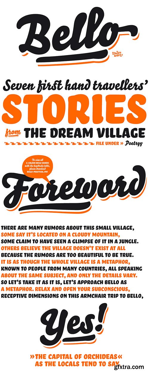
Bello Script Pro Font for $120
OTF | +Previews | 3.15 Mb RAR | Bello Pro Font
- Bello Pro is an OpenType font (.otf) which combines all Bello fonts into one sophisticated font. Bello Pro contains Advanced Layout Features, which makes it for example easy to automatically implement all the ligatures of Bello. But there is more to Bello Pro. SmallCaps are included in the same font, it’s possible to automatically replace the oldstyle figure style with lining figures, etc. And if you wanna hit Bello Pro hard, you can even automatically replace some words in your text by the pre-designed word logotypes.

PF Kids Pro Font Family - 3 Fonts for $195
3 OTF | 3 TTF | +WEB FONTS | RAR 11.2 MB | SALE PAGE
- This is not just a typeface inspired by a kid’s first attempts to write. This is in fact how exactly a kid writes. Alexandros Papalexis was born again kid when he became a father. This series came about while designing his daughter’s birthday invitations. Since its first release, it has been constantly on our most wanted list. You step into a supermarket, a bookstore or a clothing store and you see tens of products using this typeface. Anything from baby products, food, clothing, children’s books and magazines, print and TV campaigns, you name it. But don't just stick to the name. Every single weight serves the right purpose. This is why this typeface has also been used extensively for grown-up market. Recently, it was upgraded to include Latin, Greek and Cyrillic. Furthermore, the accompanied series of pictograms was completed and loaded with 125 western and eastern European pieces.
126,000 Royalty-Free 3D Model

Udemy Türkçe


Top Rated News
- CreativeLive Tutorial Collections
- Fasttracktutorials Course
- Chaos Cosmos Library
- MRMockup - Mockup Bundle
- Finding North Photography
- Sean Archer
- John Gress Photography
- Motion Science
- AwTeaches
- Learn Squared
- PhotoWhoa
- Houdini-Course
- Photigy
- August Dering Photography
- StudioGuti
- Creatoom
- Creature Art Teacher
- Creator Foundry
- Patreon Collections
- Udemy - Turkce
- BigFilms
- Jerry Ghionis
- ACIDBITE
- BigMediumSmall
- Globe Plants
- Unleashed Education
- The School of Photography
- Visual Education
- LeartesStudios - Cosmos
- Fxphd
- All Veer Fancy Collection!
- All OJO Images
- All ZZVe Vectors
- CGTrader 1 CGTrader 2


