

Pocketknife Font Family - 4 Fonts $120
4 Fonts | OTF | +previews | SALE PAGE
- Pocketknife is a simple grid-based titling font on it’s surface, but it has a surprisingly prolific set of features under the surface. The most notable of these features is an abundant set of ligatures that give Pocketknife it’s unique look. There are very few kerning pairs contained within Pocketwatch, and these ligatures fill in most gaps that could be created by letters with more empty space, such as L and T, and also give a more playful look to an otherwise sharp-edged typeface.

InkyDeals - The Fabulous Fonts Bundle
with 11 Fonts & Bonus $33
11 TypeFaces | 14 OTF | 16 TTF | +Previews + Bonus | RAR 87.3 MB | SALE PAGE
- Every designer knows that a font can make…or break a project! That’s why is so important to have in your toolbox a great variety of resources, that can fit all the different needs of your clients. Wanting to help you with this, we’re bringing you an awesome bundle with 11 fabulous fonts. They cover a wide range of styles: from vintage hand drawn to modern brush script styles. Whether you need a creative font for a logo, an invitation or everything in between, we’ve got you covered!

Regular Font Family 14 Fonts
OTF | 14 Fonts | + Preview | SALE PAGE
- A Geometric Sans! with its basic structure inspired by some of our favourite hot metal fonts: Memphis, Karnak, Stymie, Scarab and Paul Renner’s Futura — Regular started as a Slab Serif font in late 2011, however I soon realised that it wasn’t going to bring anything particular new to the faces already available on the market so my design was placed in a drawer. A couple of months passed and on a visit to Antwerp in Belgium, I was reminded of the distinct lowercase ‘g’ featuring in some of the afore mentioned typefaces. High up on a wall was a shadow of a past sign, but a Sans version! This interesting discovery inspired me directly to go back to the font and my early ideas and basically work the Slab Serif font that I had already started, into a Sans! Regular is in many ways a revival but it is also a font that has contemporary references and key words like: Rational, Readable, Refined, Relevant, Reliable and Responsive was part of the check-list during my design process. The carefully crafted range of weights; Light, Regular, Medium, SemiBold, Bold, ExtraBold & Black is ideal for books and magazines and it also lends itself very nicely to screen based projects — The family of fonts incorporates true Italics for each weight which is distinct when set in running text. Regular suggest a Modernist approach to design — but is open for interpretation.

NB Grotesk Font Family 6xOTF €199
OTF | 6 Fonts | +Preview | 1.17 Mb RAR | SALE PAGE
- NB Grotesk™ became an instant success after its initial release in 2008. The typeface was originally developed for the Neubauism exhibition taking place in Eindhoven, The Netherlands. NB Grotesk™ is a constructed monoline neo grotesk typeface which is based on Gandl’s diamond grid system following strict rules. The experimental typefaces’ concept is dominated by the fact that any optical corrections were forbidden which resulted in NB Grotesk’s raw characteristics and typical appearance. NB Grotesk™ together with NB Grotesk™-R and NB Grotesk™ Mono is Neubau’s most expanded typeset including a total of 16 different styles. Despite its unorthodox and unconventional looks, NB Grotesk™ is still Neubaus’s most popular typeface today. 255 characters, upper & lower case, proportional figures, extended character set, 5213 kerning pairs; Open Type Features: (incl. 265 characters) +capital spacing, +tabular figures.
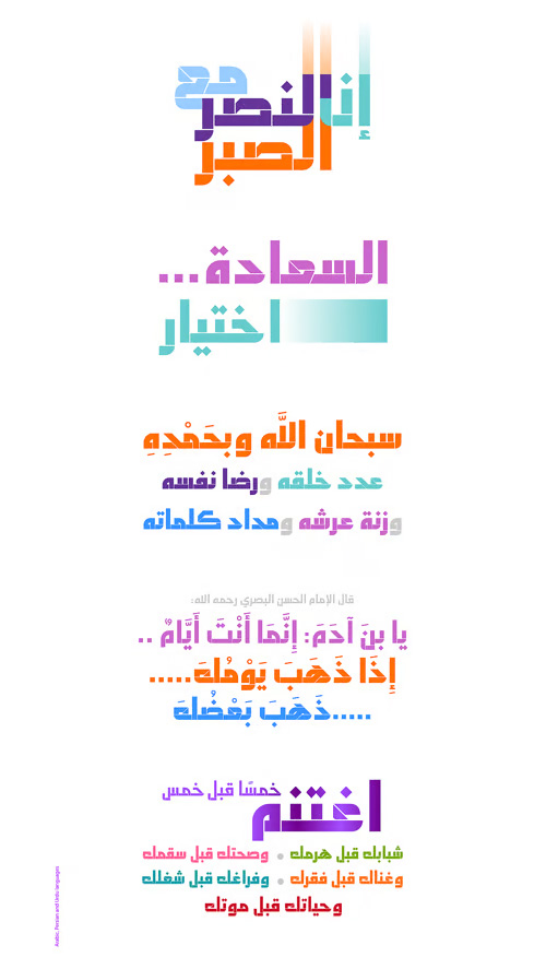
Abdo Salem Font Family 3 Fonts $75
OTF, TTF | 3 Fonts | +Preview | 1 Mb RAR | SALE PAGE
- Abdo Salem is the second version of the font FS_Salem which was designed by the type designer Abdulsamie Rajab Salem for Future Soft company fonts. It is a leading company in Arabization field and producing the Arabic and Islamic programs beside the children programs. This font appeared between 1998 and 2000. In this version there were a lot of adjustments to keep the font in its spirit and uniformity between the various characters. Also added some new characters, which gave him another beautiful addition to be used in both title and text designs. Three weights (Light, bold and black) have been created. Then the font was converted to OpenType to support Arabic, Persian and Urdu to be compatible with the various operation systems and modern software. The combination of modern Kufi and Naskh styles and varying between straight and curved parts made it a beautiful typeface appropriate to the titles and text, and able to meet the desire of the user in the design of ads and modern designs of various types of audio and visual.


Xyngia Font Family 22 Fonts $150
OTF/TTF | 22 Fonts | +Previews | 16 Mb RAR | SALE PAGE
- Xyngia is a professional modern sans serif typeface. Thanks to its excellent legibility it is a great choice both for on-screen use as well as print purposes. Xyngia is designed for use in long and short paragraphs of text, headlines and user interfaces. Its design nuances gives it distinctive character making it an interesting option for brand identification and logo design. Xyngia consists of 22 fonts - 11 weights and their corresponding italics. It has extended language support (over 1000 glyphs) and true italics, as well as broad number of OpenType features, such as small caps, case sensitive forms, standard and discretionary ligatures, stylistic sets, contextual alternates, lining, oldstyle, tabular and small cap figures, slashed zero, fractions, superscript and subscript, ordinals, currencies and symbols.

Rotundus Rounded Font Family $269
OTF, WOFF | 8 Fonts | 0.8 Mb RAR | SALE PAGE
- Rotundus Rounded is a rounded version of the Rotundus type family. It is a fresh and modern sans serif typeface based on geometric forms. The main characteristics of the typeface are a tall x-height and condensed width. The distinctive appearance makes Rotundus Rounded suitable for any type of graphic design. The Rotundus Rounded type family includes extended Latin characters, ligatures and OpenType features. It is available in light, regular, bold and black weight.

Siri Font Family - 16 Fonts for $359
OTF | 16 Fonts | +Preview | 3.2 Mb RAR | SALE PAGE
- The typeface Siri is a labour of love. A love for a Scandinavian tradition that we try our damnedest to keep evolving. A love for letters, original and bold, practical and beautiful. A love for the craft that helps create practical and beautiful typography. With its wide range of 16 styles, useful OpenType-features and four stylistic sets, Siri is well prepared for anything you wish to use it for. It has great readability, a large x-height, slightly condensed letter forms and a strong identity. These features makes it work over a wide selection of applications. It’s designed to perform well on both screen and print and is tested in both environments during the design process. Siri is a female Nordic name, comprising the words Beauty and Strength. We hope these qualities are well reflected in the typeface. Last but not least, this typeface is also about Görans love for his daughter Siri, born on Valentines day 2011. The typeface obviously pales in comparison, but we can’t sell the kid, so the type will have to make do.

Vow Font Family - 2 Fonts $55
TTF/OTF | 2 Fonts | +Preview | 3.3 Mb RAR | SALE PAGE
- Vow is an incredibly stylised font, strutting its stuff on the typography catwalk. Vow does everything to excess, even when cutting down: where it’s curvy, it’s very curvy, but where it’s thin, it’s thin. Vow’s regular weight has a certain boldness at text size, but its ultra-thin alternative is much better used at larger sizes, managing to take up very little space even when scaled up. Using a mix of the two creates a subtle emphasis, especially when coloured, which helps to create stunning messages in elegant ways.

Linotype Univers Font Family 63 Fonts $429
OTF | 63 Fonts | + Preview | SALE PAGE
- Linotype Univers is a completely reworked version of the original Univers typeface family designed by Adrian Frutiger in 1957. After a long process of painstakingly detailed revision, Frutiger and the design staff at Linotype completed this large joint project in 1997. All the existing weights were completely redrawn, with careful attention paid to making the proportions more consistent with each other and improving fine details such as curves and thick-to-thin stroke ratios. By following Frutiger’s original designs, the humanist character of the sans serif, Univers, now comes through more distinctly. The systemized numbering system has also been updated. With its sturdy, clean forms Linotype Univers can facilitate an expression of cool elegance and rational competence.

Whitney Font Family 79 Fonts
- Whitney: clear for signage, compact for print. A type family originally developed for New York’s Whitney Museum, Whitney contends with two different sets of demands: those of editorial typography, and those of public signage. Typefaces for catalogs and brochures need to be narrow enough to work in crowded environments, yet energetic enough to encourage extended reading. But typefaces designed for wayfinding programs need to be open enough to be legible at a distance, and sturdy enough to withstand a variety of fabrication techniques: fonts destined for signage need to anticipate being cast in bronze, etched in glass, cut in vinyl, and rendered in pixels. While American “gothics” such as News Gothic (1908) have long been a mainstay of editorial settings, and European “humanists” such as Frutiger (1975) have excelled in signage applications, Whitney bridges this divide in a single design. Its compact forms and broad x-height use space efficiently, and its ample counters and open shapes make it clear under any circumstances. And Whitney’s extensive language support, covering more than 200 languages worldwide, has made it a mainstay of diversified brands that require localized typography.

Trim Mono Font Family - 5 Fonts for $169
5 Fonts | OTF/TTF | +Preview | 1 Mb RAR | SALE PAGE
- Knud V. Engelhardt (1882–1931) was an architect, printer and designer from the country of our laid back neighbours, Denmark. Knud’s characteristic letter forms have already made a strong impression on some modern typefaces. Most notably is probably Skilt Gothic by a fellow Swedish compatriot, where Knuds way of trimming the diagonal stems is one of the spices used to give the typeface its character. Fighting against the desire to make something similar, this new typeface instead takes the concept to a whole new level by trimming not only diagonals, but all possible letters! The result is something – different. Trim comes in a large family including manually hinted webfonts and high quality desktop fonts. Some are fat, some are skinny and some are just lagom. This is the monospaced version of Trim.
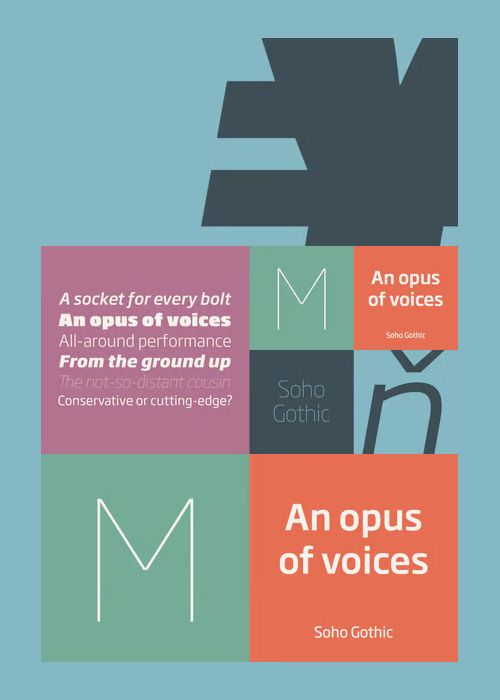
Soho Gothic Font Family - 14 Fonts for $910
14 Fonts | OTF | +Previews | 2.3 Mb RAR | SALE PAGE
- “There is just something magical about type design,” says Sebastian Lester. “If you draw a successful typeface it can travel the world, taking a part of you with it.” If this is true, his Soho® Gothic family has taken him far and wide. Understated, modern and exceptionally versatile, the family has been put to good use in just about every application imaginable. A good choice for virtually any type of project, The Soho Gothic family performs equally well as the backbone of a global brand as it would in an edgy fashion magazine. Versatile, extensive, customizable, and multilingual – the Soho Gothic typeface family has it all.With the same proportions as Soho, its slab serif cousin, Soho Gothic ranges across seven weights, from a willowy hairline to a brawny ultra – each with a complementary italic.Lester took care to ensure that the Soho and Soho Gothic designs work in perfect harmony. According to him, “The typefaces were developed alongside each other so that I could consider every aspect of each design and be certain that they would be absolutely compatible.”Soho Gothic is a more understated and more subtle design than Soho. Features that give the design its distinctive tone are the flat, crisp apexes of the diagonal characters like the A and V, and the marked horizontal stress in the a, g and s. “I wanted the family as a whole to radiate effortless modernity,” recalls Lester, “to be a master communicator that works in all conditions and at all sizes.” A collection of alternate and “semi-slab” characters were also part of Lester’s plan. “I like to develop alternate characters for all my type designs,” he says. “I believe they give graphic designers greater flexibility and make a typeface more valuable.” Soho Gothic is available as OpenType® Pro fonts that have an extended character set which supports most Central European and many Eastern European languages. If you’re looking to complete your designs, consider pairing it with Bembo® Book,Joanna® Nova,Neue Frutiger®,PMN Caecilia®,or ITC Stone® Serif.

Bisque Font Family - 2 Fonts for $120
OTF | 2 Fonts | +Preview | 4.3 Mb RAR | SALE PAGE
- Bisque is designed with a sense of play and rhythm, with intermittent areas of quietness, bringing a sense of ‘bounce’ to text. The combination of classic typographic forms and proportions with expressive, contemporary features create a typeface with charisma and joy. The 2011 revision involved adding an extended glyph set for much wider setting applications.
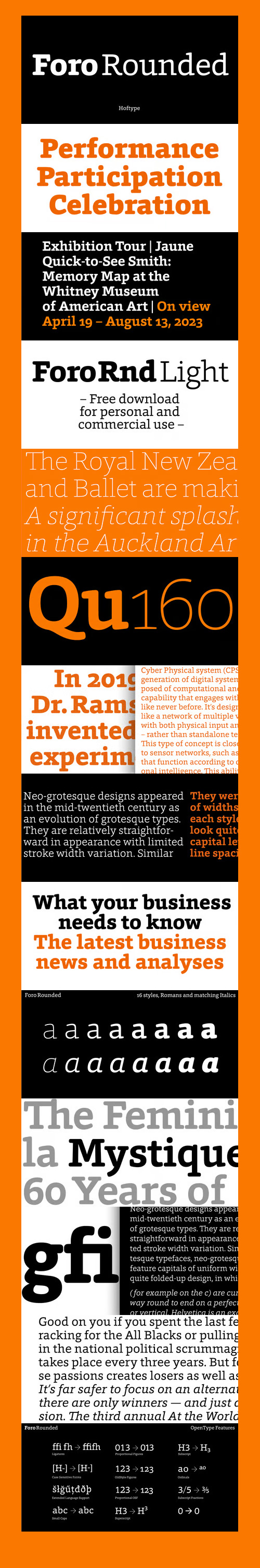
Foro Rounded Font Family - 16 Fonts $198
OTF | 16 Fonts | +Preview | 4.6 Mb RAR | SALE PAGE
- Foro Rounded is the softer sister of the succesful Foro family. Distinct in appearance, with pleasant haptic, objective, and with graphic appeal. Foro comes in 16 styles and in OpenType format. All weights contain standard ligatures, proportional lining figures, tabular lining figures, proportional old style figures, lining old style figures, matching currency symbols, fraction- and scientific numerals and arrows. Foro supports Western European, Central and Eastern European languages.
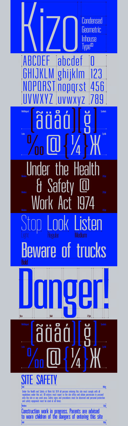
Kizo Font Family - 4 Fonts for $109
4 Fonts | OTF | +Preview | 3.6 Mb RAR | Kizo Font Family
- Kizo is a geometric condensed sans serif typeface, designed by Mariya V. Pigoulevskaya in 2013. Inspired by the urban modernist architecture, the font is functional, rational, utilitarian and subtle in its nature. Created for text and display use, Kizo offers a number of alternative characters. Build for maximum clarity and with attention to detail, Kizo features ink traps, making it suitable for the newsprint as well as the on screen application. Details include 4 weights, 434 characters and open type features.

Rambla Font Family - 6 Fonts for $120
OTF | 6 Fonts | +Preview | 6.7 Mb RAR | SALE PAGE
- Rambla is a humanist sans for medium-long texts. It’s slightly condensed, with a generous x-height and short ascender/descenders. Its proportions have as objective to gain space in height and width. It’s elegant at large sizes and legible at the same time, with a lot of rhythm in small sizes.

Prevya Display Font Family - 5 Fonts for $40
OTF | 5 Fonts | +Preview | 3.8 Mb RAR | SALE PAGE
- Prevya is a display family. Inspired by the metalwork of the early twentieth century. Have appropriate characteristics for ornamental titles. Is accompanied by a light version for featured texts and it has a shadow layer to combine in beautiful designs.
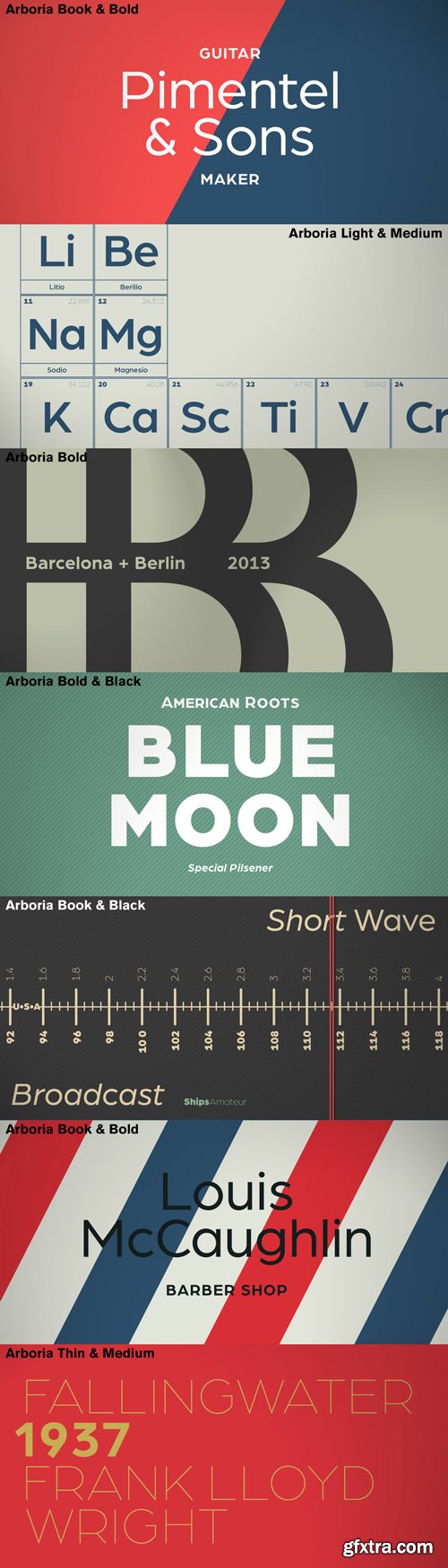
Arboria Font Family 12 Fonts $768
- Arboria has been a long-term project. Starting with the commission of a custom ‘architect’ font, this typeface has been changing over the years to its current form, which is its public debut. The source is named after the capital of planet Mongo, a futuristic city with art decó influences in their buildings. Arboria maintains that tension but is influenced by all elements of concern to his author. The result is a hybrid Grotesque with nods to the XXII century. Arboria family consists of six weights and matching italics, aside from many characters (it covers Latin and CE languages), the wide range OpenType features allows Arboria to perform great as a text and as a display typeface. Please check the ‘Read me’ file for more specifications.
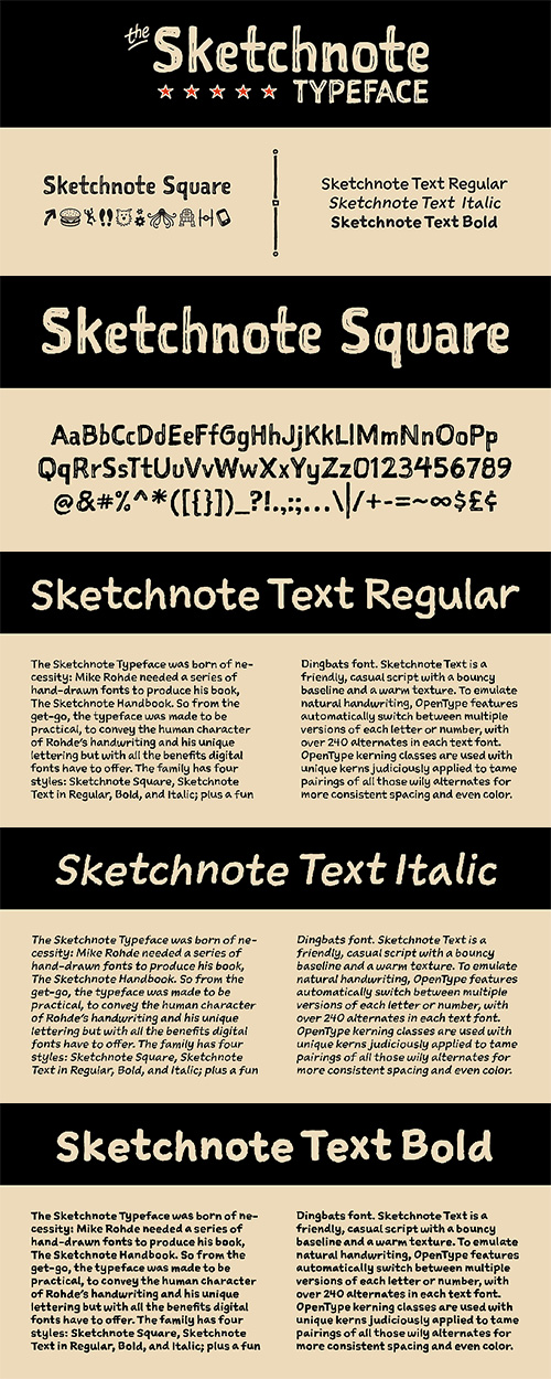
Sketchnote Typeface Font Family - 5 Fonts for $99
OTF | 5 Fonts | +Preview | 1.9 Mb RAR | SALE PAGE
- The Sketchnote Typeface was born of necessity: veteran designer and illustrator Mike Rohde needed a series of hand-drawn fonts to produce his recent book, The Sketchnote Handbook (2012, Peachpit Press). Because of its origin, the typeface was designed to be practical, to convey the human character and quirks of Rohde’s normal handwriting and unique hand-drawn lettering with the benefits inherent in digital fonts. Sketchnote Square is a bold, somewhat compressed headline type that complements the Sketchnote Text fonts. Drawn instead of written, the characters in Square have neat little happenstance voids within the strokes. Square also includes a handy selection of fun icons, rules, and arrows—some functional tidbits for your design projects. They are accessible via the OpenType feature “Ornaments” or “Stylistic Set 2” For added convenience, those same fun icons, rules, and arrows are also available as a standalone font, Sketchnote Dingbats, which comes packaged with Square and the full family package. The texture of Sketchnote is the result of actual ink-spread on paper, captured in scans of the written letterforms and left intact during production to preserve that feeling. Under the hood, the texture was carefully edited by hand, eliminating outline errors and keeping the point count low for optimal performance. These fonts are crafted to the highest industry standards. Sketchnote Square is best used at larger sizes for headlines, titles, packaging, etc. Sketchnote is great for a variety of projects where a handcrafted aesthetic and ease-of-use are desired.

MonsterHand - Ruling Pen Made TypeFace for $39
OTF/TTF/WoFF | +Preview | 9.8 Mb RAR | SALE PAGE
- MonsterHand is our first Ruling Pen made face. This tool is usually used in calligraphy for expressive lettering. Giuseppe Salerno’s hand has been converted into this crazy typeface. This font includes also a set of icons. Enjoy it!

126,000 Royalty-Free 3D Model

Udemy Türkçe


Top Rated News
- CreativeLive Tutorial Collections
- Fasttracktutorials Course
- Chaos Cosmos Library
- MRMockup - Mockup Bundle
- Finding North Photography
- Sean Archer
- John Gress Photography
- Motion Science
- AwTeaches
- Learn Squared
- PhotoWhoa
- Houdini-Course
- Photigy
- August Dering Photography
- StudioGuti
- Creatoom
- Creature Art Teacher
- Creator Foundry
- Patreon Collections
- Udemy - Turkce
- BigFilms
- Jerry Ghionis
- ACIDBITE
- BigMediumSmall
- Globe Plants
- Unleashed Education
- The School of Photography
- Visual Education
- LeartesStudios - Cosmos
- Fxphd
- All Veer Fancy Collection!
- All OJO Images
- All ZZVe Vectors
- CGTrader 1 CGTrader 2


