

Quattro Tempi - Sketch Serif Slab Brushed 2xOTF $26

Bizzle Chizzle - An Expansion of Lettering Sketches $69
4 OTF Font Files | Designer: Terry Biddle | SALE PAGE
Bizzle-Chizzle is an OpenType font package that consists of four individual fonts:
Bizzle-Chizzle Outline | Bizzle-Chizzle Front | Bizzle-Chizzle Sides | Bizzle-Chizzle Solo
![]()
![]()
![]()
![]()
- Bizzle-Chizzle is an expansion of lettering sketches initially made for my personal website. Each glyph is drawn by hand and inked by brush to simulate the texture of letters chiseled out of stone. Bizzle-Chizzle is meant to be used for dynamic layouts and prefers to be as large as possible. The first three combine to form Bizzle-Chizzle’s three dimensions, while Bizzle-Chizzle Solo can be used individually. Feel free to mix and match for fun effects!

Blue Gobblet Bundle
Fonts and Design Elements 45xOTF $376
Bundle Content:
Blue Goblet 8 fonts $89.99
Blue Goblet Christmas Ornaments 1 font $32.00
Blue Goblet Drawn 21 fonts $55.75
Blue Goblet Emblems 1 font $32.99
Blue Goblet Florals 1 font $32.99
Blue Goblet Frames and Vignettes #2 Both fonts $35.00
Blue Goblet Frames and Vignettes Both fonts $35.00
Blue Goblet Ornaments 1 font $21.99
Blue Goblet Serif 8 fonts $39.99
- This best selling series has now been extended to include a new member, Blue Goblet Drawn. Blue Goblet is hand-drawn by the artist, Cory Godbey, and is organic, charming and exuberant. Characters bounce and dance above and below the baseline and x-height, making this a whimsical and fun script.
- Not only is Blue Goblet Drawn a excellent choice, it also is also a versatile member of a wide family
- of different fonts. You can use it side by side with the original Blue Goblet fonts, and there are a wide range of ornaments available in the supplemental ornament sets--over 370 illustrations! These illustrations include doodley frames, lovely florals and other text ornaments that can be inserted into your text and resized at will. This makes the Blue Goblet series a great pick when you want a type system for a very unique and consistent look. The Blue Goblet series also continues to expand, making any of these family members a valuable investment for the future.
- Blue Goblet Drawn comes in three weights and three widths in each weight, with complementary italics for maximum impact for a total of eighteen pro fonts. The compact thin weights are delicate and tall, while the Regular has just enough heft for those situations where subtlety doesn't work. If you don't need the professional features, there are three stripped down fonts that include only the basic character set!
- Blue Goblet Drawn also includes auto-replacing ligatures that make it appear that the script was drawn by the artistís own hand--just for you! Blue Goblet Drawn also includes a wide variety of alternates that can be accessed in any OpenType enabled application. Blue Goblet includes over 190 additional glyphs and is loaded with features including an even more unique alternate alphabet. Included are swash alternates, style sets, old style figures and small caps. Please see the informative PDF brochure to see these features in action. OpenType enabled applications such as the Adobe suite or Quark can take full advantage of the automatic replacing ligatures and alternates. This family also includes the glyphs to support a wide range of languages.
- Blue Goblet Drawn is a great choice for friendly display type in children’s books, packaging, organic packaging or other unique applications. Use Blue Goblet whenever you want to inject a handmade
- sense of fun and whimsy to your designs. Give the Blue Goblet series a whirl today!
- Blue Goblet is a script developed for the pending illustrated children’s book from Portland Studios, The Blue Goblet. The font has grown to a comprehensive system, with a wide array of ornaments available.
- Blue Goblet is usable in a wide range of settings, and includes a full complement of OpenType features and a more playful alternate.
- Blue Goblet is a collaboration between Portland Studios and insigne. It was designed by Cory Godbey and digitized by Jeremy Dooley.

Capo - Make Great Effect for Large-Sized Text. $145
4 OTF Fonts | Designer: Gareth Hague | SALE PAGE
- The intention with Capo was to make a typeface with a pinched, angled connection between curves and verticals. We have explored this incised, cut motif previously on typefaces, most notably Noah, Sabre and Harbour. These have focussed more specifically on stone-cut forms. For Capo we wanted to mix the expressive quality of its ‘pinch’ idea with an overall aesthetic that could be applied to text rather than headline. So Capo has something of the function and warm, organic quality of Grotesque style typefaces. In Capo’s Bold and Black weights the sharpness of the letter shapes is more dramatic and emphasised, making for great effect for large-sized text. Why Capo? A capo is a device used on the neck of a stringed (typically fretted) instrument to shorten the playable length of the strings by pinching or clamping them in place, hence raising the pitch.

Typha Latifolia - A Plant of the Swamps 8xTTF $45
8 Fonts | OTF/TTF/WoFF | SALE PAGE
Typha Latifolia is a plant of the swamps from the Northern Hemisphere. It is characterized by its high rangy leaves.
Typha Latifolia is also a font family. It is characterized by the height of the ascenders and the descenders.
Numerous ornamental variations complete medium and bold versions.

Fika - A Warm & Fresh Semi-Script Font $40
5 OTF Fonts | Publisher: Ryan Keightley | TURKISH SUPPORT | SALE PAGE
![]()
![]()
![]()
![]()
![]()
![]()
![]()
![]()
![]()
![]()
![]()
![]()
![]()
![]()
- Fika is a warm and fresh semi-script font inspired by the feeling of a friendly local café. Appropriate for restaurants, packaging, web design, and anything in between, Fika will give a human touch to any project with its rounded edges and subtle, calligraphic weight variations. Italic is particularly nice for the swooping arcs and scriptlike flourishes of the capital letters. Fika includes a variety of accents for international languages, a small selection of swashes for a little extra flair, and a unique set of sans-serif smallcaps (in A-Z and 0-9) for supporting copy.

Fedora Pro - Creative Typeset $50
Designers: Carolina Santana | TURKISH SUPPORT
![]()
![]()
![]()
![]()
![]()
![]()
![]()
Sans serif typography, playing with alternatives as a layer and another set of ornaments
to make your titles something very nice and very entertaining.
Styles can also be combined.
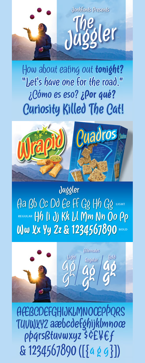
Juggler - Medium-Line Script Friendly Style $35
OTF Font File | Publisher: Jonahfonts | SALE PAGE
A casual, unconnected script face. A medium-line script that is suitable for work requiring a friendly style.
Ideal for captions, packaging, invitations, cards, posters, ads, greeting cards & book jackets and covers.
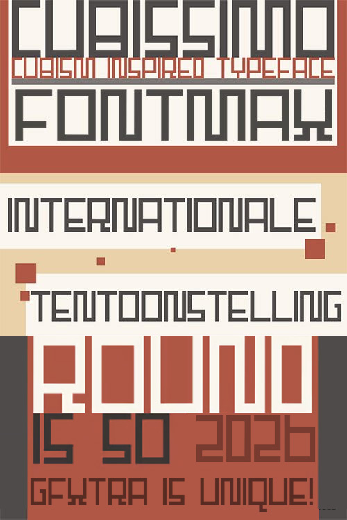
Cubissimo - All-Caps Cubist Typeface $25
It is an all-caps cubist typeface designed to look good on posters.
It comes with extensive language support.

Alternate Gothic Pro Antique $100
3 OTF Fonts | Designer: Veronika Elsner | SALE PAGE
![]()
![]()
![]()
![]()
![]()
![]()
![]()
![]()
![]()
![]()
![]()
- In 1903, the typeface family Alternate Gothic was developed for ATF (American Type Foundry) by Morris Fuller Benton. It was Benton’s intent to solve many diverse layout problems with the development of a narrow Sans with different width values. The Alternate Gothic enjoys great popularity to this day. Therefore, Elsner+Flake re-worked the typeface family, added all European fixed accents and complemented it with an Antique version.


Quilon - A High-Contrast Sans Serif Family $100
4 OTF Font Files | Designer: Jonny Pinhorn
- Quilon is a high-contrast sans serif family. It’s design features also transcend the centuries – elements of both 19th century English grotesques and 1990s postmodernism are present in its letterforms. The family is an optimal choice for use in display typography. As the weights progress, their stroke contrast increases dramatically. Each font in the family includes 391 glyphs. “Quilon” is the previous name for Kollam, a city located in Kerala, India.

Chalfont - Ink had Faded on the Bottom $250
- The typeface was designed after seeing a photocopy of some News Gothic text where the ink had faded on the bottom of each character. As character recognition is generally based on the top half of a character, readability was never compromised. Rather like Antique Olive the characters have a top heavy look when viewed straight on, however, as most type is read at an angle with the top further away than the bottom this top heavy look is diminished.

Banana and Sun
Light Handwritten Font for Fashion & Culinary $22
2 OTF Font Files | Designer: Justyna Sokolowska
![]()
![]()
![]()
![]()
![]()
![]()
![]()
![]()
![]()
Banana and Sun is light handwritten font. It’s very suitable for the fashion industry and culinary.
This font is crazy but readable, so it can be used for large amounts of text.

Boshi - Retro Goodness $30
OTF Font File | Designer: Ian Stone | SALE PAGE
![]()
![]()
![]()
![]()
![]()
![]()
![]()
![]()
![]()
![]()
- Boshi is inspired by classic video games, but it can do more than that. Saturday morning cartoons, comic books and other logos that need to express fun are other ways this font can be used. It also includes several Tiki-style interlocking ligatures. Vastly improved over the original free version, already featured in several high-profile mobile games, Boshi evokes retro goodness.

Dolce Caffe 3D
All Caps Handwritten Typeface $59
3 OTF Fonts | Publisher: Resistenza | SALE PAGE
![]()
![]()
![]()
![]()
![]()
![]()
![]()
![]()
![]()
![]()
![]()
Dolce Caffe was a handwritten font designed in the 2011 inspired in some berliner menu.
Now we developed a 3D, 3D Rough and a Shadow version.
They are very legible and high in style and carefully constructed all-uppercase letters.

Austin Hairline Font Family $75
- Originally designed for British style magazine Harper’s & Queen, Austin is a loose revival of the typefaces of Richard Austin of the late 18th century for the publisher John Bell. Working as a trade engraver Austin cut the first British modern and later the iconoclastic Scotch Roman. Available in a single weight that perfectly balances the thick and thin, Austin Hairline pushes the high contrast of the original to new extremes. Drawn by Berton Hasebe for Alex Grossman at WSJ, the weekend fashion and lifestyle magazine of the Wall Street Journal Austin Hairline is intended strictly for use at 100pt and above.

Fairwater Font Family - 18 Fonts $120
18 Fonts | OTF/TTF | SALE PAGE
- Fairwater’s aesthetic derives from three sources: the cursive handwriting styles popularized in the early to mid 1900s, the simplified, forgiving letterforms of tattoo lettering – and the pictorial themes that informed early-to-mid 20th-century naval tattoos. The Fairwater family includes two highly legible sans and script faces – friendly, monoline, and casual – in light, regular and bold weights. As with many of her faces, Laura can’t resist adding a plethora of swashes and alternates to the script version – 465 to be exact – for a total of 2,230 glyphs. Fairwater also includes four showier serif faces for use at display sizes, culminating in the the vaguely botanical “Sailor” and elegantly striped “Deco” weights.
- Fairwater also includes a powerful decorative font entitled DIY Lines: 250 ornamental characters of ships, anchors, oars, knots, rope, botanicals, diamonds, arrows and more. With strokes and proportions that perfectly complement the type, DIY Lines expands the Fairwater family into a powerful design kit that evokes 20th-century craftsmanship, maritime themes, and colorful, salty personalities.
- A beautiful singularity are the very thin in-and-outstrokes accompagnying each letter. This very high contrasted font is less condensed than usual blackletter fonts and has additionally some stencil aspects which makes Blackmoon so singular.
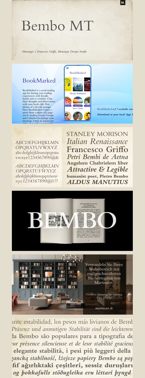
Bembo Font Family - 24 Fonts for $696
OTF | 24 Fonts | +Preview | 1 Mb RAR | SALE PAGE
- The origins of Bembo go back to one of the most famous printers of the Italian Renaissance, Aldus Manutius. In 1496, he used a new roman typeface to print the book de Aetna, a travelogue by the popular writer Pietro Bembo. This type was designed by Francesco Griffo, a prolific punchcutter who was one of the first to depart from the heavier pen-drawn look of humanist calligraphy to develop the more stylized look we associate with roman types today. In 1929, Stanley Morison and the design staff at the Monotype Corporation used Griffo's roman as the model for a revival type design named Bembo. They made a number of changes to the fifteenth-century letters to make the font more adaptable to machine composition. The italic is based on letters cut by the Renaissance scribe Giovanni Tagliente. Because of their quiet presence and graceful stability, the lighter weights of Bembo are popular for book typography. The heavier weights impart a look of conservative dependability to advertising and packaging projects. With 31 weights, including small caps, Old style figures, expert characters, and an alternate cap R, Bembo makes an excellent all-purpose font family.

Univers Cyrillic Font Family - 19 Fonts for $551
OTF/TTF/WoFF | 19 Fonts | 1.6 Mb RAR | Univers Cyrillic Font Family
- Univers was designed by Adrian Frutiger on Swiss principles for Charles Peignot at Deberny & Peignot. Frutiger imposed strict discipline across all elements of the series, from light to dark, extra condensed to extended, a concordance of design that was possible in the foundry type and photocomposition fonts. Any version may be mixed within a word with any other. It may be argued that the design of the most popular central series is limited by strict conformity to little used extremes. If Helvetica gives us the strongest central designs at some sacrifice in uniformity across the series, Univers gives us a uniform series by disciplining the central designs. Alteration of character widths required by the Monotype caster separates Monotype Univers from the original; the Linotype photocomposition version, designed by Frutiger, has a more even color across the series, achieved by relaxing the original rigid formula for stroke width.

Obvia Font Family 18 Fonts for $259
18 Fonts | OTF | +Previews | SALE PAGE
- Obvia, a geohumanist type for all media. Obvia appeared as a result of direct observation on typefaces classified as geometric and the plan to explore for the first time width axes - to be published soon - expanding its usability. The idea behind Obvia’s design was to create a distancing from geometrically pure shapes, in this case, square shapes. Then some details were added, such as subtle inktraps, concave endings of the stems and carefully drawn alternate characters, giving a ‘geohumanist’ tone to the font. This first family of Obvia has 9 weights ranging from Thin to Black with their respective italics, delivering a strong typographic identity, from the paper to the pixel.

415 Premium Brush Rough Fonts Bundle
415 Premium Typefaces | 533 OTF Fonts with Swashes, Lines | +Previews | RAR 366.3 MB
Best Brush Fonts All in One!

FilmoType - 75 Fonts Bundle
75 TypeFaces | 79 OTF Fonts | +Previews | RAR 14.4 MB


Zahran Font Family - Latin & Arabic $39
2 Fonts Latin & Arabic | OTF/TTF/WoFF/WoFF2/EOT | Style Sheet | SALE PAGE
- Zahran is a lovely Latin and Arabic handwritten script, Inspired by modern calligraphy style. This style is a challenge for me in designing Arabic letters, I tried joining Arabic on one side so that the baseline shape is dynamic. Come with many feature; Stylistic alternate, character variant (cv01 to cv12), ligatures, multilingual characters, begining and ending swash, and lovely connecter for lowercase, that can be accessed with opentype feature. Zahran is perfect for branding project, product packaging, tile, logo, wedding, quotes and where ever you need lovely design.
126,000 Royalty-Free 3D Model

Udemy Türkçe


Top Rated News
- CreativeLive Tutorial Collections
- Fasttracktutorials Course
- Chaos Cosmos Library
- MRMockup - Mockup Bundle
- Finding North Photography
- Sean Archer
- John Gress Photography
- Motion Science
- AwTeaches
- Learn Squared
- PhotoWhoa
- Houdini-Course
- Photigy
- August Dering Photography
- StudioGuti
- Creatoom
- Creature Art Teacher
- Creator Foundry
- Patreon Collections
- Udemy - Turkce
- BigFilms
- Jerry Ghionis
- ACIDBITE
- BigMediumSmall
- Globe Plants
- Unleashed Education
- The School of Photography
- Visual Education
- LeartesStudios - Cosmos
- Fxphd
- All Veer Fancy Collection!
- All OJO Images
- All ZZVe Vectors
- CGTrader 1 CGTrader 2


