

ImageRanger Pro Edition 1.9.2.1851 | macOS | 101 mb
We live in the day in which pictures are a common thing, especially with all phones being equipped with pretty powerful cameras. As such, your computer can end up the storage place of your picture collections, but it can be a hassle to manually handle it. In this regard, ImageRanger comes as an advanced picture finding and organizing too
")
")
https://pangrampangram.com/products/agrandir
Agrandir is a contemporary serifless type family that celebrates the beauty of being imperfect. It was designed to be a brave antipode to neutral modernist fonts. Agrandir accepts its own shapes as they are – unaligned, quirky and funky. It celebrates humanity, not machines. The type family consist of 74 fonts: 7 weights × 5 widths × Italics + 4 Text styles. Or just one 3-axes variable font. Agrandir features a fairly good number of OpenType stylistic alternatives, which can be turned on for individual letters or as overall presets – Default, Grotesk and Geometric. With its wide variety of flavors and super tight spacing Agrandir is gonna do a good job for big size headlines, websites, logos and posters, and its new text styles are great for body copy.
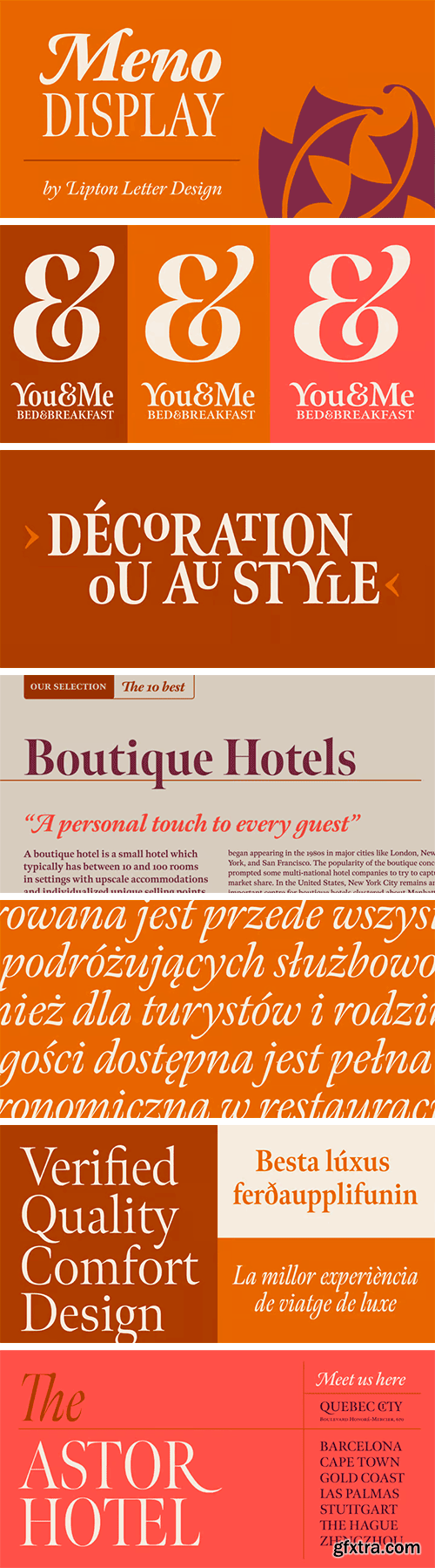
https://www.myfonts.com/collections/meno-display-font-lipton-letter-design
Richard Lipton designed Meno in 1994 as a modest yet elegant workhorse serif family in seven styles. In 2016, he expanded this spirited oldstyle into a 78–style superfamily. The romans gain their energy from French baroque forms cut late in the 16th century by Robert Granjon, the italics from Dirk Voskens’ work in 17th-century Amsterdam. Meno consists of three carefully drawn optical sizes—Text, Display, and Banner, with Condensed and Extra Condensed widths added to the latter two cuts. Steadfast in text settings, Meno is replete with alternate forms, swashes, and other enhancements that showcase Lipton’s masterful calligraphic hand. The series offers a complete solution for achieving high-end editorial typography.
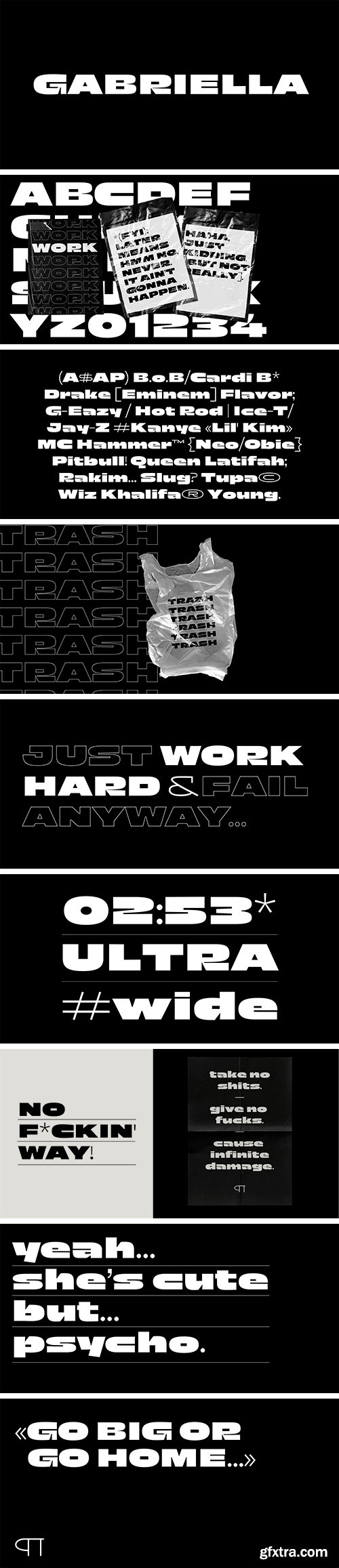
https://fercozzi.com/fonts/gabriella
Gabriella is a wide, emotional and striking typeface. Its extreme shapes and super heavy weight make her hard to miss, yet full of character and gifted with a special charm. A strong and modern design that will make no message go unnoticed. In “The Little Mermaid”, Gabriella was Ariel’s deaf Latina friend who loved to dance. Gabriella rendered a great lesson of inclusiveness for people with disabilities and minorities. With this typeface Gabriella continues to speak up, sing and dance.
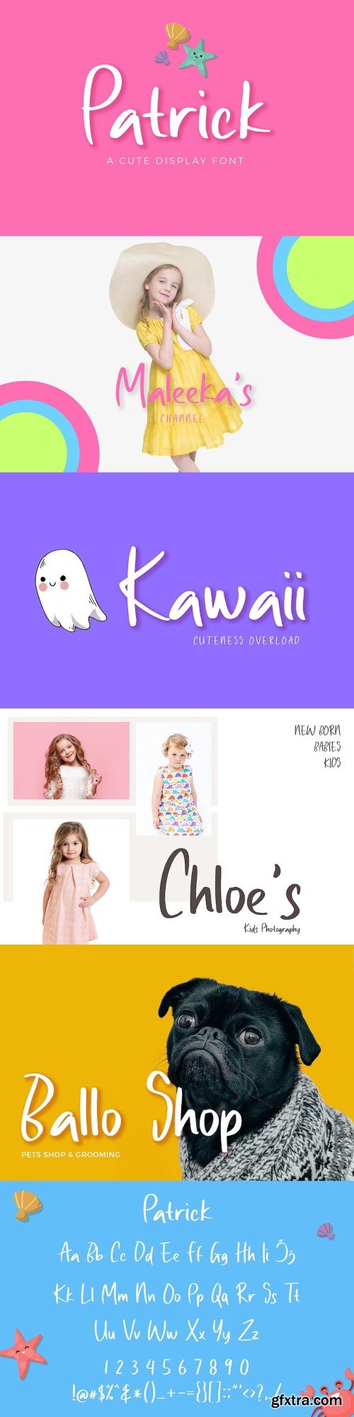


Wild Greens - Handwritten Font
TTF | OTF | WOFF | 403 Glyphs | 218 KB


126,000 Royalty-Free 3D Model

Udemy Türkçe


Top Rated News
- CreativeLive Tutorial Collections
- Fasttracktutorials Course
- Chaos Cosmos Library
- MRMockup - Mockup Bundle
- Finding North Photography
- Sean Archer
- John Gress Photography
- Motion Science
- AwTeaches
- Learn Squared
- PhotoWhoa
- Houdini-Course
- Photigy
- August Dering Photography
- StudioGuti
- Creatoom
- Creature Art Teacher
- Creator Foundry
- Patreon Collections
- Udemy - Turkce
- BigFilms
- Jerry Ghionis
- ACIDBITE
- BigMediumSmall
- Globe Plants
- Unleashed Education
- The School of Photography
- Visual Education
- LeartesStudios - Cosmos
- Fxphd
- All Veer Fancy Collection!
- All OJO Images
- All ZZVe Vectors
- CGTrader 1 CGTrader 2


