
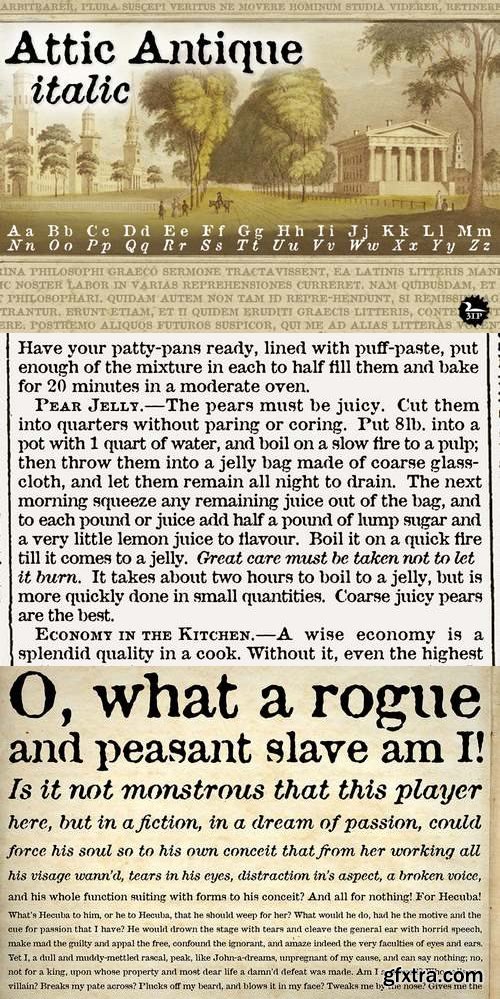
Flipping through a friend’s old book of John Burroughs nature essays many years ago, I thought it’d be fun to see if I could create a typeface with the same uneven, imperfect look to it. I picked and chose among various printed characters, enlarged them somewhat with an old photocopier, then hand-rendered each digitized glyph into roman and italic styles. The result: a surprisingly legible “grunge” serif that’s become one of our most-used fonts. Attic Antique shares the wide spacing and ample serifs of the Century faces, but with the worn, decayed look of the text in an-old library book. Use it to represent age, to suggest photocopied archives, or to convey a general feeling of old-bookishness.
http://www.signumart.com/en/fonts/family/attic_antique_


126,000 Royalty-Free 3D Model

Udemy Türkçe


Top Rated News
- CreativeLive Tutorial Collections
- Fasttracktutorials Course
- Chaos Cosmos Library
- MRMockup - Mockup Bundle
- Finding North Photography
- Sean Archer
- John Gress Photography
- Motion Science
- AwTeaches
- Learn Squared
- PhotoWhoa
- Houdini-Course
- Photigy
- August Dering Photography
- StudioGuti
- Creatoom
- Creature Art Teacher
- Creator Foundry
- Patreon Collections
- Udemy - Turkce
- BigFilms
- Jerry Ghionis
- ACIDBITE
- BigMediumSmall
- Globe Plants
- Unleashed Education
- The School of Photography
- Visual Education
- LeartesStudios - Cosmos
- Fxphd
- All Veer Fancy Collection!
- All OJO Images
- All ZZVe Vectors
- CGTrader 1 CGTrader 2


