

Lineo Editable Stroke 4110 Outline Icons #2
AdobeStock | PART 2/10 | 26 AI Vector Sets | +Previews | RAR 10 MB
Gardening & Seeding | Hotel & Hotel Services | Kitchen & Cooking
logistic & Shipping | Love & Valentine's Day | Media & Technology

Lineo Editable Stroke 4110 Outline Icons #1
AdobeStock | PART 1/10 | 25 AI Vector Sets | +Previews | RAR 9.2 MB
Strategy & Management | Camping & Outdoor | Cleaning & Housework
Coffee & Coffee Makers | Diagrams & Graphs | Drink & Alcohol
Ecology & Recycling | Fitness & Gym | Fruits & Vegetables

Verse Sans by Hubert Jocham 14 Fonts $500
14 Fonts | OTF/WoFF | +Previews | SALE PAGE
- The art director of Emotion, a women’s psychology magazine, asked me to design a copy typeface for them. Before I actually got the job I started to work on a serif. I wanted it to be feminine but still clear and modern. On one hand there are the floral round elements and on the other hand the angular serifs. In the composition I wanted the two extremes to work together. All the other elements had to be harmonized. The proportions needed to match the magazine’s requirements. The ascenders and descenders are short enough to work in narrow columns but long enough to work in small sizes. As you can imagine, the emotion-job never happened. In copy you should not get heavier than Heavy. Extrabold and Ultrabold work best in display.
![Patreon - RomainGuillon_EN - Romain Guillon [EN]](/uploads/posts/2026-04/1775311999_1.jpg)
Patreon - RomainGuillon_EN - Romain Guillon [EN]
https://www.patreon.com/RomainGuillon_EN
- WHO AM I? Hi, my name is Romain Guillon, I am a 3D motion designer and trainer. I propose on this Patreon tutorials oriented on various types of simulations in 3D. Having worked for various clients such as Chanel, Adidas, Palm Angels, Balenciaga I make my knowledge available via 3 types of monthly subscriptions. HOW DOES IT WORK? Once you have chosen the subscription that suits you you will have immediate access to all my content. Payment will be made monthly on the date of registration. WHICH SOFTWARE TO USE? The tutorials are mainly on Cinema 4D and Houdini with Redshift as the rendering engine. If necessary I offer complementary tools like AE, PS, AI, Topaz, Dall.E and others... If you want to continue training with me the trainings can be found on my website guillonromain.fr

Famous Beaches #7, Seychelles
AdobeStock | 26 UHQ Non-AI Real JPEG Images | Supersize | RAR 275 MB

White Canvases on an Easel
AdobeStock | 25 UHQ JPEG Images | Supersize | RAR 92 MB

Formed by Cultural & Agricultural Objects World Maps
AdobeStock | 26 UHQ JPEG Images | Supersize | RAR 154.1 MB

Famous Beaches #6, Maya Bay
AdobeStock | 25 UHQ Non-AI Real JPEG Images | Supersize | RAR 246 MB

CM - Steampunk Neon 3D Lettering 4438567
3 Views 132 PNG Letters | 3 Views 3 Color SVG OTF Fonts
Bonus UHQ PNG & JPG Images | RAR 1.1 GB | SALE PAGE
If you are looking for some realistic neon style lettering & graphic ellements then you are at the right place because here you will get a great set of 3D style letterings, color fonts & bonus graphic elements for your new artistic projects. You'll find here 3 view types lettering sets & color fonts + bonus graphic elements great to create your own neon typography scenes... These graphics are in hi-res transparent PNG so all are great for your new web design or any print design projects. Enjoy ;)

Wild Strawberry
AdobeStock | 6 Transparent PNG Images | 26 UHQ JPEG Images | Supersize | RAR 199 MB

Famous Beaches #5, Copacabana Beach
AdobeStock | 25 UHQ Non-AI Real JPEG Images | Supersize | RAR 237 MB

Sunbathing on the Beach #2
AdobeStock | 31 UHQ JPEG Non-AI Real Images | Supersize | RAR 231 MB

Robotic Android Arms & Hands #2
AdobeStock | 34 Transparent PNG CGI Renders | Supersize | RAR 243 MB

Sunbathing in the Countryside #2
AdobeStock | 25 UHQ Non-AI Real JPEG Images | Supersize | RAR 172 MB

Famous Beaches #4, British Virgin Islands
AdobeStock | 26 UHQ Non-AI Real JPEG Images | Supersize | RAR 206 MB

Lineo White & Light Outline Icons
AdobeStock | 555 Simple Line Icons 37 AI Vector Sets | +Previews | RAR 19.3 MB

Furry Monsters - Funny Fluffy Wool Alphabet
AdobeStock | 8 Transparent PNG Images | 27 Letters | Supersize | RAR 205 MB

Famous Beaches #3, Boulders Beach
AdobeStock | 26 UHQ JPEG Non-AI Images | Supersize | RAR 192 MB

Robotic Android Arms & Hands #1
AdobeStock | 37 Transparent PNG CGI | Supersize | RAR 282 MB

Nautical Anchors - Vintage & Tattoo Style
AdobeStock | 30 AI Vintage Vector Engravings & Illustrations | +Previews | RAR 35 MB

Conceptual Leadership
AdobeStock | 30 UHQ JPEG Renders & Photo Works | Supersize | RAR 125 MB

Food Quality Control Experts
AdobeStock | 32 UHQ JPEG Images | Supersize | RAR 180 MB

Futuristic Geometric Stripe Line
Art Design Backgrounds
AdobeStock | 26 AI Vector Backgrounds | +Previews | RAR 213 MB
Futuristic digital concept with technology hexagons!
Modern abstract blue background with circle lines!

Sunbathing on the Beach #1
AdobeStock | 30 UHQ Non-AI JPEG Images | Supersize | RAR 217 MB
NeoSkola Bütün Kursları
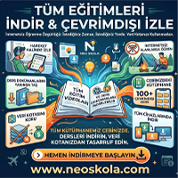
Udemy Türkçe


Top Rated News
- TheBoudoirDivas All Tutorial
- 126,000 Royalty-Free 3D Models
- CreativeLive Tutorial Collections
- Fasttracktutorials Course
- Chaos Cosmos Library
- MRMockup - Mockup Bundle
- Finding North Photography
- Sean Archer
- John Gress Photography
- Motion Science
- AwTeaches
- Learn Squared
- PhotoWhoa
- Houdini-Course
- Photigy
- August Dering Photography
- StudioGuti
- Creatoom
- Creature Art Teacher
- Creator Foundry
- Patreon Collections
- Udemy - Turkce
- BigFilms
- Jerry Ghionis
- ACIDBITE
- BigMediumSmall
- Globe Plants
- Unleashed Education
- The School of Photography
- Visual Education
- LeartesStudios - Cosmos
- Fxphd
- All Veer Fancy Collection!
- All OJO Images
- All ZZVe Vectors
- CGTrader 1 CGTrader 2


