
Categories: Fonts » Single Fonts
https://frerejones.com/families/interstate
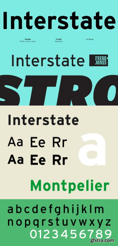
Interstate began as a personal challenge to build a typeface from the unlikely source of highway lettering. By traditional precepts, this font family is full of shapes that are “wrong” but essential to its personality, like the uppercase letters which range from oddly cramped to strangely wide or the abrupt descender of the lowercase g. Frere-Jones redesigned every original shape and extrapolated missing characters such as ampersands and foreign accents, using a light touch throughout to preserve both durability and the stumbling, dissonant charm.


Information
Members of Guests cannot leave comments.
126,000 Royalty-Free 3D Model

Udemy Türkçe


Top Rated News
- CreativeLive Tutorial Collections
- Fasttracktutorials Course
- Chaos Cosmos Library
- MRMockup - Mockup Bundle
- Finding North Photography
- Sean Archer
- John Gress Photography
- Motion Science
- AwTeaches
- Learn Squared
- PhotoWhoa
- Houdini-Course
- Photigy
- August Dering Photography
- StudioGuti
- Creatoom
- Creature Art Teacher
- Creator Foundry
- Patreon Collections
- Udemy - Turkce
- BigFilms
- Jerry Ghionis
- ACIDBITE
- BigMediumSmall
- Globe Plants
- Unleashed Education
- The School of Photography
- Visual Education
- LeartesStudios - Cosmos
- Fxphd
- All Veer Fancy Collection!
- All OJO Images
- All ZZVe Vectors
- CGTrader 1 CGTrader 2


