

Enamela - Condensed Sans Serif
Lettering on Vitreous Enamel Signage Dating $60
6 Fonts | OTF/WoFF | Publisher: K-Type | TURKISH SUPPORT | SALE PAGE
![]()
![]()
![]()
![]()
![]()
![]()
![]()
![]()
![]()
- ENAMELA (rhymes with Pamela) is based on condensed sans serif lettering found on vitreous enamel signage dating from the Victorian era and widely used in Britain for road signs, Post Office signs, the plates on James Ludlow wall postboxes, railway signs and direction signs, as well as for circular Automobile Association wayfinding plaques throughout the first half of the twentieth century. In addition to the Medium and Bold weights found on old enamel signs, a new Regular weight and the addition of a convincingly classic lowercase to match the original capitals, make Enamela Condensed a flexible and highly usable typeface. Each weight has a complementary and complimentary faux italic.
- The roots of the lettering date back to Victorian times; a Cherry Blossom Boot Polish enamel advertising sign on the Advertising Antiques website is estimated to date from 1880. Between 1908 and 1915 the lettering was used on ‘bull’s eye’ station signs for the London Underground up to the introduction of Johnston’s Underground type. I initially saw a similarity to the Charles Wright car registration plate font (see K-Type Mandatory) with its quirky terminals stemming from the compression of geometric type. Alan Brignull noted the similarity to a Victorian wood type called Runic, though the terminals on C, G, J and S slope in the opposite direction. The precise origin and identity of the typeface continues to prove elusive. In search of an existing digital font, I sought the help of Luc Devroye in Montreal who identified the closest match as Czech designer František Storm’s Enamelplate D, similarly condensed with the correctly sloping terminals. However, many characters differ substantially from those in local source material, perhaps indicating that continental European enamel lettering varied from its British counterpart, though even in Britain a fair degree of variation can be observed, draughtsmen evidently feeling free to amend the basic letter shapes and exercise individual taste. The middle diagonals of an uppercase M usually extended down to the baseline, becoming rather heavy and congested, but some draughtsmen started following the Gill /Johnston example of a higher pointed vertex, and this more elegant option has been chosen for the new Enamela typeface, though the alternative M with lower vertex is also provided at the Alt-M (µ) keystroke on a Mac, or Alt-0181 on Windows. While some designers preferred a plain vertical throat on the G, others added a crosspiece to help distinguish it from a C, and the latter is the form chosen for the Enamela fonts. However, the G without the horizontal is also present, assigned Unicode FF27 (full width capital G).
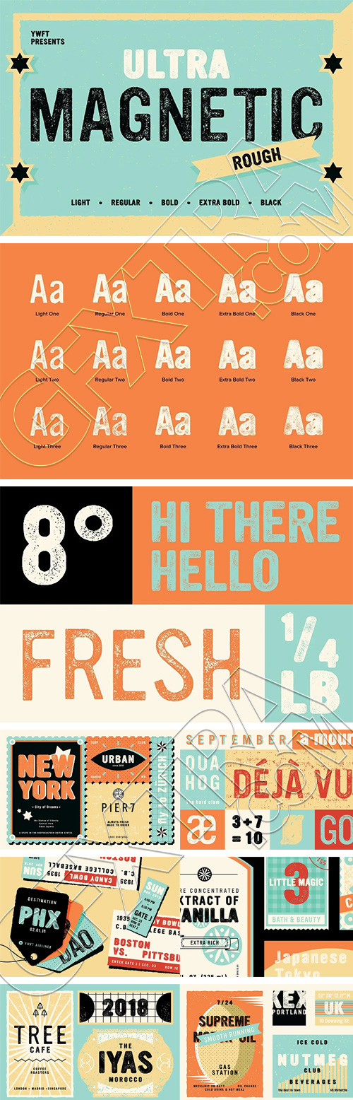
YWFT Ultramagnetic Rough
4 Fonts | OTF/TTF/WoFF | SALE PAGE
- With a soft yet gothic design, we rough-housed one of YouWorkForThem's bestselling fonts into an edgy and gritty version. This font features varying levels or distressing that increases over time to create more depth for your designs as well 15 variations so you can find the perfect fit no matter what project needs it!
- Ultramagnetic Rough features the same soft architecture as its predecessor, with varied distressing that increases in three stages. Wise beyond its years, it's more than earned its street-smarts. While Ultramagnetic Rough has hardened itself around the edges, deep down it remains a big old softie.
- Available in five weights that include Light, Regular, Bold, Extra Bold, and Black, Ultramagnetic Rough gives you fifteen variations to suit any design project that needs a strong-yet-friendly letterset with a tough exterior.

Fontbundles - Symbols Font Collection
450 Elements 3816
Flowerdinki | Halloweenbols | Heartsymo | Snowfliki | Holidaiki
Contain all kind of objects and animals easy to use on your projects.
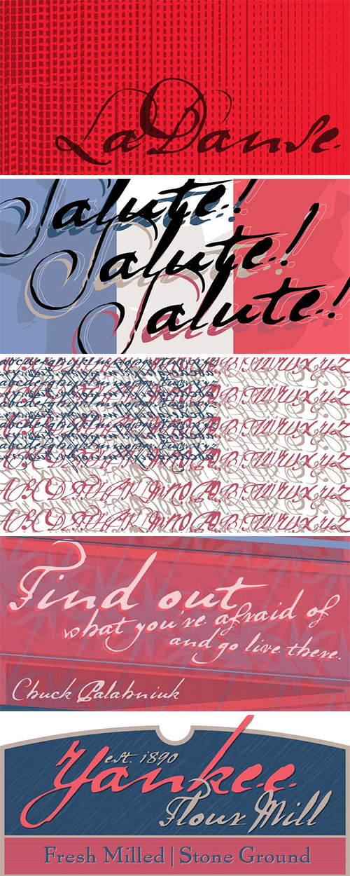
- Fontana Type Foundry in Hungary has developed an archaic identity largely based upon lettering from a rare Type Specimen of the Jesuit Academy Press of Tyrnavia (1773). They have developed many baroque style typefaces of Hungarian derivation. Gábor wanted an authentic handwriting revival from that age as well. La Danse is a ‘facsimile’ font, based on the manuscript of an inventory found in the original Tyrnavia specimen. The manuscript was written in an archaic Latin alphabet therefore some modern interpretations have been inserted.

Hate Font - For Halloween and Horror Movies
OTF | 1 Font | + Preview | 12.4 MB | SALE PAGE
- Hate is a display design for Halloween and horror movie posters. While it isn’t an everyday typeface, Hate was developed with the same degree of consideration we’d put into a superfamily. Far from being just a simple font, Hate’s character set contains 510 glyphs. Each letter has three variants available. Combined with the font’s OpenType features, this means that, if you type the same letter three times (e.g., ‘RRR’), you’ll see three different instances. There’s more to Hate than the spooky-looking hairs or roots sprouting out from each glyph. The letters are top-heavy, and this plays out both in terms of weight and width. Hate is somewhat condensed, with narrow counters, a rough drawing style, and sharp thin stroke endings. Letters don’t share exact baselines, x-heights, cap-heights, or ascender and descender settings, and character proportion is a bit caricatural, too.

Cry Wolf Font Family
2 Fonts | OTF/TTF | +Previews | SALE PAGE
- DESIGNER'S NOTE: "When I was a kid, I loved the story of The Boy Who Cried Wolf. I thought it was pretty stupid of the boy to trick the villagers into believing wolves are attacking his flock of sheep. But I also thought it was a bit sad that the sheep are eaten by a wolf in the end. I didn’t really feel sorry for the boy (he really was stupid), nor the wolf (he just does what he is supposed to do in life), but I did feel sorry for those poor sheep. I guess this is what disinformation leads to in the end. Cry Wolf is a bit of a scary font: it was made with a really old and battered brush, using Chinese ink and some quality French paper. It has a slight tilt to the right and I added some inky splatter for dramatic effect. Use Cry Wolf for your book covers, product packaging and headlines; use if to spice up you invitations and your halloween posters. Comes in a slightly tilted Regular style and an outright Italic style."

Hex Font
OTF | 1 Font | +Preview | 6.4 Mb RAR | SALE PAGE
- Hex is an uneven, spiky font with an evil twist. The glyphs look like they have been scratched onto paper (which is indeed the case), so it will be perfect for your scary halloween postcards or posters. Hex font comes with extensive language support.


136 Halloween Horror Fonts Bundle $5000
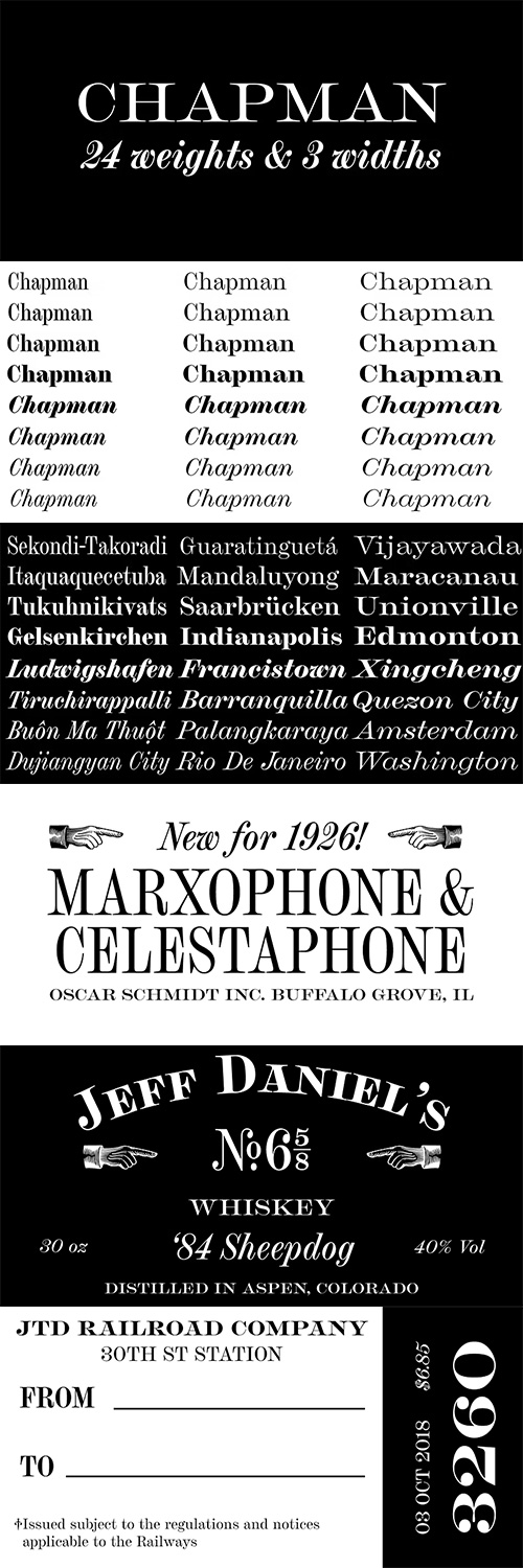
Chapman Font Family - 8 Fonts
- Chapman is the result of spending too many hours staring at the often all-capital engraver typefaces from long-gone foundries. The wide serifs, high contrast, and various widths seem to have so much character but also remain so neutral. From these references, Chapman began to emerge. It seemed natural that the lowercase would be based on a Scotch Roman model, much like the original all-capital faces. Chapman does not pull directly from any one source but from the genres themselves. It was, from the beginning, the goal to create a typeface that would be relatively neutral but not boring; an adaptable solution that works anywhere and, depending on the chosen width, can be squeezed or stretched to fit anywhere. The idiosyncrasies of the original designs are tamed in some places and turned up in others. The result is something familiar but unique and contemporary.

Typnic - A Delicious Typographic Picnic $96
- Everybody likes to have a picnic: some fresh fruits, cheese, ham, wine and so on. Like a “typographic picnic”, Typnic font system gather many fonts with different flavors too, and you can enjoy them mixed or on their own. Typnic was drawn and calligraphed by hand, and is made with eighteen typefaces, including three totally compatible yet different styles. It also has enhancement sets containing labels, dingbats, patterns and ornaments. The Headline style has six layered fonts that can be mixed in a wide variety of combinations to obtain powerful mastheads and headlines. It can be used to construct very nice advertising pieces. If you need to write informal texts, then use Typnic Script which also comes in six variants, and additionally has a complementary font with tails, double letters and ornamented ascenders. Finally, use Typnic Roman to add some secondary texts without loosing the general appearance of your work. Typnic has a cool and natural feeling and could be used in all sorts of projects. Typnic is a very ambitious project and we will be working on it to further expand the whole system.

Hazel Script - Crafted, Elegant, Connecting Script OTF $60
Designer: Dave Rowland | SALE PAGE
![]()
![]()
![]()
![]()
![]()
![]()
![]()
![]()
![]()
![]()
![]()
![]()
![]()
- The design process of this font was rudely interrupted on August 11th, 2015, when my first child, Hazel, was born. Thinking up names for fonts can be tricky, as can thinking up names for babies, so when the font was finally finished, it seemed like a good idea to kill two birds with one stone, and here it is: Hazel Script.
- Hazel Script is a finely crafted, elegant, connecting script. I wanted to make something unique, and to this end, the contrast in the face is not based on any ductal logic, or the writing of some imagined tool. The thick parts of glyphs are purely aesthetic devices, placed to give the otherwise monoline font an interesting rhythm.

Farola Font Family - 3 Fonts for $69
OTF/TTF | 3 Fonts | 3.3 Mb RAR | Farola Font Family
- Farola is a curly and romantic victorian display font, inspired specially on the ancient decorative forged iron lamps called “farolas” used on street and parks of the 1800’s. At first it was created as a lettering logotype for the collective called “Tipografistica”, a kind of experimental type and graphic design studio founded by college friends, the font was temporary identified as the same name as the collective, at same time, it was the first complete alphabet project commercially developed for PeGGO Fonts foundry, then it changed to current font name “farola”. The Farola process includes several technical cares, specially considering the visual balance weight, proportion ratio, contrast shapes, soft curves, outer and inner empty spaces also called “whites”. The main characteristics of “Farola” are curly shapes and its stronger drop spot finials. Due to concept design thoughts was “lettering logotype”. The most common pattern of this was the closer junctions between each logotype letters. To create the effect of unit, the serif and several finial shapes and also kerning adjustments keep those ideas on mind. The result was the unique kind of serif created specifically for this font. The most recommended usage of “Farola” are logotypes & lettering, but also packaging, posters, fashion young girl’s magazines headlines, videogames letterheads, valentines graphics, cover books, and many other similar ones.


Trajan Pro 3 Font Family - 6 Fonts for $175
OTF | 6 Fonts | +Preview | 1 Mb RAR
- Since its initial release in 1989, Trajan has risen to international popularity as a distinctive and versatile display type family. Carol Twombly's sensitive interpretation of the Roman capitals inscribed at the base of Trajan's column in Rome serves as a testament to her skills as a designer, and to the craftsmanship of the ancient lettering artists who devised these elegant and enduring letterforms. Responding to requests from our customers for broader language coverage and for more weights, Adobe set out to extend the family. Principal Designer Robert Slimbach added Greek and Cyrillic as well as four new weights - two lighter than the original offering, and two heavier. The extended family now provides users with a range of six weights that vary in personality and function. Alongside his extension of Trajan Pro, Robert also created the Trajan Sans type family, which offers users a contemporary and stylish variation of the original seriffed design (see Related OpenType Packages link below).

Mechanoid - Engineering & Technological Type $110
4 OTF Font Files | Designer: Keith Tricker | ![]()
![]()
![]()
![]() | SALE PAGE
| SALE PAGE
- Mechanoid is a machine age font: crisp, clean, bold and unadorned, yet with a distinctive character of its own. As the name suggests it is well suited to engineering or technological themes, yet versatile enough for universal applications.

Nilish - Legible Sans-Serif Font $20
OTF Font File | Designer: Ahmet Altun | TURKISH SUPPORT | SALE PAGE
![]()
![]()
![]()
![]()
![]()

TCF Colar - Labyrinthian, Caps Only, Display $22
- TCF Colar is the first typeface published by portuguese type designer Joel Vilas Boas. TCF Colar is a labyrinthian, caps only, display typeface with several stylistic alternates and discretionary ligatures, inspired by the late 70s typefaces.

Galerie 2 - Narrower Styling 4 Fonts $69
4 OTF Fonts | Designer: James Marsh | Turkish Support | SALE PAGE
![]()
![]()
![]()
![]()
![]()
![]()
![]()
![]()
- Galerie 2 has a narrower styling and less contrast than its sister family but incorporates the same unique characteristics as Galerie within its elegant proportions.
- The close genetic proximity to Galerie enables dual deployment in text and artwork, each family complimenting the other in combinations of headings and copy. Galerie 2, like the full width Galerie volume, comes in 4 weights from Thin to Bold.

Moho Family - 24 Fonts $319
24 OTF Fonts | Designer: John Moore | Turkish Support | SALE PAGE
![]()
![]()
![]()
![]()
![]()
![]()
![]()
![]()
![]()
![]()
There exist two groups of Moho Family
OT = Full OpenType Features and full set of glyphs
Std= Basic OpenType Features and less glyphs
- Moho is a broad family of types inspired by the burgeoning modernism of the early twentieth century. Moho introduces an unconventional style in the form of his glyphs which aims to impregnate the text compounds thus a distinctive aesthetic sobriety and elegance while creating a flow of practical reading.

Lady Rene Decorative Handwritten Font $59
- Looking back on my production to date, neither so little nor so large, it does not come as a surprise to find myself now introducing Lady Rene.
- A brief review of my career would read as follows: graphic designer graduated from Buenos Aires University, a 10-year professorship in Typography in the same institution, an illustrator in the making.
- For almost 15 years now my work has focused on the design of editorial pieces, predominantly books and CD sleeves. Typography proper has always been central to my research projects.

Quodlibet Sans - The New Universal Typeface $350
16 OTF Fonts | Designers: Tomas Nedoma, Rostislav Vanek | SALE PAGE
![]()
![]()
![]()
![]()
![]()
![]()
![]()
![]()
![]()
![]()
![]()
![]()
![]()
![]()
![]()
![]()
- The new typeface system is based on legibility of Renaissance and Baroque Antiqua. It maintains the quality of drawings without an overpowering historical legacy. The current concept makes the system a universal whole. Abrading of sharp edges which could catch one’s attention leads to a fine rounding of details. In this way, a sans drawing does not look hard and sterile unlike most of its contemporaries. Special attention was paid to every detail of each letter. The professional question of how to incorporate brightening wedges into the dark places of individual strokes’ onsets was resolved by rounded shapes that have their graphic response in the detail of the serifs. Particularly in larger sizes the typeface offers drawing sophistication and dimensional interconnection. Apart from Cyrillic alphabet, the alphabet design includes Vietnamese accents.

Snow Cone Pro - A Fresh Splash of Summer $49
7 OTF Font Files | Designer: Marloes Versluys | TURKISH SUPPORT | SALE PAGE
![]()
![]()
![]()
![]()
![]()
![]()
![]()
![]()
![]()
![]()
![]()
![]()
- Snow Cone Pro is a hand drawn font family consisting of 6 playful typefaces. Snow Cone Pro brings a fresh splash of summer to your designs. You can change the appearance of each font by playing with the open type features, such as interlocking pairs, double letter ligatures, stylistic alternates. As a bonus you can download Snow Cone Doodle for free. 150 little drawings to complement the 6 Snow Cone fonts. So play away and have some fun! You will need an Open Type Savvy Application to get the most out of Snow Cone Pro.

Deccan - Lovely Slab Serif with Soft Terminals $130
5 OTF Font Files | Designer: Saiteja Ramakrishna |TURKISH SUPPORT | SALE PAGE
![]()
![]()
![]()
![]()
![]()
![]()
![]()
![]()
![]()
![]()
![]()
- Deccan is a large plateau making up most of the southern part of India, but the Deccan typeface is a lovely slab serif, with soft terminals. Its design is very friendly. The letterforms call the most interesting 19th century British modern types to mind, as well as quality 1970s digital faces. At its core, Deccan is a text face, but the Bold weight is an excellent choice for editorial or packaging design. The Light weight makes a fine headline choice as well. Often, a typeface’s numerals go overlooked; here they really shine. Both the numerals and the lowercase letters are full of interesting ball terminals.
126,000 Royalty-Free 3D Model

Udemy Türkçe


Top Rated News
- CreativeLive Tutorial Collections
- Fasttracktutorials Course
- Chaos Cosmos Library
- MRMockup - Mockup Bundle
- Finding North Photography
- Sean Archer
- John Gress Photography
- Motion Science
- AwTeaches
- Learn Squared
- PhotoWhoa
- Houdini-Course
- Photigy
- August Dering Photography
- StudioGuti
- Creatoom
- Creature Art Teacher
- Creator Foundry
- Patreon Collections
- Udemy - Turkce
- BigFilms
- Jerry Ghionis
- ACIDBITE
- BigMediumSmall
- Globe Plants
- Unleashed Education
- The School of Photography
- Visual Education
- LeartesStudios - Cosmos
- Fxphd
- All Veer Fancy Collection!
- All OJO Images
- All ZZVe Vectors
- CGTrader 1 CGTrader 2


