
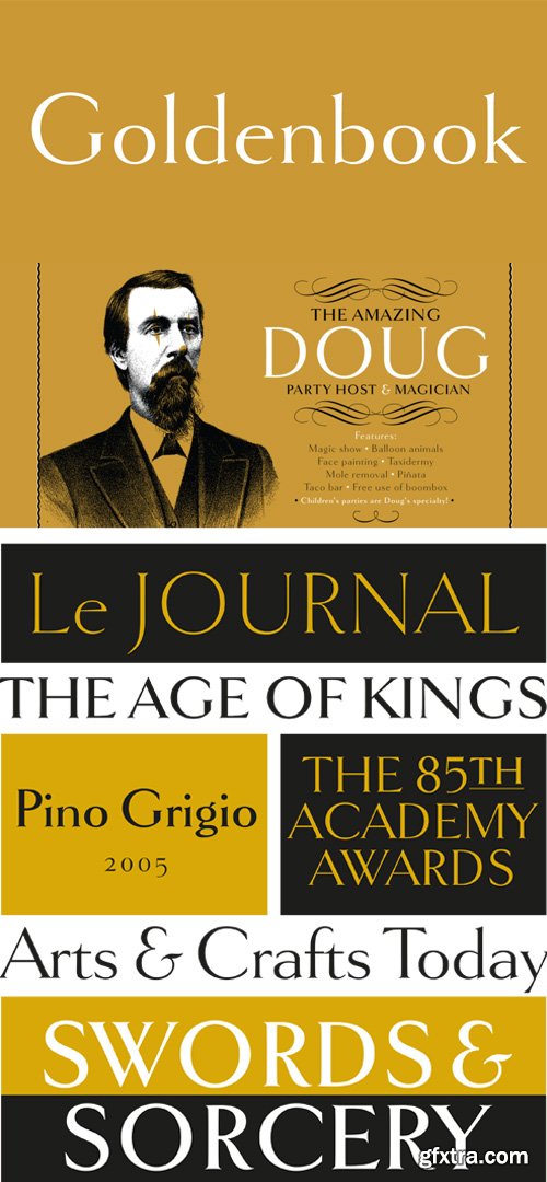
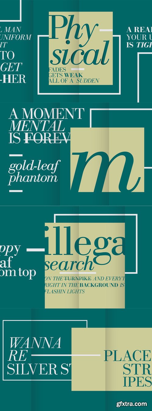
Goldenbook Font Family $59 | 3 x TTF | Turkish Support
http://www.myfonts.com/fonts/marksimonson/goldenbook/
Goldenbook is based on the logotype of a literary magazine from the late 1920s called The Golden Book Magazine. It is meant to be used large and includes fonts with both old style and lining numerals in each weight.
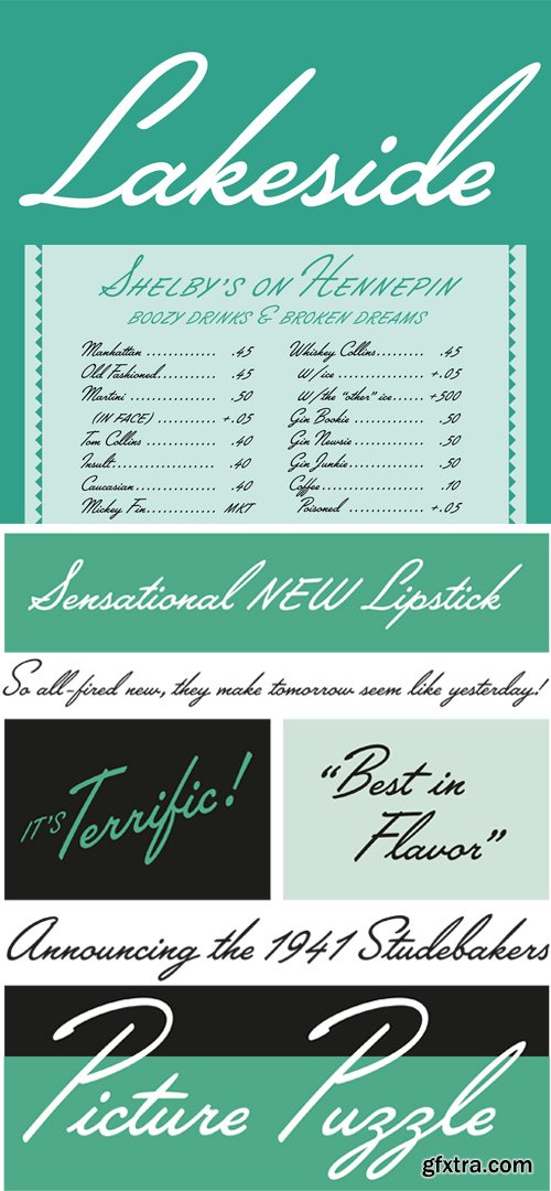
Lakeside Font $29 | 1 x TTF | Turkish Support
http://www.myfonts.com/fonts/marksimonson/lakeside/
Lakeside is a 1940s-style brush script inspired by the hand-lettered titles in the film noir classic “Laura”. It is available exclusively in the OpenType font format and features three different styles of caps—normal caps, over-sized titling caps, and smaller, plainer caps for all-caps settings.Lakeside has been programmed so that it automatically chooses the appropriate letter shapes as you type based on whether the letter appears at the beginning, middle or end of a word. The crossbar on the lowercase “t” extends itself if space allows. Lakeside also features an alternate cap “S” in a more traditional style and the ability to create automatic, arbitrary fractions.
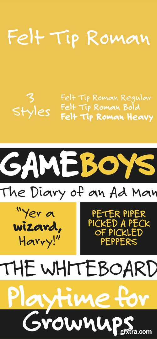
Felt Tip Roman Font Family $59 | 3 x TTF | Turkish Support
Felt Tip Roman began as an experiment in 1989--a straight adaptation of the designer’s handwriting. The Bold and Heavy weights were added in 2003 to broaden the usefulness of this very popular typeface.
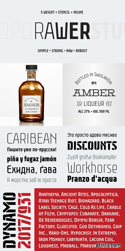
Rawer Font Family $80 | 7 x OTF
http://www.myfonts.com/fonts/gaslight/rawer/
Another boring sans?! No way! Rawer - simple, strong, raw, robust sans with stencil and inline weights. And again it’s inspired by soviet typography.
Forza Font Family $200 | 12 x TTF | Turkish Support
http://www.typography.com/fonts/forza/overview/
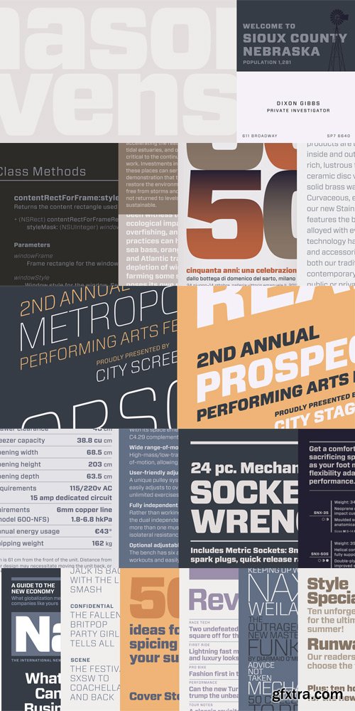
Forza. Articulate meets assertive.Succinct geometries make for an expressive type family that’s ardent, disciplined, shrewd, and commanding.Some of the world’s most complex typography can be found in magazines. Their formal requirements are daunting — even the simplest magazine includes listings, tables, complex navigation systems, and painterly display typography — but even more daunting are the multitude of editorial voices that they require. A title such as Wired might take “technology” as its theme, but it covers technological topics from cultural, political, commercial, social, and philosophical perspectives. Science requires a different voice than science fiction, as do lofty prognostications and down-to-earth service pieces. The title that includes all of these needs an especially acrobatic family of fonts.
Archer Pro Font Family $350 | 16 x OTF | Turkish Support
http://www.typography.com/fonts/archer/overview/
- Archer, the colorful slab serif.Sweet but not saccharine, earnest but not grave, Archer is designed to hit just the right notes of forthrightness, credibility, and charm.The Geometric is a twentieth-century riposte to the Antique. Informed by the same kind of rationalist thinking that inspired the great sans serifs of the Bauhaus, Geometrics abandon traditional forms in favor of mathematical strategies. A Geometric’s O is circular rather than elliptical, and its forms shed their residual contrast between thicks and thins. Geometrics usually apply this same rationalism to the woollier parts of the alphabet, replacing the alphabet’s beaks and tails and ball terminals with a program of matching serifs. While these faces can sometimes be bracingly modern, they’re often monotonous, and many Geometrics suffer from an astringent sting that makes them difficult to use and unwelcome to read.
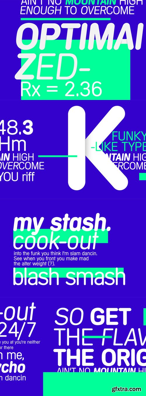
Champion Gothic Font Family $199 | 7 x OTF
http://www.typography.com/fonts/champion-gothic/overview/

Trissino DT Font $49 | 1 x TTF | Turkish Support
https://www.youworkforthem.com/font/T4720/trissino-dt

Sentico Sans DT Font Family $588 | 12 x TTF | Turkish Support

Sentico Sans DT Condensed Font Family $588 | 12 x TTF | Turkish Support

Rustikalis DT Font Family $392 | 8 x TTF | Turkish Support
https://www.youworkforthem.com/font/T4717/rustikalis-dt
New Bodoni DT Font Family $490 | 14 x TTF | Turkish Support
https://www.youworkforthem.com/font/T4711/new-bodoni-dt
Macarena DT Font Family $196 | 4 x TTF | Turkish Support
https://www.youworkforthem.com/font/T4710/macarena-dt
Garamond 96 DT Pro Font Family $294 | 6 x TTF | Turkish Support

Sante Pro Font Family $52 | 2 x TTF and OTF
http://www.myfonts.com/fonts/stiggy-sands/sante-pro/

https://www.youworkforthem.com/font/T5617/cinderblock
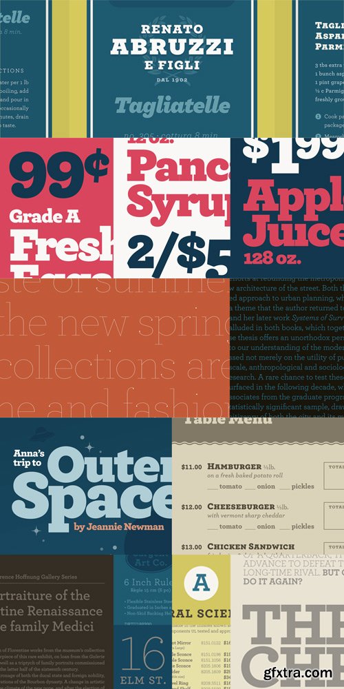
If prisons are built with stones of law, then powerful words indeed are built with letters of Cinderblock–the World’s Tallest Typeface. Inspired by masonry and available in eight heights–each version growing approximately 25% taller than the previous–Cinderblock is a brand new typeface designed to achieve maximum vertical coverage. The ultra-thin white spaces within the letterforms create a spatial rhythm between letters and counters, and the extreme contrast between positive and negative spaces allows letters, sentences and paragraphs to stack together like a wall of cinder blocks when typeset carefully. The brainchild of graphic designer Stefan Kjartansson, who previously brought you Black Slabbath and Cumulus & Foam, Cinderblock is delivered in OpenType format.
OTF | 8 Fonts | + JPG Preview
Cyclone Font Family $129 | 6 x OTF
http://www.typography.com/fonts/cyclone/overview/
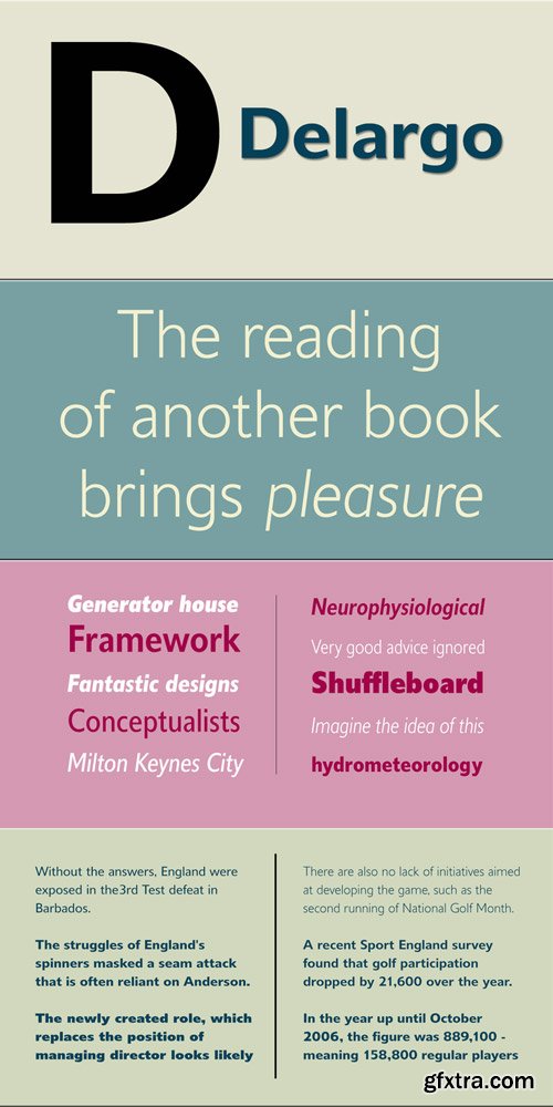
Delargo DT Font Family $1176 | 24 x TTF | Turkish Support
http://www.myfonts.com/fonts/dtptypes/delargo-dt/

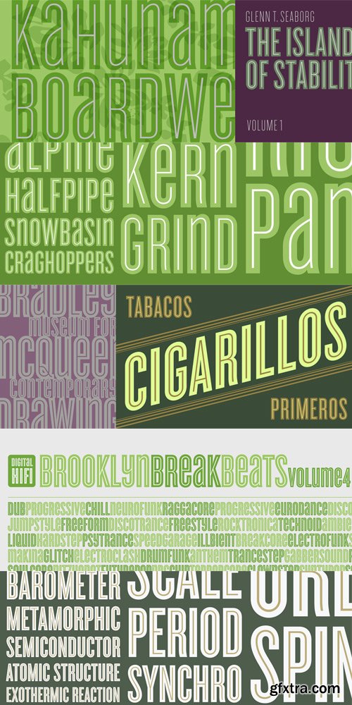
Saracen Font Family $100 | 1 x OTF
http://www.typography.com/fonts/saracen/overview/
- Saracen is the Latin collection of four interchangeable type families designed in different nineteenth century styles.Though the wedge serif printing type is a nineteenth century innovation, Saracen does not resemble any font from this era. It’s mysterious that typefounders of the Victorian age who sought the extreme and fanciful in their work — exploring all manner of serif treatments, and creating extra-condensed and super-expanded designs — never made a latin font of this straightforward proportion.
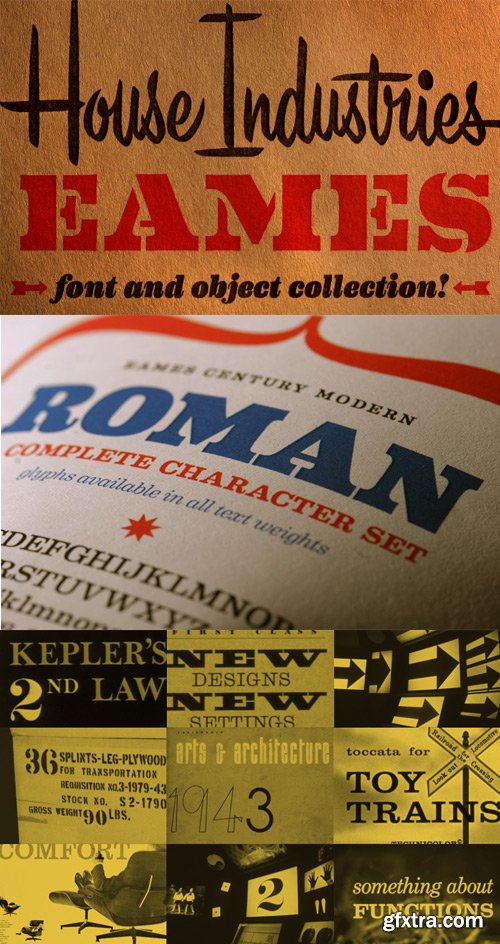
Eames Century Modern Font Family $299 | 26 x OTF | Turkish Support
http://www.houseind.com/fonts/eames
Eames Century Modern is a typographic workhorse that honors the Eames aesthetic while offering unprecedented functionality. An eighteen-style serif typeface family strikes an unprecedented balance between distinctive idiosyncrasies, readability and space economy. Its 18 styles include gracefully complementary italics and a virtually endless supply of deep text handling features. Carefully-weighted small caps, nine different figure styles, ligatures, contextual alternate forms and thousands of lines of computer code give Eames Century Modern a significant edge in contemporary design environments. A stencil font on the heaviest weight of Eames Century Modern takes the curvature of bent plywood and abstracts the shapes into type.
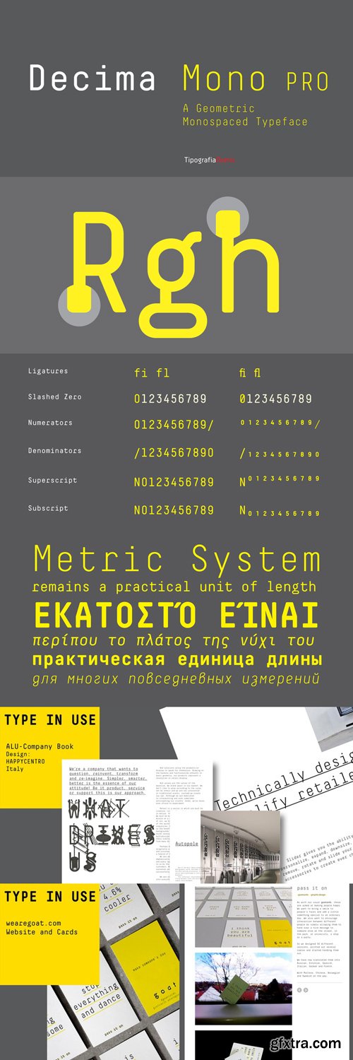
Decima Mono Pro Font Family $200 | 6 x TTF and OTF
http://www.myfonts.com/fonts/tipografiaramis/decima-mono-pro/
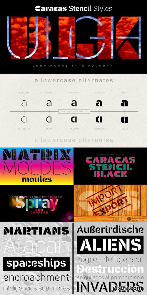
Caracas Stencil Pro Font Family $100 | 8 x TTF | Turkish Support
http://www.myfonts.com/fonts/john-moore/caracas-stencil-pro/
Caracas Stencil Pro is a new family of stencil sans serif fonts, looking friendly, sweet and comfortable to read. Where text flow between straight lines and round by becoming transparent in the interest of readability. Caracas Stencil is ideal for working in small letters and texts of a technical nature. Caracas is a humanistic approach to reading sans forms.
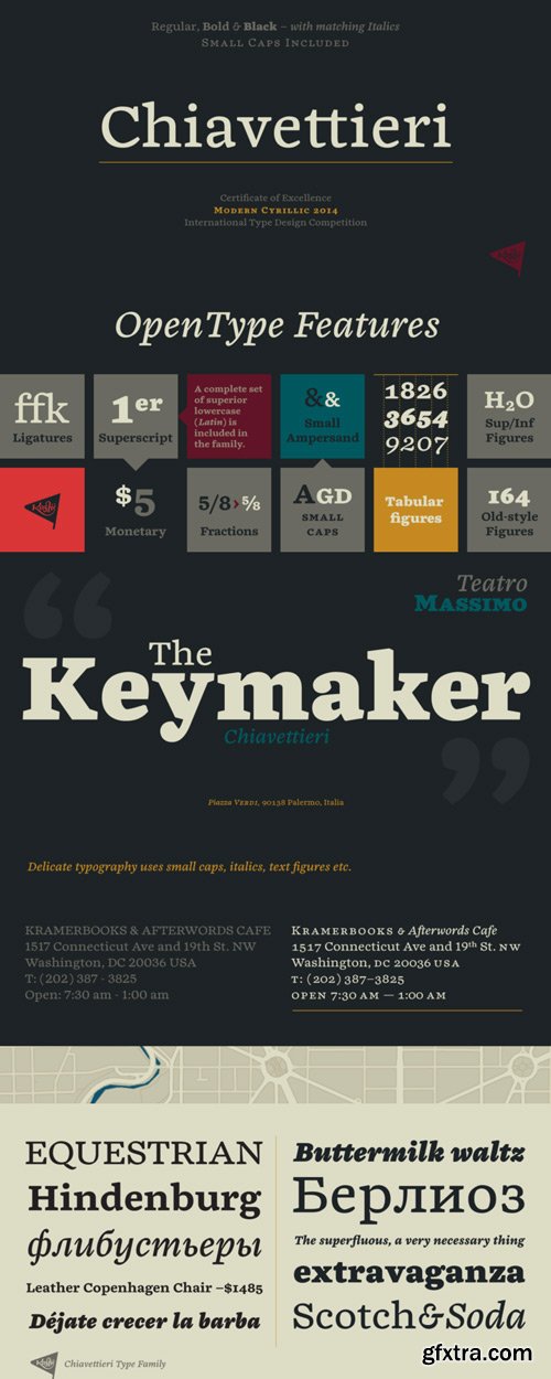
Chiavettieri Font Family $176 | 6 x TTF and OTF
http://www.myfonts.com/fonts/kostic/chiavettieri/
126,000 Royalty-Free 3D Model

Udemy Türkçe


Top Rated News
- CreativeLive Tutorial Collections
- Fasttracktutorials Course
- Chaos Cosmos Library
- MRMockup - Mockup Bundle
- Finding North Photography
- Sean Archer
- John Gress Photography
- Motion Science
- AwTeaches
- Learn Squared
- PhotoWhoa
- Houdini-Course
- Photigy
- August Dering Photography
- StudioGuti
- Creatoom
- Creature Art Teacher
- Creator Foundry
- Patreon Collections
- Udemy - Turkce
- BigFilms
- Jerry Ghionis
- ACIDBITE
- BigMediumSmall
- Globe Plants
- Unleashed Education
- The School of Photography
- Visual Education
- LeartesStudios - Cosmos
- Fxphd
- All Veer Fancy Collection!
- All OJO Images
- All ZZVe Vectors
- CGTrader 1 CGTrader 2


