
Categories: GFXTRA Special » Special Fonts

Goldana Font Family $80 | 24 x OTF
http://www.myfonts.com/fonts/seventh-imperium/goldana/
Goldana is a display layered font inspired by art deco. Base layer is regular, add a extrude and extrude shadow to create a dimensional look. Several of the style can be mixed and match together to look different style and details, there are several font that have a stand alone styles and script. The Script fonts is also equipped with opentype features. The Shadow, drop shadow, drop strip and Stencil styles are not meant to be layered. Play with the extras collection to create badge, vintage feels and art deco style.
Categories: GFXTRA Special » Special Fonts
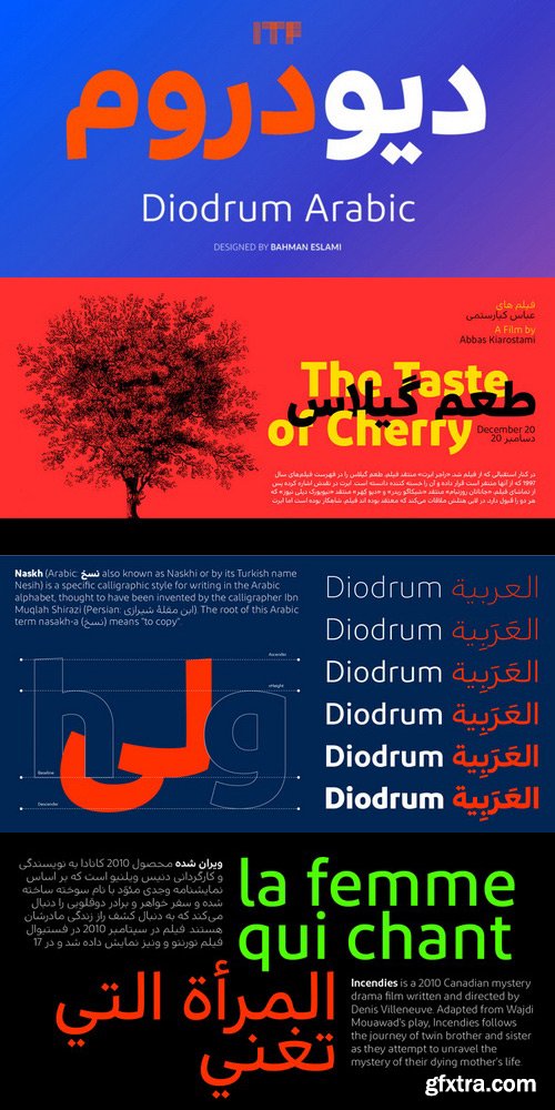
Diodrum Arabic Font Family $520 | 6 x TTF
http://www.myfonts.com/fonts/indian-type-foundry/diodrum-arabic/
Diodrum Arabic is a low-contrast Naskh family with six weights. The typeface has been optimised for corporate identity work, editorial design, and UI/UX projects. Arabic typically places a stronger emphasis on the horizontal than the Latin script does. Since both the Arabic and the Latin letterforms in Diodrum are monolinear, we have employed another method to increase the prominence of horizontality: the counterforms are large and open, and the letters’ middle sections are accentuated. Many of Diodrum’s strokes begin or end with lightly-sheared lines; these subtle angles add a trace of calligraphy back into the static language of sans serifs. The same is true for the typeface’s Arabic-script dots and marks.
Categories: GFXTRA Special » Special Fonts
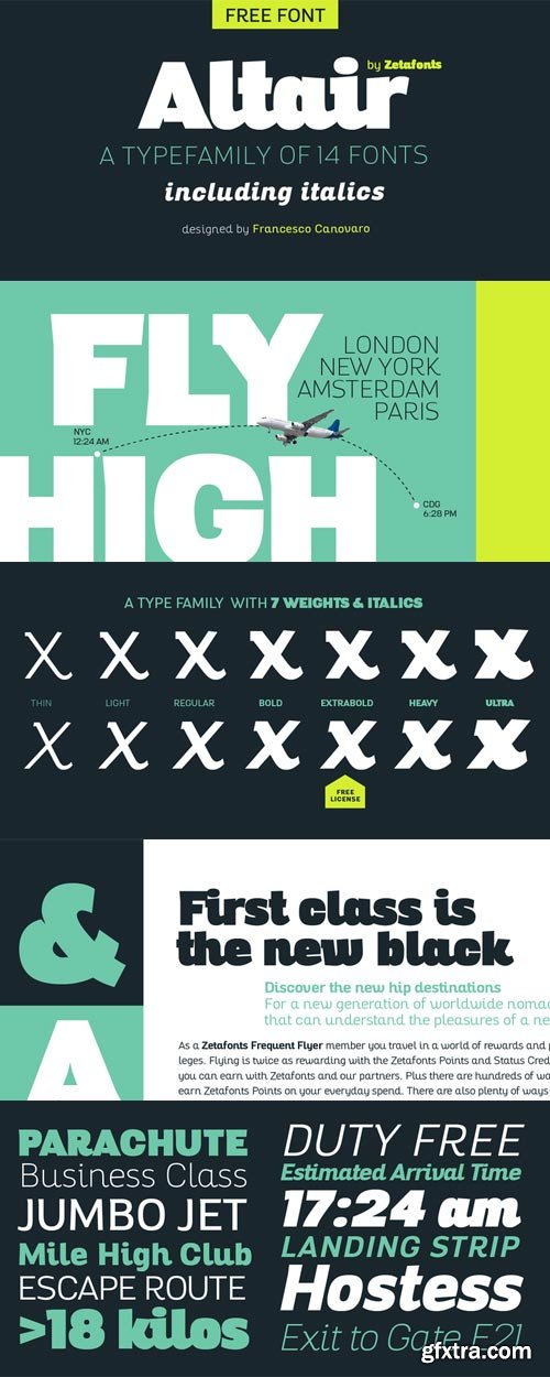
Altair Font Family $125 | 14 x OTF
http://www.myfonts.com/fonts/zetafonts/altair/
Altair is a sans serif type family derived from Zetafonts’s Digitalino typeface. The original bold design by Francesco Canovaro has been expanded in a seven weights family, suitable for a wide range of design uses, from body copy to display text and ranging from a thin weight to the ultra one.Altair’s main originality lies in the calligraphic roots of its design, that gives it a friendly, confident look that is perfect for corporate voices, new technology startups, news blogs and any other case where a solid design must be given an emotional context.
Categories: GFXTRA Special » Special Fonts
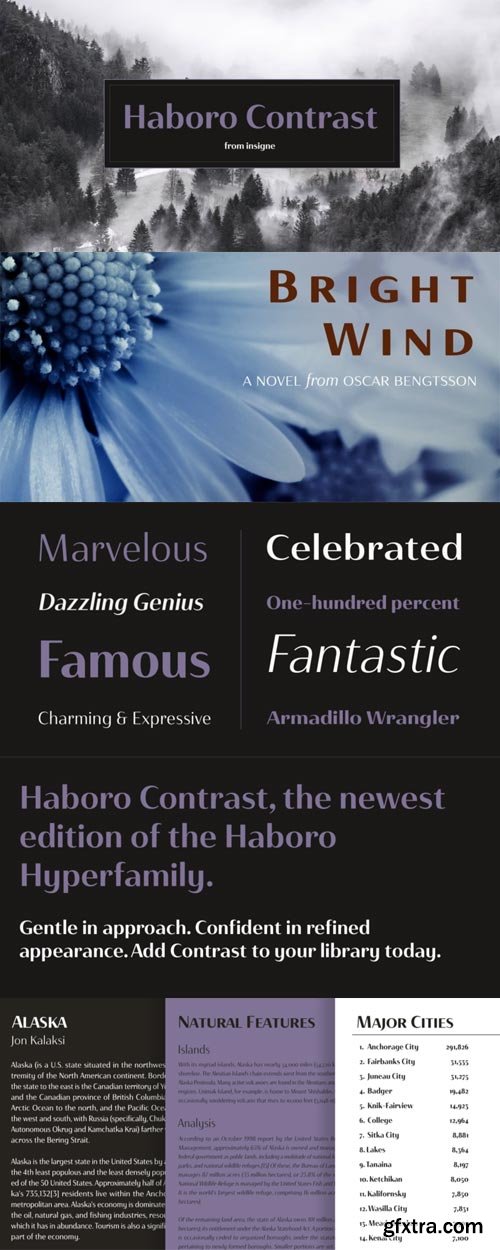
Haboro Contrast Font Family $222 | 54 x OTF
http://www.myfonts.com/fonts/insigne/haboro-contrast/
Meet Haboro Contrast, the stylish little sister of the Haboro hyperfamily. While built from the same clean, geometric shapes of Haboro Sans, this new addition has been rebalanced for elegant performance with her high-contrast sans letterforms and has been adjusted to provide the greatest impact for each weight. It’s a personality all her own, gentle in approach yet refined and modern with a confident appearance.Capitalize on Contrast’s style with OpenType features, too. Packed with options like OpenType ligatures, stylistic sets, fractions, crafted small caps and old-fashioned figures, this font will keep your work fresh and attractive. If you need even more combinations for the right statement, use the entire Haboro hyperfamily and create the right balance to capture your reader’s eye.Haboro Contrast (along with the rest of the Haboro family) has been tested for the web and is ready for use in both print and digital applications. Designed to serve as a display character for such publishing projects as magazines and company brochures, Contrast gives you comfort in having a great amount of versatility in the fonts you rely on. It’s a prime example where high contrast simplicity lends itself to achieve excellent design results.
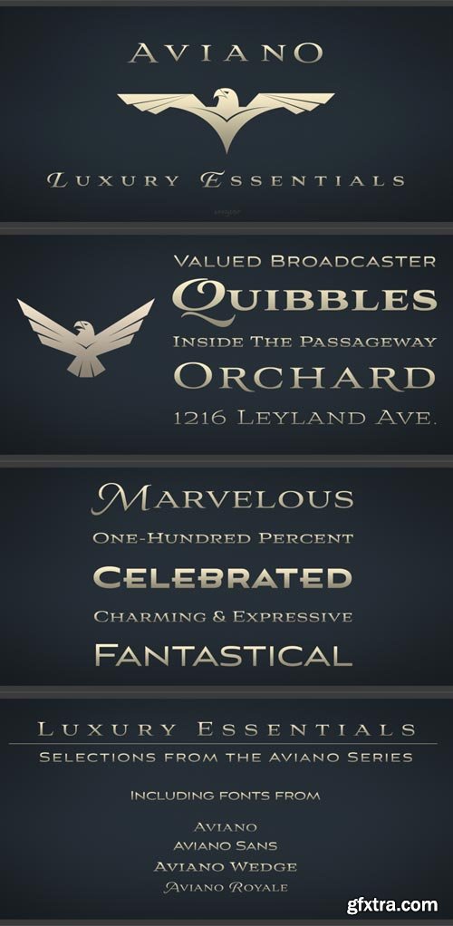
Aviano Luxury Essentials Font Bundle $99 | 10 x OTF
http://www.myfonts.com/package/566023/
It all started with Aviano: an extended titling typeface, whose design was influenced by the power and timeless beauty of classical letterforms. Jeremy Dooley’s design struck a chord—people loved the strong lines and timeless elegance of the typeface, so he went on to create 6 more Aviano typefaces, all built on the same principles he applied to his original Aviano face, but each containing its own unique personality, style and flare.Aviano Luxury Essentials collection is a versatile package of 10 of these beloved fonts from the Aviano Hyperfamily. It features Royale’s graceful script capitals, Aviano Sans’s Art Deco excellence, Aviano Wedge’s slightly harder edge, and of course, the original Aviano.
Categories: GFXTRA Special » Special Fonts

Sutro Deluxe Font Family $60 | 5 x TTF
http://www.myfonts.com/fonts/parkinson/sutro-deluxe/
Sutro Deluxe is a bold slab serif with a double drop shadow. It was originally conceived as a simple black and white display alphabet. But it seemed unfinished, begging for something more. I decided to try adding a couple layers of fill and detail to try and make it interesting. The result is this five-layer chromatic font family.
Categories: GFXTRA Special » Special Fonts
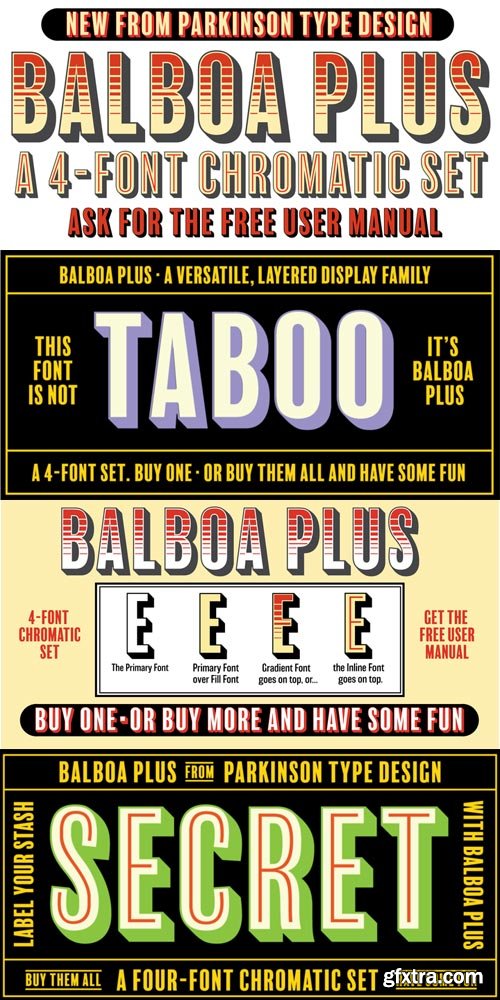
Balboa Plus Font Family $40 | 4 x TTF
http://www.myfonts.com/fonts/parkinson/balboa-plus/
Balboa Plus is a condensed sans serif display family. It was originally conceived as a simple black and white typeface. But it seemed unfinished, begging for something more. I decided to try adding a couple layers of fill and detail to try and make it interesting. The result is this four-layer chromatic font family. The Primary Font is the Main Font. The other fonts ( Fill, Inline, and Gradient) only exist to support the Primary Font. The Fill font should sit behind the Primary font (there is a little color trapping going on). The rest is even easier.
Categories: GFXTRA Special » Special Fonts
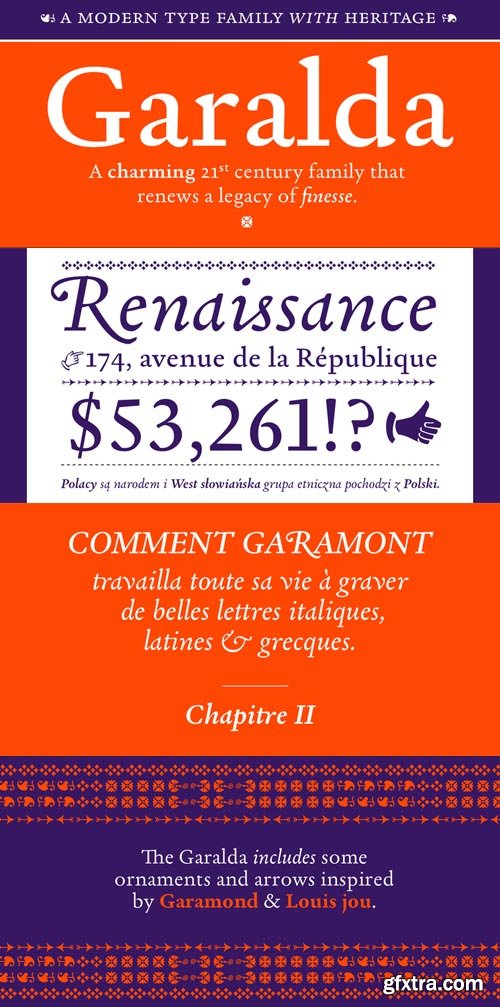
Garalda Font Family $299 | 8 x TTF
http://www.myfonts.com/fonts/type-together/garalda/
The set of ligatures in the roman and italics lend themselves to unique display use, such as creating lovely logotypes. In the italics, some swashes inspired by different historic Garamonds are included, sometimes breaking their curves to be more captivating. Just look at how the italic ‘*-s’ ligatures create ‘s’ with a cursive formation rather than merely a flowing slant. And how the roman ‘g’ link swings as wide as a trainer’s whip. These are all balanced by squared serifs in the roman to keep an overall mechanised regularity.The Garalda family comes in eight styles, includes some of the original arrows and ornaments, and speaks multiple languages for all typesetting needs, from pamphlets to fine book printing. The complete Garalda family, along with our entire catalogue, has been optimised for today’s varied screen uses.
Categories: GFXTRA Special » Special Fonts
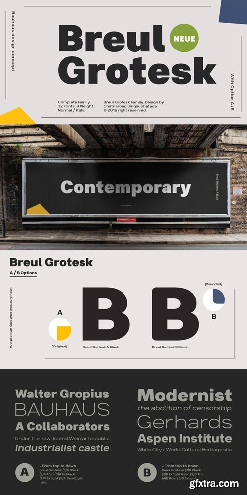
Breul Grotesk Font Family $150 | 32 x TTF
http://www.myfonts.com/fonts/typesketchbook/breul-grotesk/
Taking inspiration from an attempt to marry art with industry of Bauhaus (1919), Brueul Grotesk is classic and straightforward, cutting back superfluous elements. A Sans Serif type, it’s like a design from the Machine Age. It comes in A and B sets to offer end variations—choose the bulbous terminals set if you need a less stern impression. It then is suitable for diverse demands.Brueul Grotesk has A and B sets with 16 letters each, giving you an all-purpose usage.
Categories: GFXTRA Special » Special Fonts

Tarquin AT Font Family $35 | 3 x TTF
http://www.myfonts.com/fonts/akufadhl/tarquin-at/
Tarquin is a All-Caps sanserif typeface, inspired by the beautiful hand-painted sign. It has a strong personality, high contrast stem, and widely opened counter to improve the readibility as it designed for display purposes. It’s available in 3 different style, REGULAR, STENCIL, and SHADOW designed for display purpose design Crafted beautifully and carefully with hand.
Categories: GFXTRA Special » Special Fonts
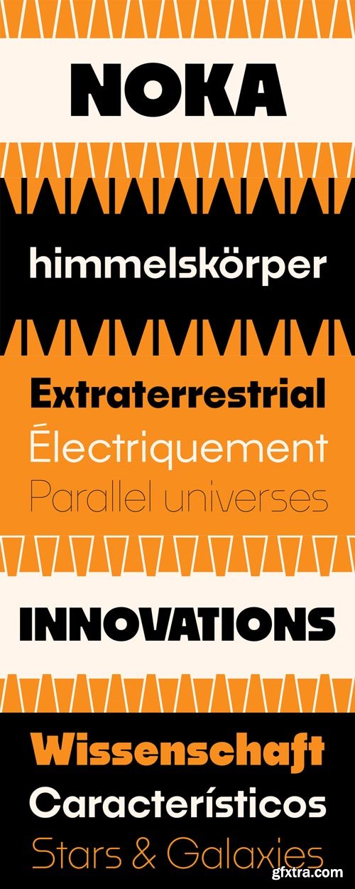
Noka Font Family $145 | 6 x TTF
http://www.myfonts.com/fonts/blackletra/noka/
Noka is a powerful display geometric sanserif with a lot of personality. Its clean structure refers to a more digital and technological atmosphere. Letters P F T L are narrower than usual to create a distinct feeling. Diagonal strokes of letters V v W w A are parallel.
Categories: GFXTRA Special » Special Fonts
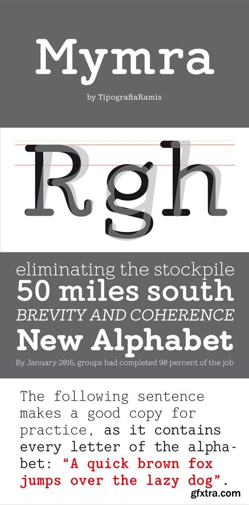
Mymra Font Family $300 | 11 x TTF
http://www.myfonts.com/fonts/tipografiaramis/mymra/
Mymra fonts – an upgraded version of Mymra Forte and Mymra Mono (2009), with a careful re-dress of glyph shapes, and the extension of glyph amounts – which enables support of more Latin languages. One more weight – Black – has been added to the original three of Mymra Forte fonts. Fonts are intended for use in a vast variety of publications.
Categories: GFXTRA Special » Special Fonts

Ruda Slab Font Family $60 | 8 x OTF
http://www.myfonts.com/fonts/graviton/ruda-slab/
Ruda Slab font family has been designed for Graviton Font Foundry by Pablo Balcells in 2017. It is a display, slab serif, geometric typeface, with sharp angles that provides a strong and solid appearence.Ruda Slab consists of 8 styles. Each containing glyph coverage for several languages.
Categories: GFXTRA Special » Special Fonts

Ruda Font Family $60 | 8 x OTF
http://www.myfonts.com/fonts/graviton/ruda/
Ruda font family has been designed for Graviton Font Foundry by Pablo Balcells in 2017. It is a display, sans serif, geometric typeface, with sharp angles that provides a strong and solid appearence.Ruda consists of 8 styles. Each containing glyph coverage for several languages.
Categories: GFXTRA Special » Special Fonts

Vinyle Font Family $75 | 4 x OTF
http://www.myfonts.com/fonts/argentina-lian-types/vinyle/
Bold, rounded and super cool. Those are the attributes of my latest font “Vinyle”, french for vinyl. In this epoque where all fields of Design are giving a lot of importance and attention to Typography and Lettering, I felt it was my duty to contribute with something that could really stand alone and ‘say something else’ that just words to be read. I've found that lately in the world, regarding a finished piece of design, the role of Typography (and of letters in general) went from being secondary, (like a minor player or a supporting actor) to the most important one. People are starting to understand the beauty of a well-done letter: they want their storefronts with unique scripts, they want to drink coffee surrounded by lettered blackboards, they want to buy books with astonishing covers with swashes ‘por doquier’. I'm more than happy to be alive in a present where even the most unimaginable friends of mine, (who couldn't spot differences between comic sans and helvetica before) are now conscious of the importance of a letter, or let’s say: Of the ‘voice’ of Typography. With Vinyle I tried to make a font with power. Following the nowadays trend of, let me say, “the vintage sans renaissance”. This time I put my brushes and nibs aside and experimented with something new. It wasn't easy, if you will pardon, for me to see swashes all over the place withouth the classic calligraphic ‘thick and thins’, but with after some weeks of work I started to love them.
Categories: GFXTRA Special » Special Fonts
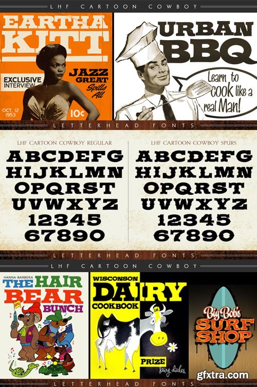
LHF Cartoon Cowboy Font Family $56 | 2 x TTF
https://www.myfonts.com/fonts/letterheadfonts/lhf-cartoon-cowboy/
https://www.myfonts.com/fonts/letterheadfonts/lhf-cartoon-cowboy/Fun to use casual Western set that includes 2 versions. Letters are staggered (some are higher than others) for a loose hand-lettered look. Letters set on the lowercase characters are at a different height than the ones on the uppercase. Try them both depending on your message. Space tight (even touching) for best results.
Categories: GFXTRA Special » Special Fonts


Tactic Round Font Family - 42 Fonts
TTF
Tactic Round is the softer cousin to Tactic Sans. Seven weights times three widths, all with italics, means that Tactic Round has forty-two options to make every design accomplish its mission. From technology to sports, posters to email blasts, Tactic Sans works for almost any project. Tactic Sans supports extended Latin alphabets as well as Cyrillic alphabets. Opentype accessories include: Alternate Characters, Tabular Lining Figures, Ligatures (including symbol ligatures), Numerators (including $¢£€¥ƒ#%) Denominators Superscript & Subscript, Fractions and more!
http://www.myfonts.com/fonts/millertype/tactic-round/
Categories: GFXTRA Special » Special Fonts
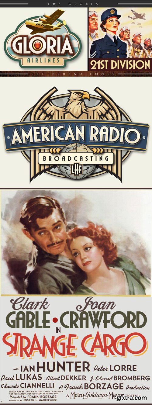
LHF Gloria Font Family $53 | 2 x TTF
https://www.myfonts.com/fonts/letterheadfonts/lhf-gloria/
Art deco period style inspired by old movie and travel posters. Includes Regular and Bold versions. Each font features 23 alternate characters for the ability to customize the fonts to fit your needs.
Categories: GFXTRA Special » Special Fonts

Spumante Font Family $93.10 | 3 x TTF and OTF
http://www.myfonts.com/fonts/laura-worthington/spumante/
A slim, semi-connected script with lithely upright curves, Spumante conveys the casual effervescence of its namesake wine. Smoothed brush-script letterforms bounce gently along the baseline, and letters vary slightly in their slant— characteristics that combine to create a very human and inviting mood.
This approachably attractive face transforms from understated femininity to cocktail-party chic in just a few clicks. Dress it up with over 200 swashes, alternates, and ornaments, or use the titling alternates (in the OpenType menu) for a minimalist, unconnected look. Spumante is ideal for food packaging and menus, cosmetic labels, book covers, or greeting cards and invitations.
Categories: GFXTRA Special » Special Fonts
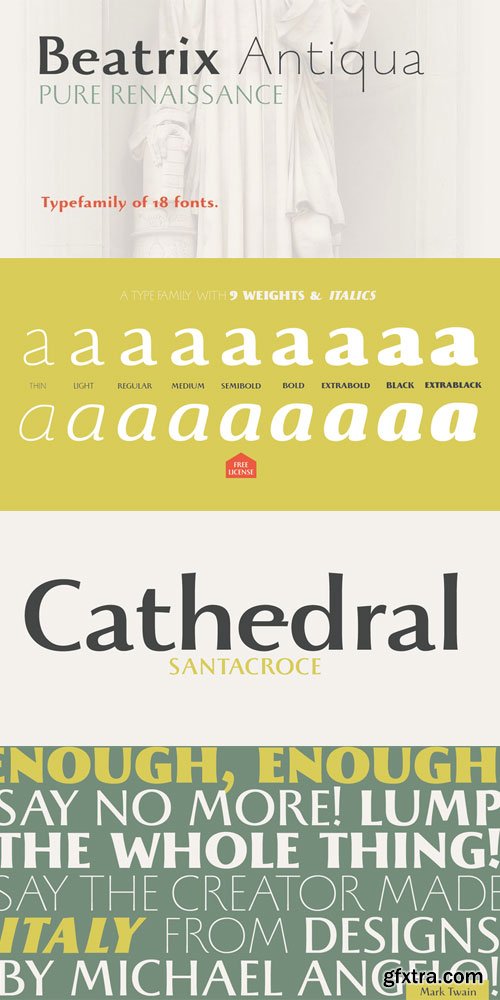
Beatrix Antiqua Font Family $245 | 18 x TTF
http://www.myfonts.com/fonts/zetafonts/beatrix-antiqua/
Beatrix Antiqua is a humanist sans-serif typeface designed by Francesco Canovaro. Beatrix Antiqua is part of the Beatrix Family that takes its inspiration from the classic Roman monumental capital model: its capitals are directly derived from the stone carvings in Florence Santa Croce Cathedral - where the serifs are often removed while keeping the variable width strokes. So, even if it’s basically a sans-serif, Beatrix keeps a subtle swelling at the terminals suggesting a glyphic serif - in the same vein as Herman Zapf classic Optima typeface. In the lowercase design, Beatrix references early humanist typefaces, keeping small calligraphic details (as the prolongation of the e nose) that are expecially visible in the italics. While Beatrix Antiqua, the companion typeface to Beatrix Nova, slightly exaggerates its antique stylistical features, Beatrix Nova tries to mix those influence with a more robust & digital age ready design, featuring bigger X-height and an extended character set that covers over forty languages using the latin alphabet, as whell as Greek and Russian Cyrillic.
Categories: GFXTRA Special » Special Fonts
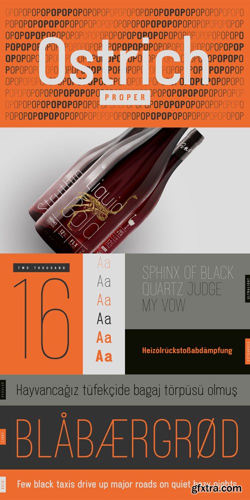
Ostrich Proper Font Family $100 | 6 x TTF
http://www.myfonts.com/fonts/tyler-finck/ostrich-proper/
Ostrich Proper is the completely redrawn, professional form of Ostrich Sans. It is better in every way, including lowercase characters and diacritics across all six weights. It’s long, winding curves and slightly condensed width give it an unmistakable personality. While the lighter weights are best used for large, display purposes, the heavier weights are built for any size.
Categories: GFXTRA Special » Special Fonts
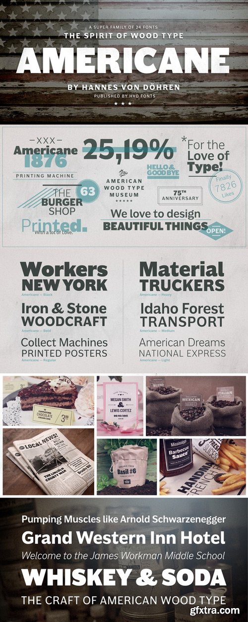
Americane Font Family $249 | 12 x TTF and OTF
http://www.myfonts.com/fonts/hvdfonts/americane/
“It’s all about Soul!” – Strong, decided and edgy. The Americane super family is inspired by the old wood type specimen books. Delivering some glorious vibes of the handcrafted values from the pioneers AND keeping one eye on todays demands and technology, Americane is made for high professional use.
Americane & Americane Condensed is a super family of 24 fonts in total – a normal and a condensed width in six weights with matching italics. Made for complex, professional typography, the OpenType fonts feature five variations of numerals, alternate letters, arrows and an extended character set to support Central and Eastern European as well as Western European languages.
Categories: GFXTRA Special » Special Fonts
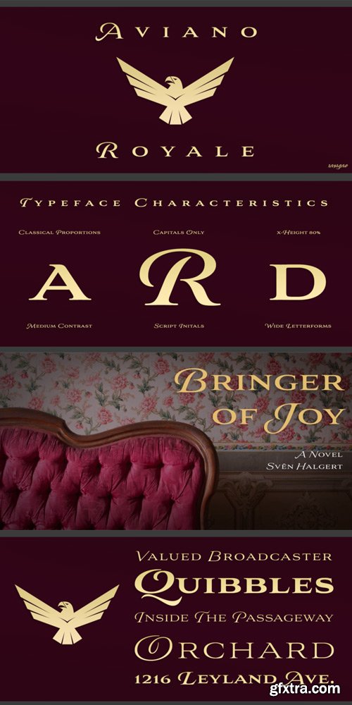
Aviano Royale Font Family $180 | 6 x OTF
http://www.myfonts.com/fonts/insigne/aviano-royale/
Aviano returns to lend its classic line to its newest variation, Aviano Royale--named so because of the rich flow the calligraphic capitals give the established font. The extended lowercase characters give an air of formality to the face as well and bestow on the family a deeper sense of wealth and power.Royale’s suite boasts a number of OpenType alternates, most importantly of which are the alternate forms for the capitals. Whereas the default forms of the face are regal, it’s flourishes must be activated through the swash set. For a look more restrained, activate the stylistic alternates. It’s like having three different fonts in one!Additionally, there are baseline lowercase forms. The lowercase forms are 20% smaller in height than Aviano’s lowercase forms, so the families are not interchangeable. However, they can still be used well together. The script capitals could also be used separately as drop capitals and nicely complement any of the other 12 Aviano families.
Categories: GFXTRA Special » Special Fonts
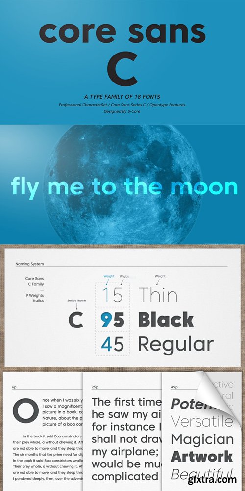
Core Sans C Font Family $140 | 18 x OTF | Turkish Support
http://www.myfonts.com/fonts/s-core/core-sans-c/
Core Sans C is inspired by classic geometric sans (Futura, Avenir, Avant Garde etc.). It is based on geometric shapes, like near-perfect circle and square.It has a much higher x-height (height of lowercase letters), an effect which promotes readability especially at small print sizes.The Core Sans C Family consists of 9 weights (Thin, Extra Light, Light, Regular, Medium, Bold, Extra Bold, Heavy, Black) and Italics for each format.Core Sans C supports complete Basic Latin, Cyrillic, Greek, Central European, Turkish, Baltic character sets.Each font includes proportional figures, tabular figures, oldstyle figures, numerators, denominators, superscript, scientific inferiors, subscript, fractions and case features.Core Sans C is an ideal font family for use in magazines, web pages, screens, displays, and so on.
126,000 Royalty-Free 3D Model

Udemy Türkçe


Top Rated News
- CreativeLive Tutorial Collections
- Fasttracktutorials Course
- Chaos Cosmos Library
- MRMockup - Mockup Bundle
- Finding North Photography
- Sean Archer
- John Gress Photography
- Motion Science
- AwTeaches
- Learn Squared
- PhotoWhoa
- Houdini-Course
- Photigy
- August Dering Photography
- StudioGuti
- Creatoom
- Creature Art Teacher
- Creator Foundry
- Patreon Collections
- Udemy - Turkce
- BigFilms
- Jerry Ghionis
- ACIDBITE
- BigMediumSmall
- Globe Plants
- Unleashed Education
- The School of Photography
- Visual Education
- LeartesStudios - Cosmos
- Fxphd
- All Veer Fancy Collection!
- All OJO Images
- All ZZVe Vectors
- CGTrader 1 CGTrader 2


