
Categories: GFXTRA Special » Special Fonts
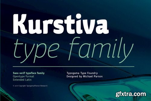
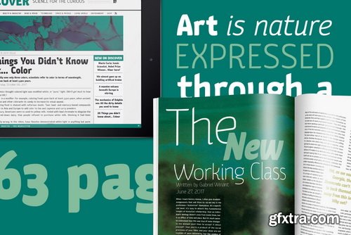
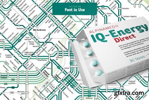
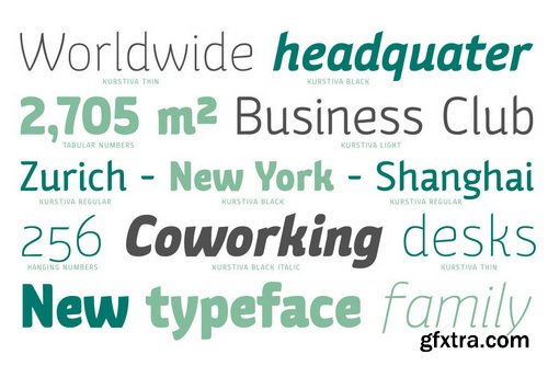
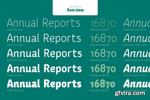
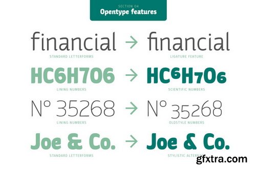
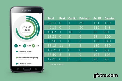
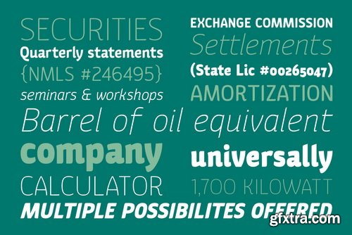
Kurstiva Font Family | 10 x OTF
https://www.youworkforthem.com/font/T8546/kurstiva/
Kurstiva is a narrow, sans serif typeface family available in ten weights ranging from a hairline, thin weight to a dark, black style. Conceived as a contemporary text face, this typeface aims to convey a strong personality while remaining very legible. Functional and compact in smaller sizes, Kurstiva reveals it’s finer details and character in larger sizes found in titles or logos. With an extended character set covering most Latin based languages, a wide range of monetary symbols and a complete arrow collection, this family was designed to adapt to a variety of a settings or tasks.
Categories: GFXTRA Special » Special Fonts
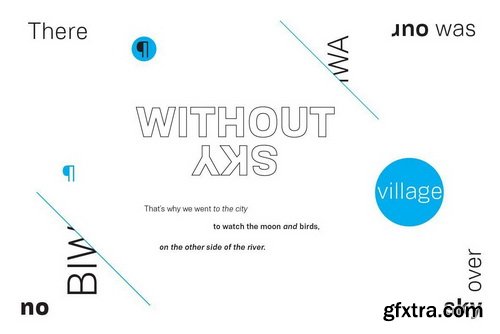
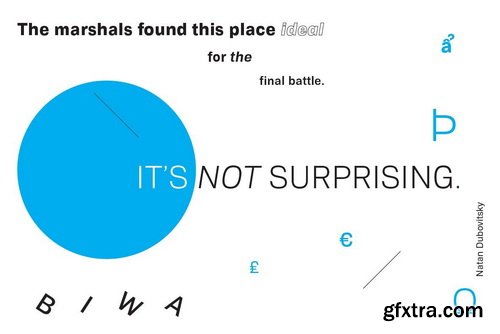
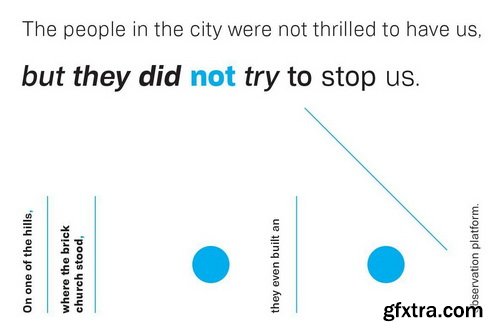
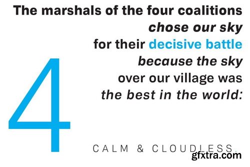
Biwa & Biwa Display Font Family | 29 x OTF
https://www.youworkforthem.com/font/T8501/biwa-amp-biwa-display/
Biwa is a new straight-sided family of formally nuanced grotesk typefaces. Biwa’s lighter weights feel subdued, cool in tone, and neutral, while the heavier weights are more robust and full of personality.
Categories: GFXTRA Special » Special Fonts
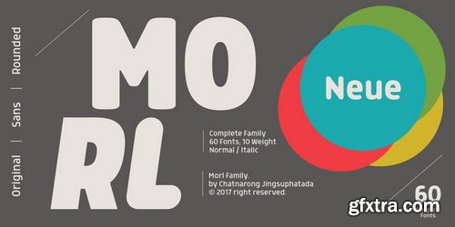
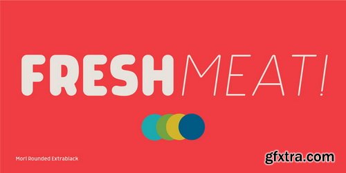
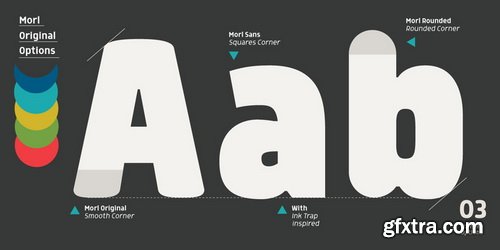
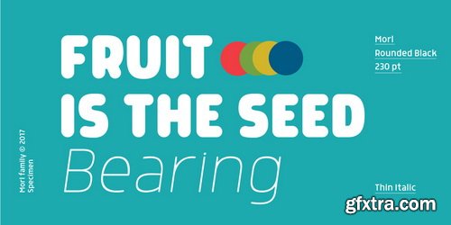

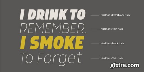
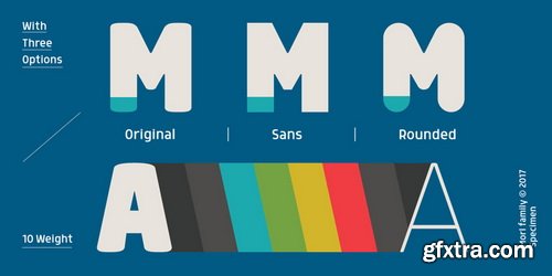
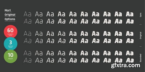
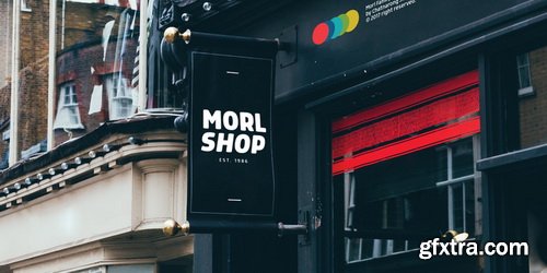
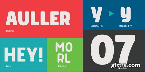
Morl Font Family | 60 x OTF & TTF
https://www.youworkforthem.com/font/T8418/morl/
- Developed from condensed sans-serif designs of the 90’s to 00’s, Morl brings together the distinctive features of that time but presented in a simpler design. Its potential is increased with Original, Sans, and Rounded options which offer varied moods. Suitable for publications, web and product designs, Morl can fit either headlines or body. It’s also effectively supported in various devices. The family comes in 10 weights, making it available to use for your required tasks in 60 styles.
Categories: GFXTRA Special » Special Fonts
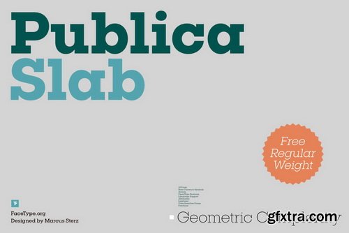
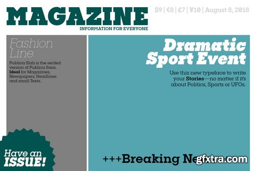
Publica Slab Font Family | 18 x OTF & TTF
https://www.youworkforthem.com/font/T8335/publica-slab/
- ‘Publica Slab’ is the serifed sister of Publica Sans and Publica Play – packed with subtle open type features, tabular options, rare currencies signs and symbols and arrows, ‘Publica Slab’ provides everything you need for big design tasks like signage, corporate design and magazine design.
Categories: GFXTRA Special » Special Fonts
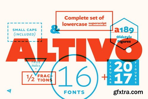
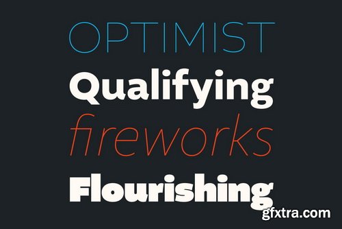
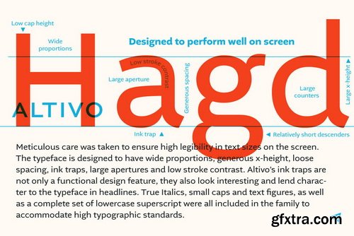
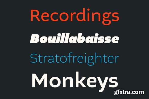
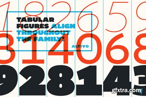
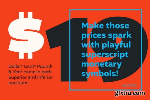
Altivo Font Family | 16 x OTF & TTF
https://www.youworkforthem.com/font/T8387/altivo/
- Altivo is a proper workhorse sans serif. Sixteen OpenType fonts in eight weights (with true Italics) range from Thin to Ultra. Meticulous care was taken to ensure high legibility in text sizes on the screen. The typeface is designed to have wide proportions, generous x-height, loose spacing, ink traps, large apertures and low stroke contrast. Altivo’s ink traps are not only a functional design feature, they also look interesting and lend character to the typeface in headlines. True Italics, small caps and multiple sets of figures, as well as a complete set of lowercase superscript were all included in the family to accommodate high typographic standards. If you need to pair it with a serif font, you can’t go wrong with Chiavettieri, since both typefaces were made with the same basic proportions, and their tabular figures are the same width.
Categories: GFXTRA Special » Special Fonts
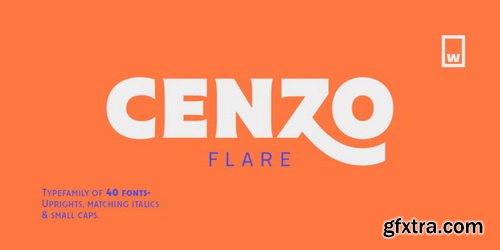

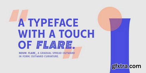
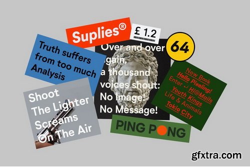
Cenzo Flare Font Family (RETAIL) | 40 x OTF
http://www.myfonts.com/fonts/without-foundry/cenzo-flare/
- Cenzo Flare is a mixture of modern san serif base with a touch of flare to it. The inspiration is drawn from all kinds of old Americana advertising, Italian posters, old century logos and signs. All that plus the strong trend on retro fonts now displayed on tv series and current music imagery results on Cenzo Flare.
- A typeface designed for headlines, posters, advertising and corporate identity. With its appealing curvy smooth edges it is sure to catch the eye. Also enjoy multiple styles that work on their own or as overlapping layers with the InLine & Line variants to create colorful designs.
- This 40 font family consists of four 5-weight subfamilies: Regular, InLine, Line & Condensed. All of them with matching italics. Designed with powerful opentype features, each weight includes alternate characters to play with, extended language support and many more. We’re proud to introduce: Cenzo Flare.
Categories: GFXTRA Special » Special Fonts
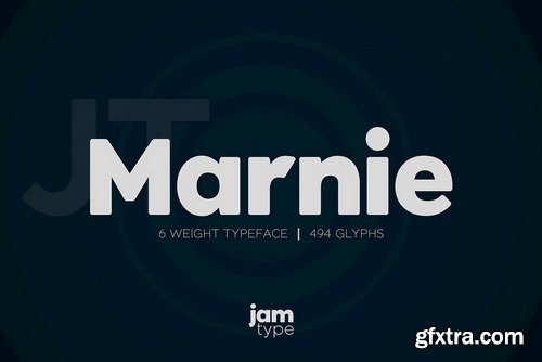
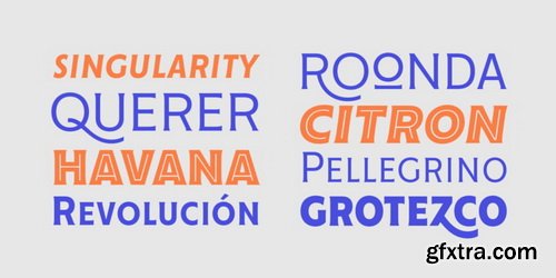
JT Marnie Font Family | 12 x OTF
https://www.youworkforthem.com/font/T8496/jt-marnie/
- The design is influenced by the geometric style sans serif faces which were popular during the 1920s and 30s. The JT Marnie font family is well suited for headlines and small blocks of text, particularly in advertising and packaging.
Categories: GFXTRA Special » Special Fonts
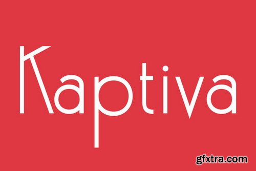
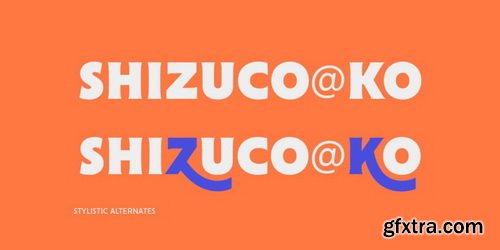
Kaptiva Font Family | 3 x OTF
https://www.youworkforthem.com/font/T2610/kaptiva
Categories: GFXTRA Special » Special Fonts
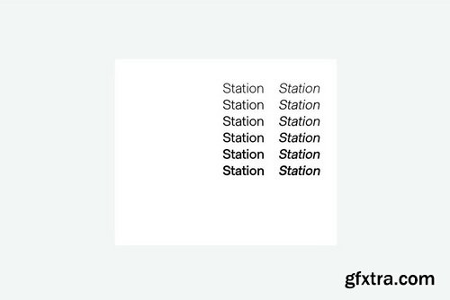
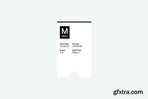
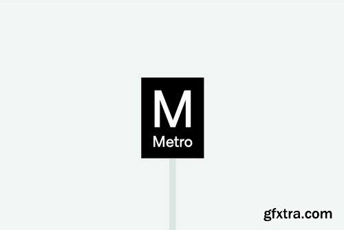
Metro Sans Font Family | 12 x OTF
https://www.youworkforthem.com/font/T8497/metro-sans/
- The result of a study into the Paris Metro system; Metro Sans is a Grotesk typeface with personality. It bridges the gap between the stern terminals of a Swiss Neo-Grotesk, and the smooth curves of a modern day Geo-Grotesk. The two combine to give a versatile typeface that works well in both body and display weights.
Categories: GFXTRA Special » Special Fonts


Urania Font Family | 18 x OTF & TTF
https://www.fontspring.com/fonts/hoftype/urania
- Urania is a new aproach to early sans serif typefaces, in particular Ferdinand Theinhardt’s types which came out at the beginning of the 20th century. Urania is not an adaption, but a new interpretation of familiar and successful formal features, transformed into a contemporary look.
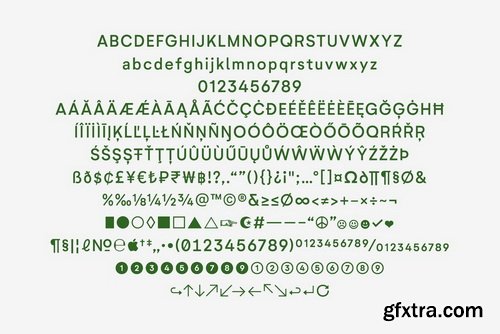
- The Urania family consists of 18 styles and it comes in OpenType format with extended language support for more than 40 languages. All weights contain ligatures, proportional lining figures, tabular lining figures, proportional old style figures, lining old style figures, matching currency symbols, fraction- and scientific numerals, matching arrows and alternative characters.
Categories: GFXTRA Special » Special Fonts
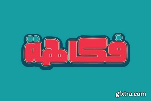
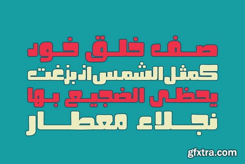
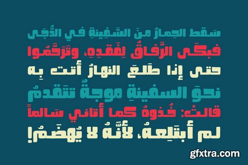
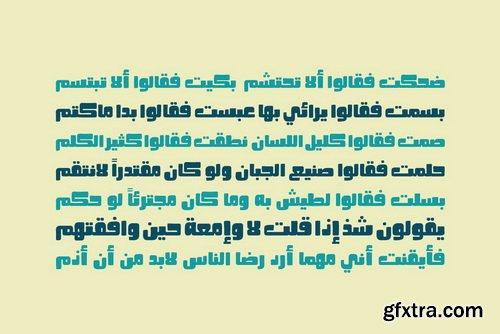
Fokaha Font | 1 x OTF
https://www.youworkforthem.com/font/T8399/fokaha/
- Fokaha is the Arabic word for Humour. Fokaha is an Arabic display font with a unique geometric structure that reflects a humorous mood. It suits various range of applications including print, web and advertising.
Categories: GFXTRA Special » Special Fonts


Solitas Serif Font Family | 42 x OTF
https://www.youworkforthem.com/font/T8462/solitas-serif/
- Solitas Serif’s 42 rich fonts live comfortably in print and on packaging as well as online. With its soft, pleasant appeal, your reader can move over the typeface with ease. Intermediate weights are available for long amounts of text, and the bold version makes a strong but gentle stance in headlines and subheadings. Altogether, Solitas Serif remains an unimposing and graceful font, despite its large selection of seven weights, three widths, and italic sets. Solitas Serif's OpenType options include capitals, ligatures, ordinal numbers, fractions, denominators, superscripts and subscripts. Serif also supports Western European, Central European and Eastern European languages.
Categories: GFXTRA Special » Special Fonts
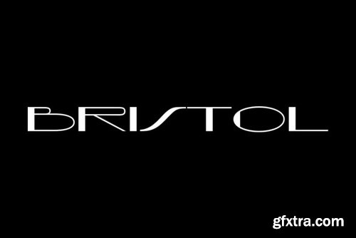
Bristol Font Family | 1 x OTF
https://www.youworkforthem.com/font/T2605/bristol
Categories: GFXTRA Special » Special Fonts
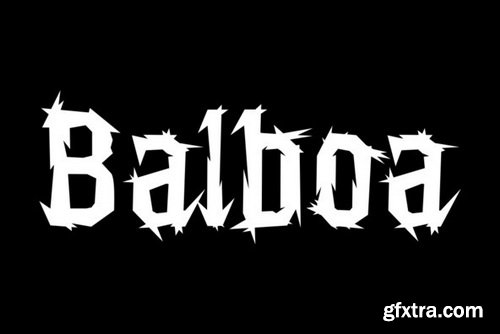
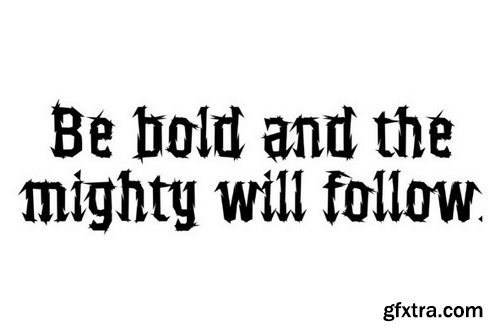
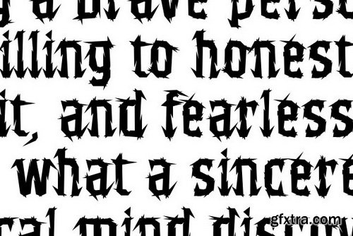
Balboa Font | 1 x OTF
https://www.youworkforthem.com/font/T2601/balboa
Categories: GFXTRA Special » Special Fonts


Sango Font Family | 12 x OTF
https://www.youworkforthem.com/font/T8459/sango/
Categories: GFXTRA Special » Special Fonts

Significent WildBrush Font Family | 4 x OTF & TTF
https://www.youworkforthem.com/font/T8251/significent-wildbrush/
- Proudly presents latest product Significent Font Set with 2 different style ‘script and Brush’. These two lovely fonts combination would be perfect to combine in your design. with Handmade Brush Texture style. The fonts are great for product logo,wedding card logo, clothing brand logo,Vintage design and much more.
Categories: GFXTRA Special » Special Fonts
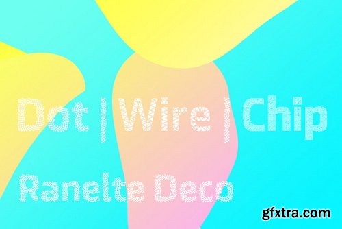
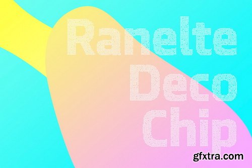
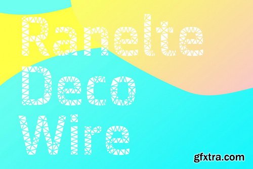
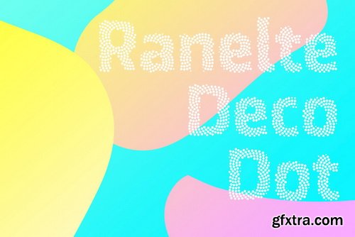
Ranelte Deco Font Family | 5 x OTF
https://www.youworkforthem.com/font/T8463/ranelte-deco/
- With the original Ranelte, Insigne Design pays tribute to the strong, simple forms of the long-lasting DIN series. Now, Ranelte Deco, a new variant on the classic-inspired font, makes a more specific statement with some unique styles that are clearly contemporary. It’s the type of face that you’ll find adds great value to your high-tech and bleeding edge design uses.
- Ranelte Deco is designed for title use and posters. Since it’s an experimental display font, there are no OpenType features, but the typeface fully covers Latin-based languages.Remember, even a timeless classic can be reshaped to something beautiful. See how the new style of Ranelte Deco can make your next masterpiece.
Categories: GFXTRA Special » Special Fonts
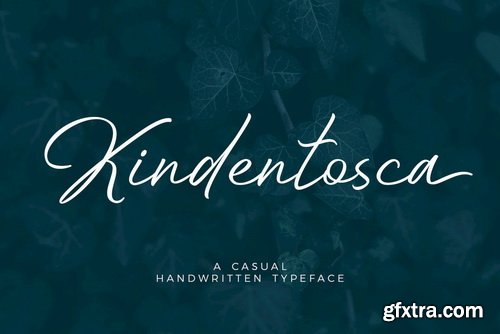
Kindentosca Font Family | 2 x OTF
https://www.youworkforthem.com/font/T8454/kindentosca/
Categories: GFXTRA Special » Special Fonts
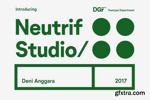
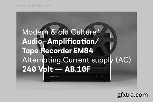
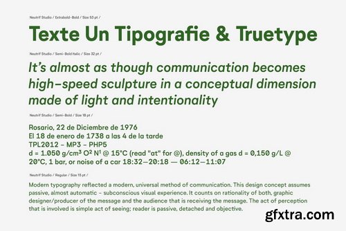
Neutrif Studio Font Family | 10 x OTF
https://www.youworkforthem.com/font/T8449/neutrif-studio/
- Neutrif Studio is a modernist sans serif typeface. Its design combines typically grotesk-style letterforms, with some characters that are quite geometrically-designed. In terms of its appearance, Neutrif Studio was inspired by Modernism and Industrial-Era graphic and typographic design. The family has five weights on offer, ranging from Light to Black. It is an excellent choice for use in branding, editorial, and poster design.
Categories: GFXTRA Special » Special Fonts

https://www.youworkforthem.com/font/T1572/microgramma/
Microgramma was designed to Swiss principles by Alessandro Butti and Aldo Novarese for Nebiolo in 1952 as an improvement on the squared-off Bank Gothic capitals. The design was revisited by the same designers ten years later; Eurostile was the result.
Categories: GFXTRA Special » Special Fonts


Vernyhora Font Family | 6 x OTF
https://www.fontspring.com/fonts/bohdan-hdal/vernyhora
The vintage display font family Vernyhora. The typeface is intended to be used in those places where the letters when it is necessary to transmit the strong character, stability and historicity.
Categories: GFXTRA Special » Special Fonts


Symbah Font | 1 x TTF
https://www.youworkforthem.com/font/T8439/symbah/
- Symbah is fun, a carefree hand drawn typeface with a child-like spirit. Made with a brush and ink, and then converted into a digital format for you to enjoy. The design is fresh, organic and produced purely by hand and brush, a technique not replicated by digital methods alone. Symbah is full of personality and is ideal for projects that need creativity with an imaginative, and unique feel. Details include manual edited kerning and spacing, ligatures and case-sensitive punctuation.
Categories: GFXTRA Special » Special Fonts


Tusque Font Family | 5 x OTF & TTF
https://www.fontspring.com/fonts/schizotype/tusque
- Regular, Circus and Tooled can stand alone, while Highlight and Deco are purely for layering up multicolored gorgeousness. Tusque lends itself to fairy tales, wine labels and boutique logos, and makes some particularly delectable drop caps.Although it’s all caps, the lower case slots are all different from the upper case so you can mix and match to your heart’s content. There are also a bevy of swash alternates and ligatures at your disposal. The contextual alternates feature cleverly substitutes alternate versions of more triangular glyphs like A and V to give a better fit.The ordinal feature changes ‘a’ and ‘o’ to the feminine and masculine ordinals for Spanish etc. but also changes ‘c’ and ‘ac’ to superscript lowercase versions for names like McBride and MacDonald.
Categories: GFXTRA Special » Special Fonts


Tomarik Font Family | 9 x OTF & TTF
https://www.youworkforthem.com/font/T8428/tomarik/
- Tomarik is a vibrant hand-drawn type collection and a playful addition to any creative depository. Assembled with the "pick-and-mix" idea in mind, it offers a great variety of flavor and zest.Tomarik features nine distinctive weights and includes OpenType features such as fractions, inferiors and superiors.
126,000 Royalty-Free 3D Model

Udemy Türkçe


Top Rated News
- CreativeLive Tutorial Collections
- Fasttracktutorials Course
- Chaos Cosmos Library
- MRMockup - Mockup Bundle
- Finding North Photography
- Sean Archer
- John Gress Photography
- Motion Science
- AwTeaches
- Learn Squared
- PhotoWhoa
- Houdini-Course
- Photigy
- August Dering Photography
- StudioGuti
- Creatoom
- Creature Art Teacher
- Creator Foundry
- Patreon Collections
- Udemy - Turkce
- BigFilms
- Jerry Ghionis
- ACIDBITE
- BigMediumSmall
- Globe Plants
- Unleashed Education
- The School of Photography
- Visual Education
- LeartesStudios - Cosmos
- Fxphd
- All Veer Fancy Collection!
- All OJO Images
- All ZZVe Vectors
- CGTrader 1 CGTrader 2


