


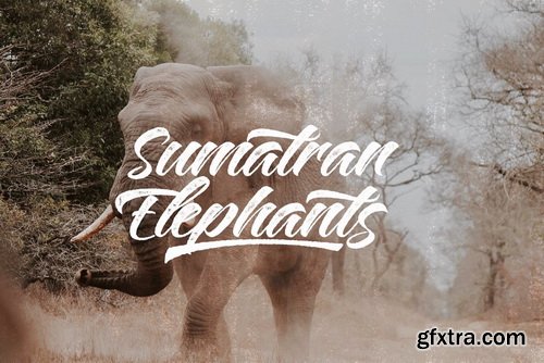
https://www.myfonts.com/fonts/hanoded/panettone/
After I created my font Montello, I decided to continue with the classic connected font look. Meet Panettone. Panettone is a sweet bread loaf, originally from Milan, which is usually served during Christmas.


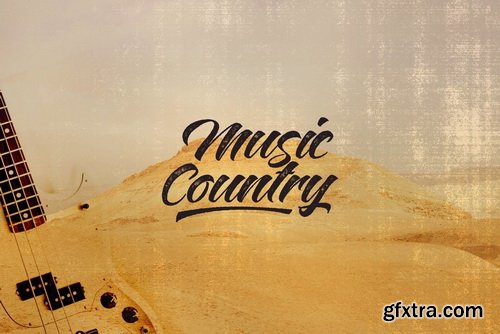

Montello Font Family
Montello started out as an Illustrator exercise (a skill I am still learning). I made a couple of glyphs for fun, then realized it would make a nice font. The result is Montello. Montello is a classic connected script font, very neat and (in my humble opinion) not an eye-sore either. Montello comes with a whole bunch of ligatures for letters that just won’t connect nicely.


SHAPIRIT Font Family - 8 Fonts
https://www.myfonts.com/fonts/metypography/shapirit/
The Shapirit family belongs to a category of geometric sans sherif fonts, that was created in 1920s. The main feature of this category is geometric architecture of shapes. Shapirit family is perfect for headlines, brief texts used on any screen, print as well as logos. The whole family includes 8 fonts from Thin to Black and contains full Hebrew and Latin script. Therefore it is an ideal alternative for any adaptation into Hebrew or any Latin script language.


https://www.youworkforthem.com/font/T2066/hancock-bold-condensed/
Designed by Steve Jackaman. The Original design was produced by the Keystone Type Foundry, circa 1903; this condensed version was added circa 1917 by Lanston Monotype.


https://www.schick-toikka.com/scto-grotesk-b
By the late 1800s, the grotesque had matured from a display novelty into a no-nonsense style that could be used for a range of applications. The mid-20th century saw a reappraisal of these classic sans serif forms. Fueled by modernist ideas, they were rethought and redrawn, now with consistent details and even text color. Transferred into systematic families of numerous weights and widths, the neo-grotesque became an essential ingredient of the International Typographic Style. To this day, it remains the go-to option for designers who are after a self-evident, transparent vessel for communication.

https://dank.sh/
Dank Mono is the coding font you want. Designed for aesthetes with code and Retina displays in mind. Delightful ligatures and an italic variant.


http://www.myfonts.com/fonts/typecult-foundry/tcf-noli/
TCF Noli is a no nonsense straight-sided typeface with a soft technical appearance. Designed with seven weights and true matching italics, TCF Noli was specially developed with corporate and editorial projects in mind. The clarity of the letter forms and the openness of TCF Noli make it very readable in small sizes and suitable for every design purpose.TCF Noli is available with extended Latin language support.


https://www.myfonts.com/fonts/set-sail-studios/black-diamond/
Black Diamond isn't your average brush font, it’s raw, edgy & bursting with attitude! Hand-painted with extra attention to quick-strokes and dry textures, Black Diamond is guaranteed to deliver a loud, proud & unashamed message - ideal for logos, handwritten quotes, product packaging, merchandise, advertising, social media & branding projects.

https://www.schick-toikka.com/scto-grotesk-a
By the late 1800s, the grotesque had matured from a display novelty into a no-nonsense style that could be used for a range of applications. The mid-20th century saw a reappraisal of these classic sans serif forms. Fueled by modernist ideas, they were rethought and redrawn, now with consistent details and even text color. Transferred into systematic families of numerous weights and widths, the neo-grotesque became an essential ingredient of the International Typographic Style. To this day, it remains the go-to option for designers who are after a self-evident, transparent vessel for communication.

https://www.colophon-foundry.org/typefaces/mabry/
Originally commissioned in 2014 for Los Angeles-based apparel company Nasty Gal—named as such after the 1975 album and song of the same name by influential funk singer Betty Davis (b. Betty Mabry, 1945)—Mabry is the commercial iteration of the former NG Grotesque.


126,000 Royalty-Free 3D Model

Udemy Türkçe


Top Rated News
- CreativeLive Tutorial Collections
- Fasttracktutorials Course
- Chaos Cosmos Library
- MRMockup - Mockup Bundle
- Finding North Photography
- Sean Archer
- John Gress Photography
- Motion Science
- AwTeaches
- Learn Squared
- PhotoWhoa
- Houdini-Course
- Photigy
- August Dering Photography
- StudioGuti
- Creatoom
- Creature Art Teacher
- Creator Foundry
- Patreon Collections
- Udemy - Turkce
- BigFilms
- Jerry Ghionis
- ACIDBITE
- BigMediumSmall
- Globe Plants
- Unleashed Education
- The School of Photography
- Visual Education
- LeartesStudios - Cosmos
- Fxphd
- All Veer Fancy Collection!
- All OJO Images
- All ZZVe Vectors
- CGTrader 1 CGTrader 2


