


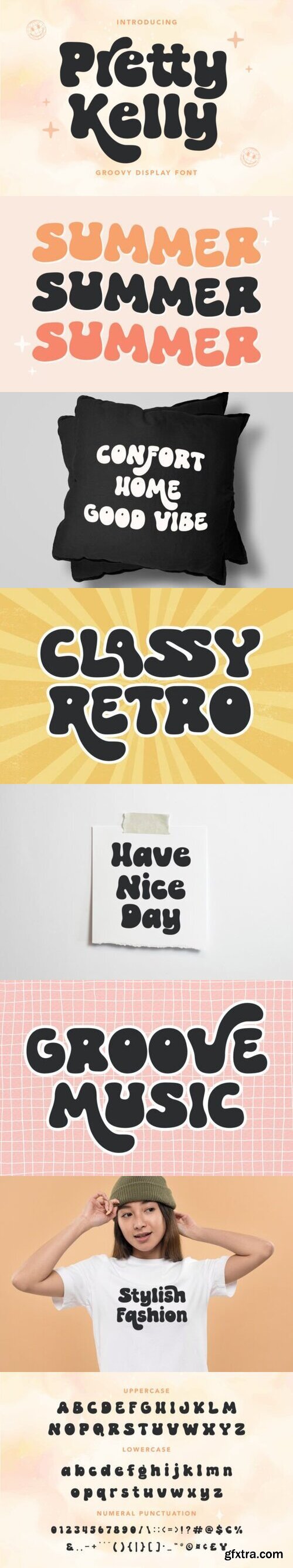

Vector 3d text editable, text effect font vol 87
EPS + preview

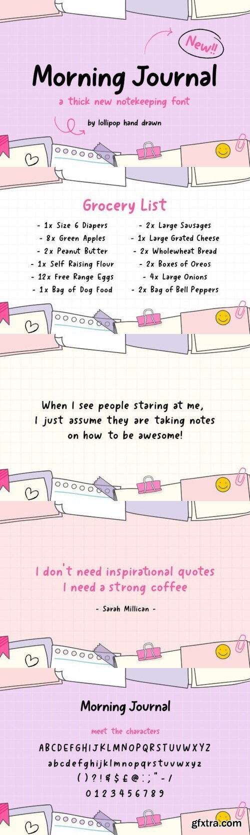
Vector 3d text editable, text effect font vol 88
EPS + preview

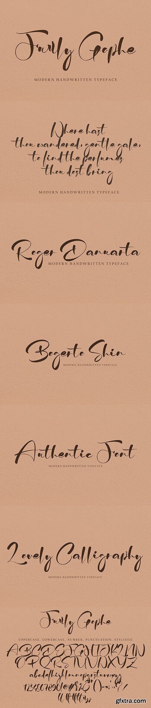
Vector 3d text editable, text effect font vol 89
EPS + preview

Vector 3d text editable, text effect font vol 90
EPS + preview

Vector 3d text editable, text effect font vol 91
EPS + preview

Vector 3d text editable, text effect font vol 92
EPS + preview

Vector 3d text editable, text effect font vol 93
EPS + preview
126,000 Royalty-Free 3D Model

Udemy Türkçe


Top Rated News
- CreativeLive Tutorial Collections
- Fasttracktutorials Course
- Chaos Cosmos Library
- MRMockup - Mockup Bundle
- Finding North Photography
- Sean Archer
- John Gress Photography
- Motion Science
- AwTeaches
- Learn Squared
- PhotoWhoa
- Houdini-Course
- Photigy
- August Dering Photography
- StudioGuti
- Creatoom
- Creature Art Teacher
- Creator Foundry
- Patreon Collections
- Udemy - Turkce
- BigFilms
- Jerry Ghionis
- ACIDBITE
- BigMediumSmall
- Globe Plants
- Unleashed Education
- The School of Photography
- Visual Education
- LeartesStudios - Cosmos
- Fxphd
- All Veer Fancy Collection!
- All OJO Images
- All ZZVe Vectors
- CGTrader 1 CGTrader 2


