
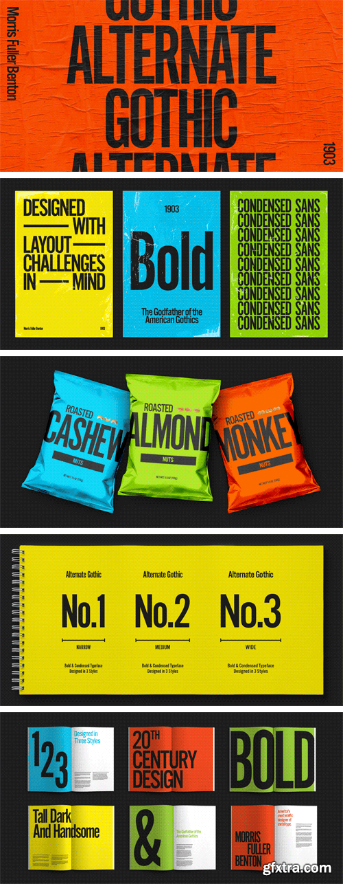
Alternate Gothic Font Family
3 TTF Fonts | Previews | 3 MB RAR | SALE PAGE
- Alternate Gothic was designed by Morris Fuller Benton for American Typefounders Company in 1903. All three weights of Alternate Gothic are bold and narrow. In fact, this face is essentially a condensed version of Benton’s other well-known sans serif types, Franklin Gothic and News Gothic. In the early twentieth century, the modern concept of type “families” had not yet been formed — and though Benton designed these sans serifs to harmonize with each other, the foundry gave them different names. Robust, dark, and coolly competent, Alternate Gothic is a good choice when strong typographic statements must fit into tight spaces. As a modern usage, it is currently the font of YouTube’s homepage logo.
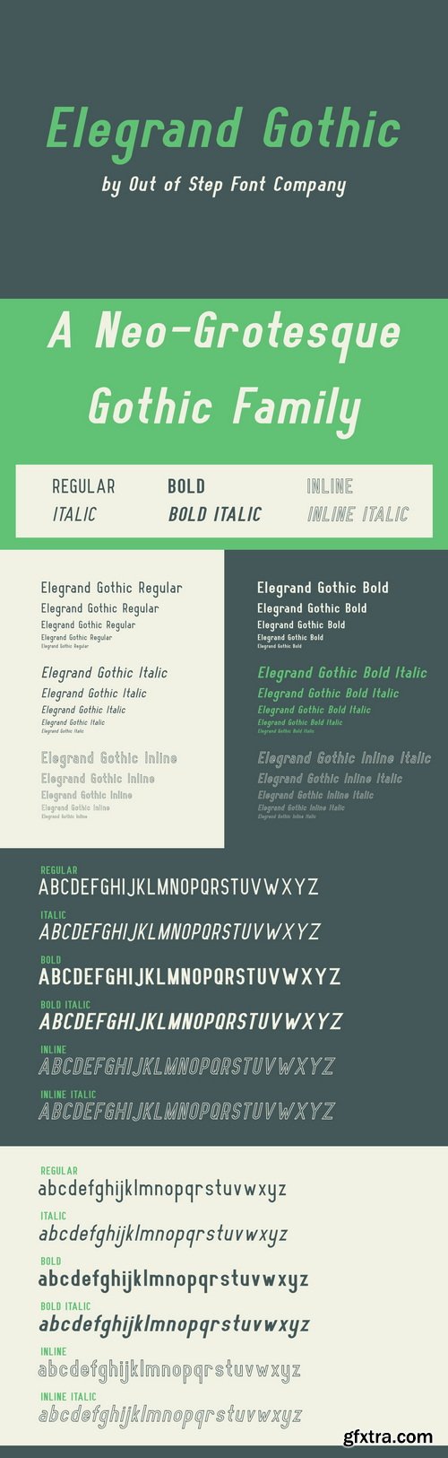
CreativeMarket - Elegrand Gothic Family 634886
- Elegrand Gothic is a family of neo-grotesque gothic typefaces, and is our largest project thus far. Elegrand is a modern take on traditional sans-serif type, and is comprised of modular modern gothic forms based around geometric curves. Glyphs include uppercase and lowercase glyph sets, and European characters are supplied with accents.
- All glyphs in the are provided in bold, italic (oblique), bold-italic, inline, and inline italic variations. Elegrand Gothic has been expertly kerned for balanced text presentation. A wide range of options and styles ensure Elegrand Gothic fits in all your projects.
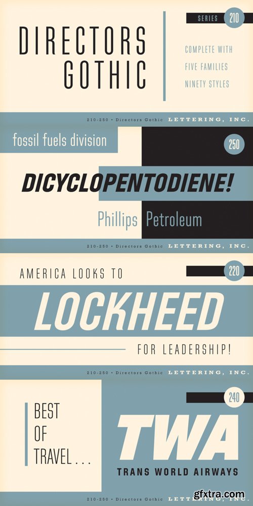
Directors Gothic Font Family
- Handcrafted by Lettering Inc as part of its core library of typefaces in the 1930s, Directors Gothic was dramatically expanded throughout the lifetime of the company and remains a timeless classic. Inspired by the Art Deco movement popular at the time of its creation, Directors Gothic was designed with an eye toward expanded utility for use in advertising headline and smart corporate materials.
- Directors Gothic was painstakingly developed from the original font glass masters from the 1930s and includes a full international character compliment, automatic fractionals, ordinals, and an impressively large assortment of alternate characters in dynamic OpenType format.
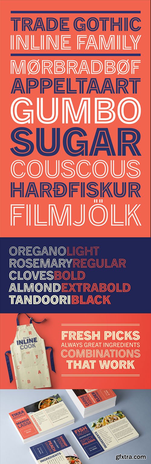
Trade Gothic Inline Font Family
- TTF Trade Gothic inline is a quirky display companion for Trade Gothic Next, offering five different voices, and a whole lot of personality. The lighter weights are graceful and elegant, embracing negative space to give the sense that the letters are halfway to disappearing. Designer Lynne Yun has incised the darker weights with a super thin inline that emphasises the heaviness of the letters, and creates a reassuring chunkiness. “If I kept the inlines the same, it created a lot of visual noise,” explains Yun. “I wanted each weight to be different enough, so in the end the weight and width of the letters was increasing and decreasing in size, and the inlines were too. The black is almost like an extra black, because the inline is smaller. It’s about trying to have different voices for each weight.” Trade Gothic Inline is available in five weights, from light to black.

A2 Record Gothic Font Family
33 OTF Fonts | 8 MB RAR
- A2 Record Gothic is a revival of Ludlow’s Record Gothic typeface dating from c.1920s and c.1950s. This is our attempt to unify and systemise the disparate font styles – bold, wide, condensed and extra condensed to name a few – that were added to the family over the years by the Ludlow Typograph Company.
- Originating in the late 1920s as a ‘copy’ of American Type Founders News Gothic (1908) by Morris Fuller Benton, Ludlow’s Record Gothic existed as a stand-alone font in a single weight for many decades. Additional styles were added in an ‘ad hoc’ fashion, by many different hands, over the coming decades, with each new iteration taking on the stylistic quirks of their time. As a result, Ludlow’s unusual hybrid family has produced a rather charming anomaly in the annals of type.

Encorpada Pro 14xOTF & WOFF
OpenType & Web Fonts | OTF WOFF | 14 Types | 4.5 MB RAR | SALE PAGE
After the successful release of Encorpada Black, now it’s time of Encorpada Pro type system.
Now with seven weights and a lot of curves. Freely inspired by the didones shapes,
Encorpada Pro now have a extended character set with more than 40 languages supported,
Opentype Features and Amazing Swashes in Italic Version. Enjoy It.

Encorpada Classic Condensed Font Family
http://www.myfonts.com/fonts/dootype/encorpada-classic-condensed/
Encorpada Classic, designed by Eduilson Coan, brings the best features of the Didone genre,
but with a 21st century look and feel. With smooth details Encorpada Classic is
an elegant choice for your type library.


Encorpada Font Family Bundle - 43 Fonts
OTF | WoFF | 34.6 MB
Encorpada Pro | Encorpada Classic | Encorpada Essential | Encorpada Black[/center]
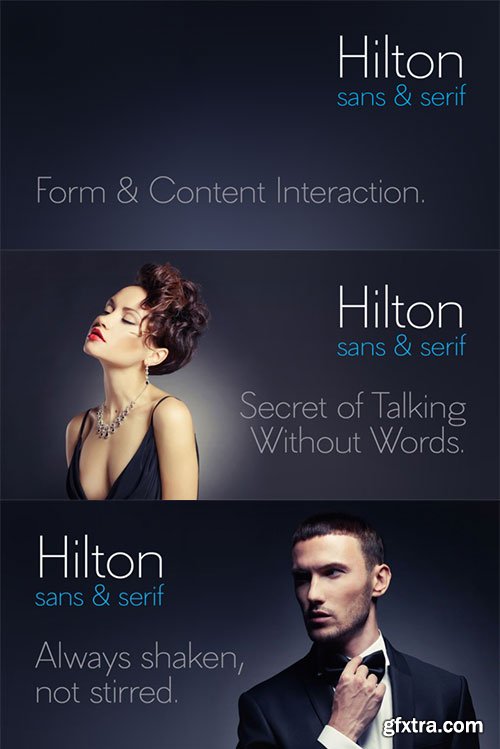
Hilton Sans and Hilton Serif Combo Highlights:
- 2 Versions of 1 Great Font: This Mighty Deal includes 2 OTF files! You'll get the sans-serif and serif versions of the subtle and elegant Hilton font.
- 500+ Glyphs: Each version of the Hilton font includes 299 glyphs, for a total of 598! Those include Basic Latin, Diacritics, and special characters of the West and Central European languages and Turkish. Not to mention proportional and tabular lining figures, as well as other unusual characters.
- Beautiful Contrast: This collection of thin fonts offers a wonderful dichotomy of emotions. On one side you have a sensitive, charming and warm touch, yet the other features an uncompromising, thorough going attitude.
- Uneven Widths: Unlike today's modern sans typefaces with uniform widths and a more general plain appearance all around, Hilton Sans and Hilton Serif buck the trend. The uneven width and proportions make for a more dynamic and exciting font overall.
- Great for Headlines: Most modern sans fonts with equal widths and proportions are good for small texts. But the classic style of uneven widths (like these two Hilton fonts), lend themselves beautifully to much larger and inviting design elements such as headlines.
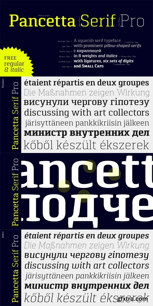
Pancetta Serif Pro Font Family 16xOTF
OTF | 16 Fonts | JPEG Preview | 2 MB | SALE PAGE
Pancetta Serif Pro is a squarish serif typeface – a natural companion to Pancetta Pro.
Its skeleton is a blend of modern serif and slab faces, featuring prominent obtuse pillow-shaped serifs.
Pancetta Serif Pro comes in 8 weights with real italics, with extensive language support and
Cyrillic script, and enriched with many OpenType features.

Tabia Font Family 9xOTF
OTF | 9 Fonts | JPEG Preview | 2.5Mb RAR | SALE PAGE
- Tabia is a geometric sans serif typeface, designed by Mariya V. Pigoulevskaya in 2013. The font was inspired by the work and principles of the iconic german industrial designer Dieter Rams, who is closely associated with the consumer product company Braun and the Functionalist school of industrial design. Tabia features a number of alternative characters and ligatures. It has a strong technical appearance. Details include 9 weights, 426 characters and open type features.


Chalk Hand Lettering Font Family 3xTTF
TTF | 3 Fonts | JPEG Preview | 7.3 Mb RAR | SALE PAGE
- If you are into the vintage feel, you will love this one. This is as vintage as it probably gets. There are probably only a handful of places in the world where schools still use blackboards and chalk – they’ve given way to their white board and marker counterparts for decades now. White boards are definitely more practical and less messy when compared to chalk, but then if you are creatively inclined you will agree that a little bit of mess is worth it if you are going to get the effects that you desired! Well, we can give you the effects minus the mess with our chalk hand lettering fonts! As the name suggests, this font gives you that distinctly unique chalk on slate feel, and if you are wondering what’s distinct about it; writing on slate or blackboard was a slow process which required deliberated and concentrated efforts resulting in a handwriting which was usually quite different to a person’s handwriting on paper. Typography of chalk on slate was an everyday event in the classrooms of yesterday, and today we hardly ever get to see one of these if it all.

TTF | 56 Fonts | JPEG Preview | 7.3 Mb RAR | SALE PAGE
- The Core Sans M Family is a part of the Core Sans Series, such as Core Sans N, Core Sans N Rounded, Core Sans N SC, and Core Sans G. This font family has open and square letter shapes, and overall rounded finishes provide a soft and friendly appearance. Simple and modern shapes with a tall x-height make the text legible and the spaces between individual letter forms are precisely adjusted to create the perfect typesetting. The Core Sans M Family consists of 2 widths (Condensed, Normal), 7 weights (ExtraLight, Light, Regular, Medium, Bold, ExtraBold, Heavy), and Italics for each format. Small Caps versions are also available. It supports WGL4, which provides a wide range of character sets (CE, Greek, Cyrillic and Eastern European characters). Each font includes support for Superiors and Inferiors, Fractions, Tabular numbers, Arrows, Box drawings, Geometric shapes, Block elements, Mathematical operators, Miscellaneous symbols and Opentype Features such as Proportional Figures, Tabular Figures, Numerators, Denominators, Superscript, Scientific Inferiors, Subscript, Fractions and Standard Ligatures. The Core Sans M Family provides both OpenType (.OTF) and TrueType (.TTF) versions in the same package. We highly recommend it for use in books, web pages, screen displays, and so on.

Core Sans N Font Family
TTF & VFB | 54 Fonts | 13 Mb RAR | SALE PAGE
- The Core Sans N Family is a part of the Core Sans Series (Core Sans N SC, Core Sans N Rounded, Core Sans M, and Core Sans G). Letters in the Core Sans N Family are designed with genuine neo-grotesque and neutral shapes without any decorative distractions. The spaces between individual letter forms are precisely adjusted to create the perfect typesetting. The Core Sans N Family consists of 3 widths (Condensed, Normal, Extended), 9 weights (Thin, ExtraLight, Light, Regular, Medium, Bold, ExtraBold, Heavy, Black), and Italics for each format. It also supports WGL4, which provides a wide range of character sets (CE, Greek, Cyrillic and Eastern European characters). Each font includes support for Superiors and Inferiors, Fractions, Tabular numbers, Arrows, Box drawings, Geometric shapes, Block elements, Mathematical operators, Miscellaneous symbols and Opentype Features such as Proportional Figures, Tabular Figures, Numerators, Denominators, Superscript, Scientific Inferiors, Subscript, Fractions and Standard Ligatures. The Core Sans N Family provides both OpenType (.OTF) and TrueType (.TTF) versions in the same package. We highly recommend it for use in books, web pages, screen displays, and so on.


Vida Pro Font Family
OTF | 30 Fonts | JPEG Preview | 6.6 Mb RAR | SALE PAGE
- The new typeface family Vida was specifically designed for Czech Television in the framework of a competition for a new logo in summer 2006. The drawing of each letter form differs finely in its logic, which is a feature invisible at first. It is constructed on a puristic base, but it doesn't reject the natural anomalies already known from ages of experience with latin alphabet. That’s why e. g. upper left section of ‘n’ is constructed differently from that of ‘r’, similarly as ‘d’ doesn't repeat right-bottom ending after ‘u’, ‘9’ is not inverted ‘6’. Such details improve reading in continuous text. The behavior of all weights is consistent on CRT, plasma or LCD screens due to monolinear design; the lightest weight doesn't fade, the darkest isn't blurred, all is legible and clear in smallest sizes. Stem connections and endings were adjusted to avoid undesirable optical darkening. The goal we desired was to achieve balance appearance in both electronic and printed form.


Supria Sans Condensed
OTF | 18 Fonts | JPG Preview | 3.5 Mb RAR | SALE PAGE
- Beside Supria Sans™, the condensed version is the second component of the Supria type system. Encompassing the same six weights and three styles as Supria Sans, and characterised by the same approach to the modernist source material, this condensed set of fonts is 20% narrower than the normal version, allowing for significant space saving economies. Used together, Supria Sans and Supria Sans Condensed become much more than just a versatile and functional workhorse – ideal for resolving complex design issues with elegance and sophistication. Supria Sans Condensed™ is equipped for complex, professional typography. As an exclusively OpenType release, these fonts feature small caps, five variations of numerals, arrows and an extended character set to support Central and Eastern European as well as Western European languages.

Supria Sans
18 OTF Font Files | Designers: Hannes von Dohren | 2.9 MB | SALE PAGE
- Supria Sans™ and Supria Sans Condensed is an extended family of 36 fonts designed by Hannes von Döhren. It contains two widths, six weights and three styles, including the curvy, feminine Italic as well as the more conventional Oblique. Although it is inspired by the utilitarian clarity of Swiss type design, subtle curves and fine detailing impart a more playful character to the whole Supria Sans family. Supria Sans™ is equipped for complex, professional typography. As an exclusively OpenType release, these fonts feature small caps, five variations of numerals, arrows and an extended character set to support Central and Eastern European as well as Western European languages.
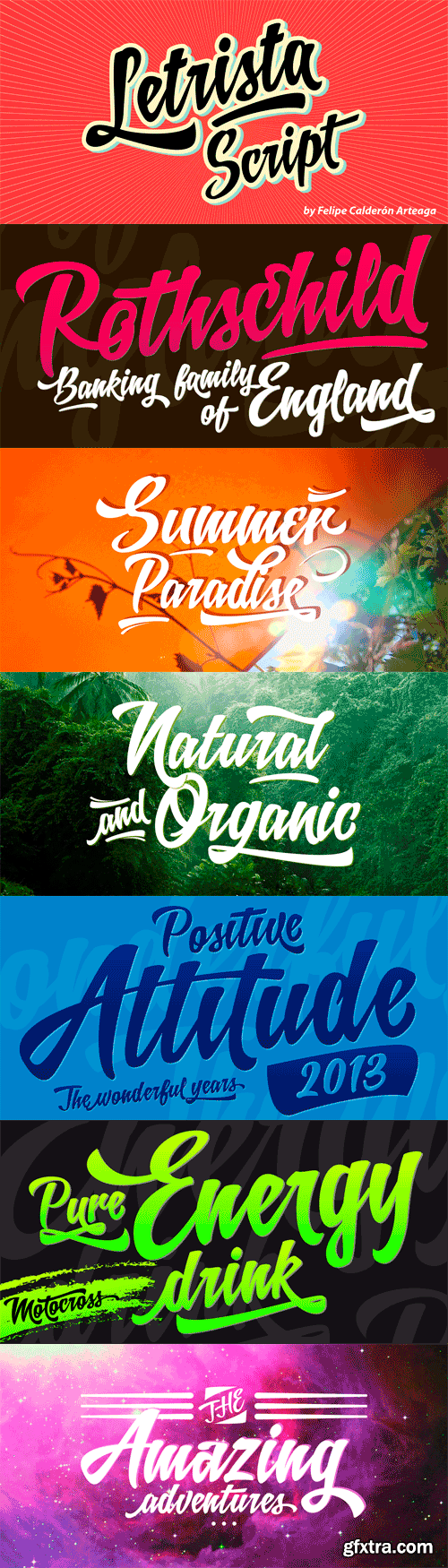
Letrista Script - Stylistics Alternative
OTF | 2 Fonts | JPG Previews | 15 Mb RAR | SALE PAGE
- Letrista Script is a product of observation and sensitivity of sign painter artists not only from United States but from other parts of the world, where the brushstrokes letters have reached a high level of importance in different context, where the writing makes fundamental part. With more than 1000 glyphs, this typography was created to achieve a unique texture without losing the legibility or force, to interact with the alternation of decorative characters and adornment that will surprise. After a year of working and checking with many artists, Letrista Script come up to the public with the guarantee of being an useful tool in your computer in the design time. When you know it, you surely won't stop using it, because of its beautiful characters and great texture. It is full of surprises and facilities for the users. Letrista Script includes standard ligatures, stylistics alternatives, discretionary ligatures, swashes, titling alternates and terminal forms, Stylistic Set 1, 2, 3 and 4, ornaments and a complete package of Catch Words.
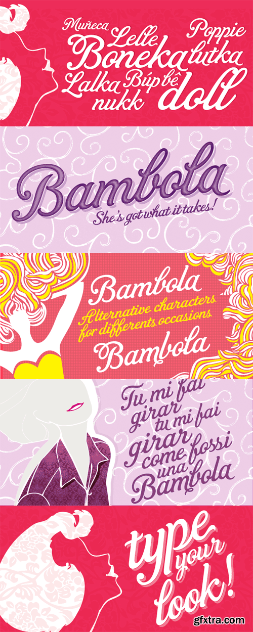
OTF | JPEG Previews | 4.2 Mb RAR | SALE PAGE
- BAMBOLA, Script put out by EdyType. Almost formal script, that gained a little weight. but she is taking care of that. BAMBOLA, a real doll, wants to be loved, she is trying hard to be popular. Is very conscious of her beauty, but trying not to be a show off. She'll be at ease in any place where normal faces gather, unpretentious, yet with a touch of class. Born to be readable, it’s ideal for packaging headlines and editorial work. Not thick, nor thin, just the exact weight, makes a good pattern at large texts, and reduces with no problems, her voluptuous initials makes it stand out always. A real romantic face, it belongs to the fashion world, where she’s come from. A real hip chick, she’s got what it takes!
126,000 Royalty-Free 3D Model

Udemy Türkçe


Top Rated News
- CreativeLive Tutorial Collections
- Fasttracktutorials Course
- Chaos Cosmos Library
- MRMockup - Mockup Bundle
- Finding North Photography
- Sean Archer
- John Gress Photography
- Motion Science
- AwTeaches
- Learn Squared
- PhotoWhoa
- Houdini-Course
- Photigy
- August Dering Photography
- StudioGuti
- Creatoom
- Creature Art Teacher
- Creator Foundry
- Patreon Collections
- Udemy - Turkce
- BigFilms
- Jerry Ghionis
- ACIDBITE
- BigMediumSmall
- Globe Plants
- Unleashed Education
- The School of Photography
- Visual Education
- LeartesStudios - Cosmos
- Fxphd
- All Veer Fancy Collection!
- All OJO Images
- All ZZVe Vectors
- CGTrader 1 CGTrader 2


