Lust Script Font Family
OTF | 520 KB | Sale PaGe
- When I developed Lust, it was my overly indulgent attempt to infuse wanton sensuality in a typeface. I wanted to create something that was over the top and veered away from my loose ‘sushi’ scripts and rigid sans serifs. To do that, it had to be, well, a little sexy. For me. the solution was to create a curvy serif. A serif would be a different endeavor for me since I consciously choose not to do many serifs—because there are so many wonderful options already. Because of this, my approach (and design) had to be different. Here’s how I broke down what I felt it needed to have under the covers to create a ‘lusty’ typeface: Lots of contrast, almost demure, coy contrast mixed with the flowing curves of a woman’s body, incomplete, almost teasing ball terminals, and serifs that went on forever… so sharp they would draw blood if you touched them. Well, mission accomplished. But, while I was finishing Lust, the idea of taking it further, making it, well, sexier took hold. The end result is just more… more experience, more curves, more of everything. It looks good dressed down or in a little black dress. Lust Script plays well with others too…
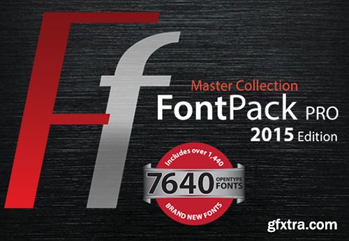
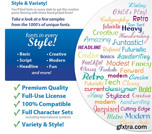
FontPack Pro Master Collection 7640 Fonts
7640 OTF Fonts | RAR 929 MB | Sale Page
- Fonts can be a very powerful tool when properly used in a design project or a website. Different fonts send out different messages or emotions, making them a very important aspect in a project. But there’s a big issue regarding them – the price. A good set of fonts for commercial use can create serious holes in your budget.Wanting to help you, we’ve partnered with the guys from SummitSoft to bring you FontPack Pro Master Collection with 7,640 OpenType fonts!

XXII HandTypeWriter Font Family
OTF | 4 Fonts | JPEG Preview | 4.1 Mb RAR | SALE PAGE
- If you liked the XXII Marker you may like this small family too. The HandTypeWriter is, like the name might suggest, a playful handwritten typewriter font. And as already known from XXII Marker is this cool letter-replacing “Contextual Alternates” feature replacing every second glyph by an alternate character. This gives the HandTypeWriter a more natural and handwritten look. Just check it out.
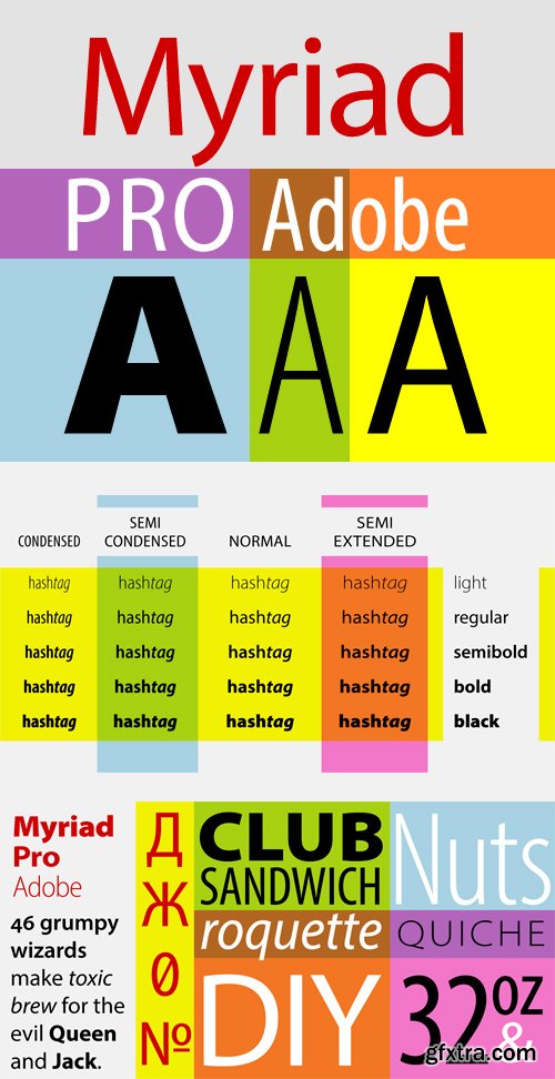
Myriad Pro Font Family
OTF | 40 Fonts | 2.2 Mb RAR | SALE PAGE
- An Adobe Originals design first released in 1992, Myriad has become popular for both text and display composition. As an OpenType release, Myriad Pro expands this sans serif family to include Greek and Cyrillic glyphs, as well as adding oldstyle figures and improving support for Latin-based languages. The full Myriad Pro family includes condensed, normal, and extended widths in a full range of weights. Designed by Robert Slimbach & Carol Twombly with Fred Brady & Christopher Slye, Myriad has a warmth and readability that result from the humanistic treatment of letter proportions and design detail. Myriad Pro’s clean open shapes, precise letter fit, and extensive kerning pairs make this unified family of roman and italic an excellent choice for text typography that is comfortable to read, while the wide variety of weights and widths in the family provide a generous creative palette for even the most demanding display typography.

OTF | 26 Fonts | JPEG Preview | 6.2 Mb RAR | SALE PAGE
- Metro Nova comprises seven weights, from ultra thin to extra black in regular proportions, and six weights as condensed designs. Each has an italic counterpart for a total of 26 fonts. The family is available as OpenType® Pro fonts, which provide for the ability to easily insert typographic features such as ligatures, fractions and alternate characters. Pro fonts also offer an extended character set to support most Central European and many Eastern European languages.

PF Bague Slab Pro Font Family
18 OTF | WoFF | 1.2 MB | Sale Page
- PF Bague Slab Pro draws its inspiration from early 20th century slabs and was designed as a companion to Bague Sans, a versatile monoline typeface with a distinct and eye-catching personality. Following its predecessor’s design guidelines, it overcomes the monotonous and mechanical rigidity of early geometrics by introducing subtle variations in stroke width and semi-wedge serifs rather than square slabs. These striking serifs, along with a mixture of attractive letterforms, exude a strong, modern and energetic personality at display sizes. On the other hand, at small sizes these distinct characteristics become subtle and the simplistic geometric personality of the typeface comes in place to offer a highly readable text.Bague Slab Pro is a very clean and legible typeface with a warm and well-balanced texture which is ideal for editorial design, branding and corporate identity. This superfamily includes 18 weights from Hairline to Ultra Black with a consistent and well-refined structure. The italics are slightly narrower than the romans with cursive characteristics. Each style consists of 718 glyphs with 13 opentype features and an extended set of characters which supports simultaneously Latin, Cyrillic and Greek.

PF Bague Sans Pro
OTF | 18 Fonts | 1 Mb RAR | SALE PAGE
- PF Bague Sans Pro is a versatile monoline typeface with a distinct and eye-catching personality. Despite its inspiration from early 20th century geometrics, it diverts from the mechanical rigidity of those typefaces by incorporating humanist characteristics, such as subtle variations in stroke width and open counter shapes with vertical endings. This is a very clean and legible typeface with a warm and well-balanced texture which is ideal for intense editorial use in magazines and newspapers. Bague Sans’ most remarkable feature is its vast array of uppercase alternates and ligatures which truly shine when set at display sizes. This typeface is automatically transformed into a flexible, charming and stylish typeface with strong modern aesthetics. From classic to modern, from excessive to neutral. Bague Sans Pro is a multipurpose typeface which offers enormous possibilities and variations for editorial design, branding and corporate identity. Bague Sans Pro signifies freedom and personal style. This superfamily includes 18 weights from Hairline to Ultra Black with a consistent and well-refined structure. Each style consists of 1063 glyphs with more that 330 alternates and ligatures and an extended set of characters which support simultaneously Latin, Cyrillic and Greek.

Futura ND Font Family
- Futura does give a restful, almost bland impression, which accords with Renner’s objectives. Futura seems classical, not only due to the form of its capitals, but also to the open, wide forms of the geometrical small letters. The typeface relies on notions of classical, yet contemporary form — harmony and evenness of texture.Futura ND was completely digitized anew from the original sources of the Bauersche Giesserei, now held by Bauer Types in Barcelona. Thanks to the modern digital technology Futura lives on in a greater variety than ever, offering a wide choice of typographic solutions for contemporary design in the new millennium.

Australis Pro Font Family
6 OTF | JPEG Preview | 7.1 Mb RAR | SALE PAGE
Australis is a hybrid roman font that won first prize
in the Morisawa International Type Design Competition in 2002.
After 10 years the family is finally complete and
its release coincides with the reopening of the competition in 2012, in Japan.
Designed by Francisco Gálvez Pizarro.

OTF | 48 Fonts | JPEG Preview | 14.9 Mb RAR | SALE PAGE
- It’s time to kick off your shoes and feel the “sans” between your toes. Like Cabrito Inverto, its stress-reversing cousin, the new Cabrito Sans serves up something nice and cool in the heat of the project. A quick recap: the original Cabrito is an insigne Design slab serif produced for the kid’s book The Clothes Letters Wear. It’s been pretty well-received--even more than I expected. I promised to grow the family with a free-standing inverted style that could pair well with Cabrito. (See Cabrito Inverto.) Now, I'm rounding out the family with this well-crafted sans. And so now, Sans is where it’s at. Strip away the serifs of Cabrito, and you have a laid back, rounded sans serif alternative served up over easy. This handwriting-inspired creation--like its relatives--is definitely not uptight about its forms (though not afraid to show them off a little). Cabrito Sans' whole pack of alternates is accessible in any OpenType-enabled program. This kiddo consists of a workforce of alternates, swashes, and alternate titling caps to give the font a little extra sweetener to its flavor. Also bundled are swash alternates, old style figures, and compact caps. Check out the interactive PDF brochure to test out each these options. This font family members also consists of the glyphs for 72 various languages. Cabrito Inverto and Cabrito do pair nicely with Cabrito Sans (in case you doubted). Use Sans--or all three of these amigos--to express friendliness on just about anything: food, candy, toys, cars (if you're feeling bold). Don't wait, though. Purchase Cabrito Sans today, and bring a one-of-a-kind look to whatever your computer’s next design party is.


https://www.myfonts.com/fonts/insigne/cabrito-serif/
- The Cabrito family is making a statement again. Launched as a supplement to the children's book, The Clothes Letters Wear, the original Cabrito is carefree, fun and easy on the eyes. Now, by balancing this friendly connection with new elegance, Cabrito Serif arrives: attractive copy text with an extra sophisticated sensibility incorporated into the design. Still bright and playful, this new Cabrito is cleaner and leaner, ensuring that its polished appearance retains legibility.

- A graceful kid if ever you’ve seen one, Cabrito Didone joins the Cabrito family of fonts--a family designed to provide young infants with clear recognition of letter forms. The original letters were released as part of the children’s book about fonts, The Clothes Letters Wear.Now, this latest addition brings a new Didone flavor to the table. But don’t judge the book by its cover. While Didones can be stodgy in the way they deliver a sense of luxury, this stubborn goat of a Didone bucks the stodgy stereotypes with its high-contrast, carefree, flowing fun, taking a more calligraphic direction than most. Cabrito Didone joins structure and handwriting to create a flowing balance of both characteristics. It’s a unique combination of functional and friendly. Its 46 well-designed fonts give you plenty of easy-going, highly readable options to work with as you craft your design.Cabrito Didone supports OpenType features and is packaged with upright obliques, alternates, ligatures, old-fashioned figures, and compact caps. Preview any and all of these features in the interactive PDF manual. The family member font also includes glyphs for 72 languages; over 600 glyphs per font await. Cabrito Didone is an excellent choice for websites as well as flyers and packaging. Like Cabrito, which is currently used by a number of visible brands, Cabrito Didone is also a great option for defining your brand.

Cabrito - Typographic Legibility for Children
OTF & TTF | 48 Fonts | JPEG Preview | 8.2 Mb RAR | SALE PAGE
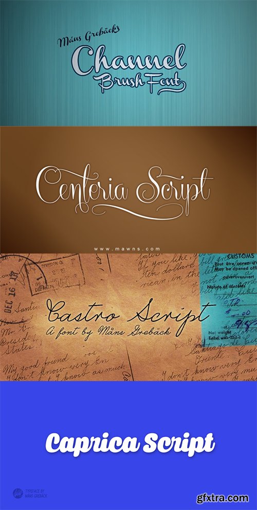
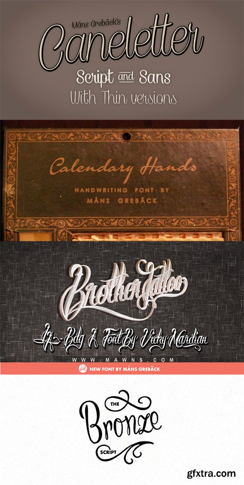
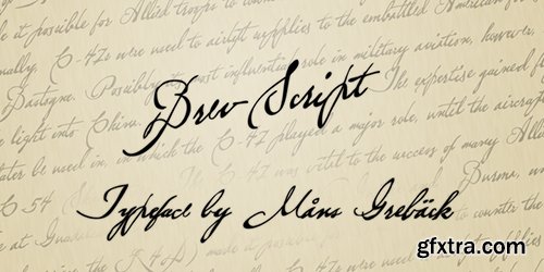
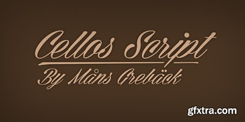
GFXTRA Font Bundle 3 - 18 Fonts 1062$
OTF | 6.7 MB
Channel Centeria Cellos Script Castro Script Caprica Script Caneletter Script Calendery Hands Brother Tattoo Bronze Script Brev Script Brannboll Blockography

Aguda Stencil 8xOTF
OTF | 8 Fonts | JPEG Preview | 3.2 Mb RAR | SALE PAGE
- Aguda Stencil font family is the stencil version of the Aguda font family and has been designed for Graviton Font Foundry by Pablo Balcells in 2014. Aguda Stencil consists of 8 styles. The 4 “Stencil 1” styles contain a narrow stem for big sizes type and/or rigid materials printing, and the 4 “Stencil 2” styles contain a wide stem for small sizes type and/or light materials printing.

Invitation Script - Maiscule Initials & Ornaments 4xOTF
OTF | 4 Fonts | JPEG Preview | 9 Mb RAR | SALE PAGE

Samui Script OTF
OTF | 1 Font | JPEG Preview | 4.1 Mb RAR | SALE PAGE
- Named for the island that I've had the pleasure of calling home for over a year now, Samui Script is a lovingly made, hand-lettering-style, script font, with a bouncy baseline and exuberant character. Taking mid 20th century commercial lettering as its inspiration, it is no revival, or pale imitation of past forms. This font can be as contemporary as you need it to be, or as retro, or somewhere inbetween. A wealth of sophisticated OpenType features lie beneath the bouncy exterior, making for a versatile script font that performs well at headline sizes, but is also legible enough to set small amounts of copy. See the user guide in the gallery section for a comprehensive overview of features, and see if you can resist the urge to have your own personal sign-writer living inside your computer.

Neon Bugler - No Sharp Corners, All Gentle Turns OTF
OTF + TTF | 1 Font | JPEG Preview | 8.7 Mb RAR | SALE PAGE
- Neon Bugler is a font based on the third logo created by Harry Warren in early 1975 for his sixth grade class newsletter, The Broadwater Bugler, at Broadwater Academy in Exmore, Virginia, on Virginia’s Eastern Shore. This font design has these principles as its parameters: The letters generally follow what would be natural stroke directions; no sharp corners, all gentle turns; no lines back up over each other, cross each other, or run into each other. All of this civility between the lines produces an unintentional but welcome neon quality about it. This font can have a variety of vibes depending on its context--it has a certain nostalgia to it, yet it also has a slick, clean, futuristic look. It can even be used in a semi-grunge setting.

WeGraphics - Statik: A Bold Style Font Kit
OTF | TTF | 148 Kb | SALE PAGE
Statik is a bold font face with a hint of static via radio transmission.
This font is great for creating a tech look to your designs.
The incredible background photo is provided via the US Army's photo stream.
- In order to comfortably and with maximum speed to download my files, I recommend you get premium access to the file-sharing services such as Letitbit and Secureupload (listed below). When you use the premium access, download speed is limited only by your communication channel. We also strongly recommend to buy a premium-only access to the sites of file-sharing services, the only way you're guaranteed to not be deceived!

Ronnia Font Family Complete
- One of the most remarkable characteristic of this humanistic sans serif is its versatility. Ronnia’s personality performs admirably in headlines, but is diffident enough for continuous text and small text alike.The heavier weights deliver very cohesive shapes, and they have been successfully used for branding and newspaper headlines. Its ten styles grant the designer a broad range of coherent color and texture variations in text blocks, necessary tools to solve complex information and editorial design problems. Ronnia has been mainly engineered for newspaper and magazine applications manifested in its properties: economic in use, highly legible, and approaching the reader with some friendliness and charm. Ronnia features about 800 characters per weight, including small caps, fractions, old style and lining numbers, scientific superior/inferior figures, and a set of symbols and arrows. It supports over 40 languages that use the Latin extended alphabet.Ronnia Basic is a reduced version of Ronnia. It is still an OT-font but without any particular features except of a set of ligatures, class-kerning and language support including CE and Baltic.
Top Rated News
- CreativeLive Tutorial Collections
- Fasttracktutorials Course
- Chaos Cosmos Library
- MRMockup - Mockup Bundle
- Finding North Photography
- Sean Archer
- John Gress Photography
- Motion Science
- AwTeaches
- Learn Squared
- PhotoWhoa
- Houdini-Course
- Photigy
- August Dering Photography
- StudioGuti
- Creatoom
- Creature Art Teacher
- Creator Foundry
- Patreon Collections
- Udemy - Turkce
- BigFilms
- Jerry Ghionis
- ACIDBITE
- BigMediumSmall
- Globe Plants
- Unleashed Education
- The School of Photography
- Visual Education
- LeartesStudios - Cosmos
- Fxphd
- All Veer Fancy Collection!
- All OJO Images
- All ZZVe Vectors
- CGTrader 1 CGTrader 2


