

Tanger Serif Font Family
TTF | 48 Fonts | JPEG Preview | 6.9 Mb RAR | SALE PAGE
- Inspired by New Transitional and Egyptian fonts Tanger Serif has elements of a sturdy work-horse text face and finely detailed headline font. A wide variety of widths and weights support many text sizes. Typically Narrow is used in headlines, Medium in body and Wide in smaller print. Nothing is predefined, though. By combining the right widths with the right weights this traditional approach can easily be challenged. Let’s take an oversized (over 10 pt) body copy for instance. In conjunction with using a bigger size to enhance readability, a narrow and slightly lighter weight will save space and brighten text color. Tanger Serif Narrow is a slim normal rather than a condensed face. As an Open Type “Pro” font each weight includes an expanded character set, small caps, old style figures, tabular figures, ligatures, fractions etc. All these are easily accessible through OpenType features.

Bardot Font Family
OTF | 3 Fonts | JPEG Preview | 4.1 Mb RAR | SALE PAGE
- Bardot is a versatile swashed type family that combines modern elegance with technical structure. It features swashed alternate caps, as well as various ligatures and alternative characters. Uppercase swash alternates can be applied to all characters or just the first of each word. These alternates can be accessed easily through any OpenType-enabled application for specific needs. Bardot works best as a display font at large sizes but is equally adept to paragraphs of text or small pull quotes. Graceful, curvaceous and attention seeking, Bardot offers elegance and charm in abundance.

JollyGood Sans Font Family
OTF | 12 Fonts | JPEG Preview | 5 Mb RAR | SALE PAGE
- Finally, a serious alternative to that other comic font. After years of mocking the font that shall not be named, I decided to create an alternative. I wanted to keep the fun feel and the comic book roots, but have a more polished look. The result? JollyGood, a complete font family, with great language support, a big range of weights and styles, and a friendly look.


Roihu - For Titles, Packages & Logos
OTF | 16 Fonts | JPEG Preview | 5.2 Mb RAR | SALE PAGE
- Roihu is a sans serif type family of 16 fonts. Consisting of eight upright and eight italic weights. Each weight has over 1,100 glyphs. It includes some groovy stylistic alternates and swashes of which you can use to make your titles, packages, logos etc. to pop out. Roihu has also small caps, old style and lining figures, ligatures to make sure your text and design is not going to be boring.

Niveau Serif Font Family
OTF | 18 Fonts | JPEG Preview | 6.9 Mb RAR | SALE PAGE
- Niveau Serif - the companion of Niveau Grotesk - is a type family of six weights plus matching italics & small caps. It was designed by Hannes von Döhren in 2013. Influenced by classical nineteenth century engravers faces, the fonts are based on geometric forms. Niveau Serif has a contemporary feel and combines the clearness of a Sans with the elegance of a typeface with serifs. Niveau Serif is equipped for complex, professional typography with alternate letters, arrows, fractions and an extended character set to support Central and Eastern European as well as Western European Languages.

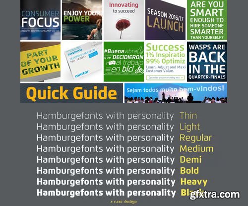
Flexo Font Family - 16 Font $800
OTF | 1.78 MB | Sale Page
- Flexo is a geometric sans typeface, with humanistic warmth. It is a synthesis of the geometric and the humanistic. It has both mathematical straightforwardness, and humanistic refinement.Flexo has a squarish design, making it stand out in many uses. It will shine in both headlines and text. It is well suited for graphic design and corporate identity design. Flexo has sixteen styles, extensive language support, eight different kinds of figures, sophisticated OpenType features — so it’s ready for advanced typographic projects.

Quan Slim Font Family
OTF | 30 Fonts | JPEG Preview | 4.9 Mb RAR | Sale Page
- The typeface of Quan Slim is based on the successful Quan font family by font foundry Typesketchbook. Font designer Chatnarong Jingsuphatada created Quan Slim as a condensed version to Quan. Both type families consist of eight weights plus obliques and additional rounded versions. Quan Slim’s typeface has a clean and modern sans serif appearance. This modern geometric font is very legible and can be used for headlines as well as small and long text.


Typonil Font Family
OTF | 8 Fonts | 4.3 Mb RAR
- TYPONIL Font Family includes eight fonts in four weights; normal and italic. The font family is characterized by its rounded corners, soft views thanks to its optimized kernings, esthetical design and great legibility in both big and small type size. With TYPONIL Font Family you can create good works on the web as logos, texts, your presentations etc. and also in prints as posters, t-shirts, magazines, affiches. Because of its eye-pleasing style, TYPONIL is effective and useful.

Barbieri Font Family
OTF | 6 Fonts | 3.7 Mb RAR | SALE PAGE
- Barbieri is a casual sans type family, based on a German lettering style from the 1960s. The original hand-drawn alphabet was used in a rather peculiar edition of Der Barbier von Bagdad, an opera composed by Peter Cornelius. Our efforts to identify the cover designer have been, so far, unsuccessful. As fans of informal typography and popular lettering styles, we thought these few thin letters deserved a re-incarnation as a complete type family. Andrés Torresi and Marta Sánchez Marco were in charge of the production work. Now Barbieri has 6 weights suitable for packaging, posters, and music covers. It resembles a certain ‘Americana’ spirit, though with a Germanic twist.

Festival Script Pro Font
OTF | 184 KB | Sale Page
- Festival Script is a logical evolution within the deco script territory previously explored by Koziupa and Paul in efforts like Aranjuez, Bellas Artes, Heraldica and Tanguera. In Festival Script, strong bilinear contrast and ornamental swashes combine to convey a sense of modern luxury. This combination echoes the current trend in consumer goods of elevating simple, everyday products to objects of desire.Festival’s basic structure is the familiar Koziupa aesthetic of tapering stems and sharp endings, but this time informed by a more geometric sensibility. A wide variety of thin, ribbonlike strokes add a beautifully ornamental feel, evoking Argentine “filete” motifs. Almost every letterform includes multiple alternates, providing design possibilities from minimal to exuberant.Festival Script Pro is loaded with alternates, swashes, endings and Latin-based language support.

Brevia Font Family 14XOTF
OTF | 14 Fonts | JPEG Preview | 4.8 Mb RAR | SALE PAGE
- Type designer Hannes von Döhren created Brevia, a soft sans serif type family consisting of seven weights plus matching italics. The fonts have a hint of a brushed feeling and come across as casual and friendly. Nevertheless Brevia’s architecture is straight, making it perfect for longer texts. Because of its large x-height, it also performs nicely in very small sizes. Brevia’s heavier weights are slightly more curved and have an eye-catching appearance. They unfold their strength especially in bigger sizes. This contemporary type family is intended to be used in applications like: Cosmetics, Service, Food and Advertising – basically everywhere where a pleasant feeling should be conveyed. Brevia is equipped for highly professional use. The OpenType fonts have an extended character set to support Central and Eastern European as well as Western European languages. Each font includes small caps, fractions, old style-, lining-, tabular numbers, scientific superior/inferior figures and a set of arrows.

Lytiga Pro Font Family
OTF | 48 Fontrs | JPEG Preview | 4.8 Mb RAR | SALE PAGE
- Lytiga Pro is a modern sans-serif typeface with a pronounced techy feel. The family contains 48 fonts: 8 weights from thin to black, 3 widths, and italics. Each font includes a variety of OpenType features: four sets of digits, superior and inferior digits, slashed zero, and a full set of small caps. Rich language support includes all the main Latin-based languages as well as Cyrillic script. The rhythm and character of the typeface makes it suitable for both display and text use.


Galea Display Font Family
OTF | 8.73 MB | Sale Page
- Galea is a slightly condensed serif typeface with long extenders. Its elongated proportions and graceful terminals seek to bring femininity and elegance to any layout. It is a display face that works well at large sizes in editorial contexts as a headline, titling or introduction to a text. Galea was designed by Isabel Urbina Peña while at Cooper Union’s Type@Cooper Extended Program, 2012 and released on May, 2014.Galea obtained an Honorable Mention from the Fine Press Book Association in the Text Family Category, 2013. Also, it is featured in the book "Playing with Type: 50 Experiments" by Lara McCormick, Rockport Press, on Parenthesis Magazine, Autumn 2013 on Behance’s Typography Served and will appear on “Typography Magazine”, Japan (Nov 2014).

Slim Tony Font Family
OTF | 3 Fonts | JPEG Preview | 3.9 Mb RAR | SALE PAGE
- Slim Tony is a delicious script font. Tony is a distant relative of Mishka but much bolder and more extravagant. Slim Tony works superbly for custom headlines and logotypes. Turn on Swash, Stylistic or Contextual Alternates for some serious extra kick. Activate small caps for clear capital letters designed to work perfectly with the script. Slim Tony’s ornaments is a set of over one hundred swooshes, swashes, ornaments and pictograms.


Adios Script Pro
OTF | 8.18 MB | Sale Page
- Romantic, decorative Adios Script is one of Alejandro Paul’s most elaborate and technically refined faces to date. Inspired by designs in “how-to” commercial lettering guides of the 1940s, it has been refined and brought into the 21st century through a huge variety of ornate swash letterforms. The lowercase “h” alone offers 43 variants. Hundreds of ornamental ascenders and descenders allow a beautiful interplay of strokes and combinations, while avoiding overlaps or conflicts. Adios Script features a mind-boggling 1,470 characters in total, in OpenType format. Adios Script received a Certificate of Excellence from the Type Directors Club.

Heron Sans Font Family
OTF | 20 Fonts | JPEG Preview | 4.1 Mb RAR | SALE PAGE
- Steadfast and no-nonsense, Heron is always ready to go to work. It began with a Joe Heroun commission for Men’s Health inspired by industrial, machine-made letters. Unlike other type with mechanical influences, Heron is a refined, versatile family, capable of doing the job in both headlines and small text. Heron Serif and Sans are born of hard iron and steel, but galvanized with Cyrus Highsmith’s warmth and energy.

Nauman - Highly Legible Font Family
OTF | 20 Fonts | JPEG Preview | 6.6 Mb RAR | SALE PAGE
- A modern humanist sans serif made for the screen. Broad open letter forms are combined with precise geometry to create a functional and legible font that’s ideally suited to the web and on-screen applications. To reinforce readability and create more distinction at small point sizes serif like details have been drawn into uppercase ‘I’, ‘J’ and lowercase ‘i’ and ‘j’. Other characters of distinction include a serifed number 1 and a crossed out zero. Nauman is a highly legible font family aimed at large interface based projects. Details include over 800 characters with alternative lowercase a, e, I and M. 7 variations of numerals, true small caps with accents, manually edited kerning and Opentype features.

Tabac Micro Font Family
8 OTF | 1 MB RAR | SALE PAGE
- When they say everything’s already been invented, they’re exaggerating a bit. But not much. When we design new typefaces, whether we like it or not, we have in our memories the historical legacy and invention of our predecessors.
- That’s also true for more detailed work on optical sizes, intended for the largest or the smallest typesetting. Although for display sizes we give room for fantasy and elegance when shaping fine serifs or smooth drawings full of refined details, for styles designed for footnotes and other small texts we do the exact opposite – pragmatically and rationally, with knowledge of the optical properties of small text. And that’s precisely the case for the Tabac Micro subfamily, a sans-serif typeface derived from Tabac Sans.

Tabac Big Glam Font Family
16 OTF Font Files | Previews | PDF | RAR 4 MB | SALE PAGE
- Tabac Big Glam probably stretches the Tabac super-family’s boundaries the furthest. While it’s based on the serif version, it achieves an especially surgical cleanliness and extremely sharp typesetting by completely letting the serifs go. Despite this, the text isn’t boring for a moment — the angled cut of the stems on b, d, h, k, l, the open loop on g or the rounded variant of the italic y, which can be called by turning on the stylistic set, reliably banishes any suspicions of the letters’ monotony.

Tabac Big Sans Font Family
16 OTF Font Files | Previews | RAR 3 MB | SALE PAGE/
- Those who have grown tired of text typefaces insensitively blown up to the size of a poster or a building facade should from time to time try out extreme display styles, which are designed precisely for this purpose.
- They look best in dimensions from around 32 point out to infinity, and they rise to the occasion when a strong impression is necessary. This is especially true for the extreme weights Hair and Black, which don’t allow for any compromise. The sharp hairline and brutal contrast of the strokes test the most extreme possibilities, without having readability suffer in continuous text, as is characteristic for all the typefaces of the Tabac superfamily.
- Tabac Big Sans has the distinction of having most of its styles hold up not only in giant sizes, but also in smaller texts, where it’s an obedient little doggie. It actually works like a narrowed linear grotesk with an increased x-height. There’s no limit to fantasy.

Tabac Big Slab Font Family 16xOTF
16 OTF Fonts | RAR 0.9 MB | SALE PAGE
- Eleven out of ten typographers have confirmed that Tabac Big Slab can be used both on the facades of majestic villas and on the most ordinary typesetting of labels and medication package inserts, where it saves both space and tired eyes. Even width compression doesn’t take away from the typeface’s well-distinguished characters, while its huge x-height optically enlarges typesetting in small sizes. Aside from the lightest weights, we can recommend Tabac Big Slab for all applications where there is a lack of space or paper.

Tabac Slab Font Family
OTF | 16 Fonts | JPEG Preview | 5.8 Mb RAR | SALE PAGE
- Tabac Slab was created by combining several contradictory influences, the result of which is a universal linear font. The combination of brisk serifs and refined calligraphic details in the structure of the characters serves to create an original concept that mixes influences from both book and advertising graphics. Serifs aid legibility in long texts, while small drawn details realise their full potential in sizes of twenty-four points and larger. The basis for our Egyptienne was Tabac Sans, with which Slab logically forms a harmonic duo. The addition of bracket-less serifs caused the typeface to thicken and become solidly anchored on the lines, giving a firm answer to all typographers who like to complain about the slight exuberance of grotesque fonts.
126,000 Royalty-Free 3D Model

Udemy Türkçe


Top Rated News
- CreativeLive Tutorial Collections
- Fasttracktutorials Course
- Chaos Cosmos Library
- MRMockup - Mockup Bundle
- Finding North Photography
- Sean Archer
- John Gress Photography
- Motion Science
- AwTeaches
- Learn Squared
- PhotoWhoa
- Houdini-Course
- Photigy
- August Dering Photography
- StudioGuti
- Creatoom
- Creature Art Teacher
- Creator Foundry
- Patreon Collections
- Udemy - Turkce
- BigFilms
- Jerry Ghionis
- ACIDBITE
- BigMediumSmall
- Globe Plants
- Unleashed Education
- The School of Photography
- Visual Education
- LeartesStudios - Cosmos
- Fxphd
- All Veer Fancy Collection!
- All OJO Images
- All ZZVe Vectors
- CGTrader 1 CGTrader 2


