
Harri Font Family 5 Fonts #120
5 OTF | 5 TTF | RAR 7 MB | SALE PAGE
- Harri –“stone” in Basque language– is a display font based on the peculiar letter forms used in signs and fascias all over the Basque Country. This idiosyncratic lettering style, very often used as an identity signifier, evolved from ancient inscriptions carved on gravestones which can still be found in the French part of the Basque Country (Behe Nafarroa, Lapurdi and Zuberoa).Harri takes some of its more significant features from those engraved letter forms, but also from the current overemphasized shapes derived from them, while keeping in sight their antecessors: the Romanesque inscriptions and ultimately the Roman Capitals. Gerard Unger once said “the black version of a font is a caricature of the regular”. This may explain how the odd heavy shapes in use in the Basque Country today might have evolved from their engraved roots, which are already an interpretation of Romanesque and Roman letter forms.

Eolia Font Family
12 OTF | RAR 232 KB | SALE PAGE
- In ancient Greece, the inhabitants of the Aegean islands and the northwest coast of Asia Minor were called "Eolia". Eolia is a family of sans serif fonts that combine grotesque style with certain geometric characteristics. This family composed of six weights harmonically controlled, has blunt strokes, perfectly defined with subtle modulations as a result of careful optical corrections. The control of the counterforms and accurate kerning gives it great readability, personality, aesthetic value and visual impact.

Barberino Font Family

21 Beautiful Fonts Collection
18 TTF | 13 OTF | 6 MB
BUNDLE LIST:
Angelina Script | Berliana Monoline | Better Signature | Dellamonde | Dreamlandfree
Highstories | Hypebeast | MADE Kenfolg | Malina1 | TiffanySans
TiffanyScript | Adelline | Badtaste | Bedebah | Brittaney | Dhanikans Signature
Fibonaccy Journey | Martinesse | Rossela | Sophistica | The Athalita | Zelifa

Shenandoah - Lovely, Flowing
Professional Typography $59
OTF Font File | Designer: Mans Greback | TURKISH SUPPORT
![]()
![]()
![]()
![]()
![]()
![]()
![]()
![]()
![]()
![]()
- Shenandoah is a beautifully crafted script by Måns Grebäck, and is made for lovely, flowing and professional typography. Shenandoah has bold, crisp lines, giving it a rustic and retro effect whilst keeping it sleek and modern. This typeface and a bit of love could be used for fashion, apparel, stationary, magazines, typography, film, books and marketing!

Camphor Pro Font Family - 12 Fonts for €696 and 2 XiaoMi Special Camphor Fonts
12 OTF | 2 XiaoMi Special Fonts | RAR 2.9 MB | SALE PAGE
- Inspired by Edward Johnston's type for the London Underground and Eric Gill's Gill Sans®, Camphor™ is also informed by the European sans serifs typified by Adrian Frutiger. However, Camphor copies neither. It is narrower than Johnston's type and eschews the idiosyncrasies of Gill Sans, making for clean and cool, modern sans serif that lends itself to everything from branding and wayfinding to advertising and editorial design. Nick Job says I wanted to draw a modern, uncluttered sans serif family with classical proportions, unashamedly English but with fewer idiosyncrasies than its influential forerunners. And he succeeds. Despite it lack of embellishments, Camphor resists the sterility of other faces designed on the same premise. It is a lean, self assured, legible, and versatile type, coming in six weights, from thin to heavy, all with companion italics, small caps, alternates, and broad language support.


- Hummingbird is reminiscent of old-fashioned cursive penmanship, the sort learned by endless repetition and found in treasured letters bundled together by silken ribbons or in worn leather-bound ledgers. The aim, across the past few centuries, was a graceful, yet disciplined uniformity. But to the discerning eye, those hours of painstakingly practiced elegant scripts were still, at their essence, thoroughly human, filled as they were with unintentional variations in pressure, contrast, and fluidity. My typeface, Hummingbird, uses technical sophistication to bring us a typeface that is lovely, sensual, airy, personal, and, in its sensitively wrought irregularities, as innately and intimately human as the writer’s hand and pen.


Port Font Family - 6 Font $150
- Port is an experimental Didone typeface with a modern twist, inspired in the well known forms of typography masters such as Bodoni and Didot and the exuberance and elegance of calligraphy typefaces.Port melds the straight lines and strong contrasts of the Didone typefaces with the elegant lines of calligraphy in a geometric way, resulting in exuberant characters with geometric swashes that can be combined in countless ways.The result of this experiment is Port, an unique and rich display typeface meant to be used on big sizes and it’s main perk is the amount of alternative characters it features. Port is Open-Type programmed and includes hundreds of alternates, from swashes to titling alternates, ligatures and stylistic sets with each character having a thin version of itself, giving complete freedom to all your creative needs.Port is available in several flavours: Port Regular, being the base version and featuring the whole base character set; Port Regular Decorated, featuring richer forms and containing more ornamentated and more extravagant characters; Port Medium and Port Medium Regular, designed for the occasions you need a bit more thickness and the decoration variants: Port Ornaments, containing a wide set of elements meant for the creation of fillets, vignettes and fleurons, resulting in an almost infinite number of possible combinations to embellish your designs and Port Words, a set of some of the most common words used in English, Spanish, French, German, Italian and Portuguese.It’s strongly recommended that you use it on big sizes, for better performance you can also set the Photoshop text anti aliasing settings to Strong when you type, for a better understanding of all the uses of Port and the full character list I recommend the reading of the manual.


Uniform Font Family - 18 Fonts 468$
18 OTF | 18 WOFF | RAR 1.6 MB | Sale Page
- Uniform is a multi-width geometric type family designed around the circle. The O of the Regular width is based on a circle, the O of the Condensed width is based on 1.5 circles stacked (with straight sides) and the O of the Extra Condensed width is based on two circles stacked with straight sides as well, and all other characters are derived from this initial concept. This unique idea creates a remarkably fresh type family that bridges the gap between circular geometric typefaces and condensed straight-sided typefaces. Uniform also includes many opentype features like Old Style Figures, Tabular Lining Figures, Alternate characters, Ligatures and more.Uniform was first drawn starting with the Black weight. This careful process allows each character to look consistent and balanced through all weights. As a result, the typeface does not ‘break down’ or lose its form in the boldest weights like many typefaces do.The three widths of Uniform make an ideal type family for a host of various uses. From branding to web design, book covers to signage, Uniform is a very versatile solution to complex typographic needs.


Lugo Font OTF $90
- The font “Lugo” is a heavy typeface designed for use in headlines and caption text.
- Their design has a strong visual impact, a persuasive and seductive personality throughout its organic shapes.
- This is a versatile and expressive font. Lugo can create an appealing atmosphere, conveying a gamut of message and emotions. It is well suited in the jobbing areas like packaging, logotypes, magazines, web pages and advertising, etc.
- Lugo has all the advantages of OpenType features that allow a variety of combinations: You may choose to set types in connected or unconnected ways, being used as body text or headlines for its good legibility, visual impact and accurate kerning. It has more than thousand glyphs: swashes, standard and discretional ligatures, stylistics and contextual alternates, old style numerals, word ending and tails. It has also an extended character set to support Central and Eastern European as well as Western European languages.
- Lugo is a city in northwestern Spain in the autonomous community of Galicia. The Celtic name Lug suggests that it may have been a sacred site. Augustus founded the Roman town of Lucus Augusti in 15-13 BCE following the pacification of this region. It is the only city in the world to be surrounded by completely intact Roman walls.

- YWFT 6x7oct was originally inspired by found maps that were drawn with only octagonal shapes. When creating this typeface, we used different influences such as punch cards and other electronic devices that use systematical circles for readout. YWFT 6x7oct has been used in advertisements by the popular hat store Lidz and for VH1 brand spots.
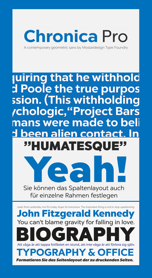
- Chronica Pro is a new contemporary font family focusing on balance and quality for high professional use. Designed with a lot of attention to details and versatility, Chronica Pro could satisfy all kinds of demand such as editorial design, brand creation, graphic design, signage as well as on screen, apps, web sites, ebooks, etc.
- With its 18 fonts. Chronica Pro can be define as a humanist spirit in a geometric body and support an international communication like Central, Western and Eastern European languages.

Caracas Pro - A New Family of Sans Serif Comfortable to Read $435
20 OTF Font Files | Designer: John Moore | Design Date: Jun 13, 2015 | TURKISH SUPPORT
http://www.myfonts.com/fonts/john-moore/caracas-pro/
![]()
![]()
![]()
![]()
![]()
![]()
![]()
![]()
![]()
![]()
![]()
![]()
- Caracas Pro is a new family of sans serif fonts, looking friendly, sweet and comfortable to read. Where text flow between straight lines and round by becoming transparent in the interest of readability. Caracas is ideal for working in small letters and texts of a technical nature. Caracas is a humanistic approach to reading sans forms. Caracas Pro is inspired by geometric shapes, but looking softness and sweetness in the fluidity of forms and spaces, is a balanced mix between straight and curved. Caracas is ideal for reading text, working fine on a small scale. Best for technical texts where legibility is imperative.
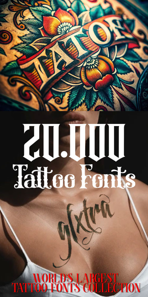
20.000 Tattoo Fonts - Mega Bundle!
Collected 20.214 Fonts in OTF & TTF Types | RAR 599 MB
- Here are just a few sample fonts. With 20,000 tattoo fonts installed into your computer, you will be able to design and print fabulous names, word's or number stencils in virtually any font you could imagine perfectly, the very first time, every time! Just download, unzip and install! Change the size of the font to your desired size and print!
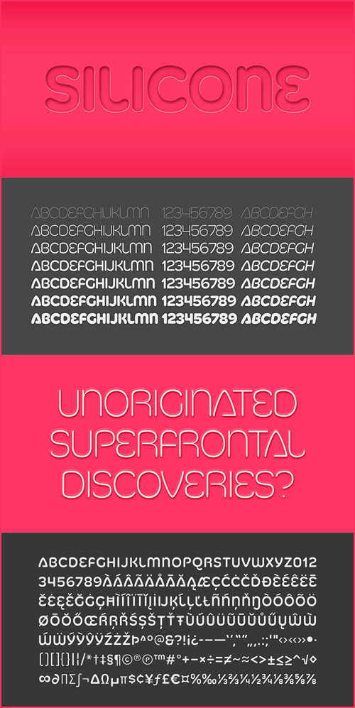
Silicone is a soft, synthetic family of display fonts. Soft ends, soft shapes . . . nobody gets hurt.
Silicone comes in seven weights from chubby to laser thin with italics for each.

Zocalo Text Font Family - 12 Fonts for $210
OTF | 12 Fonts | +Previews | RAR 7 MB | SALE PAGE
- Eduardo Danilo’s dramatic redesign of El Universal, a leading Mexico City daily, introduced Cyrus Highsmith’s Zocalo. The original text, and display series was tuned for distinct character frequency and repetition when set in Spanish. Nicholas Kis’s oldstyle and Chauncey Griffith’s classic newsface Ionic No. 5 inspired the sturdy text while the “energetic character of Mexico City” influenced the display. Among other uses, Zocalo Text is recommended for Newspaper, Magazine and Custom use. Zocalo Text is provided as premium OpenType fonts with professional OT layout features, including both lining & oldstyle figures and small caps, plus extended language support.

Aphrodite Slim Font Family 5xOTF $125
OTF | 5 Fonts | +Previews | 15.4 Mb RAR | SALE PAGE
- Aphrodite Slim Pro is not just a lighter version of its sister Aphrodite Pro. Aphrodite Slim Pro has duplicated the quantity of characters of its partner, and that means more than 500 new glyphs, reaching a total of more than 1000. More delicate and meticulous, Aphrodite Slim Pro is once more a new typography with deep calligraphic ideals: We immersed ourselves into the world of each calligraphy ductus and each calligraphy masters by studying from decoration to lettering books. This was the key for the logic of Aphrodite Slim’s behavior. The new concept of Aphrodite Slim Pro was to join diverse styles of calligraphy in one in order to achieve an autonomous expressiveness, in fact, this is what calligraphy aims to, and we agreed to bring those ideals to the world of typography: It is justifiable to be inspired in hundred-year-old calligraphies, but it is even better if the results you obtain have a plus. A personal plus. During the creation process we were wondering whether it was possible to mix certain strokes of such rigid styles as uncial, (Li·n’s favourite style), with strokes of the copperplate, (Sav’s favourite style), and also to take and mix cualities of cancelleresca cursiva, formata and moderna; finally giving our creation a roman-transition italic look.
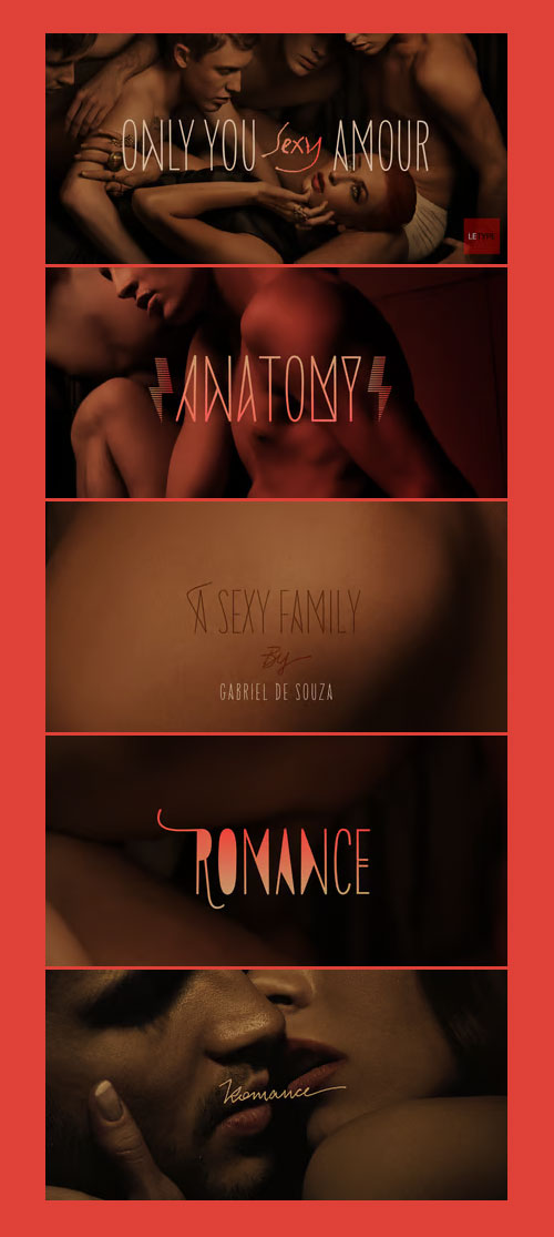
Only You Sexy Font Family - 10 Fonts for $40
10 OTF | 12.9 Mb RAR | SALE PAGE
- Is the real romanticism over? This is not the intention achieved on a creation of the new version of Only You Pro. Develop a font that reflects the perfect union of sensuality and romanticism: Only You Sexy. It has a soft trait and delicated curves that evokes contemporary and musicality while has erotic and sensual references. The icons are a piece of show. They make reference to hipsters concept a recurring nostalgia and a recovery of an almost forgotten romanticism. Bring all that romance back. Bring the sensuality in your work and graphic texts. This font brings back everything that the true romanticism deserves: a font that allows you to write using beauty, sensuality and the sounds from the hearts. Only You Sexy is handmade, stylish, modern and multilingual. With more than 800 glyphs it is possible to get an infinity of combinations at your disposal. The font doesn't have PDF and works better in softwares that support the complete OpenType function.

Sugar Pie Font 79$
OTF | 0.1 MB | Sale Page
- When Candy Script was officially released and in the hands of a few designers, I was in the middle of a three-week trip in North America. After returning to Buenos Aires, I found a few reactions to the font in my inbox. Alongside the congratulatory notes, flattering samples of the face in use, and the inevitable three or four “How do I use it?” emails, one interesting note asked me to consider an italic counterpart. I had experimented with a few different angles during the initial brainstorming of the concept but never really thought of Candy Script as an upright italic character set. A few trials confirmed to me that an italic Candy Script would be a bad idea. However, some of these trials showed conceptual promise of their own, so I decided to pursue them and see where they would go. Initially, it seemed a few changes to the Candy Script forms would work well at angles ranging from 18 to 24 degrees, but as the typeface evolved, I realized all the forms had to be modified considerably for a typeface of this style to work as both a digital font and a true emulation of real hand-lettering. Those were the pre-birth contractions of the idea for this font. I called it Sugar Pie because it has a sweet taste similar to Candy Script, mostly due to its round-to-sharp terminal concept. This in turn echoes the concept of the clean brush scripts found in the different film type processes of late 1960s and early 1970s. While Candy Script’s main visual appeal counts on the loops, swashes, and stroke extensions working within a concept of casual form variation, Sugar Pie is artistically a straightforward packaging typeface. Its many ligatures and alternates are just as visually effective as Candy Script’s but in a subtler and less pronounced fashion. The alternates and ligatures in Sugar Pie offer many nice variations on the main character set. Use them to achieve the right degree of softness you desire for your design. Take a look of the How to use PDF file in our gallery section for inspiration.

Red Benny Font Family - 6 Fonts for $16
OTF | TTF | EOT | WOFF | WOFF2 | 6 Fonts | Demo StyleSheet | 0.73 Mb RAR
- Did you just get hired to redesign the logo of the nickel arcade around the corner from that used Buick dealership? Use Red Benny to give that arcade the italicized, uniwidth, design they’ve deserved all along. Don’t want to waste time creating silly ligatures? Yeah, Benny’s got your back. Don’t believe me? Type out “Dingleberry,” and you’ll see what I mean.

Agmena Pro Font Family - 8 Fonts for $468
OTF | TTF | WOFF | 8 Fonts | 3.7 Mb RAR | SALE PAGE
- Created by Jovica Veljovic, the Agmena typeface family is a fine melding of digital technology and beautifully crafted Renaissance fonts. This typeface makes skilful use of proportion, form and spacing rather in the way that a practiced storyteller varies the timbre of his voice and deftly inserts longer pauses to bring his tale alive.
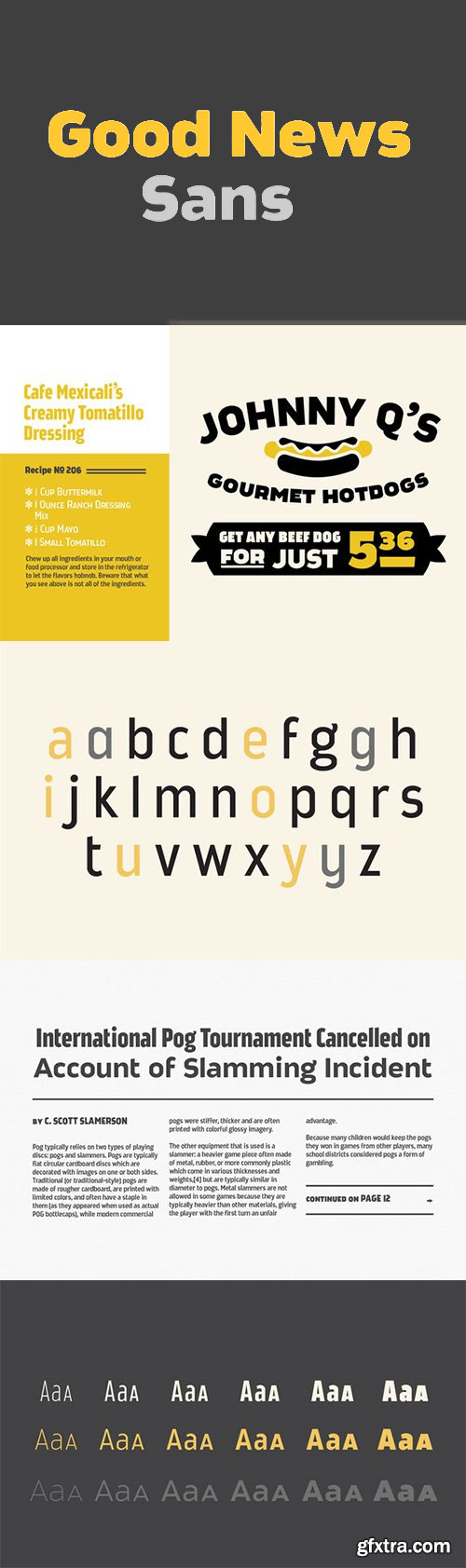
- True writers know there is nothing to writing. All you do is sit down at a typewriter and bleed, according to Hemingway anyway. But when your blood runs dry (as does your scotch), you need your words to show vigor. You need Good News Sans.Good News Sans’ 18 fonts come with 6 weights and 3 widths to complement any of your printing needs. We understand your woodwork brochure needs a sense of grace with a twinge of urgency. Good News Sans includes a full small caps set for that. And don't worry, we know you're working hard on that catalog for Chilean cattle ranchers. Not only does Good News Sans offer wide language support, it has OpenType functions and vintage looking fractions to impress their bookkeepers. Good News Sans even provides arrows, display asterisks, many stylistic alternates, and ordinal catchwords.


Lulo Clean Font Family - 10 Fonts $180
10 OTF | 10 WOFF | 30.5 MB | Sale Page
- Lulo Clean from Yellow Design Studio is the non-distressed version of the original textured Lulo family. It’s friendly, retro, and amazingly 3-dimensional. Endless effects can be created by adding different colors to each of the 5 stackable layers. Lulo Clean is all-caps and includes regular and bold weights and extensive language support.
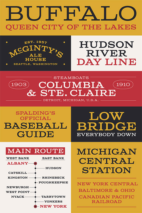
Columbia Titling Font Family - 4 Fonts for $24
OTF | 4 Fonts | JPEG Preview | 3.2 Mb RAR | SALE PAGE
- Columbia Titling is a titling-caps display family based on wide Clarendon-style wood type and industrial signage design from the late-19th and early-20th Century. Columbia Titling includes a small set of OpenType features, including both tabular and proportional figures, special superscript ordinal suffixes, underlined superscript alternate letters, and OpenType fractions. Columbia Titling can have a ‘period feel’ depending on its use, but is fresh enough to use in contemporary designs, like magazine headlines, invitations, or stationery. The typeface — released in four weights — takes its name from the historic S.S. Columbia, a steamboat launched in 1903. Lettering found on the ship’s wheelhouse provided initial inspiration for Columbia Titling.
126,000 Royalty-Free 3D Model

Udemy Türkçe


Top Rated News
- CreativeLive Tutorial Collections
- Fasttracktutorials Course
- Chaos Cosmos Library
- MRMockup - Mockup Bundle
- Finding North Photography
- Sean Archer
- John Gress Photography
- Motion Science
- AwTeaches
- Learn Squared
- PhotoWhoa
- Houdini-Course
- Photigy
- August Dering Photography
- StudioGuti
- Creatoom
- Creature Art Teacher
- Creator Foundry
- Patreon Collections
- Udemy - Turkce
- BigFilms
- Jerry Ghionis
- ACIDBITE
- BigMediumSmall
- Globe Plants
- Unleashed Education
- The School of Photography
- Visual Education
- LeartesStudios - Cosmos
- Fxphd
- All Veer Fancy Collection!
- All OJO Images
- All ZZVe Vectors
- CGTrader 1 CGTrader 2


