

FF Quadraat Sans Font Family - 24 Fonts for $999
OTF + PDF | 24 Fonts | +Previews | 14.8 Mb RAR | SALE PAGE
- Dutch type designer Fred Smeijers created this sans FontFont between 1997 and 2012. The family has 28 weights, ranging from Thin to Black in Condensed and Medium (including italics) and is ideally suited for book text, editorial and publishing, logo, branding and creative industries, small text as well as web and screen design. FF Quadraat Sans provides advanced typographical support with features such as ligatures, small capitals, alternate characters, case-sensitive forms, fractions, and super- and subscript characters. It comes with a complete range of figure set options – oldstyle and lining figures, each in tabular and proportional widths. As well as Latin-based languages, the typeface family also supports the Cyrillic writing system.

Zelda Font for $25
OTF | 1 Font | + Preview | 4.0 Mb RAR | SALE PAGE
- Zelda is a script font with clear characteristics: Feminism & elegant. It is a classy typeface for multipurpose usage: from greeting card, editorial, branding, wedding invitation, etc. Zelda is ideal typeface to make an attractive message or put in some instant beauty to your design by using a bunch of its ornamental characters. Zelda comes with 537 glyphs in total and 362 alternate characters to give some personal characteristics into your design. They were divided into several OpenType features such as Contextual Alternates, Stylistic Alternates, Stylistic Sets, Swash and Ligature. The OpenType features can be accessed by using an OpenType savvy program such as Adobe Illustrator and Adobe InDesign.

MB Empire Font Family - 12 Fonts for $100
OTF | 12 Fonts | +Previews | 2.3 Mb RAR | SALE PAGE
- MB Empire is a font that like MB vintage has its roots in early 20th century design, It has a distinctly english feel with its style references to the classic Gill Sans. It has a very traditional look whilst still maintaining its own modernist individuality. It comes in six weights with italics and has extended language support. With many opentype features including oldstlye & lining figures, automatic fractions and more its a font family that will work for almost any application.
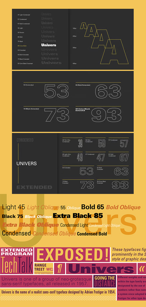
Univers Font Family - 27 Fonts for $548
OTF | 27 Fonts | +Previews | 1.2 Mb RAR | SALE PAGE
- As a student in Zurich, Adrian Frutiger began work on Univers, which would eventually be released in 1957 by the Deberny & Peignot foundry in Paris. The design is a neo-grotesque, similar to its contemporary, Helvetica. With the release of Univers, Frutiger began using numbers rather than names to designate variations of weight, width, and slope. The full Univers family consists of twenty-one typefaces, and Frutiger has used this numerical system on other designs, including Serifa and Frutiger. Linotype also has adopted this numerical system for many other faces. All twenty-one Univers faces were designed to work together, so they can be mixed in a variety of ways. Their legibility lends itself to a large variety of applications, from text and headlines to packaging and signage.

Geomanist Font Family 9xOTF
OTF | 9 Fonts | +Previews | 1 Mb RAR | SALE PAGE
Geomanist font family, this is a cool Sans Serif typeface. Atipo Foundry is this font Author and You can download Geomanist font family freely for your purposes. You can use for logos and banners design, cards, software, applications, branding projects, labels, apparel design and more, with support for most western languages.

Balto Font Family - 16 Fonts for $375
OTF | 16 Fonts | +Previews | 2.6 Mb RAR | SALE PAGE
Balto is an American Gothic built for the 21st Century.
It has a rhythmic typographic texture that pronounces any message
with a confident and approachable tone of voice.
Afrikaans, Albanian, Asturian, Basque, Bosnian, Breton, Catalan, Cornish, Croation, Czech, Danish, Dutch, English, Estonian, Faroese, Finnish, French, Galician, German, Greenlandic, Guaraní, Hawaiian, Hungarian, Icelandic, Indonesian, Irish Gaelic, Italian, Kurdish, Latin, Latvian, Lithuanian, Luxembourgish, Malagasy, Maltese, Maori, Norwegian, Occitan, Polish, Portuguese, Romanian, Romansh, Sami, Samoan, Scots, Scottish Gaelic, Slovak, Slovene, Spanish, Swahilli, Swedish, Tagalog, Turkish, Walloon, Welsh and Wolof.
- I have a longstanding passion for the classic American Gothic typeface style. The style dates back over a century, and like so many things American, its origins can be traced across the ocean and through generations. There have been numerous interpretations of the style, but, frankly, none of them capture the unpretentious, sturdy and versatile soul that I admire so much. I have been working on capturing these attributes in my own version of the style for as long as I have been drawing typefaces. I’m thrilled to finally show the result of my work: Balto. In Balto, I have focused on emphasizing the base ideas of the style rather than particular visual attributes, quirks or artifacts of bygone type technologies. This allowed me to rethink many common assumptions about the shapes of the letterforms and the result is a clean, modern typeface that honors the noble history of the American Gothic. Balto has a carefully considered range of weights from very thin to incredibly heavy, it works equally well in small and large sizes and it works quite well in print and on screen (in fact, you are reading it now). In short, it’s a typeface that you can use every day. Below you’ll find more information about and samples of the various features and styles in Balto. From the first inkling of the idea to the final screen optimization, I loved developing Balto. I am quite proud of the result and I sincerely hope that you find it useful.


Kohinoor Devanagari Font Family 5 Fonts #420
5 Fonts | OTF/WoFF | +Previews | RAR 2.9 MB | SALE PAGE
- Kohinoor Devanagari is an elegant low contrast typeface family suitable for both body and display text. Kohinoor Devanagari comes in 5 upright styles with full support for the conjuncts and ligatures.
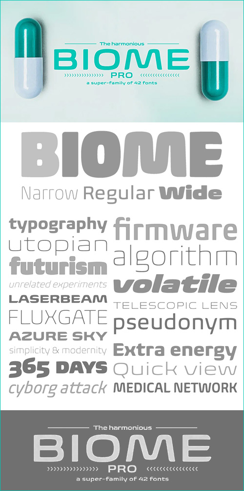
Biome Pro Font Family - 42 Fonts for $2236
OTF | 42 Fonts | JPEG Preview | 2.4 Mb RAR | SALE PAGE
- In the sketches that formed the basis for his typeface Biome, Crossgrove experimented with inner and outer shapes in different styles, adapted letters to the form of the super-ellipse, and added curves only to remove these again. His challenge was to find a harmonious and coherent approach that provided sufficient contrast with existing fonts. Biome is essentially in the sans serif tradition and the letters exhibit only minor variations in terms of line thickness. There is still a suggestion of the super-ellipse at many points, but this never becomes the predominant design factor. While most of the terminals of the vertical strokes are only slightly rounded, the horizontals and diagonals have pronounced arches and it is these that basically determine the round and soft character of the typeface. The more unconventionally shaped letters, such as the lowercase ‘g’ with its two semi-open counters and the ‘k’ and ‘x’ with their crossbars, provide Biome with an individual personality. And this effect is emphasized by the generously rounded links in the ‘v’ and ‘w’ and the uppercase ‘M’ and ‘N’. Biome has been designed as a typeface super-family. From the near hairline Extra Light to the amply proportioned Ultra, there are seven clearly differentiated weights and three tracking widths. There are oblique italic versions of all variants. The range includes small caps and numeral sets containing lowercase and uppercase digits. With its available range of characters, Biome can be used to set texts in all Eastern European languages. Although the remarkable individuality of Biome is most clearly apparent in the larger point sizes, this typeface is not just suitable for producing headlines and logos. Biome’s elegant visual effects mean that it is equally comfortable in short texts while its large x-height and generous counters make it readily legible even in the small font sizes. Biome is a contemporary typeface that employs mid-20th century futurist elements which ironically give it a retro feel.

Irma Text Round Font Family - 18 Fonts for €560
18 Fonts | OTF | +Previews | RAR 2.6 MB | SALE PAGE
- Irma Text Round has been carefully crafted with nuanced curves and a more intimate character than Irma Text. Its edges are round and soft, but the underlying forms are clear and lucid, making it both suitable for display use and legible at small sizes. Each weight behaves differently — the terminals of lighter cuts are completely circular, while the heavier weights are less rounded — yet its appearance is consistent in each weight.

Globe Script Font for $30
OTF | 1 Font | +Preview | 4.1 Mb RAR
- A casual semi-connected script, Eubie Script's letterforms rise and drop to create surprising word shapes, helped by position-specific ligatures and contextual alternates. With tenacious rhythm and dynamic connections, Eubie Script gives power to your headings and overlays.

Zian V15 - NEW Futuristic Techno Font $20
OTF Font File | Publisher: Qbotype

Ruby Red - Playful Font Made with Ink & Brush
OTF Font | Designer: David Kerkhoff | TURKISH SUPPORT | SALE PAGE
![]()
![]()
![]()
![]()
![]()
![]()
![]()
Ruby Red is a playful font, made with ink and a brush.
Ruby Red would look great in ads and packaging.
Comes with a treasure trove of diacritics.


Iosevka Slab fonts
- Iosevka Font Family is a versatile open-source typeface engineered for technical precision and aesthetic flexibility. Designed primarily for coding environments and terminal interfaces, it offers monospace and quasi-proportional variants in both sans-serif and slab-serif styles, ensuring adaptability across programming editors, documentation, and user interfaces. Its slender default glyphs maximize screen space efficiency while retaining clarity, with Extended width options for improved readability. The family includes nine weights, three slopes (upright, italic, oblique), and specialized terminal-optimized versions. Built programmatically for consistency, Iosevka supports 161 languages and features extensive OpenType customization, allowing developers to tailor glyph shapes for personal preference. Combining geometric rigor with subtle organic nuances from its digital-for-metal origins, this typeface bridges functional minimalism with expressive typographic depth.

CF - Wonderful Collection 90 Typefaces Bundle 173xOTF 25790606
90 Typefaces 173 Fonts | OTF/TTF | RAR 36.1 MB
This bundle gathers 90 stunning fonts for you to use in your upcoming projects.

CM - Super Collection Font Bundle
258 Premium Fonts 23629076
258 OTF/TTF Fonts | RAR 27.9 MB SALE PAGE Updated!
- It’s here, the MEGA font bundle! The Super Collection Font Bundle features 258 premium fonts from the designer Balpirik. You do not want to miss the opportunity to add this massive bundle to your font collection. All fonts include Creative Fabrica’s lifetime commercial license.


Sonus Font Family 16xOTF $198
16 Fonts | OTF/WoFF | RAR 2.6 MB | <!--dle_leech_begin--><!--dle_leech_end-->
- Sonus – a new monoline family with dynamic-flow drive. Influenced by early English sans serifs - Powerful and energetic but with some classical features. Its firm structure makes it great for text and demonstrates its lively linearity in displays.
- Sonus comes in 16 styles, in OpenType format and with extended language support. All weights contain standard ligatures, proportional lining figures, tabular lining figures, proportional old style figures, lining old style figures, matching currency symbols, fraction and scientific numerals and arrows.


Quarca Font Family $250
16 Fonts | OTF | RAR 1.9 MB | SALE PAGE
- Quarca’s masculine power runs strong across the page with bold self-assurance and a raw energy that courses through its thick veins.
- Don't think the continuous, smooth geometry of this semi-modular face is captively chained to the grid, though. Quarca has been cautiously optimized to engage the reader’s eye. Achieving an attractive balance to its sturdy design, the open forms of this “rounded square” geometric sans -together with a tall x-height- make the font legible even when using the compact widths. This high-impact typeface definitely doesn't sacrifice versatility for style.
- These compact widths, with their raw heart and strength, are perfect for callouts, while the extended widths provide you with the platform for a punchy and extremely efficient headline. The font has a thinner weight and transcends to an intense bold. The face’s geometric or technological construction also tends to make it right at home on the web.
- The family consists of 36 fonts -six weights plus italics. Where Quarca truly stands out, though, is its wide number of OpenType typographic choices and optional glyphs, allowing you to design your piece with a personal, one-of-a-kind variant touch. These variations consist of Experimental Capitals, Angled Capital Terminals, and “Future Stencil”. In all, you can find more than one hundred of these alternate glyphs.
- Quarca is well-suited for anything you are able to throw at it. Devised for today’s multi-disciplined designer, this clear and infinitely versatile family provides tremendous value to your toolbox.

Cinta Font Family - 20 Fonts for $112
20 Fonts | OTF/TTF/WoFF/WoFF2/EOT | RAR 6.5 MB | Cinta Font Family
- We are really happy to introduce you to Cinta, a brand new elegant sans serif font designed for text. It has a humanistic skeleton, dressed up with a hand-made mechanical suit, which made it rush, audacious. A dedicated tribute to the breakdown of mestizo music rhythm, bright, dreamy but completely real. Full of a broad variety of weights and versions, it’s able to produce subtle changes in the typographic stain. Perfect to make delicate hierarchy both in web and text and show the world their family background undoubtedly. Prudent and thrifty, condensed forms and with a generous x-height, it almost accidentally saves space and avoids being a spendthrift. Discreet even in the italic, slightly slanted to produce a subtle change of look on web use, will make a delightful for the most exquisite users with the audacity of modernity. Classic but not silly. Generous in abundance, with small caps, old numerals, denominators and numerators, fractions, ligatures, all you need to survive in the new modern life of Opentype with elegance. Polyglot, with support for Latin languages, Central European and Cyrillic. A delicate friend who will delight ladies and gentlemen who are discerning анд cosmopolitan.

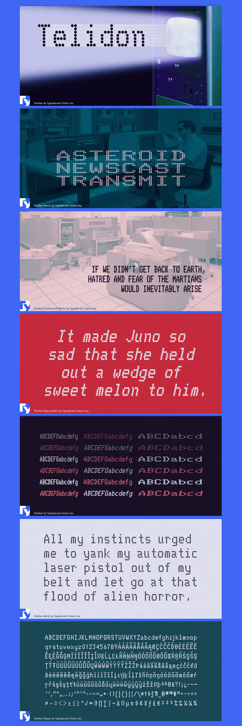
Telidon Font Family - 18 Fonts for $405
OTF + TTF | 18 Fonts | 5.6 Mb RAR | SALE PAGE
- Telidon is an font reminiscent of dot matrix printer fonts of the 1970s and 1980s and are still in use today on retail receipts. Telidon is useful for simulating LED pixel board graphics. If you want a rougher, more authentic dot matrix printer look, Telidon has a sister family called Telidon Ink which has a distressed, inky appearance. The extended styles have doubled pixels, just like the dot matrix fonts of yesteryear.

Plau Font Family - 6 Fonts for $89
OTF | 6 Fonts | +Previews | 1.7 Mb RAR | Plau Font Family
- Futurist typeface from the programming era, Plau is a sans-serif with rounded corner personality and interestingly deliberate lettershapes. Comfortable in headlines, reads surprisingly well in longer passages of text. Includes the following OpenType features: OT All Small Caps, Small Caps, Fraction, Proportional/Tabular Oldstyle and lining figures, subscript and superscript numbers.
126,000 Royalty-Free 3D Model

Udemy Türkçe


Top Rated News
- CreativeLive Tutorial Collections
- Fasttracktutorials Course
- Chaos Cosmos Library
- MRMockup - Mockup Bundle
- Finding North Photography
- Sean Archer
- John Gress Photography
- Motion Science
- AwTeaches
- Learn Squared
- PhotoWhoa
- Houdini-Course
- Photigy
- August Dering Photography
- StudioGuti
- Creatoom
- Creature Art Teacher
- Creator Foundry
- Patreon Collections
- Udemy - Turkce
- BigFilms
- Jerry Ghionis
- ACIDBITE
- BigMediumSmall
- Globe Plants
- Unleashed Education
- The School of Photography
- Visual Education
- LeartesStudios - Cosmos
- Fxphd
- All Veer Fancy Collection!
- All OJO Images
- All ZZVe Vectors
- CGTrader 1 CGTrader 2


