

Verse Sans by Hubert Jocham 14 Fonts $500
14 Fonts | OTF/WoFF | +Previews | SALE PAGE
- The art director of Emotion, a women’s psychology magazine, asked me to design a copy typeface for them. Before I actually got the job I started to work on a serif. I wanted it to be feminine but still clear and modern. On one hand there are the floral round elements and on the other hand the angular serifs. In the composition I wanted the two extremes to work together. All the other elements had to be harmonized. The proportions needed to match the magazine’s requirements. The ascenders and descenders are short enough to work in narrow columns but long enough to work in small sizes. As you can imagine, the emotion-job never happened. In copy you should not get heavier than Heavy. Extrabold and Ultrabold work best in display.
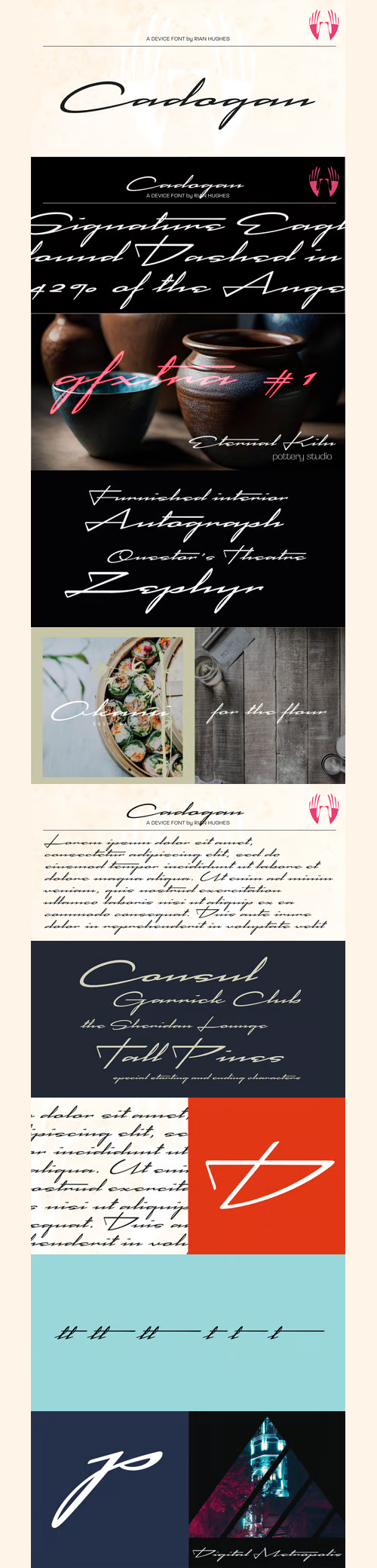
Cadogan Font for $39
OTF | 1 Font | +Previews | 2 Mb RAR | SALE PAGE
- A freeform linking script that uses OpenType programming to replace beginning and ending characters with uniquely designed variants. Also includes ligatures and an extended t-bar carefully designed to not collide with ascenders. (Note: Please view the image above for correct versions of the end and beginning letters, as they will appear in Indesign, Illustrator, etc. The Myfonts previews below are not Opentype savvy, and so these specially designed versions do not substitute themselves.)


Gryffensee Family 4 Fonts $40
- Gryffensee is designed to be the Futura of blackletter, combining the time-honored gravity and relentlessness of the Gothic script with the clean, contemporary freshness of the geometric sans. Built from a tightly controlled inventory of lines, arcs, sharp cuts, and OpenType features, Gryffensee was born and raised in the digital age, yet retains the powerful charisma and human warmth of its mediaeval blackletter ancestors. As a result, it excels in a wide range of display settings, logotypes, and short text. Unlike most conventional blackletters, it even handles all-caps usage with grace, and includes an extensive Cyrillic character set (in the Pro version). Apart from a generous range of automatic ligatures and contextual alternates, Gryffensee offers stylistic alternates that allow users to customize its appearance to their tastes. The capital letters |AGHIKZ| come in alternate cuts that trade traditional shapes for increased legibility, while the letter |s| appears in three cuts, each with a unique, distinct flavor. All these options are accessible through OpenType stylistic sets in the main Latin font, Gryffensee Eins. For easy use in applications without OpenType support, we provide two additional Latin fonts (Gryffensee Zwei and Drei) in which these options replace the default cuts. Finally, Gryffensee Pro offers all the functionality of Gryffensee Eins, plus Cyrillic support. My intention to devise a contemporary geometric blackletter was inspired by four hand-painted letters, |ABCD|, in Sasha Prooducts online portfolio. I later found out that he had, in turn, taken those letters from an existing font, Bastard, by Jonathan Barnbrook. Luckily, by that time my project had taken on a life of its own. Gryffensee is an original design that bears only the most superficial resemblance to Bastard. Gryffensee is a mediaeval spelling of the lake Greifensee near which I grew up. It is pronounced [?gri?f?n?se?], or "GRIEF-un-say" in English approximation. This font is dedicated to Simone.
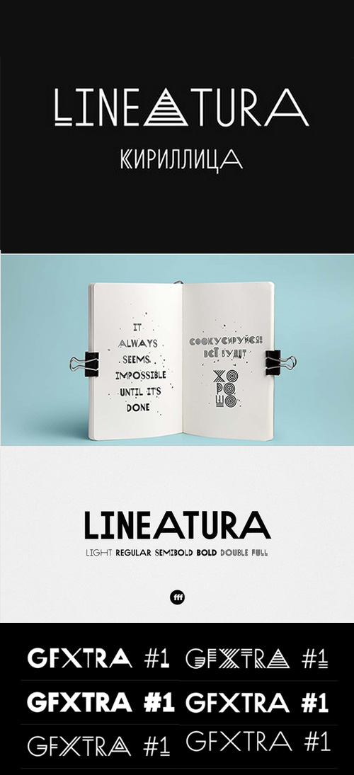
Lineatura Font Family - 6 Fonts for $90
OTF/TTF | 6 Fonts | +Preview | 1 Mb RAR | Lineatura Font Family
Lineatura is a simplistic sans serif caps only typeface with dynamic character width.
All its styles are based around the same skeleton.

Austin Font Family $350
- Originally designed for British style magazine Harper’s & Queen, Austin is a loose revival of the typefaces of Richard Austin of the late 18th century for the publisher John Bell. Working as a trade engraver Austin cut the first British modern and later the iconoclastic Scotch Roman. Narrow without being overtly condensed, Austin is a modern with the styling and sheen of New York in the 1970s. The Light and Ultra weights were added by Berton Hasebe.

Haboro Serif Family 42 Fonts $200
42 Fonts | OTF | +Previews | SALE PAGE
- The polls are in. Now here by customer request--Haboro Serif, the newest edition of the Haboro Hyperfamily. The Haboro fonts are an outstanding upstart success from the first part of 2016. Following the release of the popular Haboro, Haboro Sans and Haboro Slab have both been welcomed additions to the family, too.

Haboro Slab Family 42 Fonts $226
OTF | 42 Fonts | + Previews | SALE PAGE
- Haboro Slab. It’s a nose-to-the-grindstone kind of font like the first of its family. This slab serif pushes through the clutter powerfully in editorial and corporate work such as business websites and software. The Haboro hyperfamily as a whole is known for its ability to make the work clear and simple, even with the fonts’ advanced angle--and Slab is no change here. Consistent with Haboro, too, the simplified geometric features of the slab face just make sense, no matter where you use it. Its timeless wedge-molded serifs give this family the formula it needs to function flexibly in jobs from fashion to packaging. Enhance your output with the font’s wide range of ligatures and alternates, including OpenType alternates. Use Haboro Slab’s large pair of solution glyphs and various other OpenType specifics, too, to give your message the clarity it deserves. Even more, it couples well with the sophisticated didone of the Haboro hyperfamily to further expand your capabilities. Haboro Slab has every quality you need for successful lettering. Use this modification on a classy tradition to mold and shape your next layout, whether website, iPhone app, advertising, or newspaper. There is no work Haboro Slab won’t power through.

Haboro Soft Family 42 Fonts $249
- Take Haboro Soft even farther with its OpenType features. The typeface contains specially shaped small caps and old-fashioned figures--just enough to give your work a unique touch. Of course, for more options, use the entire Haboro hyperfamily to expand your abilities.Enjoy the comfort in knowing you’re choosing a font family equipped with tools for most anything: packaging, branding, web pages, iPhone apps and more. Its simplicity lends itself to achieve perfect results. And yes, your work will even thank you.

Haboro Contrast Font Family $222
- Meet Haboro Contrast, the stylish little sister of the Haboro hyperfamily. While built from the same clean, geometric shapes of Haboro Sans, this new addition has been rebalanced for elegant performance with her high-contrast sans letterforms and has been adjusted to provide the greatest impact for each weight. It’s a personality all her own, gentle in approach yet refined and modern with a confident appearance.Capitalize on Contrast’s style with OpenType features, too. Packed with options like OpenType ligatures, stylistic sets, fractions, crafted small caps and old-fashioned figures, this font will keep your work fresh and attractive. If you need even more combinations for the right statement, use the entire Haboro hyperfamily and create the right balance to capture your reader’s eye.Haboro Contrast (along with the rest of the Haboro family) has been tested for the web and is ready for use in both print and digital applications. Designed to serve as a display character for such publishing projects as magazines and company brochures, Contrast gives you comfort in having a great amount of versatility in the fonts you rely on. It’s a prime example where high contrast simplicity lends itself to achieve excellent design results.

Haboro Sans Family 42 Fonts $249
- Quit trudging through the thick with encumbering fonts, and spring to the front of the pack with the cutting edge sans serif, Haboro Sans. With nothing to clutter up your work, your editorial designs, websites, and software will be sharp and clear.Haboro Sans features simple geometric shapes to help you achieve that perfect effect wherever you use it. Enjoy the comforting reassurance that this multi-tool of a typeface family can work on most anything, including packaging, branding, web copy, and more.Take the simplicity of Haboro Sans a step farther with OpenType features, too. Haboro Sans contains special glyphs like Titling, Small Caps and Oldstyle figures that give your work just enough of a distinct touch. For even more options, use the entire Haboro hyperfamily to expand your capabilities.

Haboro Font Family 54 Fonts $130
OTF | 54 Fonts | +Preview | 8 Mb RAR | SALE PAGE
- Haboro is a powerful workhorse. It’s a neoclassical font developed for numerous uses, ranging from editorial and corporate to web pages and apps. This new face from insigne Design takes a modern twist on the high-contrast typeface genre known as the Didone. Recognized for their ability to convey clarity, the geometric simplification of the Didone genre adds a level-headed rationality to whichever work it’s applied. Didones are used to lend style and sophistication to a wide number of applications--everything from style or cosmetic labels to annual reports. With its unique take on this classic genre, Haboro--with its slight wedge-shaped serifs and unique terminals--is still defined by elegance, tradition and timelessness. Even more to its versatility, this multi-purpose text face features whimsical terminals, which liven up even the most serious texts. If you desire, you can also opt for the more usual ball terminals by activating OpenType alternates. The Haboro family consists of seven weights from a Thin to a Black along with matching italics. The contrast from the letters’ thick strokes and thin strokes draws the eye to your design, making Haboro a powerful visual tool for communicating your message. The typeface also contains numerous ligatures and alternates. Choose between serif variants such as ball terminals or standard serifs by utilizing OpenType alternates. We recommend using the default contextual alternates and discretionary ligatures in order to benefit from all members of this fantastic font family. In addition, Haboro has a sizable set of option glyphs and numerous other OpenType variables to give your text the unique touches it needs. Haboro has all of the attributes you need to undertake your next project. Use its modified elegance to shape and mold your next design, whether a web site, app, branding package, or magazine. You’ll find there’s no job Haboro can’t take on.

Hoban - Swashy Alternates Butter & Jelly $70
OTF | 2 Fonts | +Preview | 4 Mb RAR | SALE PAGE
- The light and the bold. The thick and the thin. Laverne and the Shirley. Peanut Butter and the Jelly. Hoban is about contrast. Hoban wants to be noticed, but only after a second glance. A friend of a friend to the didones, it has smaller, tapering serifs, slightly calligraphic traits, and spindly little terminals that go where they please. It’s a headline face. Period. Set it big and bold. Or light and airy. But preferably next to something with flair. Cuff links, canapés, or corvettes–it’s up to you. Distinct ligatures, ornaments, and swashy alternates provide plenty of character to tailor your style.

ALS Dereza Font Family - 4 Fonts for $63
OTF | 4 Fonts | +Preview | 1.8 Mb RAR | SALE PAGE
- Dereza is a grotesque typeface designed specially for display use in children’s books and magazines. Books for little ones are usually set in grotesques, and a vigorous font would make a nice addition to the main face. Playful and lively, Dereza is great for any non-grown-up design such as games and toy boxes, cookie jars and cereal packs, clothing labels and other things meant for kids. It looks super in speech bubbles. The Dereza family includes four fonts, from light to bold, with ligatures, lowercase figures and accented characters.

Baufra Font Family 6 Fonts for $119
OTF | Web Fonts | Style Sheet | 6 Fonts | +Preview | 1.5 Mb RAR | SALE PAGE
- Baufra is a humanist sans-serif typeface. It is based on the sans-serif typefaces of the early 20th century. A characteristic feature of Baufra is its geometric design combined with an earthy naturalism. Baufra family includes 6 weights, 435 characters, manually edited kerning and Opentype features. It was designed for both display and text usage.


Brando Sans Font Family 16 Fonts
16 Fonts | OTF | +Previews | SALE PAGE
- Brando Sans is the distinct companion to Brando. Like its mate, Brando Sans has contemporary humanist qualities, but which have been simplified with a practicality suited for editorial design, branding, digital experiences, and signage systems. Although simple at first sight, Brando Sans retains the character and charm of its serif counterpart while introducing some unique traits of its own, like the curved ‘l’ or a more symmetrical approach to glyphs like the ‘M’ and ‘W’.


Brando Arabic Font Family 24 Fonts
24 Fonts | OTF | +Previews | SALE PAGE
- The Latin version of Brando, designed by Mike Abbink, balances hard and soft characteristics giving the typeface a refined contemporary elegance. Brando Arabic is an interpretation of these characteristics following the conventions of the Naskh script.

Neue Kabel Font Family 18 Fonts $231
OTF | 18 Fonts | + Preview | SALE PAGE
- Marc Schütz, a type design teacher at the University for Art and Design Offenbach, took on the challenge of updating and re-imaging the original Kabel® typeface design. His goal was to create forms that perform well in modern imaging environments while keeping the original Kabel’s character and charm. Neue Kabel maintains the spirit of Koch’s design, and adds to this the consistent traits and family structure of a 21st century design. Text copy set in Neue Kabel echoes the elegance and playfulness of Koch’s design, while delivering the versatility to shine in a wide variety of hardcopy and interactive environments.

Corporative Sans Round Condensed 32 Fonts $189
OTF | 32 Fonts | + Previews | SALE PAGE
- Corporative Sans Rounded Condensed is the narrowed version of Corporative Sans Rounded that offers high performance when using for text, what makes it the perfect match for Andes Rounded. The font works well at both display and small sizes. Corporative Sans Rounded Condensed is the perfect choice for logotypes, posters, signs, branding, packaging and so on! Corporative Sans Rounded Condensed comes with Latinotype’s standard set of 350 characters, making it possible to use the font in 128 different languages. Corporative Sans Rounded Condensed provides users with a wide range of characters and weights for every project. By combining different variants, designers can achieve the best results. The family consists of 32 fonts: a basic family that includes 8 weights plus italics and an alternative family of 8 weights with matching italics as well. Corporative Sans Rounded Condensed was created by Latinotype Team and developed by Elizabeth Hernández and Rodrigo Fuenzalida, under the supervision of Luciano Vergara and Daniel Hernández.

Museo Sans Condensed Font Family $89
10 Fonts | OTF| Web Fonts | Style Sheet | + Previews | SALE PAGE
- Museo Sans is a full-featured, highly legible sans serif font family designed by Jos Buivenga. Museo Sans sports a familiar look and is based on the popular Museo serif typeface family. Museo Sans has a sturdy, low contrast, geometric design style that works well in both text and display sizes. The Museo Sans font family includes 10 fonts: 5 different weights with matching italics with Western and Central European language support. The OpenType features in Museo Sans includes ligatures, fractions, proportional, tabular lining and oldstyle figures. Museo Sans is a trademark of Exljbris Font Foundry and may be registered in certain jurisdictions.

Klartext Mono Font Family $120
10 Fonts | OTF/TTF | +Previews | SALE PAGE
- Klartext [plain talking, clear words] A modern monospaced type family of 10 weights. Klartext Mono combines a classical monospaced font and modern monolined sans-serif with a humanistic touch. It is characterized by a large x-height, slightly condensed glyphs with well shaped curves and soft strokes.As a special feature, Klartext contains a bunch of uncommon glyphs like the German capital sharp S, a nice arrowset and a ‘complete’ phonetic alphabet (well, 20 letters in IPA Extensions, some more in Latin Basic thru Extended B).


Bajka Font Family 5 Fonts $70
OTF/TTF | 5 Fonts | +Previews | 8 Mb RAR | SALE PAGE | More Detail: Behance
- Bajka (or Fairy tale in English) is a Baskerville font family made for children’s fairy tale books. Originally designed in 2010. Today the family contains Regular, Bold, Italic, Bold Italic, Symbols and Ornaments (Latin, Cyrillic, dingbats, ornamental caps).

Jumlah Arabic Typeface OTF
OTF/TTF | Web Fonts | +Previews | RAR 1.15 MB
126,000 Royalty-Free 3D Model

Udemy Türkçe


Top Rated News
- CreativeLive Tutorial Collections
- Fasttracktutorials Course
- Chaos Cosmos Library
- MRMockup - Mockup Bundle
- Finding North Photography
- Sean Archer
- John Gress Photography
- Motion Science
- AwTeaches
- Learn Squared
- PhotoWhoa
- Houdini-Course
- Photigy
- August Dering Photography
- StudioGuti
- Creatoom
- Creature Art Teacher
- Creator Foundry
- Patreon Collections
- Udemy - Turkce
- BigFilms
- Jerry Ghionis
- ACIDBITE
- BigMediumSmall
- Globe Plants
- Unleashed Education
- The School of Photography
- Visual Education
- LeartesStudios - Cosmos
- Fxphd
- All Veer Fancy Collection!
- All OJO Images
- All ZZVe Vectors
- CGTrader 1 CGTrader 2


