

Mic 32 New Stencil - 8 Fonts Family $160
8 Fonts | OTF | TTF | 1 MB RAR | SALE PAGE
- Mic 32 New Stencil is the third variation of the popular Moretype family Mic 32 New. This stencil version provides an industrial flavour to the futuristic rounded geometry of Mic 32 New. Mic 32 New Stencil still has all the normal Opentype features including small caps, tabular, proportional and old style numerals and ligatures.


Mic 32 New - 8 Fonts Family $160
OTF | 8 Fonts | +Preview | 5.2 Mb RAR | SALE PAGE
- Mic32 New is a revival of the of the original Mic32 released in 2004. Keeping its futuristic appeal, this popular font has been re-drawn from the ground up, with new spacing and kerning. A range of Opentype features have been added, and the new version includes small caps, tabular, proportional and old style numerals and ligatures.
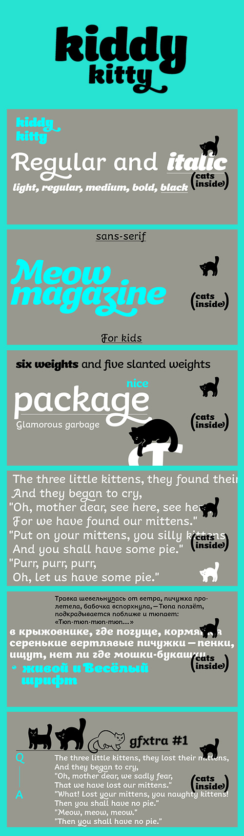
Kiddy Kitty - 11 Fonts Family $49
OTF | 11 Fonts | +Previews | 2.5 Mb RAR | SALE PAGE
- Kiddy Kitty is a soft and friendly sans-serif type family which consists of 6 upright italic and 5 italic weights. It supports Western and CE Latin and Cyrillic, and it also has some ligatures and swashes and 16 carefully drawn cat dingbats in each font. Kiddy Kitty is good for greeting cards, children’s books and package design. It is designed by Vasily Biryukov with some support of Alexandra Korolkova.

Kids Script Font Family 3xOTF
OTF | 3 Fonts | +Preview | 1.1 Mb RAR | SALE PAGE
- Kids Script is based on the calligraphic models used in Spanish’s primary school in the 40’s. The result is a fresh and naive typography perfect for use in children’s oriented publishing. Taking advantage of Opentype functions, it’s possible to get different styles of writing, adding initials, ligatures, contextual characters and alternatives, plus a complete set of uppercase letters. The font contains three different weights for solving the most common issues, working with perfect legibility and readability in all sizes.

Fratello Nick - 14 Fonts Family $100
OTF | 14 Fonts | +Preview | 14 Mb RAR | SALE PAGE
- Fratello Nick is a hand-lettered text with 1160 glyphs to play with. It was inspired by my beautiful red-headed son Nick. There are 15 fonts in the family. Both the Regular and Pro come in a variety of weights: Regular, Bold, Italic and Bold Italic. Also included are fun accessories like Initial Caps, 94 ornaments, 82 frames, two sets of Initial Caps (one allows you to insert special ornaments in the side insets!), a 3-letter Monogram font and three different Split Monogram fonts! (Each one has two different options when you type using upper or lower case... plain, flowers, bunnies, birds and butterflies!) It can be simple and sweet or bring a touch of flair and whimsy to your project with any of its fun alternate letters. There are nine different uppercase alphabet sets! Additional features include: Roman numerals, fractions, ordinals, Greek symbols, all caps and small caps. It also includes Western and Central European, Romanian and Turkish language support.
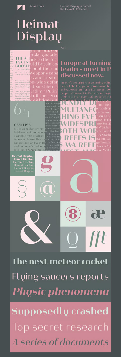
Heimat Display - 72 Fonts Family $300
OTF | WOFF | 72 Fonts | +Previews | 20 Mb RAR | Heimat Display Font Family
- Heimat Display is a typeface family designed for contemporary typography, especially for use in headlines and on posters, but also for reading purposes. It combines an idiosyncratic appearance with the feeling of a grid-based letter construction of the late 20s. Since the design might be too extreme for some applications, Heimat Display’s character set provides different alphabets, the regular one plus alternate designs that comes across as less suspenseful. Heimat Display [873 glyphs] comes in 72 styles and contains extra sets of alternate glyphs, many ligatures, lining figures [proportionally spaced and monospaced], hanging figures [proportionally spaced and monospaced], positive and negative circled figures for upper and lower case, superior and inferior, fractions, extensive language support and many more OpenType features.

Pauline Didone Font Family - 10 Fonts $152
- An Art Deco, script inspired typeface for ‘modern’ times, Pauline Didone is a full type family with a unique and flavorful design. It has a sense of femininity and naïveté that comes from its predecessor, Pauline. It’s a typeface useful for short bits of copy, logotypes and interesting titling. This typeface family of 10 different fonts includes 5 weights and their italics and a wide range of OpenType alternates. The original Pauline was inspired by and has a strong influence from retro scripts. The typeface is geometric, formed with deliberate contrasting brush strokes and a ostentatious flair. Pauline Didone’s high contrast strokes give it a very interesting look that is up to date with latest design trends and very useful for today’s design environment. Pauline Didone pairs nicely with the original sans-serif Pauline. The typeface family also includes a full array of alternate forms, including over 150 alternate characters. These alternates can be accessed by activating OpenType features and style sets.

Foral Pro - 8 Fonts Family $187
OTF | 8 Fonts | +Previews | 3.3 Mb RAR | SALE PAGE
- Foral Pro is an economic slab serif typeface designed for text and caption sizes. It features pronounced ink-traps that open the insides of some of the letters, to avoid the clogging of black, and allow for more condensed shapes. The serifs are shorter than usually seen in slab serif fonts. They function more as a reinforcement of the stroke ends, making the letter shapes clear and distinct, while attaining a clean sans-like feeling in text settings. To also look good on bigger sizes, the ink traps were carefully rounded to be a pleasant counterpoint to the geometric rigidity of the predominant straight lines. For more sophisticated typesetting, Foral Pro comprises eight fully featured OpenType fonts, including small caps, eight figure styles, superscript letters and discretional ligatures.

Nobel Font Family - 18 Fonts for $522
OTF | 18 Fonts | +Preview | 1 Mb RAR | SALE PAGE
- Nobel offers personal variations on strict Bauhaus geometry. In 1929, three years after the Futura release, Sjoerd Henrik de Roos at Amsterdam explored alternative character sets to enliven basic Futura forms. The Nobel series was designed for Font Bureau by Tobias Frere-Jones, who fondly views Nobel as ‘Futura cooked in dirty pots & pans. The Extra Lights were added by Cyrus Highsmith and Dyana Weissman. Among other uses, Nobel is recommended for Newspaper, Magazine, Book, Web and Corporate use.

Ademo Font Family - 14 Fonts $280
OTF | 14 Fonts | +Preview | 3.1 Mb RAR | SALE PAGE
- Ademo is a classic, shaded and perspective looking display font. The design is based on two typefaces designed by Carl Albert Fahrenwaldt and published between 1931– 1932 by the German Schriftguss AG type foundry. Ademos special Fill fonts can be used for building multi colored text or for special finishing needs like blind imaging, embossing, stamping, partial UV coating and laser cutting.

Controller Font Family - 19 Fonts for $250
OTF | 19 Fonts | +Preview | 2.7 Mb RAR | SALE PAGE
- Controller is a geometric rounded sans serif including 5 weights and corresponding obliques and thier extended style are ready. Originally, the designer was inspired by a mixture of techno and organic design in the end of 20th century around the West Coast. The letterforms of this font are designed geometric but are also slightly rounded to make a natural, warm and organic impression. Uppercase N has its alternative glyph that can be accessed by using OpenType stylistic feature. Controller is a versatile and useful family for a wide range of projects.

Selva Font Family - 4 Fonts $149
OTF | 4 Fonts | +Preview | PDF Instruction | 2.0 Mb RAR | SALE PAGE
- Selva is a contemporary interpretation of the textura style. Selva is a modern interpretation of Textura by Gunnar Link. The letters combine strict straight lines with soft curves to create a striking and distinctive typeface. The splayed upper stems are a typical nod to its historical predecessors. The typeface is available in four weights, each with 363 glyphs. A long s is included for historical typesetting, but no Fraktur ligatures are provided.

Rhythm - 4 Fonts Family $110
4 Fonts | OTF | TTF | WoFF | +Previews | SALE PAGE
- I hate the idea of revivals. I have publicly said I choose not to do revivals because they make me uncomfortable. This is as close as I have been to crossing my own line. To be direct, Rhythm is based on the ATF typeface, Ratio (I just recently learned the foundry of origin). I came across this typeface from a printed specimen years ago when I was in school and held onto it. It was unique and I loved how well integrated the inline worked within both the flourish and serif of the glyphs—it was old, but not, reminiscent, but fresh.
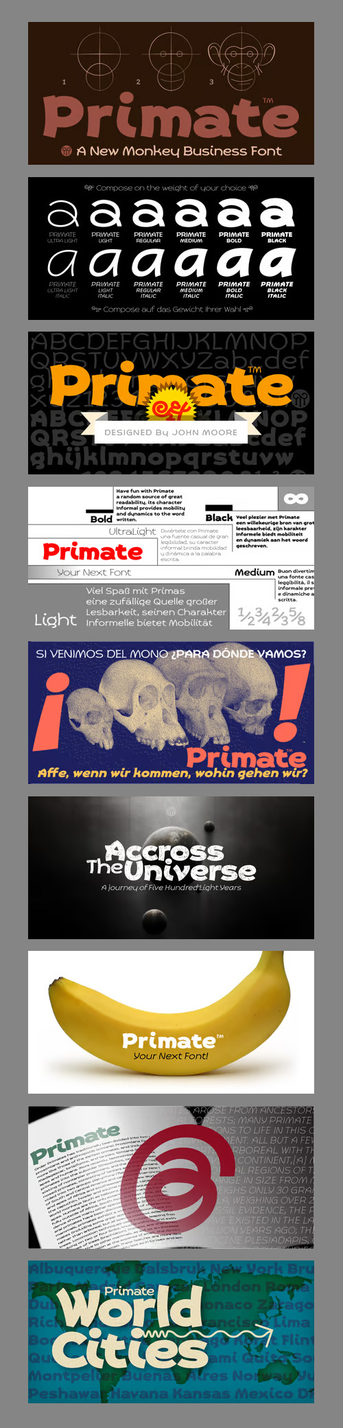
Primate -12 Fonts Family $210
12 Fonts | OTF | TTF | WoFF | +Previews | SALE PAGE
- Primate is a typeface family that works both as a display font for reading, casual and informal as it approaches the forms of nature, hence the name Primate. Primate’s family comes in a full range of weights, from the thin Ultra Light to Heavy Black, all weights are also presented in italics and all have ornaments. Primate is a natural and fun to compose texts, giving the design work of a contemporary look.
Ingra - 30 Fonts Family $600
OTF | WOFF | SALE PAGE
- I started designing Ingra in 2007, as a derivative of a typeface specifically drawn for newspapers’ info-graphics. The earlier design of the typeface was a narrower, made in order to optimise the use of space in a newspaper setting. After a few years, I came up with the wider version for a broader range of uses, since designers already used it in different ways. After a few attempts, I left the old fonts behind and I decided to redraw it as a brand new typeface. The resulting typeface has a strong connection to its ancestor in terms of functionality, but it has a different character.

Lovato - 5 Fonts Family $125
5 Fonts | OTF | Previews | Sale Page
- Lovato is a family of five fonts, perfect for branding applications, books, or poster designs that require a clear, sharp, stylish tone. The styles range from an elegant, delicate light weight up to a brazen, commanding black weight. This original Latin-serif family, designed by Kosal Sen, has primarily a geometric construction, with hints of details inspired by inscriptional lettering, all coalescing to fit a contemporary palette.

Kuro - 9 Fonts Family $48
9 Fonts | OTF | TTF | WoFF | +Previews | SALE PAGE
- A precision drawn sans-serif typeface. Simple geometric forms are combined with accurate detailing to create a charming, straightforward and uniform font. Careful attention has been paid to white space areas making the font appear brighter across text layouts. Kuro is a precisely rendered sans-serif type family. Modern geometric forms combined with subtle detailing create a charming, straightforward and versatile design. The lighter weights bring a contemporary touch to body copy while the bold weights add the strength of character to branding, identity and packaging. Details include eight weights, over 450 characters, manually edited kerning and Opentype features.
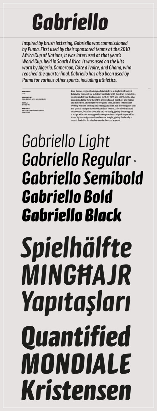
Gabriello - 5 Fonts Family $150
- Inspired by brush lettering, Gabriello was commissioned by Puma. First used by their sponsored teams at the 2010 Africa Cup of Nations, it was later used at that year’s World Cup, held in South Africa. It was used on the kits worn by Algeria, Cameroon, Côte d’Ivoire, and Ghana, who reached the quarterfinal. Gabriello has also been used by Puma for various other sports, including athletics.

TD Hothouse - 3 Fonts Family $157
3 Fonts | OTF | WOFF | +Previews | Sale Page[/center]
- Hothouse was designed in 2001 for The Glasgow School of Art and is still in use as their corporate typeface today. It is recognizably inspired by Charles R. Mackintosh’s (1868–1928) explorations in the field of letterforms, renown architect of The Glasgow school of Art.Based on a square the (almost entirely) monospaced Hothouse corresponds to Mackintosh’s art nouveau architecture. For the Type Department release Hothouse was carefully expanded into a versatile font family with Regular, Medium and Bold weights and includes a widely extended character set. Interchangeable upper and lower case characters and a set of alternative glyphs and ligatures provide great variety to the appearance of your text.

Workhorse - 2 Fonts Family $65
2 Fonts | OTF | WOFF | SALE PAGE
- Workhorse is a Sign Painter’s Gothic developed by Master Sign Painter Greg Reid. Workhorse captures the true essence of hand lettering. From the tapered waists to the elegant snaps of the brush; these elements present a warmth unseen in today’s mechanically stiff Gothics. Greg Reid and Charles Borges de Oliveira collaborated to bring this truly one of a kind typeface to fruition. With the power of Open type, Workhorse utilizes Contextual Alternates to create random variations of the capitals and lowercase letters. This allows your text to have subtle differences in the letters without losing form which helps to create an honest hand lettered look. This feature can be turned on or off to suit your individual style. You also have the ability to manually choose the glyph variations from the glyph pallet to help you create one of kind designs. Both versions of Workhorse feature complete variations of the capitals and lowercase letters (56 total), Small Caps and six alternates. The Small Caps are not just the capitals scaled down. They have been designed as a unique second set that adjusts the stroke thickness to match the existing letters, creating what we like to refer to as “Real Small Caps”. Workhorse is a timeless classic that can be used from early Americana advertising all the way up to present day modern use.? No matter how you use Workhorse it always looks and reads well.

Finalist Round Slab - 10 Fonts Family $99
10 Fonts | OTF | SALE PAGE
- Finalist Round Slab project started in April of 2014 and I am happy to announce the first family - Finalist Round Slab - is now ready for release. This family includes 10 weights - five uprights and five italics.The font was intended primarily to have a stronger body. It has a simple geometrical surface. This font has a strong personality, that makes it perfect for use in headline sizes but means it also works gracefully within text blocks. Finalists Round Slab is carefully crafted and a unique slab serif. Use for websites, print, motion graphics, logo design, packaging design, t-shirts and more.You can enjoy using it.
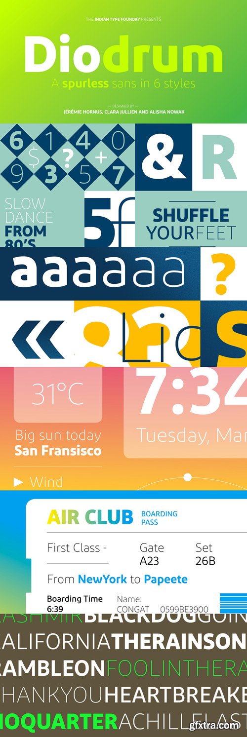
Diodrum Font Family 6xOTF $160
6 Fonts | OTF | TTF | WoFF | SALE PAGE
BOLD - EXTRALIGHT - LIGHT - MEDIUM - REGULAR - SEMIBOLD
- Diodrum is a spurless sans family for the Latin script. “Spurless” typefaces features smooth transitions from letters’ stems into their curved strokes. The design is generally monolinear. Diodrum’s x-height has tall, and its counterforms are large and open. Instead of being drawn with straight lines, Diodrum’s diagonals swell outward. This gives letters with prominent diagonals an increased dynamism. The Diodrum typeface appears friendly & legible and is available in six weights; the lightest is an ExtraLight font – a unique addition to our library. Due of its multiple weights, versatile range and formal style, Diodrum is an excellent choice for usage in Corporate Design and UI/UX Design applications.

Fair Sans Text - 8 Fonts Family $100
8 Fonts | OTF | TTF | WoFF | +Previews | RAR 1.3 MB | SALE PAGE
- Fair Sans Text is the natural follow-up to the popular Fair Sans - now a text family based on the calligraphic structure and casual construction of its predecessor. As the name implies, Fair Sans Text has proportions for longer text settings, strong headlines, and everything in between. Lively and casual, FST is four weights with true italics. Also included are small caps, old style and tabular numerals, and multi-language glyphs.
126,000 Royalty-Free 3D Model

Udemy Türkçe


Top Rated News
- CreativeLive Tutorial Collections
- Fasttracktutorials Course
- Chaos Cosmos Library
- MRMockup - Mockup Bundle
- Finding North Photography
- Sean Archer
- John Gress Photography
- Motion Science
- AwTeaches
- Learn Squared
- PhotoWhoa
- Houdini-Course
- Photigy
- August Dering Photography
- StudioGuti
- Creatoom
- Creature Art Teacher
- Creator Foundry
- Patreon Collections
- Udemy - Turkce
- BigFilms
- Jerry Ghionis
- ACIDBITE
- BigMediumSmall
- Globe Plants
- Unleashed Education
- The School of Photography
- Visual Education
- LeartesStudios - Cosmos
- Fxphd
- All Veer Fancy Collection!
- All OJO Images
- All ZZVe Vectors
- CGTrader 1 CGTrader 2


