

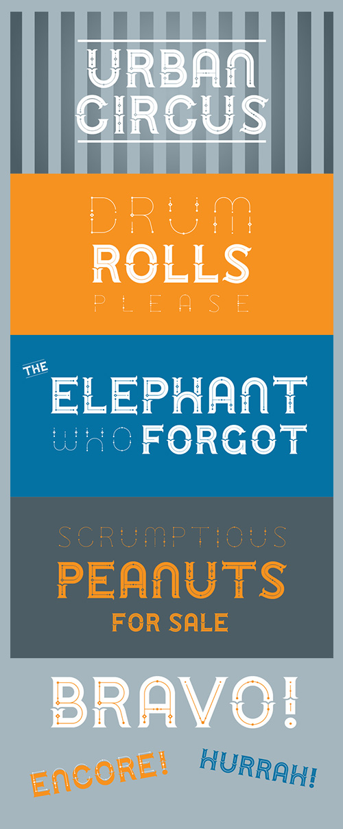
Urban Circus Font Family - 4 Font 207$
4 Fonts | OTF/WOFF | RAR 646 KB | Slae Page
- Urban Circus is a big, grand display font that celebrates both the thoughtful, carefully constructed elements of contemporary urban planning and also the joyful, chaotic and magical elements of the circus. This typeface comes in four font styles which have a total of eight different alphabets that can be used together to create dramatic poster headlines and titles. Use the different alphabets on overlapping layers in different colors for a striking poster effect.The basic concept for this font came from a big fancy T that was drawn for a poster for an event at the Minneapolis Institute of Arts. At the event, MIA visitors were invited to spontaneously craft a letter out of play-dough, yielding a fun-filled assortment of letters and numbers inspired by that big ol' T. That workshop event yielded a fun photofont that helped fuel the direction for what eventually became the Urban Circus font. The characters here have all been carefully re-drawn with crisp, clean lines while retaining a fanciful, spontaneous character.

Kaapeli Font Family 6 Fonts 180$
- It's mixed feelings about Kabel; It is a brilliant headline font with a lot of character, but it’s the characters having problems with. The versions of all big foundries have the same flaws (in my opinion), especially lowecase a and s. So I finally went ahead and made an all new version. It is not Kabel, but very much like it. It has unique x-height, weight and width, and many individual characters are also different from the original.

Haneda Font Family - 6 Fonts 60$
6 Fonts | OTF/TTF/WoFF | RAR 1.33 MB | SALE PAGE
- Haneda is a handwritten font by Indie Type. This font family is friendly, fun and easy to read. Haneda is made up of mix widths giving it a unique look. Perfect for magazines, book covers, stationery, greeting cards and websites.
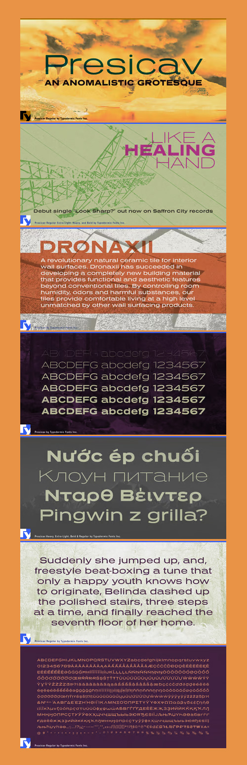
Presicav Font Family - 6 Fonts 180$
6 Fonts | OTF/TTF | EOT/WoFF/WoFF2 | Style Sheet | 572 KB | Sale Page
- Tempo was a popular newspaper typeface in the mid 20th Century. Problem: mismatched styles. Individually, they were brilliant. As a family: chaotic. Except for a recent stint as Neuzon, Tempo Bold Extended was abandoned by the cruel tides of history.

Moho Condensed Font Family - 20 Fonts $500
- “Moho” is inspired by the Victorian sans shapes, movements and expressions of modernism art deco and constructivism, conceiving a decorative and elegant font, modern and readable display. This provides a retro look style of elegance of the 30s. Moho Condensed font family is straight, vertical, with joints and links or curvilinear or angular. Moho provides an innovation in the form of letters, to replace traditional forms of curves by straight or vice versa. Condensed Moho is a category of square letter, has an efficient OpenType programming for Moho OT Condensed, and basic for Moho Std families to compose texts in European languages ??of East and West, having wide set of over 610 glyphs. Designed to hold and typesetting over 14 pts or less increasing readability depending on the tracking. Moho Condensed is ideal for publishing newspaper and magazine design, convenient for the design covers and labels due to its space saving. Moho Condensed typefaces are closely related to the arts and fashion are very useful in creating logos and brands.
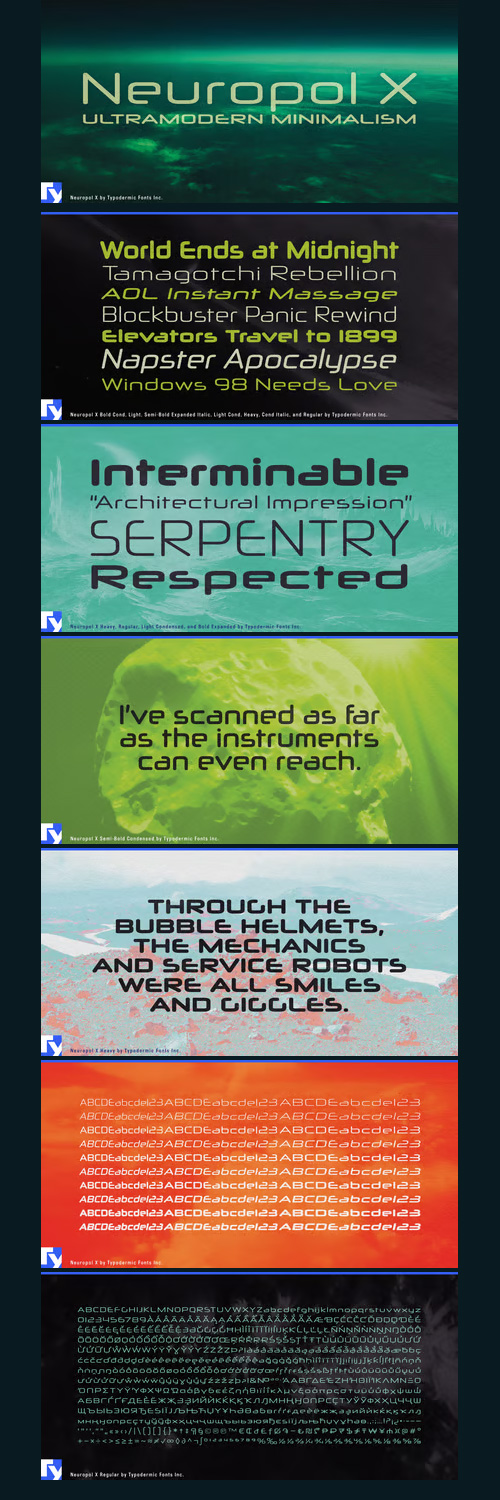
Neuropol X - Ultramodern Minimalism 30 Fonts 170$
- Neuropol X is built on a foundation of streamlined geometry and cinematic precision. Its most distinctive signature lies in its truncated strokes—seen in characters like the lowercase ‘e’ and ‘a’—as if each curve had been halted mid-motion by a high-speed laser or a vector plotter tuned for maximum efficiency. This imagined economy of form gives the letters a sense of engineered intent, like components in a spacecraft control panel or circuitry etched at micron scale.


Emblema Font Family - 12 Fonts 360$
- Emblema is an evocative font that remains Art Deco style from early decades of the 20th Century. Its geometric shapes gives a clean and modern look to the designs where it is applied. Emblema was designed in 12 near but different weights and is ideal to fit the same weight in a single piece using different point sizes. Open Type users could acces to extensive set of alternative and ornamental characters including 3 different size sets of caps, so versatility is the most important advantage you can take using this font family.
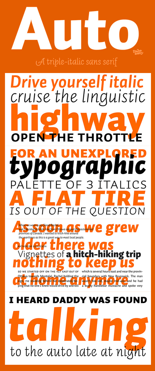
Underware - Auto 1,2 & 3 All 72 Fonts $1350
72 Fonts | TTF/OTF | 4.9 MB | SALE PAGE
- Auto is a sans serif typeface which has three different models of italics, each with its own flavour.The complete font family consists of 3 x 24 fonts: Auto 1, whose italic is straightforward and restrained; Auto 2, with a personal and friendly italic; and Auto 3 with provocative, almost upright italics, with open counters and strategically placed serifs, loops and swashes.With its three italics, Auto creates a new typographic palette, allowing the user to drive through unknown typographic and linguistic possibilities. Also, because of its four weights and the three different figure styles, it’s a vehicle equipped for many roads of typography.Take a cruise, and let this typeface carry you to business or leisure.
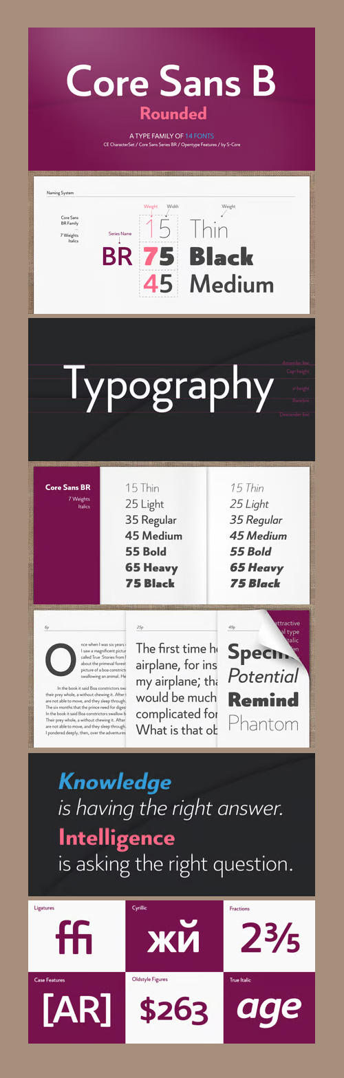
The Core Sans BR Font Family 14 FONTS $299
14 Fonts | OTF | SALE PAGE
- The Core Sans BR Family is a part of the Core Sans Series, such as N, NR, N SC, M, E, A, D, G, R and B. The Core Sans BR Family is designed with rounded stroke endings for visual comfort. This family has very small x-heights and large ascenders(descenders) which give an elegant feeling in body text. It is a sans-serif family but it’s structure is similar to serif fonts, so you can make paragraph beautiful with this font family. It is very legible and readable even in small size because of its open counters and distinctive shapes. This font family consists of 7 weights (Thin, Light, Regular, Medium, Bold, Heavy, Black) and Italics for each format. Core Sans BR supports complete Basic Latin, Cyrillic, Central European, Turkish, Baltic character sets. Each font includes proportional figures, tabular figures, oldstyle figures, numerators, denominators, superscript, scientific inferiors, subscript, fractions and case features. We highly recommend it for use in books, web pages, screen displays, and so on.


Suisse All Family - 61 Styles $650
71 Fonts | OTF | +Previews | RAR 5.3 MB | SALE PAGE
With 6 packages and 61 styles, the Suisse collection is one of the most versatile and adaptable typeface of the market, with a lot on offer.
- The Suisse typeface forms the centerpiece of the Swiss Typefaces library. Comprised of 6 collections with a total of 61 styles, 71 Fonts. Suisse is a utilitarian font set that covers all basic needs of the contemporary typographer, from Suisse Int’l, the go-to Grotesk with its monospaced and condensed companions, to the sturdy text serif Suisse Works, the clear-cut sans serif Suisse Screen, and the reliable slab serif Suisse Neue. Suisse combines classic style with cutting edge design quality and the most user-friendly license.
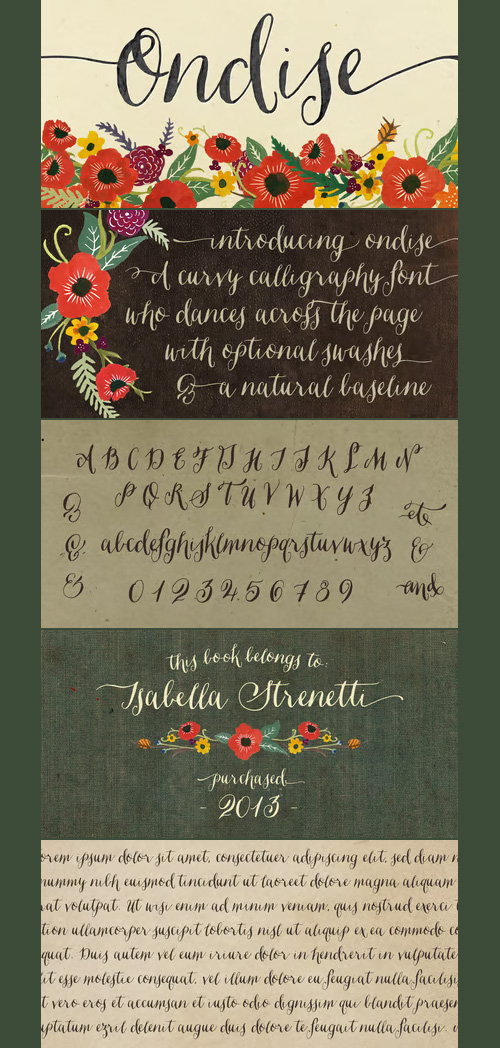
Ondise - Hand-Lettered Calligraphy Script for $32
OTF | 1 Font | +Preview | 9.4 Mb RAR | SALE PAGE
- Ondise is a curvy and warm hand-lettered calligraphy script with a natural, dancing baseline. This Opentype font was created with a pointed pen & ink, and includes six different ampersands as well as a swash feature that automatically substitutes beginning & end of word letters. To enable alternate ampersands, simply turn on the contextual alternates feature and type &1, &2, &3, etc. Opentype coding automatically substitutes the new ‘and’.

Oxymora Font Family 2 Fonts €15
OTF | 2 Fonts | +Preview | 6.5 Mb RAR | Oxymora Font Family
- A little while ago, Birgit did some work for a client and started to play around with Eschers impossible shapes. In the end Birgit got so addicted by the system that she made a complete font, based on impossible shapes. The name Oxymora: An oxymoron is a term for a figure of speech. It is made up of two or more words that seem to be opposite to each other, or actually are opposite.

P22 Zaner Pro Font Family - 4 Fonts $120
OTF/TTF | 4 Fonts | +Preview | 4.8 Mb RAR | SALE PAGE
- P22 Zaner is based on ornamental penmanship as taught by Charles Paxton Zaner at his art college at the turn of the 20th century. The Zaner font set includes four unique fonts that complement the other fonts in the set. Each font is available in PostScript and TrueType formats as well as OpenType which offers even more characters, options and overall functionality. Set options include PostScript and TrueType with a bonus set of extras and a “super” pro set containing over 3,000 characters. Zaner is perfect for wedding invitations and documents that require a touch of elegance.

Nolan Font Family $495
- The idea behind Nolan is to create emotional response due to its inviting character and legibility. It is ideal for headlines, presentations, product signage and bespoke logotypes. Due to the structure of the letters, Nolan can also stand its ground in body text, although this is not its primary purpose.Nolan is created slightly wider than what is to be expected from a typical sans font, yet not to the point of being considered a wide typeface. This uniqueness lends the family an air of originality while adhering to already established standards in the creation of contemporary sans typefaces.Nolan has a large x-height, so as to deliver a better punch and be legible at a glance . Its clean and modern lines are reminiscent of architectural aesthetic.
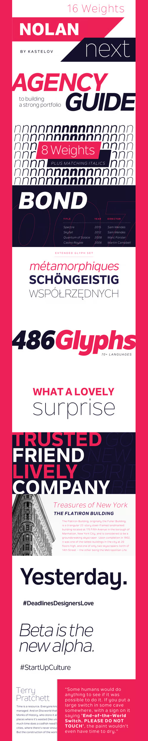
Nolan Next Font Family 16 Fonts $225
16 Fonts | OTF/TTF/WoFF/EOT/WoFF2 | +Previews | 1.6 Mb RAR | SALE PAGE
- Nolan Next is a low-contrast humanist sans-serif with a large x-height and streamlined appearance. It is based on Nolan, but with a more compact letterforms and remastered curves. Designed to appeal to a broader audience due to its narrower width and subtle presence, Nolan Next is ideal for everyday usage. It is well suited for design applications ranging from branding and corporate identity to editorial and web design. Comprising of eight weights with matching italics, Nolan Next is easy to work with and accommodating to your needs. Designed to work as a universal typeface, it also stands its ground in headlines, presentation materials, logotypes, etc. Additionally, the typeface includes an extended character set supporting an array of languages.

Outcast - Heavy Grunge Typeface $50
4 OTF Font Files | Designer: Patrick Griffin | TURKISH SUPPORT | SALE PAGE
![]()
![]()
![]()
![]()
![]()
![]()
![]()
- Outcast puts the whole grunge font problem to rest by eliminating repetition. Here we have eight variations on each character (4 all cap fonts), so there is no more need to use the same character twice in any display setting. You have the main interchangeable fonts, then you have Outcast Pro — an amalgamation of all four fonts, synched together in one file and programmed with a contextual alternates feature that randomizes setting on the fly. Language support includes Western, Central and Eastern European character sets, as well as Baltic, Esperanto, Maltese, Turkish, and Celtic/Welsh languages. For those end-of-days shirts and placards everyone is eager to design now. Because true grunge never repeats itself.

Harlean - Hand-Drawn Wicked Typeface $35
OTF Font Files | Designer: Laura Worthington | TURKISH SUPPORT | SALE PAGE
![]()
![]()
![]()
![]()
![]()
![]()
![]()
![]()
![]()
![]()
![]()
- Harlean’s lively personality bursts off the page in an exciting blend of ruggedness and panache. Its eccentric letterforms vary in axis, baseline, and height, reflecting Harlean’s unusual provenance — it was rendered with a flexible-nib pen. It’s a font that speaks of free-spirited adventure and jazz-inflected, improvisational style. Harlean’s convincingly human appearance derives from its savvy use of contextual alternates. Add your own swash and alternate forms to experiment even further, then complement your layout with ornaments, borders, and corner elements.


Kyouking - Effective Ghotic Font $25
OTF Font File | Designer: Cucu Supriyadi | SALE PAGE
- The Kyouking design is basically the structural century blend with a modern feel approach to make it a flexible and epic, effective font for the creation of ambitious poster headlines, Book covers, logos and so on.

Milano Traffic - Hand-Drawn Quick Sketch Font $13
- This is a hand drawn quick-sketch font. I wanted to create a high contrast serif in a cartoonish, kid style. It contains basic latin western and central european language extensions and accents. Looks natural and playful, and really nice on chalkboard texture as you can see on the example above. It comes with the classic default ligatures of fi, fl, ffi and ffl.

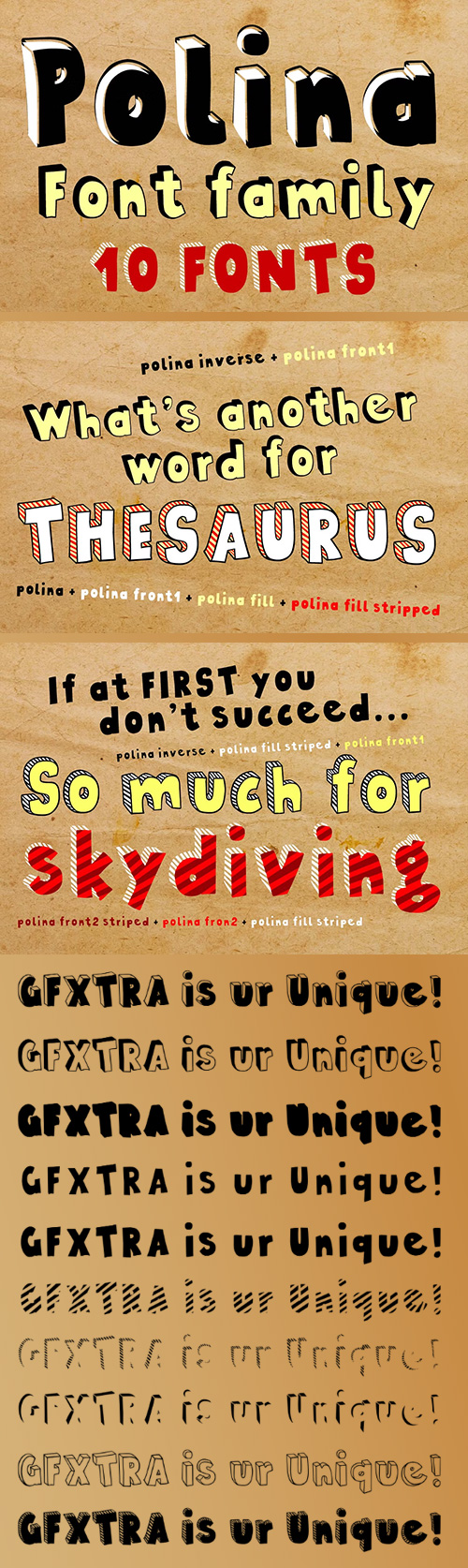
Polina - Handmade, Layered Cartoon 10xOTF $46
Designer: Bartek Nowak | TURKISH SUPPORT | SALE PAGE
![]()
![]()
![]()
![]()
![]()
![]()
![]()
- Polina (previously named Dobra) is a handmade, layered type family which includes several textures and shadows. Different font types can be created using various combinations of Polina fonts and colors. Language support includes Western, Central and Eastern European character sets, as well as Baltic and Turkish languages.

FHA Condensed French Font Family
OTF | 3 Fonts | JPG Preview | 1 Mb RAR
- One could speculate that FHA Condensed French probably started life as wood type for displays, headlines and posters. The exaggerated sharp serifs and condensed forms were not uncommon for that period. At some point, sign painters picked up Condensed French added their own character. At the end of the nineteenth century, Frank H. Atkinson included Condensed French in his samples of lettering for his book, ”Sign Painting, A Complete Manual.” This book became one of the definitive guides for signwriting and hand lettering. In 1999, Mike Adkins digitized Condensed to add to our Atkinson collection. For its re-release, Condensed French has been updated with more language support, ligatures, and OpenType alternates. It has true vintage character but still plays well in more modern designs. A font for all seasons, the condensed forms and sharp serifs fit in every layout from wildwest days posters and creepy film credits to Christmas ads and Mother’s Day cards. While I can’t really see FHA Condensed French as the font for phone aps or video game text, it will provide impact to logos, branding, and product labeling.
126,000 Royalty-Free 3D Model

Udemy Türkçe


Top Rated News
- CreativeLive Tutorial Collections
- Fasttracktutorials Course
- Chaos Cosmos Library
- MRMockup - Mockup Bundle
- Finding North Photography
- Sean Archer
- John Gress Photography
- Motion Science
- AwTeaches
- Learn Squared
- PhotoWhoa
- Houdini-Course
- Photigy
- August Dering Photography
- StudioGuti
- Creatoom
- Creature Art Teacher
- Creator Foundry
- Patreon Collections
- Udemy - Turkce
- BigFilms
- Jerry Ghionis
- ACIDBITE
- BigMediumSmall
- Globe Plants
- Unleashed Education
- The School of Photography
- Visual Education
- LeartesStudios - Cosmos
- Fxphd
- All Veer Fancy Collection!
- All OJO Images
- All ZZVe Vectors
- CGTrader 1 CGTrader 2


