

Swashington Serif Font by CounterPoint Type Studio
OTF | 1 Font | JPEG Preview | 4.8 Mb RAR
- Inspired by a few letters in a hand-drawn logotype, Swashington is a serif font with both an early 20th Century feel and yet is evocative of the swash fonts of the 1970s as well. The real meat of this typeface comes with using all the swash and ligature variants allowing for an enormous amount of typographic flair. Starting with the original logo, Jason Walcott was moved to develop these interesting letterforms into a full typeface with all the swashy might he could muster. In addition to a comprehensive set of Swash and Alternate letters, there are also over 270 Discretionary Ligatures that can be used to create different possibilities by mixing and matching. Included with the downloaded fonts are two .pdf files showing all the swashes and ligatures, that can be printed and used for easy reference. All of the alternates are available via the Glyph Palette or with OpenType features. The font includes support for all Latin based and Eastern European languages.
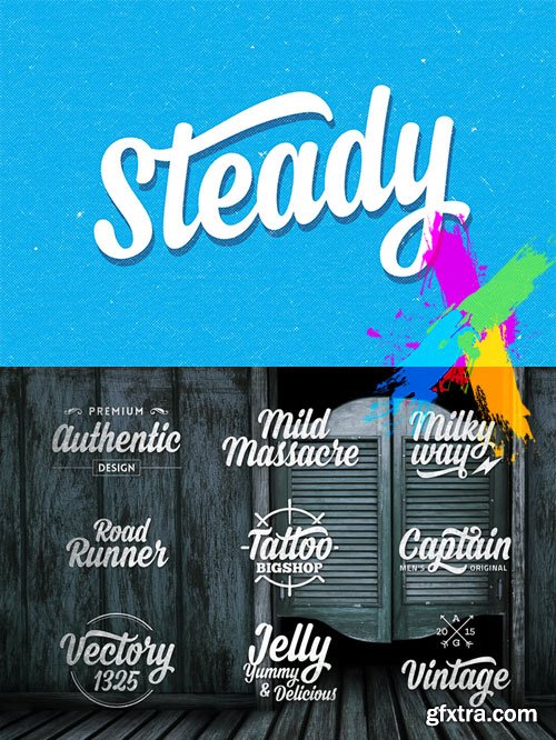
Steady Script Typeface OTF TTF
OTF TTF | 0.2 MB
- Steady is a script typeface with personality. It was designed as a display typeface that contains 315 glyphs in total and 126 alternative characters to improve your design. You can use it as a logo, badge, insignia, packaging, headline, poster, t-shirt/apparel, greeting card, and wedding invitation. The flowing characters are ideal to make an attractive messages, mix and match Steady with a bunch of alternative characters to fit your project. The alternative characters in this font were divided into several OpenType features such as Contextual Alternates, Stylistic Alternates, Stylistic Sets, and Ligature. The OpenType features can be accessed by using OpenType savvy program such as Adobe Illustrator and Adobe InDesign.

Ethnocentric Font Family - 12 Fonts
OTF | 12 Fonts | JPEG Preview | 4 Mb RAR
- Ethnocentric, a robot-friendly futurefont originally created in 1999 has been rebuilt and expanded: more languages, more symbols, no more ugly Q, greatly improved M and W, fractions, ordinals, new kerning, new accents, better proportions, six weights + italics, even more futuristic
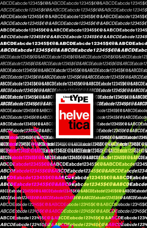
Helvetica Ultimate Font Collection
Helvetica Ultimate Collection 475$
Helvetica | Helvetica World | Helvetica Neue | 85 OTF & TTF Fonts
 This typeface was initially released as Neue Haas Grotesk, and was designed in 1957 by Max Miedinger for the Haas’sche Schriftgiesserei (Haas Type Foundry) in Switzerland.
The name was changed to Helvetica (an adaptation of Helvetia, the Latin name for Switzerland) by Walter Cunz when D. Stempel AG, a major stockholder in Haas, reworked the design for Linotype GmbH in Frankfurt, a major stockholder in Stempel. The Mergenthaler Linotype Company in New York, then a major stockholder of Linotype GmbH, adopted the design, and it rapidly became the most popular sanserif in the world, replacing Futura.
Helvetica is designed as a strong central series, with condensed and extended forms and extreme weights adapted and added later, a system which suited Linotype mechanical limitations and marketing philosophy, but which resulted in a family of weights that were not as well coordinated as they might have been.


Utile Narrow Font Family
Utile Narrow consists of seven Roman styles and extends the Utile collection with designs narrower than its normal-width counterpart. With a multipurpose aim in mind the type is suitable in applications such as titles, subheads, and data tables, as well as readable passages of text of various length. The two Utile widths, normal and narrow, work effortlessly together and include the same extended Latin character set.

Utile Font Family
The Utile type collection consists of two sets of styles, one for smaller set typography and one intended for display enabling corresponding use for various sizes and applications. The optical scale characteristics differ in a few ways: Utile (Text), featuring a sturdy letter build, is spaced more openly with compensating ink traps, while the contrasted Utile Display is closer spaced with re-proportioned letters, slightly extended ascenders and descenders, and close to non-existing ink traps. Utile’s incised stem modulation, uniquely asymmetrical in its application, attempts to maintain a balancing act between swelled strokes and the absence of such. A family of fourteen styles offers a balanced range for identity-branding, editorial and advertising for print and screen.

https://www.myfonts.com/fonts/type-type/tt-autonomous/
The idea was born in Amsterdam when one of our colleagues took the official electric taxi at the Schiphol airport. At the moment we were thinking about creating a new wide sans-serif, and an interesting question emerged during the trip: what font would be associated with autonomous electric transport. Then we thought it would also be nice to expand this theme visually.


Iskra Sans Serif 14xOTF
OTF | 14 Fonts | JPEG Preview | 4.6 Mb RAR | BUY Iskra
- A practical sans serif need not appear dry, constructed, or derivative. It can excel in its sensible role and yet possess a distinct flair. Iskra (spark or flash) is a new sans serif designed by Tom Grace. It was conceived to challenge the limits between utilitarian and decorative. Sporting a low-contrast profile, it is a study of bridled energy in the Cyrillic and Latin scripts. Its eye-catching forms are an oblique tribute to the less-predictable style of brush lettering, and contain daring, elegant curves, economical proportions, and a slight top-heavy asymmetry. Its warmth comes from the subtle emphasis on the structures and details of individual letterforms, whereas its solidity is demonstrated through its balanced rhythm over long spans of text. Each font supports over 75 languages and is hand-tuned for a pleasing legibility and aesthetic both in print and on screen. This type family makes an excellent choice for presentations, articles, branding, and advertising. Available in 14 styles, Iskra represents a fresh, stimulating, forward-looking perspective on how we see both the vitality of the particular letter and the overall harmony of text. Iskra is available in three different character repertoires: Iskra, complete set — Iskra CYR, Cyrillic-based subset with a Latin supplement — Iskra Cyr, Latin-based subset. Both the LAT and CYR series conform to most standard codepages used by typical software covering their respective scripts. All three series have similar OpenType functionality."

https://www.myfonts.com/collections/avant-garde-gothic-font-itc
ITC Avant Garde Gothic is a font family based on the logo font used in the Avant Garde magazine. Herb Lubalin devised the logo concept and its companion headline typeface, then he and Tom Carnase, a partner in Lubalin’s design firm, worked together to transform the idea into a full-fledged typeface. The condensed fonts were drawn by Ed Benguiat in 1974, and the obliques were designed by André Gürtler, Erich Gschwind and Christian Mengelt in 1977. The original designs include one version for setting headlines and one for text copy. However, in the initial digitization, only the text design was chosen, and the ligatures and alternate characters were not included. The font family consists of 5 weights (4 for condensed), with complementary obliques for widest width fonts. When ITC released the OpenType version of the font, the original 33 alternate characters and ligatures, plus extra characters were included.

Bodoni Sans Display Font Family 8xOTF
OTF | 8 Fonts | JPEG Preview | 4.2 Mb RAR
- Bodoni Sans is a new classic built on the foundation of two centuries of history. Fresh and contemporary, while feeling familiar. Stylish and sophisticated, confident and elegant. Bodoni Sans is more than just chopping off the serifs. The classical proportions of the capitals and x-heights were maintained, but the letterforms were rebalanced for use without serifs. Contemporary modifications were made to some widths, as well as an all new Light weight was created. High contrast is the key feature of Bodoni Sans. To maintain this contrast over a wide range of sizes, three optical sizes were drawn: Standard, Display and Text. Contrast adjustments were made for each optical size for optimal performance. The Standard was designed for the mid range of 12 to 60pt, Display for 48pt and above, and Text for 6 to 12pt. Web/Digital use was also considered while developing Bodoni Sans. The fonts were tested as web formats, and examined on a variety of screens, to ensure seamless use in both print and digital applications.

Amour Font Family - 4 Fonts $76
4 Fonts | OTF | 476 KB | Sale PaGe
- Amour is a romantic handwritten retro inspired font by Cultivated Mind. This type face includes 4 fonts .Amour works lovely for stationery, valentine’s day, magazines, weddings, invitations, websites and anytime you would like to express your love.


Avenir Pro Font Family $470 | 12 x TTF | Turkish Support
http://www.myfonts.com/fonts/linotype/avenir-pro/

http://www.myfonts.com/fonts/typedepot/centrale-sans-condensed/
Centrale Sans Condensed is not just a “squished” version of our Centrale Sans family, it’s designed as a stand alone typeface with the family characteristics in mind. It bears all the qualities of the normal width being even friendlier because of the closer relation it has with the humanist model. The condensed width is with 15% narrower than its normal sibling, which makes it precious space-saving tool. Centrale Sans Condensed also have 9 weights from Hairline to Extra Bold plus their matching italics. It includes Some OpenType features like discretional ligatures, tabular figures and stylistic alternatives.
OTF | 9 Fonts | JPG Preview | 3.5 Mb RAR

Gotham Rounded Font Family $180 | 8 x OTF And PostScript | Turkish Support
http://www.typography.com/fonts/gotham-rounded/overview/
Gotham Rounded is a technical letter that goes from friendly to high-tech to cheeky with ease.Our Gotham typeface, inspired by signs on buildings, celebrates the workmanlike “draftsman’s alphabet” at a monumental scale. Similarly unadorned, but at a more intimate size, is the lettering of engineering: the marks on precision instruments, blueprints, stencils and templates. Drawn, stamped, engraved and routed, these forms are sensitively captured by our new Gotham Rounded family, available in eight styles including italics.
Gotham Family [Updated] - Extended Latin, Greek, Cyrillic
+ ScreenSmart & Office Version
- Ours is the first century in which most mass-produced letters can correctly be called “typography.” Technically speaking, typography is the product of type, the individual, recombinable characters in a typeface that are designed for printing words on paper. A century ago, a book’s pages contained typography, but its cover, spine, and illustrations featured lettering, each of the product of an artist working by hand in a different medium. Because letters made by hand had no obligation to resemble the look of printing types, different media evolved their own aesthetics: lithographed posters, engraved banknotes, and neon signs once enjoyed unique alphabetic styles.
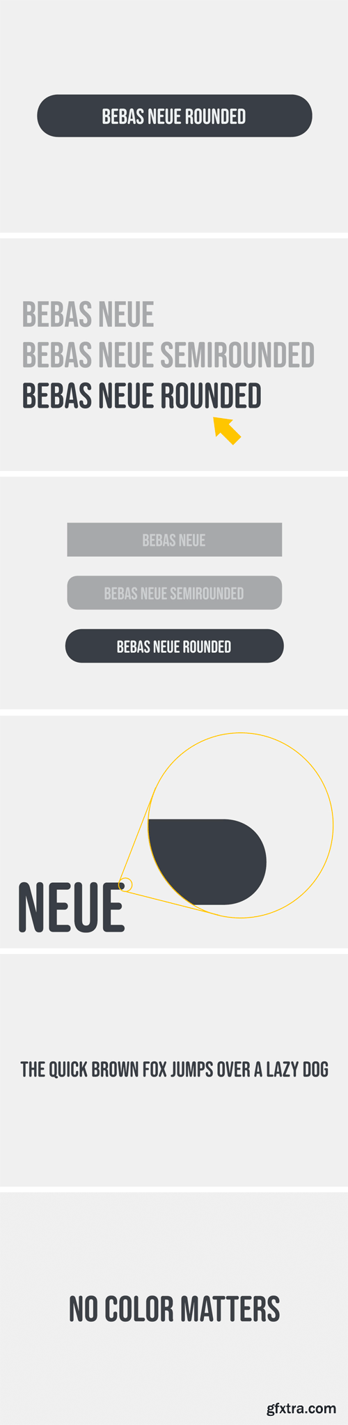
Bebas Neue Rounded Single Font
- Bebas Neue Rounded is the Bebas Neue with rounded corners and terminals. As you know, Bebas Neue is the most widely used free font on the market. This rounded version is a new style where the basic theory and proportion are same as Bebas Neue, but with a rounded shape that gives a warm, soft and natural impression.

126,000 Royalty-Free 3D Model

Udemy Türkçe


Top Rated News
- CreativeLive Tutorial Collections
- Fasttracktutorials Course
- Chaos Cosmos Library
- MRMockup - Mockup Bundle
- Finding North Photography
- Sean Archer
- John Gress Photography
- Motion Science
- AwTeaches
- Learn Squared
- PhotoWhoa
- Houdini-Course
- Photigy
- August Dering Photography
- StudioGuti
- Creatoom
- Creature Art Teacher
- Creator Foundry
- Patreon Collections
- Udemy - Turkce
- BigFilms
- Jerry Ghionis
- ACIDBITE
- BigMediumSmall
- Globe Plants
- Unleashed Education
- The School of Photography
- Visual Education
- LeartesStudios - Cosmos
- Fxphd
- All Veer Fancy Collection!
- All OJO Images
- All ZZVe Vectors
- CGTrader 1 CGTrader 2


