

Gimlet Superfamily 112 Styles
- Gimlet draws its inspiration from Georg Trump’s 1938 typeface, Schadow. At the behest of Nick Sherman, I reimagined the oddball serif as an energetic contemporary workhorse, complete with three optical sizes and a flexible set of widths tailored for responsive layouts. A multifaceted series that speaks with a singular voice, Gimlet is a rare find: a typeface that is as funky as it is functional.

Layla Pro Arabic Font Family
Layla pro Arabic typeface is a modern Arabic typeface designed by Ahmed Zaza. the design is inspired by the Kufi calligraphic style and influenced by the Naskh style. The result is a hybrid that combines modern proportions with Classic Arabic scripts. it’s suitable for branding, editorial, packaging, and advertising. Layla pro Arabic Features five weights from Light to Bold.


Leidener Font Family - 6 Fonts $240
6 Fonts | OTF | 1.25 MB | http://input.fontbureau.com/
- This font family is inspired by printed work made by the Elzevir family back in the XVIIth century at Leiden (NL). They worked with material from several type designers, but further investigations sends us to the tracks of one in particular: Robert Granjon. Granjon italics were way ahead of his time, making some really beautiful signs like swashy ampersands and minuscule v letters. This font also contains old style figures in the same fashion as they were printed, like the flipped number 8 and open forms in 6 and 9. This is as much a revival as an original design, because of their weights bold and heavy (both with italics) that were inspired on some titles. In this font you can also find a lot of ligatures, small caps, diacritics and even a fleuron for each weight and variation.Leidener came up from two books: Constantini Imperiatoris (1611) and Exercitationum Mathematicarum (1657), printed by Louis and John Elzevir on their Leiden Workshop, back in the day.

New commercial use fonts for creative home and business projects.
- Get creative with a new collection of 1,000 OpenType fonts for commercial use. The font collection includes 240 unique font family styles, with 1000 total fonts. An excellent addition to any font collector's library for use in graphic and logo design, web design, scrapbooks, presentations, invitations, promotional material, advertisements, and more.

- Aktiv Grotesk is a condensed sans-serif typeface designed by Dalton Maag, first released in 2010. It is characterized by its versatility and functionality, making it suitable for a variety of branding exercises that require a diverse typographic palette. The font family includes multiple styles, such as Light, Regular, Medium, Bold, and their respective italics, amounting to a total of 24 styles available through platforms like Adobe Fonts. Aktiv Grotesk is noted for its clean lines and modern aesthetic, often described as a “Helvetica killer” due to its balance between neutrality and authority. The design aims to remove the quirks found in Helvetica while infusing a bit of warmth reminiscent of Univers. This makes it an excellent choice for projects that need to convey professionalism without being overly aggressive. Aktiv Grotesk is a modern, versatile typeface suitable for a wide range of design applications, from branding to web design, with a strong emphasis on clarity and professionalism.
![]()
2150 TTF, OTF, FON & PFB Fonts for Windows & Mac | Compressed to 20 MB

https://www.myfonts.com/collections/nova-grotesk-font-untype
Nova Grotesk is a contemporary interpretation of the classic sans serif model born in the early 19th century that flirts with a humanist spirit, becoming a cozy Grotesque full of personality and functionality. Ranging from Thin to Black, offers 7 weights plus matching obliques on 3 widths for a total of 42 styles, a wide horizon of possibilities for a typeface that includes more than 800 glyphs per style, more than 20 Opentype features, smallcaps, oldstyle and tabular numbers, stylistic alternates, ornaments and plenty of other attributes for your typographic delight and delirium. Nova Grotesk is an excellent option for use in corporate identity and branding, also works perfectly on signage and information design, its ubiquitous essence and affable scent make Nova Grotesk a typeface for every occasion.

A new modern classic. Regime Grotesk is a versatile sans serif font family that’s ideal for building a contemporary yet timeless brand look.
Inspired by Italian Graphic Design of '20 and '30. The fascist regime made a great work with propaganda by choosing certain aesthetic canons and fonts like Futura and Mostra. Regime inherits from that proportions, with low crossbars and the peculiar Sloping "S". It is designed to be balanced, modern and easily adaptable to web, print, and signage applications. From fashion to corporate industry, this font gives the designer full flexibility to express his/her vision.
- With 4 different weights, round version and matching obliques, Regime Grotesk is a powerful communication tool for today.
- LANGUAGES SUPPORTED: English, French, Spanish, Portuguese, Basque, German, Swedish, Norwegian, Danish, Finnish, Icelandic, Czech, Polish, Hungarian, Croatian, Esperanto, Maltese, Turkish, Romanian, and Albanian.

https://type-department.com/collections/sans-serif-fonts/products/non-natural-grotesk/
Meeting functionality with subtle, purposeful quirks, Non Natural Grotesk first presents as pretty straightforward. But, what’s so compelling about this typeface is that it only takes a millisecond and you’re drawn into its fascinating details and deviations from conformity. Designed by Jonathan Saucedo, intricate, subtle touches—such as the width of the counters and comfortable, breathable apertures—mean that throughout weights and sizes, Non Natural Grotesk sits calmly and confidently. The typeface has great legibility and good contrast between black and white, making it stunningly versatile; showing off its seamless combination of contemporary details and classic styles.

https://fonts.floriankarsten.com/fk-raster-grotesk
FK Raster Grotesk is a pixel-based sans-serif typeface, sharpest at the 12-pixel size. Its Compact variant partially abandons the pixel grid and serves as a tightly spaced display typeface, carefully kerned to leave no superfluous gaps. The variable font smoothly transitions between sharp, pixelated form to completely rounded shapes, creating strong contrasts between the two states. FK Raster Grotesk supports Latin Extended-A character set (i.e. Western European, Central European and Southeastern European languages) and several OpenType features.


https://www.myfonts.com/collections/fud-grotesk-font-ilya-bazhanov
- A narrow sans serif, FUD Grotesk was inspired by brutalist architecture and modernist typography. There is a subtle stroke contrast, many inktraps, and even some microserifs (look for them in the main strokes!). Note the closed bowl apertures, exaggerated in the alternate forms, which result in a dense, ornate typeset. Five weights (from Light to Bold), and a large set of discretionary ligatures.

Introducing Luminoir Grotesk, a modern variable sans-serif font that embodies versatility, readability, and luxury. Inspired by contemporary sans-serif fonts, Luminoir Grotesk offers a seamless blend of modernity with a touch of elegance, making it suitable for various design applications.
One of Luminoir Grotesk’s distinctive features is its subtly tilted stem when joined with other letter parts, adding a futuristic edge without compromising the essence of a classic sans-serif font. This unique characteristic creates a sense of dynamism and innovation, making Luminoir Grotesk a perfect choice for forward-thinking design projects.


- The design of the typeface Moskau Grotesk is based on the signage created for the Café Moskau in Berlin by the graphic artist Klaus Wittkugel in the beginning of the 1960s.The Café Moskau, across from the Kino International on Karl-Marx-Allee in Berlin Mitte was one of the prestige edifices of the former DDR (German Democratic Republic). Built in the early 1960s, it advanced over the years and changing social developments to a trademark building of the capital. The lettering display on the roof was created by the graphic artist Klaus Wittkugel (October 17, 1910 – September 19, 1985). He had been Professor at the School for Applied Arts in Berlin, and, in addition to the creation of many posters, book covers and postage stamps, he was responsible for the signage of the Kino International as well as for the complete graphic treatment for the Palace of the Republik.The signage for the Café Moskau with the words »RESTAURANT«, »CAFÉ«, »KONZERT« and »MOCKBA« set in capital letters, becomes the basis for the Moskau Grotesk which was developed by Björn Gogalla in 2013. This face should not be seen as an imitation. A few shortcomings were »fixed«. In favor of maintaining the core characteristics some unique features were, however, not relinquished. Lower case letters and the missing capital letters were designed from scratch. It is not surprising that the plain, unassuming geometrical direction of the basic character style forms a bridge to the architecture of the 1960s. Inspired by the then favored, diverse possibilities inherent in the architectural example and wall reliefs, two complimentary pattern fonts emerged.[/center]


Neue Haas Grotesk Font Family - 44 Font $2376
OTF | TTF | 8 MB
- The first weights of Neue Haas Grotesk were designed in 1957-1958 by Max Miedinger for the Haas’sche Schriftgiesserei in Switzerland, with art direction by the company’s principal, Eduard Hoffmann. Neue Haas Grotesk was to be the answer to the British and German grotesques that had become hugely popular thanks to the success of functionalist Swiss typography. The typeface was soon revised and released as Helvetica by Linotype AG.As Neue Haas Grotesk had to be adapted to work on Linotype’s hot metal linecasters, Linotype Helvetica was in some ways a radically transformed version of the original. For instance, the matrices for Regular and Bold had to be of equal widths, and therefore the Bold was redrawn at a considerably narrower proportion. During the transition from metal to phototypesetting, Helvetica underwent additional modifications. In the 1980s Neue Helvetica was produced as a rationalized, standardized version.For Christian Schwartz, the assignment to design a digital revival of Neue Haas Grotesk was an occasion to set history straight. “Much of the warm personality of Miedinger’s shapes was lost along the way. So rather than trying to rethink Helvetica or improve on current digital versions, this was more of a restoration project: bringing Miedinger’s original Neue Haas Grotesk back to life with as much fidelity to his original shapes and spacing as possible (albeit with the addition of kerning, an expensive luxury in handset type).”

- The Aktiv Grotesk family is a 21st century interpretation of a grotesque sans typeface. It takes an authoritative but neutral position, lending your message support, without overpowering it.
- Grotesque fonts have been hugely popular over the last fifty years, with designers and font-users choosing them for their neutrality, contemporary feel, utilitarianism, and seriousness; these are fonts which can be applied in a broad range of contexts and media. Aktiv Grotesk is therefore an ideal choice for branding exercises which require a diverse use of type, or where quiet authority is needed. Unlike many other grotesque font families, Aktiv Grotesk was specifically designed to stay true to the grotesque tradition. You will find that Aktiv Grotesk pairs well with robust serif fonts, such as the Cordale, King’s Caslon, and Lexia font families.


BoxTube Labs presents the Sports Fonts Bundle BTL.1 - a collection of five sporty and athletic type families with a total of 27 unique fonts. This bundle features strong, confident and powerful typefaces designed to work great with sports logos, club branding, apparel applications, labels and more, including our top sellers Empera and Fanatix.
OTF | TTF | RAR 7,4 MB

Regan Slab™ by The Northern Block Updated!
TTF | 20 Fonts | JPEG Preview | 4.1 Mb RAR
Regan Slab Font Family
- A precision cut slab serif typeface. Simple curves are combined with sharp angles to provide a readable font with subtle characteristics. Regan Slab is ideally suited to wide range of applications including magazines, newspapers and handheld devices. Details include 10 weights with italics, 540 characters, 5 variations of numerals, small caps, stylistic alternatives, manually edited kerning and Opentype features.


Regan Script Typeface OTF
- Hello everyone, we present a new font Regan Script Font is a beautiful writing theme with a charming curve and a very shaky bottom line It has a perfectly paired free marker font, and a bunch of very practical Swash bonuses Ideal for logos, handwritten quotes, product packaging, headers, posters, merchandise, social media & greeting cards.
OTF | TTF

Nimbus Sans Round Font Family 16 Font $320
16 OTF TTF | SALE PAGE
- The first versions of Nimbus Sans have been designed and digitized in the 1980s for the URW SIGNUS sign-making system. Highest precision of all characters (1/100 mm accuracy) as well as spacing and kerning were required because the fonts should be cut in any size in vinyl or other material used for sign-making. During this period three size ranges were created for text (T), the display (D) and poster (P) for small, medium and very large font sizes. In addition, we produced a so-called L-version that was compatible to Adobe’s PostScript version of Helvetica. Nimbus was also the product name of a URW-proprietary renderer for high quality and fast rasterization of outline fonts, a software provided to the developers of PostScript clone RIPs (Hyphen, Harlequin, etc.) back then. Also in the 80s, a new, improved version of the Nimbus Sans, namely Nimbus Sans Novus was designed. Nimbus Sans Novus was conceptually developed entirely with URW’s IKARUS system, i.e. all styles harmonize perfectly with each other in terms of line width, weight, proportions, etc. On top of that, Nimbus Sans Novus contains more styles than Nimbus Sans. Now, Nimbus Sans Novus is also available as Round (like the popular URW fonts Futura Round and Eurostile Round). The Round versions are intended to facilitate the work of designers and typographers. The fonts can be used directly, without further preparatory work in graphic programs as finished, high-quality Rounds.


FF Kievit Slab Font Family - 18 Fonts for $659
OTF + TTF | 18 Fonts | 1.4 Mb RAR
- American type designer Michael Abbink and Dutch type designer Paul van der Laan created this slab FontFont in 2013. The family has 18 weights, ranging from Thin to Black (including italics) and is ideally suited for advertising and packaging, book text, logo, branding, small text, wayfinding and signage as well as web and screen design. FF Kievit provides advanced typographical support with features such as ligatures, small capitals, alternate characters, case-sensitive forms, fractions, and super- and subscript characters. It comes with a complete range of figure set options – oldstyle and lining figures, each in tabular and proportional widths.

Brownstone Sans by Sudtipos
OTF | 3 Fonts | JPEG Preview | 3.4 Mb RAR
- One design sparks another. As Alejandro Paul experimented with the strokes and curves of the monoline script Business Penmanship, he discovered interesting new forms and shapes that didn't fit the Spencerian theme of that typeface. These forms simmered in Ale’s subconscious over the next three years, during which time he visited New York City, pored over rare type specimen books in the New York Public Library, and explored Brooklyn’s neighborhoods. Brownstone, the face born from these explorations, is an original 21st-century design, yet one subtly infused with historical and cultural references -- keen observers might spot influences from decorative typefaces of 19th-century foundries. And just as faces from that era were influenced by contemporary architecture, the frames included with Brownstone echo the ornate iron railings of Park Slope’s row houses. (There’s also a slight 1960s vibe to Brownstone, of novelty swash-sans photocompositing faces, that can be played up at your discretion.) Influences aside, Brownstone has broad appeal to modern audiences. A soft, monoline sans-serif, with elements of Swiss geometry (see the ‘k’ and ‘x’), its marriage of highly legible, draftsman-like letterforms with decorative swashes and ornaments reflects the old-meets-new aesthetic of the DIY craft culture seen in Brooklyn and other urban centers. It’s ornamental but unfussy, romantic but understated. Brownstone includes character sets for Latin-based languages, including Western and Eastern European, Baltic, Turkish, Maltese, Celtic and Welsh. Over 1500 glyphs, including small capitals, swash characters, alternates, and ligatures, in both Light and Thin weights. Ornamental frames are also included in both weights.
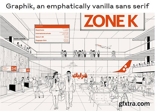
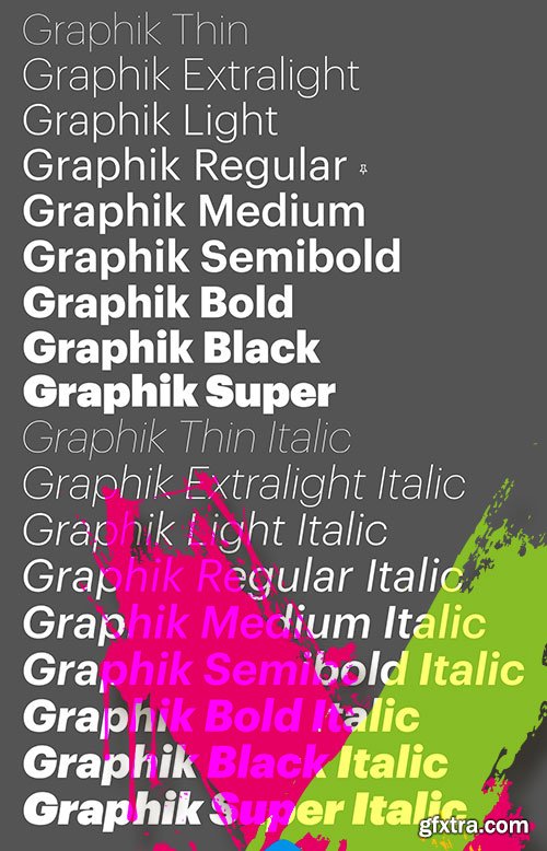
Graphik - Most Popular Commercial Typeface 18xOTF
OTF | 18 Fonts | JPEG Preview | 10.9 Mb RAR
- Graphik, a deliberately vanilla editorial workhorse, remains one of Commercial Type’s most popular families. This hybrid face offsets the round bowls typical of a geometric sans with the architecture and proportions of a European grotesk, without the baggage of more dogmatic, overused sans serifs mired in postwar modernism. Graphik’s low contrast, open counters, and compact descenders recommend it for use in tight settings like subheads, captions, labels, and running text; human touches like round dots and other details also make it ideal for larger, more impactful uses such as titles, covers, posters, and signage. Over time, the family has matured into an expansive collection of nine weights and eight widths, and has even branched out into a companion slab family: Produkt.
- The dominant trend of the mid twentieth century simple sans serifs still reverberates in visual culture. Graphik proves that it is still possible to create something refreshing inspired by this era. Taking cues from the less-known anonymous grotesques and geometric sans serifs, Graphik is perfectly suited for graphic and publication design. Originally designed for Schwartz’s own corporate identity, it was later finished for Conde Nast Portfolio and then expanded for Wallpaper* and later T, the New York Times Style Magazine.

Libertad Sans-Serif Typeface Family by TipoType
OTF | 14 Fonts | JPEG Preview | 8.6 Mb RAR
- Design can do without images, but not without typefaces. Libertad is a sans-serif typeface that mixes humanist and grotesk models. It’s most interesting feature is the combination of balanced regulars with dynamic italics, which makes it a very versatile font for different uses. This typeface follows the Luc(as) de Groot’s Interpolation Theory, that’s why it has seven specially-calculated weights plus their matching italics, from thin to extra-bold. This allows it to be useful in big headlines and also small texts. It has more than 800 characters per weight and support for more than 70 languages.
126,000 Royalty-Free 3D Model

Udemy Türkçe


Top Rated News
- CreativeLive Tutorial Collections
- Fasttracktutorials Course
- Chaos Cosmos Library
- MRMockup - Mockup Bundle
- Finding North Photography
- Sean Archer
- John Gress Photography
- Motion Science
- AwTeaches
- Learn Squared
- PhotoWhoa
- Houdini-Course
- Photigy
- August Dering Photography
- StudioGuti
- Creatoom
- Creature Art Teacher
- Creator Foundry
- Patreon Collections
- Udemy - Turkce
- BigFilms
- Jerry Ghionis
- ACIDBITE
- BigMediumSmall
- Globe Plants
- Unleashed Education
- The School of Photography
- Visual Education
- LeartesStudios - Cosmos
- Fxphd
- All Veer Fancy Collection!
- All OJO Images
- All ZZVe Vectors
- CGTrader 1 CGTrader 2


