

https://www.futurefonts.xyz/east-of-rome/mushy
Mushy is a soft-edged joining script display type that comes in four weights each named after gradations of dairy product - Cheese, Butter, Yoghurt and Cream. It's also available as a variable font. Mushy is great for logos and shorter word-marks. Using contextual alternates, the lowercase of Mushy joins up making words look like a sticky mess. And if this makes a word too hard to read, just untick contextual alternates and the unjoined Mushy lowercase will look clearer. The inspiration for Mushy comes from jugendstil soft display types like Herkules. The idea for the joining script comes from inky textura types (Gutenberg Bible style lettering), where the blackletter in/out strokes bleed into each other making a line of text look like a garden fence. The uppercase also contains a few optional Swashes.

https://www.futurefonts.xyz/jan-sindler/afrikola
Typeface inspired in my own chaotic handwriting. It started as a monospace family developed beyond that.


https://www.futurefonts.xyz/blast/granblue
Granblue is a type family for boxing titles. For now, it features two different types of contrast levels, but more options will be added down the line. Invest in this font now, as we have grand plans for expanding it, so you’ll be getting an amazing value by being an early tester.

https://www.futurefonts.xyz/scribble-tone/iso
ISO was originally designed for our project exif.co, an image embedding service. It was inspired by old cameras, specifically Leicas and Nikons, which have really warm, slightly goofy, and tactile engraved text all over.

https://www.futurefonts.xyz/ohno/ohno-blazeface-italic
Ohno Blazeface Italic began as its roman counterpart, which in turn began as Ohno Fatface, a super black didone that took some bizarre opportunities to fill space. At a certain point, I wondered what putting a stoney filter on it might look like, and so Ohno Blazeface came about. From there, it was an obvious move to try out an italic, and then I really started having a good time! I swear I am not trying to be patronizing, but this is intended for large sizes.

https://www.futurefonts.xyz/acute-studio/anouk
Anouk is a reversed high contrast typeface designed to be used at large sizes. Its design was conceived by Sabina Chipara at Acute Studio. The design started with her writing letters with a soft brush-marker. The emphasis of the ‘normal’ letter-contrast changed, and the thin lines became very thick, while the thick ones became thin.
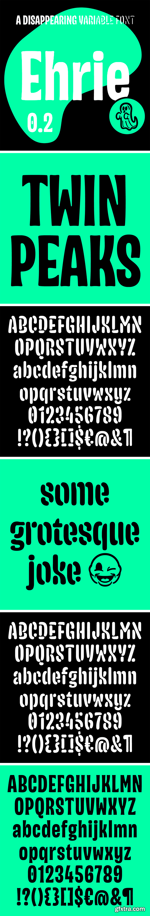
https://www.futurefonts.xyz/blast/ehrie
- Ehrie is a variable typeface developed by Rafał Buchner with animation in mind. The design process started with the question: “what would happen if we use a variable font axis to make letters completely disappear?”. We started with a condensed, slightly chubby design, which dematerialized into a stencil version. The challenge was to get these intricate shapes, full of tiny details, to technically animate and perform well in a variable font environment.


https://www.futurefonts.xyz/spaghetype/monstera
- Monstera came from a custom font for a game to play when you're bored with friends: something light, with a 60's-70's vibe, while keeping a contemporary twist. Inspired by the swirls of time, Hector Guimard's Art Nouveau typeface of the Paris Metro, Wes Wilson's letterings, and Roger Excoffon's latest font. Also the Monstera Deliciosa is the only plant I can grow for a while.

https://www.futurefonts.xyz/luis-gomes/coriolis
Coriolis is a display serif typeface, based on a calligraphic old program that I randomly found while searching for inspiration on the internet.

https://www.futurefonts.xyz/ohno/nonplus
This counterless semi-connecting script is an ode to unbridled enthusiasm and a complete disregard for the ruler tool. Most of my work in type focussed on the idea of “counterspace equals letterspace”, a nice starting point for spacing that I learned in Type Media. But what happens when the counters get removed? Immediately things feel much more abstract, but with the unfamiliarity comes a different sort of impact. Nonplus works well for short words at large sizes, like the majority of my projects!

https://www.futurefonts.xyz/cstm/backslanted
Backslanted is not a font family, but rather a font series including backslanted typefaces of various styles, weights and angles. The series explores backslanted forms defined by their drawing tools (a ruler and a driver) with a minimum amount of optical compensations.


CoFo Kak Font Family
- CoFo Kak is a powerful sans with an unconventional family structure. Just 3 styles? Yes, you got it right. While the design world is obsessing over superfamilies with hundreds of styles and variable fonts with seemingly ‘limitless’ possibilities, we dare to create a family so small! Because by limiting the amount of styles, we can allow ourselves to design a functional sans with organic personality and no compromises.
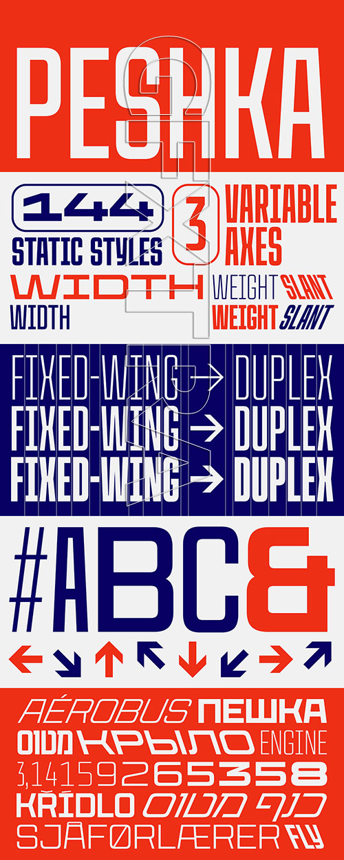 CoFo Peshka Font Family
https://www.futurefonts.xyz/contrast-foundry/cofo-peshka
- CoFo Peshka is based on examples of industrial lettering from the early 20th сentury, and yet the design is not limited to being a pure revival. Seemingly square, blocky and brutal, CoFo Peshka nevertheless embodies familiarity and friendliness. We pushed the initial idea to a variety of extremes, added extensive language and character support and developed it as a variable typeface from the very start.

The Ultimate Winter Font Collection Vol.1
52 Premium Fonts | 70 TTF | 70 OTF | 9 MB


Bimbo Monoline Script Font Family 7xOTF
CM 2395799
- Bimbo is a monoline script font family created in 2018 by Francesco Canovaro for Zetafonts as an extension & redesign of the original Arsenale White typeface created with italian illustrator Jonathan Calugi.


Ballinger X-Condensed 8 OTF TTF
- Their ancestral DNA is visible in the generous counters and x-height, forthright forms, and air of cheery efficiency. But the radically smooshed X-Condensed styles are ideal for movie credits, legal disclaimers, and lists of side effects. Features include semi-oldstyle figures and case-sensitive punctuation and delimiters. Also available in full-width, condensed, and monospaced versions.

Ballinger Mono Font Family
The addition of a monospaced version returns the Ballinger family to (some of) its roots: a 70s-era typewriter face called Candia, which Josef Müller-Brockmann designed for Olivetti.

Ballinger Condensed Font Family
Our Ballinger family continues to grow with the addition of 16 new narrow styles. Their shared DNA is visible in the generous counters and x-height, forthright forms, and air of cheery efficiency. And like their wider relatives, they have their roots in 19th Century jobbing faces. While the eight Condensed styles are designed for impact, we took care to balance them for continuous reading, making them ideal for applications where space is at a premium. In contrast, the radically smooshed X-Condensed weights are ideal for movie credits, legal disclaimers, and lists of side effects. Features include semi-oldstyle figures and case-sensitive punctuation and delimiters. Winner of an ICAD Gold Bell.

https://www.myfonts.com/fonts/graviton/armadura/
Armadura font family has been designed for Graviton Font Foundry by Pablo Balcells in 2012.
It is a display typeface with a geometric angular look. Armadura consists of 6 styles.


FORBES is a handmade Victorian handlettering, which is combining modern and classic typography with some awesome alternates. Yes we back to early 1800s, bring classic touch on this decade.
OTF | TTF | WOFF

Migra Font Family 15xOTF
- Migra is a spiky serif typeface inspired by the features in migratory birds. Its weights span from an austere and elegant light cut to a hawkish and powerful black one. Packed with a set of even more gestural Italics and sundry special ligatures, this typeface is guaranteed to add sparkle and grace to any of your designs.

Tomato Grotesk Font Family in 9 Weights & 9 Matching Slanted
18xOTF | 3.5 MB
- Tomato Grotesk is a modern grotesk family with simple geometric shapes and accentuated contrast that give it a strong display like personality. High contrast, tight spacing and ink traps make it perfect for use in print and on screens in small sizes. When used in large dimensions these features make it an extremely cheerful, versatile typeface for a range of different uses.

Wanted is an old west style title font with hints of hand placement and letterpress grunge. Use this font to create stylistic western style designs.
TTF | 101 Kb
126,000 Royalty-Free 3D Model

Udemy Türkçe


Top Rated News
- CreativeLive Tutorial Collections
- Fasttracktutorials Course
- Chaos Cosmos Library
- MRMockup - Mockup Bundle
- Finding North Photography
- Sean Archer
- John Gress Photography
- Motion Science
- AwTeaches
- Learn Squared
- PhotoWhoa
- Houdini-Course
- Photigy
- August Dering Photography
- StudioGuti
- Creatoom
- Creature Art Teacher
- Creator Foundry
- Patreon Collections
- Udemy - Turkce
- BigFilms
- Jerry Ghionis
- ACIDBITE
- BigMediumSmall
- Globe Plants
- Unleashed Education
- The School of Photography
- Visual Education
- LeartesStudios - Cosmos
- Fxphd
- All Veer Fancy Collection!
- All OJO Images
- All ZZVe Vectors
- CGTrader 1 CGTrader 2


