
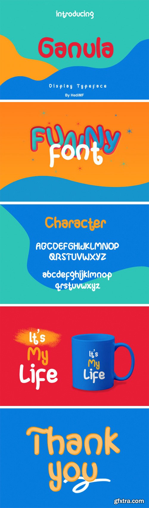
Ganula Font
The Ganula is a fun display font. It has a little irregularity which gives it an interesting look. This display font is suitable for magazines, logos, signatures, posters, advertising, brochures, and much more!


At every month, the user that is selected by you in a survey which is between the users that have most sharings will win Filenext premium for 3 months.


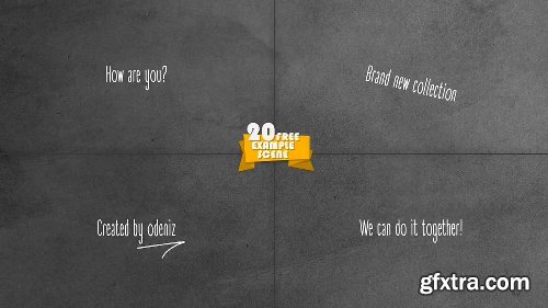


After Effects Version : CC 2015, CC 2014, CC, CS6, CS5.5
Files Included : After Effects Project Files
Resolution : Resizable
File Size : 183MB
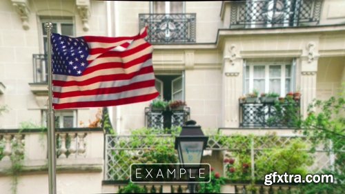
Demo


Spesification :
1 Ai File & 1 Psd file
Well organized layers
8.27" x 11,69"
100%vector
full editable
CMYK 300 DPI
Print Ready
Layered PSD | Ai Illustrator | 8x11


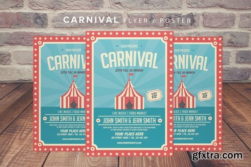
Real Estate Flyer
This flyer made for your special event.
Spesification
Ai&PSD Files
21x29.7 cm + Bleed
Well organized layers
fully editable
CMYK 300 DPI
CS5
Layered PSD | 21x29


An elegant and minimalist flyer, perfect for any personal or corporate use. It’s ideal for any company project and very easy to edit. All you need to do is just to change content and images. It’s fully customizable.
Features :
A4 Size (210 x 297 mm) with Bleed 3 mm
Easy to Use
Smart Object Image Placeholder
Image are Not Included
Print Ready with CMYK Colors and 300 dpi
All Text are Editable with Text Tool
Well-organized Layers
Free Font Use
Font Link are Included on Documentation
Layered PSD | 21×29


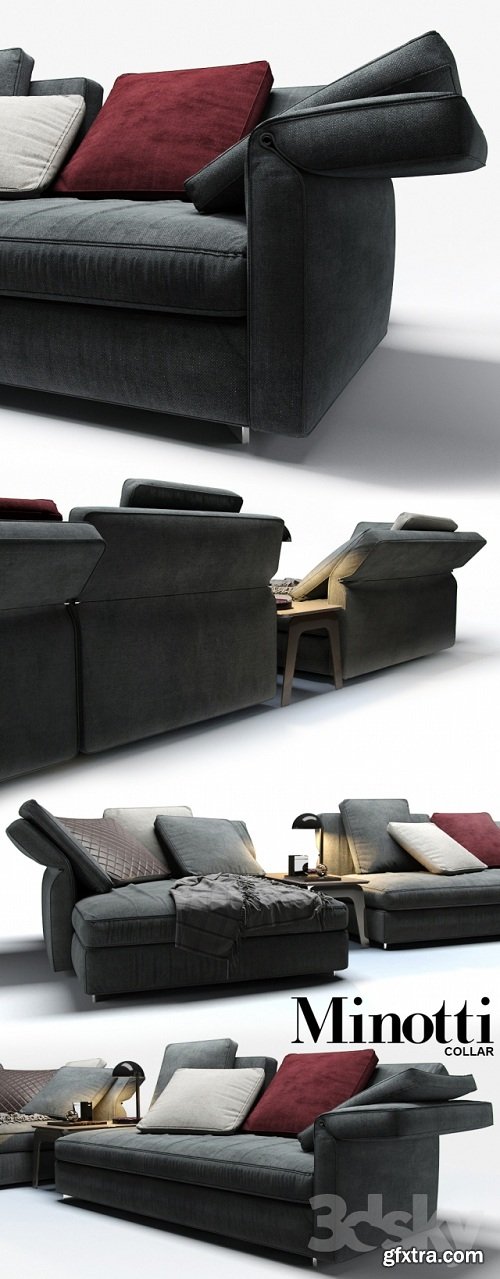
126,000 Royalty-Free 3D Model

Udemy Türkçe


Top Rated News
- CreativeLive Tutorial Collections
- Fasttracktutorials Course
- Chaos Cosmos Library
- MRMockup - Mockup Bundle
- Finding North Photography
- Sean Archer
- John Gress Photography
- Motion Science
- AwTeaches
- Learn Squared
- PhotoWhoa
- Houdini-Course
- Photigy
- August Dering Photography
- StudioGuti
- Creatoom
- Creature Art Teacher
- Creator Foundry
- Patreon Collections
- Udemy - Turkce
- BigFilms
- Jerry Ghionis
- ACIDBITE
- BigMediumSmall
- Globe Plants
- Unleashed Education
- The School of Photography
- Visual Education
- LeartesStudios - Cosmos
- Fxphd
- All Veer Fancy Collection!
- All OJO Images
- All ZZVe Vectors
- CGTrader 1 CGTrader 2


