10 eps, ai + 10 jpeg, tif / prew / 55,6 Mb
17 eps, ai + 17 jpeg, tif / prew / 106,5 Mb
PSD | 1275x1875 PIX | 140,67 MB
PSD | 1275x1875 PIX | 142.39 MB
PSD | 1275x1875 PIX | 94.00 MB
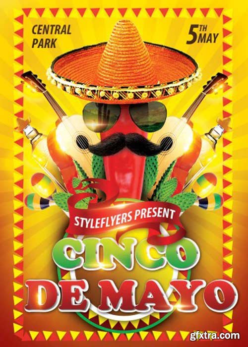
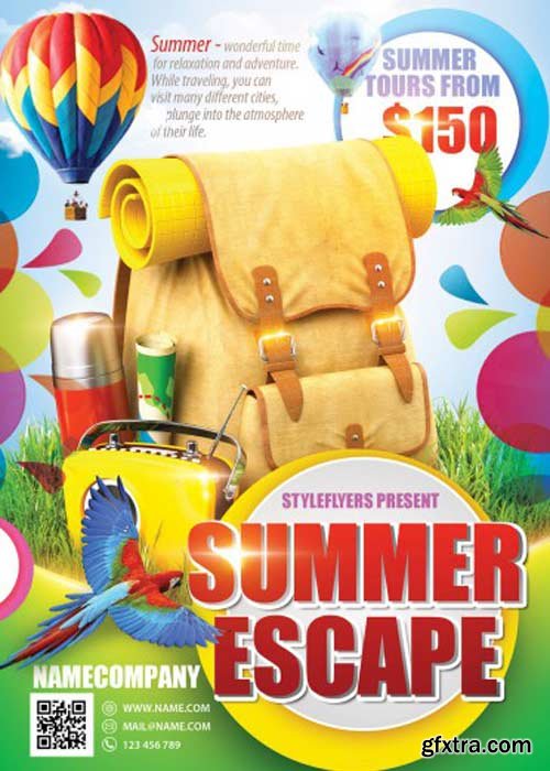
PSD | 1275x1875 PIX | 175.75 MB
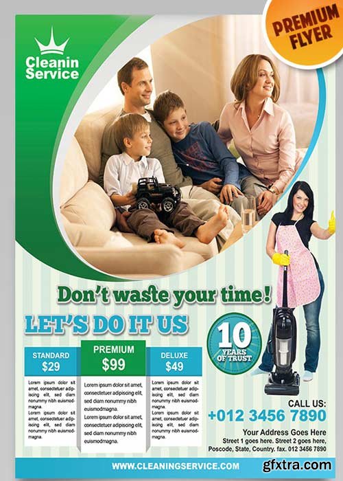
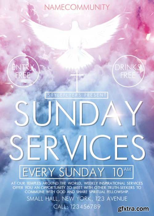
PSD | 1275x1875 PIX | 130.32 MB
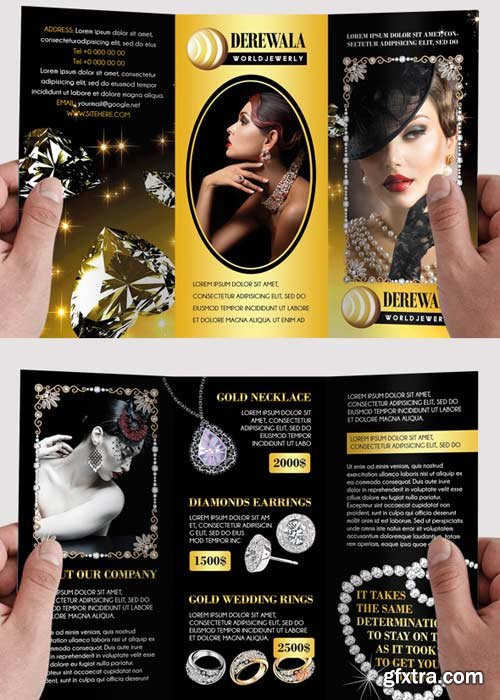
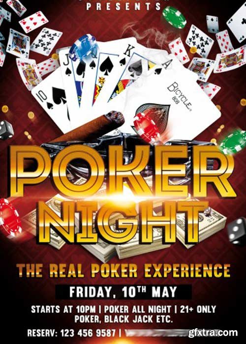
PSD | 1275x1875 PIX | 177.04MB

Salient is an ultra responsive, beautiful WordPress theme that is perfect for freelancers, photographers, designers and creative agencies alike. Its stunning design and layout capabilities will give your portfolio pieces the attention they deserve. One of the great feature of this theme is that you can run video backgrounds on this theme, which is quite a unique feature. Salient has quite clean layout, this theme comes with nicely laid theme options which makes very easy to make changes in this theme, that is why it is one of the most popular theme right now.
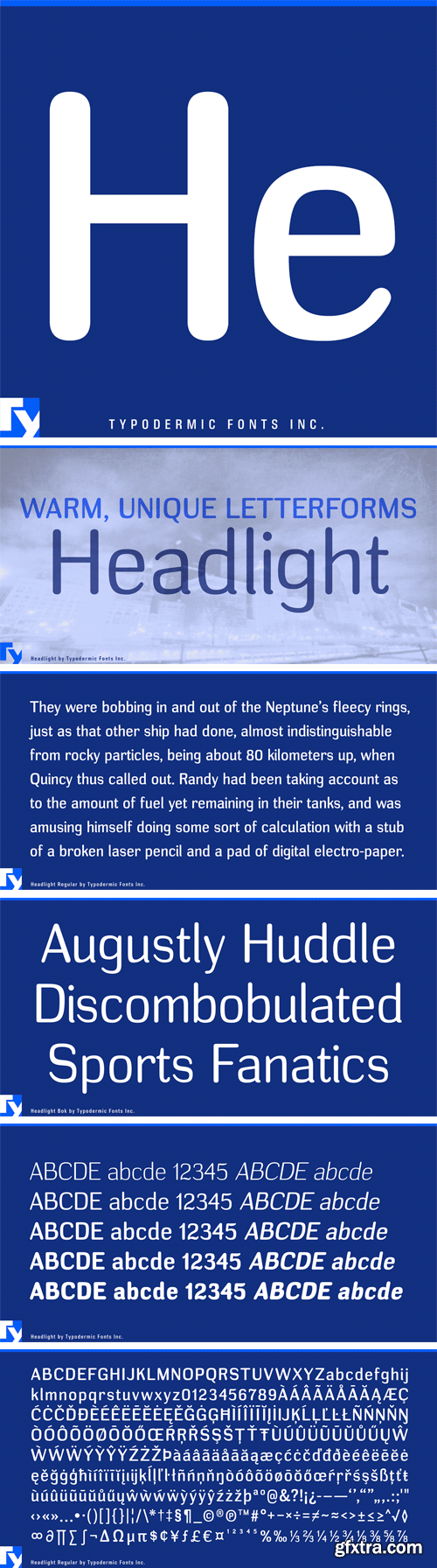
http://www.myfonts.com/fonts/typodermic/headlight/
Headlight is an atypical sans-serif typeface. A curious mix of oval-nib garnishes and mechanized squareness gives Headlight a idiosyncratic ambience. It’s available in 5 weights and italics. Numerals come in lining proportional and old-style proportional styles.
OTF | 10 Fonts | + JPG Preview

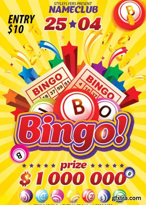
PSD | 1275x1875 PIX | 130.48 MB
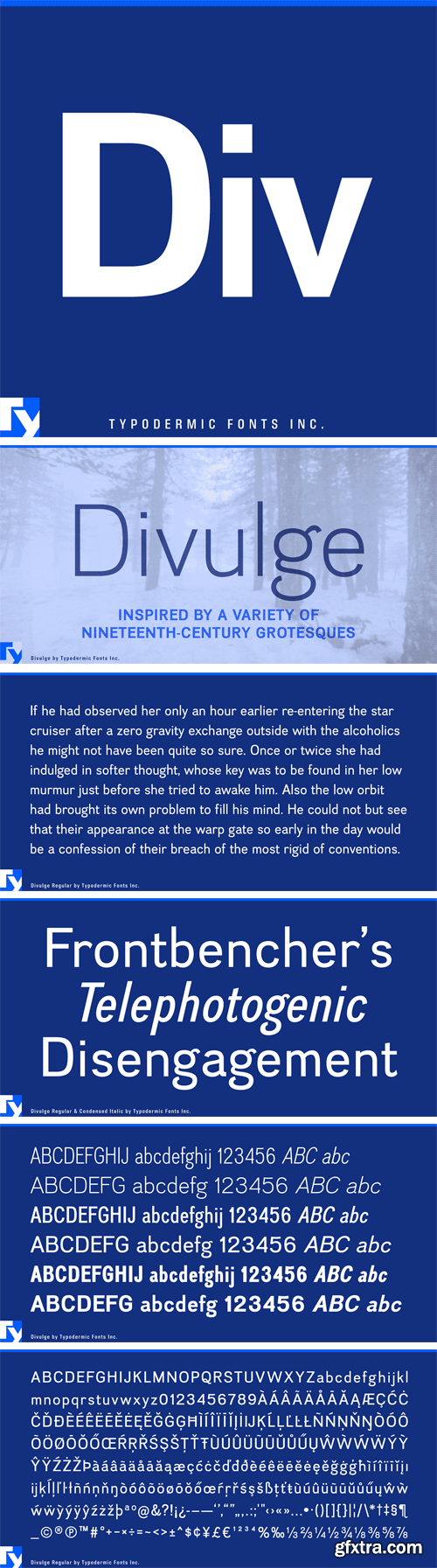
http://www.myfonts.com/fonts/typodermic/divulge/
Divulge is a modern grotesque that takes inspiration from nineteenth and very early twentieth-century sans-serif metal type. Its austere, nuanced voice feels old-fashioned but not in a jokey way. Idiosyncrasies are liberally sprinkled but not so much that the reader stops in their tracks. This handsome typeface comes in 3 weights, 2 widths and italics.
OTF | 12 Fonts | + JPG Preview
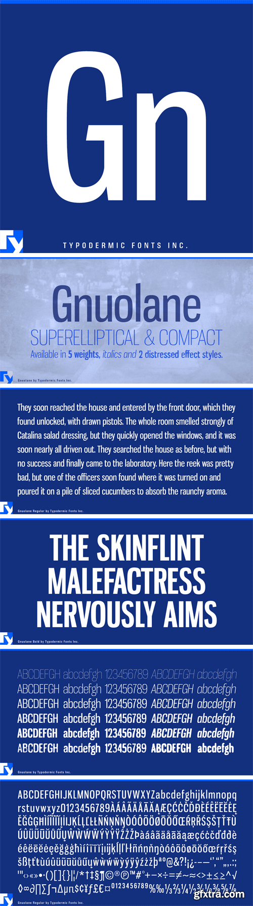
http://www.myfonts.com/fonts/typodermic/gnuolane/
Gnuolane is a serious headline font in five weights. While it borrows from 19th Century grotesque models, it possesses a superelliptical sixties sneer. Gnuolane includes old-style numerals, ordinals, superiors, inferiors, f-ligatures and class-based kerning.
OTF | 13 Fonts | + JPG Preview
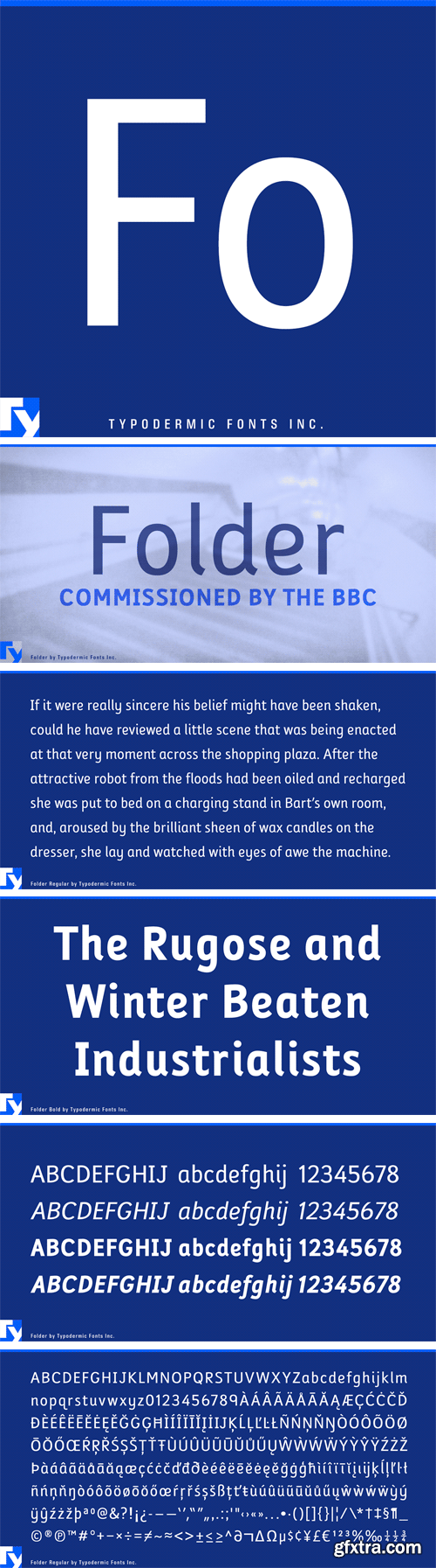
http://www.myfonts.com/fonts/typodermic/folder/
Folder is a clear, sans-serif typeface intended for children. It was commissioned by the BBC for an educational program and was designed to resemble the style of print that young students are often taught. Folder will imbue your designs with a spirit of scholarly material without overtly resembling a print tracing guide. In OpenType savvy applications, you can access more conventional looking stylistic alternates for the 9, I, J and lowercase q. Folder is available in regular, bold and italic.
OTF | 4 Fonts | + JPG Preview
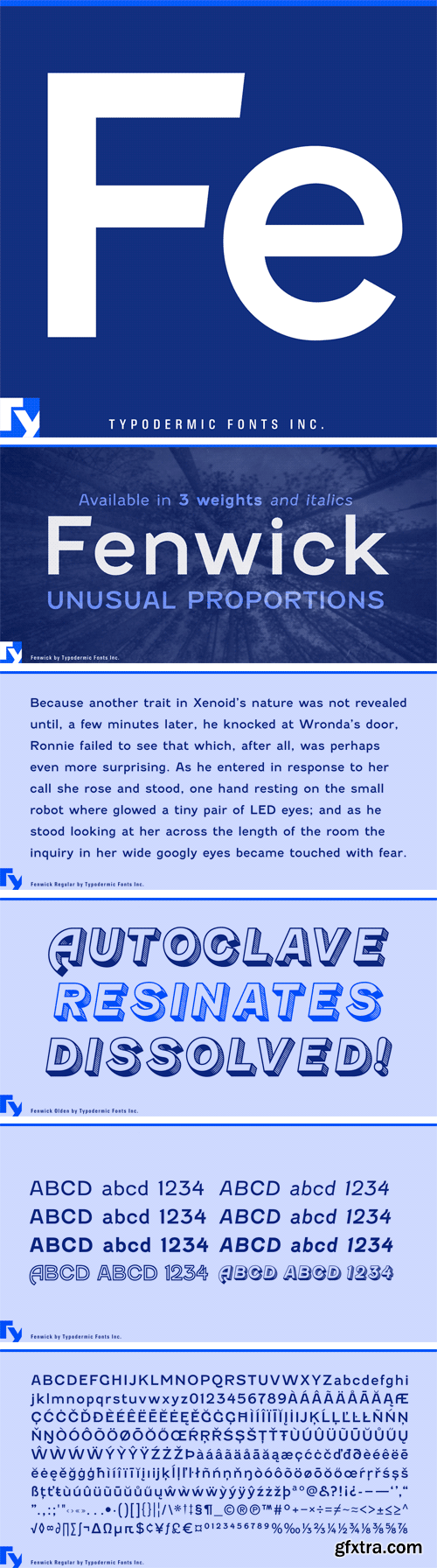
http://www.myfonts.com/fonts/typodermic/fenwick/
Fenwick is a lineal, metal type with unusual proportions. The almost sinuous curves of the numerals revive their inherent Arabian roots and the italic’s line thickness was amended by eye so as not appear too mechanical.
OTF | 8 Fonts | + JPG Preview
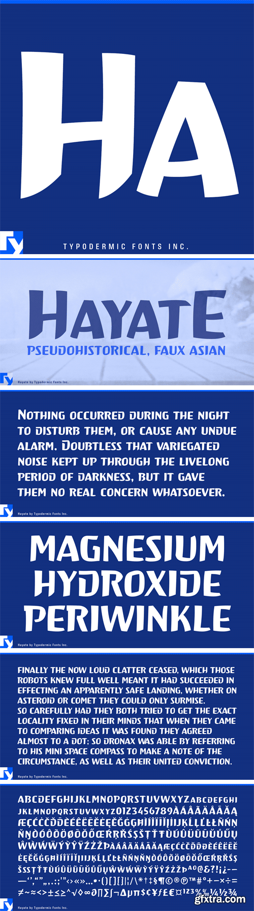
http://www.myfonts.com/fonts/typodermic/hayate/
Hayate (ha-ya-teh) is a pseudohistorical, faux Asian font commissioned for a WWII Pacific Air War videogame.
OTF | 1 Font | + JPG Preview
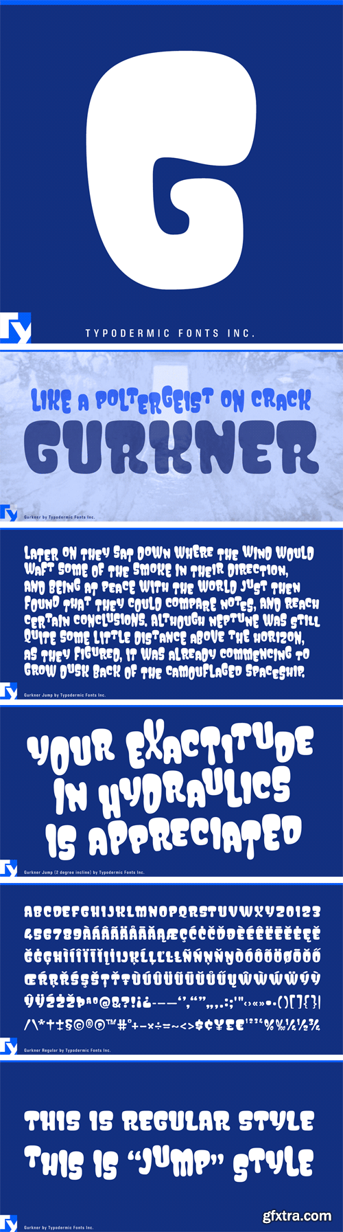
http://www.myfonts.com/fonts/typodermic/gurkner/
Gurkner can take on two forms: First, there’s the straight form, a ruly Gurkner with all its ducks in a row—an obedient army of Caspers. Then there’s a quixotic form, a demented Gurkner that bounces around the house like a poltergeist on crack.
OTF | 2 Fonts | + JPG Preview
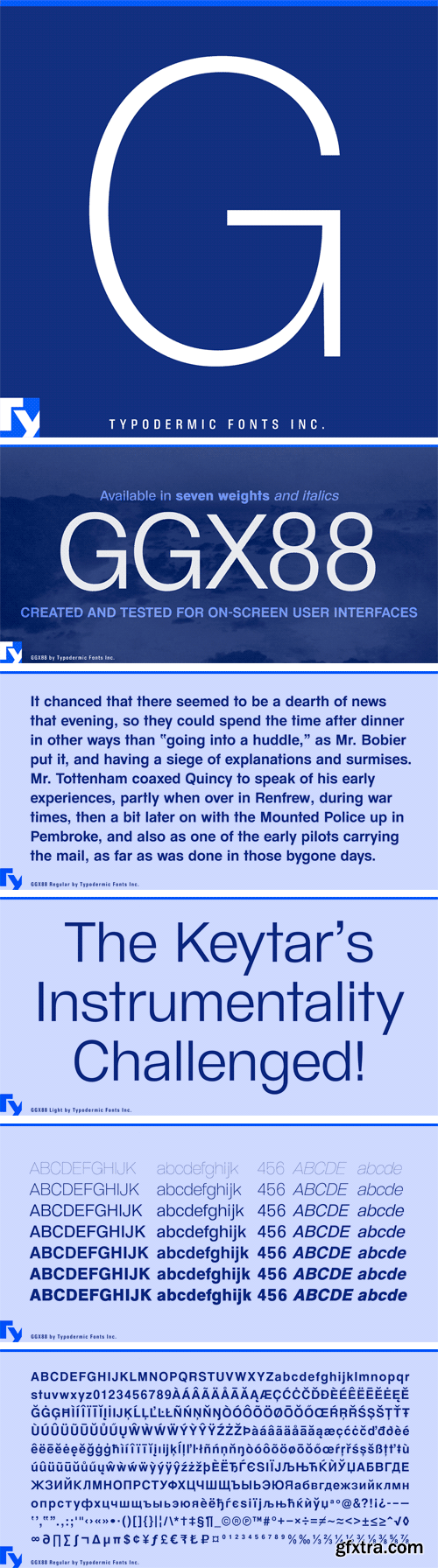
http://www.myfonts.com/fonts/typodermic/ggx88/
GGX88 is a Swiss inspired sans-serif typeface, created and tested for on-screen user interfaces. The geometry is even more minimal than the already minimalist typeface it suggests. It works exceptionally well in adaptive interfaces and displays that don't necessarily give the viewer a 1:1 pixel ratio, such as television screens, phones, kiosks, projections and smart watches. While the TrueType version comes with vertical pixel hinting, GGX88 looks great with basic pixel smoothing. GGX88 is available in seven weights plus italics.
OTF | 7 Fonts | + JPG Preview
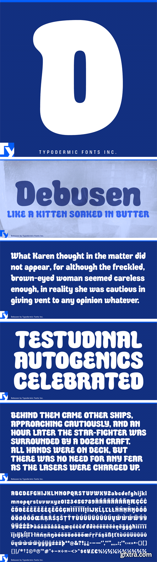
http://www.myfonts.com/fonts/typodermic/debusen/
Creamery-fresh Debusen is soft. Soft like a kitten soaked in butter. That’s what makes Debusen so friendly. It’s nothing but a friendly, buttery kitten.
OTF | 1 Font | + JPG Preview
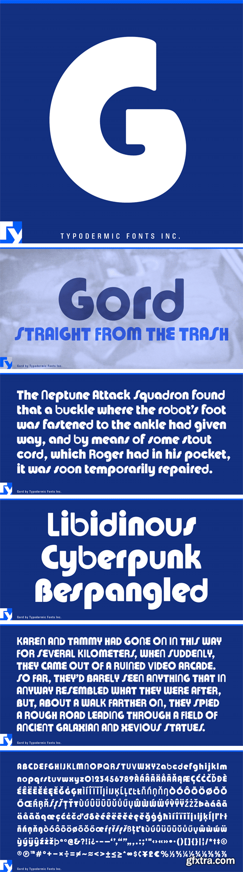
http://www.myfonts.com/fonts/typodermic/gord/
Gord is a collage of famous curvy 1970’s fonts.
OTF | 1 Font | + JPG Preview
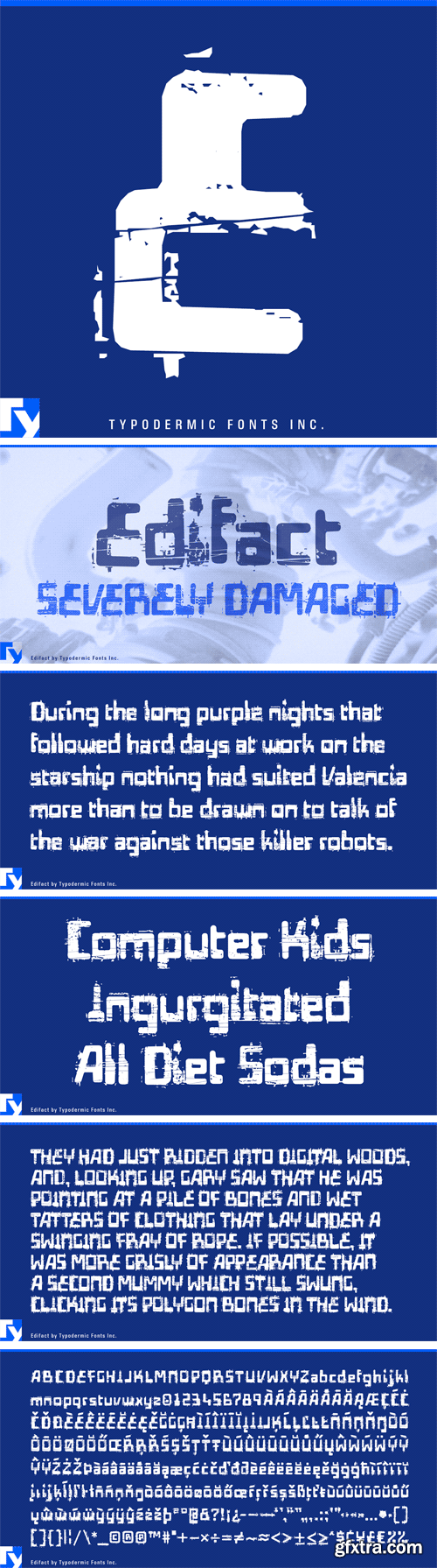
http://www.myfonts.com/fonts/typodermic/edifact/
Edifact is a severely damaged 1960s style techno font.
OTF | 1 Font | + JPG Preview
SermonBox - Seasonal Collection

SermonBox - The Series Pack Collection
Top Rated News


Would you like to be a Author?


