


Regan Script Typeface OTF
- Hello everyone, we present a new font Regan Script Font is a beautiful writing theme with a charming curve and a very shaky bottom line It has a perfectly paired free marker font, and a bunch of very practical Swash bonuses Ideal for logos, handwritten quotes, product packaging, headers, posters, merchandise, social media & greeting cards.
OTF | TTF


Nimbus Sans Round Font Family 16 Font $320
16 OTF TTF | SALE PAGE
- The first versions of Nimbus Sans have been designed and digitized in the 1980s for the URW SIGNUS sign-making system. Highest precision of all characters (1/100 mm accuracy) as well as spacing and kerning were required because the fonts should be cut in any size in vinyl or other material used for sign-making. During this period three size ranges were created for text (T), the display (D) and poster (P) for small, medium and very large font sizes. In addition, we produced a so-called L-version that was compatible to Adobe’s PostScript version of Helvetica. Nimbus was also the product name of a URW-proprietary renderer for high quality and fast rasterization of outline fonts, a software provided to the developers of PostScript clone RIPs (Hyphen, Harlequin, etc.) back then. Also in the 80s, a new, improved version of the Nimbus Sans, namely Nimbus Sans Novus was designed. Nimbus Sans Novus was conceptually developed entirely with URW’s IKARUS system, i.e. all styles harmonize perfectly with each other in terms of line width, weight, proportions, etc. On top of that, Nimbus Sans Novus contains more styles than Nimbus Sans. Now, Nimbus Sans Novus is also available as Round (like the popular URW fonts Futura Round and Eurostile Round). The Round versions are intended to facilitate the work of designers and typographers. The fonts can be used directly, without further preparatory work in graphic programs as finished, high-quality Rounds.


FF Kievit Slab Font Family - 18 Fonts for $659
OTF + TTF | 18 Fonts | 1.4 Mb RAR
- American type designer Michael Abbink and Dutch type designer Paul van der Laan created this slab FontFont in 2013. The family has 18 weights, ranging from Thin to Black (including italics) and is ideally suited for advertising and packaging, book text, logo, branding, small text, wayfinding and signage as well as web and screen design. FF Kievit provides advanced typographical support with features such as ligatures, small capitals, alternate characters, case-sensitive forms, fractions, and super- and subscript characters. It comes with a complete range of figure set options – oldstyle and lining figures, each in tabular and proportional widths.
AquaSoft Stages is a tool for professionals, photographers, animators, and ambitious advanced users who require maximal functionality from their software and want to control every moment of their project precisely.
")
")
")
")
")
")
")
")
")
We have long overtaken the topic of photo presentation. For years, our programs have been able to do much more than the name SlideShow could express. Along with the new version 15, the new name was changed to AquaSoft Vision. Vision is thus the direct successor to the popular AquaSoft slide show program. AquaSoft SlideShow Ultimate becomes AquaSoft Video Vision
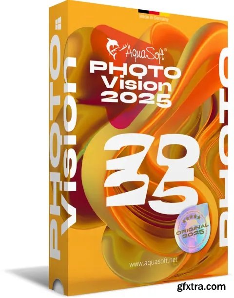
We have long overtaken the topic of photo presentation. For years, our programs have been able to do much more than the name SlideShow could express. Along with the new version 15, the new name was changed to AquaSoft Vision. Vision is thus the direct successor to the popular AquaSoft slide show program. AquaSoft SlideShow Premium becomes AquaSoft Photo Vision.


Brownstone Sans by Sudtipos
OTF | 3 Fonts | JPEG Preview | 3.4 Mb RAR
- One design sparks another. As Alejandro Paul experimented with the strokes and curves of the monoline script Business Penmanship, he discovered interesting new forms and shapes that didn't fit the Spencerian theme of that typeface. These forms simmered in Ale’s subconscious over the next three years, during which time he visited New York City, pored over rare type specimen books in the New York Public Library, and explored Brooklyn’s neighborhoods. Brownstone, the face born from these explorations, is an original 21st-century design, yet one subtly infused with historical and cultural references -- keen observers might spot influences from decorative typefaces of 19th-century foundries. And just as faces from that era were influenced by contemporary architecture, the frames included with Brownstone echo the ornate iron railings of Park Slope’s row houses. (There’s also a slight 1960s vibe to Brownstone, of novelty swash-sans photocompositing faces, that can be played up at your discretion.) Influences aside, Brownstone has broad appeal to modern audiences. A soft, monoline sans-serif, with elements of Swiss geometry (see the ‘k’ and ‘x’), its marriage of highly legible, draftsman-like letterforms with decorative swashes and ornaments reflects the old-meets-new aesthetic of the DIY craft culture seen in Brooklyn and other urban centers. It’s ornamental but unfussy, romantic but understated. Brownstone includes character sets for Latin-based languages, including Western and Eastern European, Baltic, Turkish, Maltese, Celtic and Welsh. Over 1500 glyphs, including small capitals, swash characters, alternates, and ligatures, in both Light and Thin weights. Ornamental frames are also included in both weights.
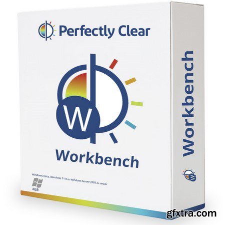
Perfectly Clear Workbench is an application that uses Athentech’s Perfectly Clear image correction libraries and is made available to demonstrate the capabilities of the Perfectly Clear processing libraries, face detection library and to allow a quick export of the processing settings for use.


- Franca is a neo-grotesk family in nine weights plus matching italics. The inspiration for the design came trough the constant interest in new interpretations of the classic grotesk model and a study of „neutral“ typefaces like Helvetica, Univers or Normal Grotesk. During the studies, additional attention was given to the American representatives of the genre, resulting in the initial impetus for a reinterpretation, combining both paths into one contemporary design.


- Gilam is a sans serif font with semi-condensed proportions. The typeface was based on the famous DIN but combines its popular neo-grotesque look with characteristics, such as the pointed edges in the “W” and “M” as well as the outward cut terminals, which gives a distinctive look to the modern geometric typeface. The complete set of 9 weights plus italics gives to designers an absolute freedom to create. Perfect layouts with blocks of text, headlines, motion graphics, logos, apps, and websites are just part of the intended usage of this versatile typeface.

126,000 Royalty-Free 3D Model

Udemy Türkçe


Top Rated News
- CreativeLive Tutorial Collections
- Fasttracktutorials Course
- Chaos Cosmos Library
- MRMockup - Mockup Bundle
- Finding North Photography
- Sean Archer
- John Gress Photography
- Motion Science
- AwTeaches
- Learn Squared
- PhotoWhoa
- Houdini-Course
- Photigy
- August Dering Photography
- StudioGuti
- Creatoom
- Creature Art Teacher
- Creator Foundry
- Patreon Collections
- Udemy - Turkce
- BigFilms
- Jerry Ghionis
- ACIDBITE
- BigMediumSmall
- Globe Plants
- Unleashed Education
- The School of Photography
- Visual Education
- LeartesStudios - Cosmos
- Fxphd
- All Veer Fancy Collection!
- All OJO Images
- All ZZVe Vectors
- CGTrader 1 CGTrader 2


