












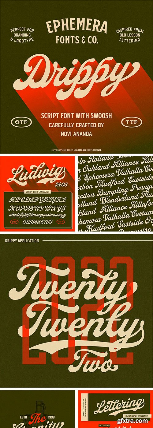
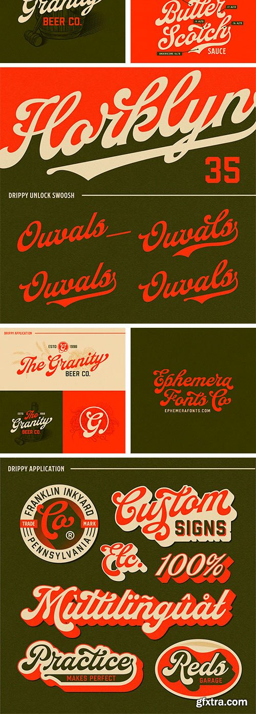
https://ephemerafonts.com/products/efco-drippy
Starting from the archive of vintage educational lettering books, posters, and decorative stuff of visual trends back in the day, Drippy was born based on that particular reference. To fill the gap between classic historical ambiance and the pop modern retro vibes. The swashy touch on each letter is tailored to make Drippy more remarkable in the industry. Stand out from the crowd, and be the best version of your vision statement. Undoubtedly a perfect pair for your logotype, branding project, label design, sign painting, and a very wide of advertising needs.

https://www.myfonts.com/collections/meloso-font-mini-press
Meloso is an easygoing typeface. It has a playful and organic feel that has its own hand-drawn charm while still being incredibly legible due to its simple shapes and high x-height. It has the unique ability to stand alone as a title text or work in small paragraph form. It's the perfect way to bring the friendly feel of an "imperfect" and slightly rounded font into your next project. Meloso is a variable font with 6 set weights. If you're using a program that supports variable fonts, you'll be able to choose any point between the "Extra Thin" and "Extra Bold" weights to get the perfect thickness and adjust the italic to the angle you need. You can also use the standard OTF files to have the 6 set weights.
https://www.myfonts.com/collections/everflow-font-andrejs-kirma
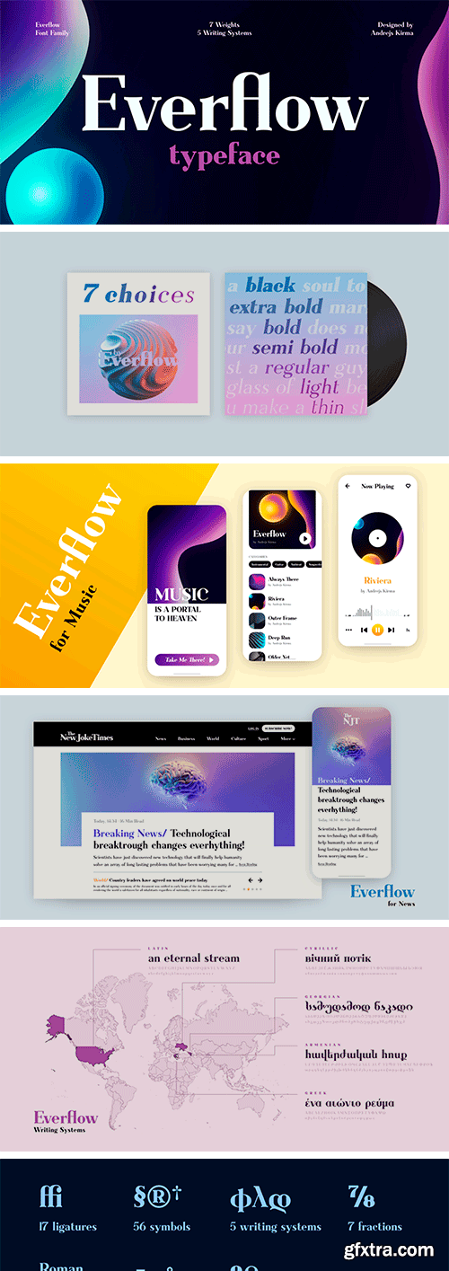
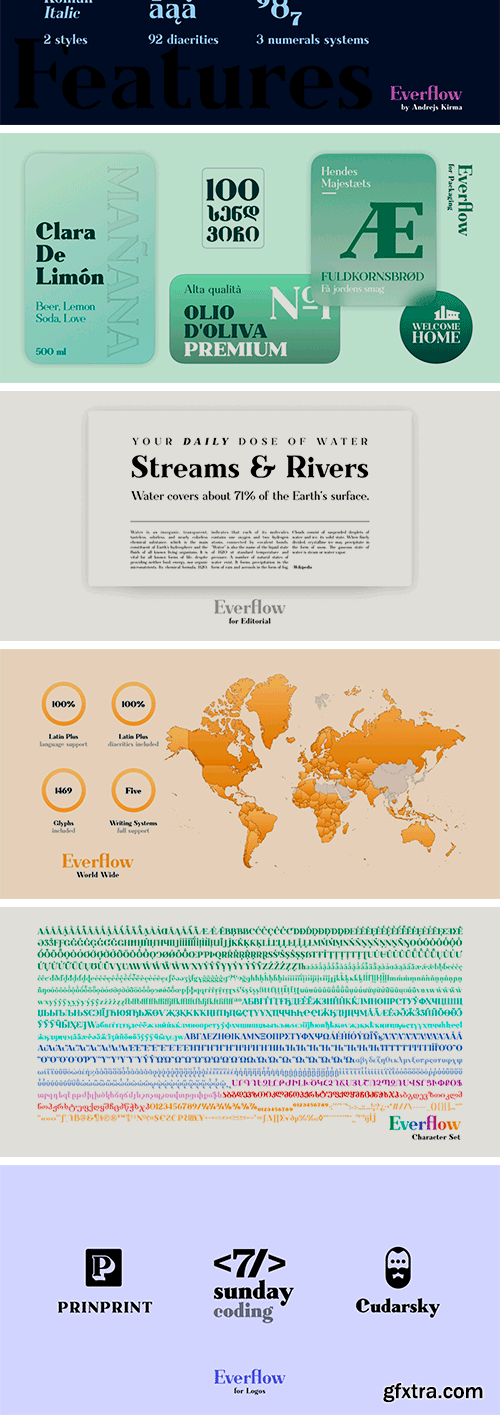
Everflow is the third typeface family by Andrejs Kirma. Coming from the background of creating a large amount of geometric icons, he set the goal of creating geometric typefaces in a variety of styles and consequently exploring new opportunities in typeface design. A modern, geometric serif typeface in seven weights Everflow was created to serve the modern designer that appreciates precision, versatility and simplicity.

https://www.myfonts.com/collections/incidentia-font-umka-type
Incidentia - A Display Font : Incidentia is a carefully crafted display font. It has Extended Latin and Cyrillic characters. It is created for poster, web, brand and social media designs.

Become Font
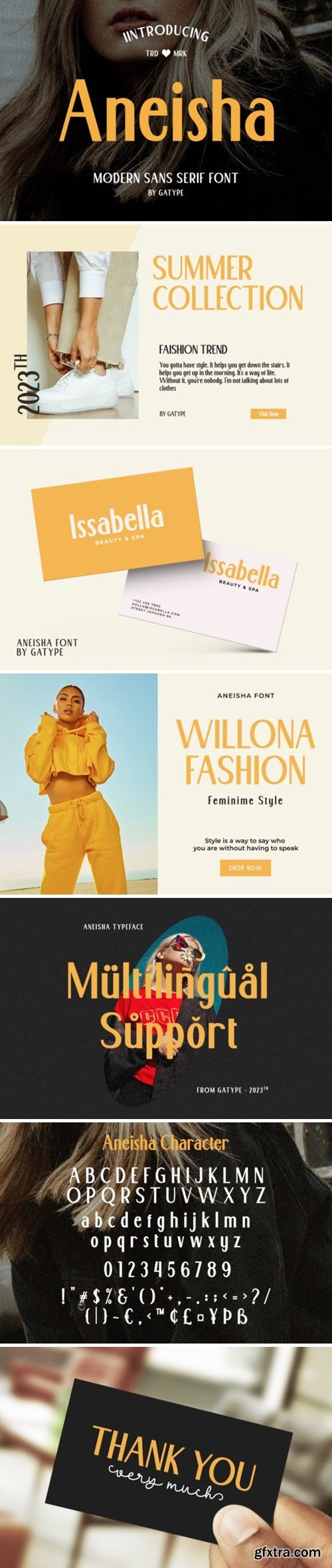
Become is a futuristic logo font based on sans serif. With unique and twisted lowercase, you can make your logo looks more attractive and modern. This font also including creative ligature that will make your project looks more stunning. You can use this font for branding, logo, and designs that require sci-fi looks. This font also support multilingual.
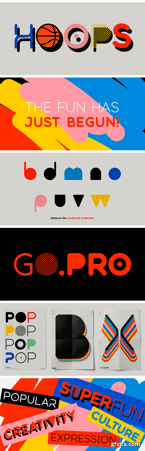
https://www.myfonts.com/collections/modulus-pro-font-arkitype
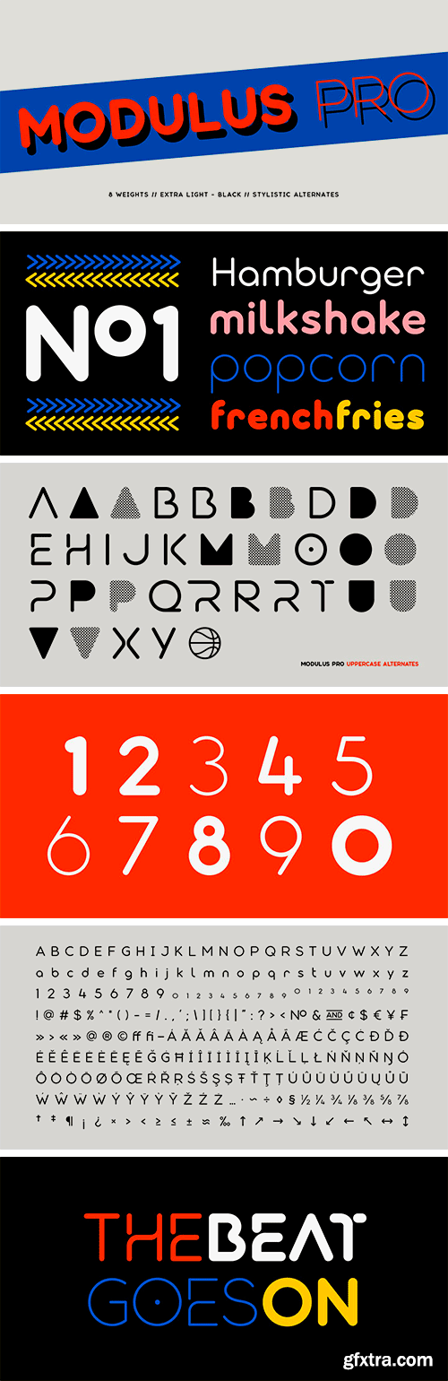
Modulus Pro, the extensive update to Modulus. This update was built around the original Modulus Font. This rounded sans-serif has a larger glyph set which covers many languages. Modulus Pro now comes in 8 weights from Extra-Light to Black. This updated version was designed with the designer in mind, you have many stylistic alternates to get creative with and make some really cool customised typography. A large range of examples have been designed to show just how versatile and creative you can get with this font family. It's fun but has a cool, edginess to it at the same time. Modulus Pro is not just another rounded sans-serif, you are going to want this in your font list.

https://schriftlabor.at/custom/sephora/
The world’s largest beauty retailer, Sephora, uses their custom typeface system for their global branding on their printed materials, their shop fronts, their website and their mobile apps. In collaboration with New York-based agency Mucca, the team at Schriftlabor created a typeface superfamily consisting of two serif and one sans-serif family, plus two unique handwriting fonts.

https://www.sourcetype.com/typefaces/333/karl
The history of rounded type is strange and diverse, from baked bread letterforms to bubbly corporate tech logos. While today rounded type might be a stylistic genre, it’s interesting to understand its evolution as a product of technological or production constraints. Take, for example, wood type where it was easier to mill curved forms as opposed to right angles. Or highway signage, where text would appear blurred from backlighting, making words look different in the day versus the night.

https://cotypefoundry.com/our-fonts/rm-mono/
RM Mono is the monospaced version of RM Neue. Each character in RM Mono fits in a box of the same width (600 units). While developing RM Mono, we also took the time to update RM Neue with a few new glyphs, tighter tracking, better kerning, and an overall facelift.
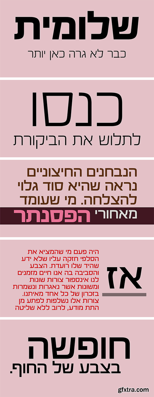
https://www.myfonts.com/collections/otostrada-mf-font-masterfont
Legible yet elegant font family with a variety of weights.

NeoSkola Bütün Kursları
Udemy Türkçe


Top Rated News
- TheBoudoirDivas All Tutorial
- 126,000 Royalty-Free 3D Models
- CreativeLive Tutorial Collections
- Fasttracktutorials Course
- Chaos Cosmos Library
- MRMockup - Mockup Bundle
- Finding North Photography
- Sean Archer
- John Gress Photography
- Motion Science
- AwTeaches
- Learn Squared
- PhotoWhoa
- Houdini-Course
- Photigy
- August Dering Photography
- StudioGuti
- Creatoom
- Creature Art Teacher
- Creator Foundry
- Patreon Collections
- Udemy - Turkce
- BigFilms
- Jerry Ghionis
- ACIDBITE
- BigMediumSmall
- Globe Plants
- Unleashed Education
- The School of Photography
- Visual Education
- LeartesStudios - Cosmos
- Fxphd
- All Veer Fancy Collection!
- All OJO Images
- All ZZVe Vectors
- CGTrader 1 CGTrader 2



















