OTF | WOFF | 1 MB
Sale Page
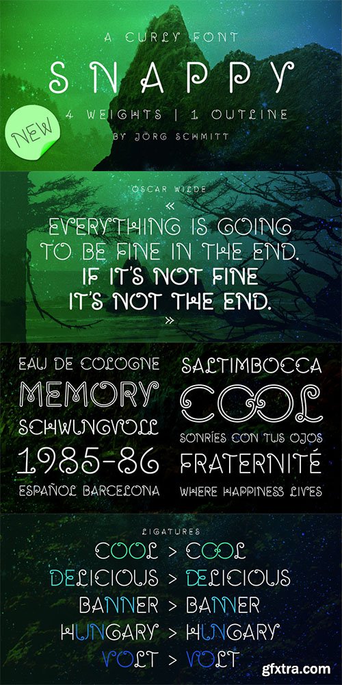
Snappy is a friendly and curly font. It is influenced by the typical coffee house typefaces in france. It comes along with four weights and one outline font.
OTF | WoFF | 46.1MB
Sale Page
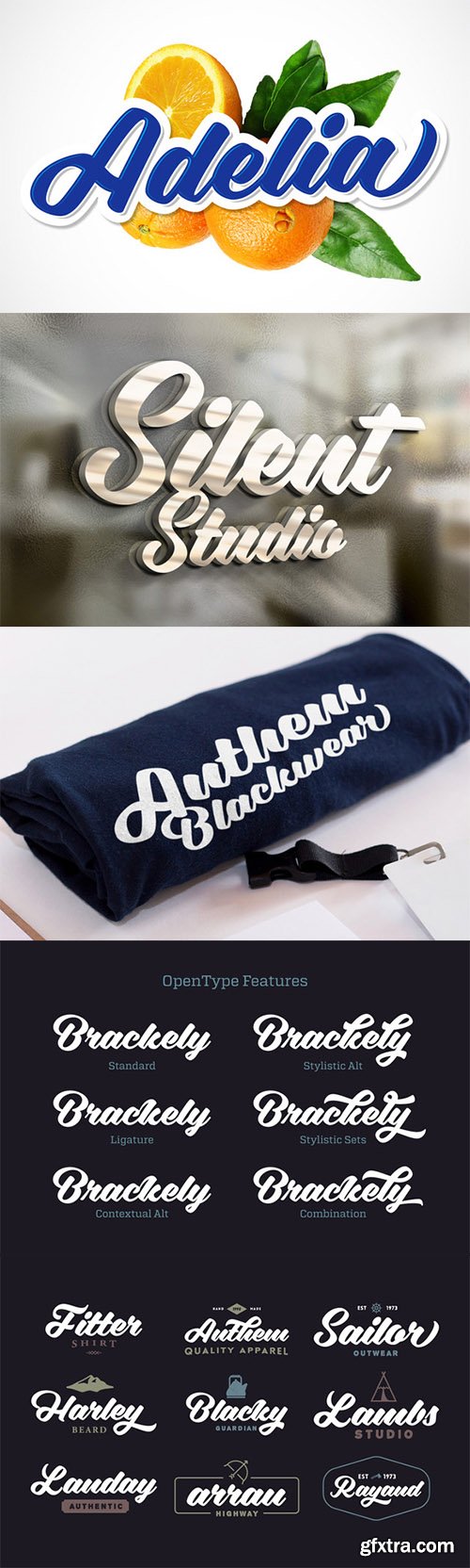
Adelia is a unique script that's bold, playful, and smooth. Inspired by traditional sign painting and brush lettering. It is suitable for logo, packaging, headline, poster, t-shirt, etc.Adelia has 108 alternate characters to help you create an attractive message and improve your design, mix and match Adelia with its alternate characters where ever you like it. The alternative characters divided into several OpenType features such as Ligature, Contextual alternates, stylistic alternates, and stylistic sets. It can be accessed by using OpenType savvy program such as Adobe Illustrator and Adobe InDesign. The Manual that show you how to use OpenType feature was included in the package.
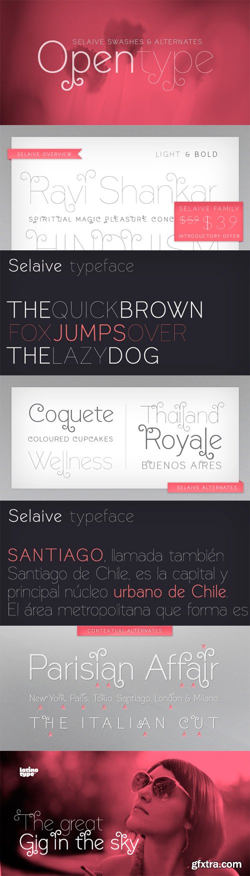
Selaive is a geometric typeface that has an air of rebelliousness. The thick and thin versions give you the chance to play a coquettish and seductive game. Its flourishes make it a very dynamic typeface when composing a text, ideal for those who want to add a personal and glamorous touch to their compositions. Selaive is an excellent choice for fashion magazines, logotypes and shops. Languages include: Basic Latin, Western European, Euro, Catalan, Baltic, Turkish, Central European, Romanian and Pan Africa Latin.
OTF | 2 Fonts | JPEG Preview | 4 Mb RAR


Helvetica Ultimate Collection 475$
Helvetica | Helvetica World | Helvetica Neue
This typeface was initially released as Neue Haas Grotesk, and was designed in 1957 by Max Miedinger for the Haas’sche Schriftgiesserei (Haas Type Foundry) in Switzerland.
The name was changed to Helvetica (an adaptation of Helvetia, the Latin name for Switzerland) by Walter Cunz when D. Stempel AG, a major stockholder in Haas, reworked the design for Linotype GmbH in Frankfurt, a major stockholder in Stempel. The Mergenthaler Linotype Company in New York, then a major stockholder of Linotype GmbH, adopted the design, and it rapidly became the most popular sanserif in the world, replacing Futura.
Helvetica is designed as a strong central series, with condensed and extended forms and extreme weights adapted and added later, a system which suited Linotype mechanical limitations and marketing philosophy, but which resulted in a family of weights that were not as well coordinated as they might have been.
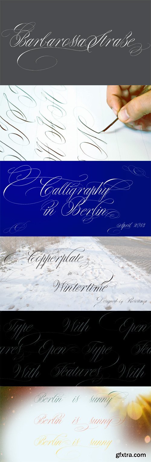
Copperlove was born during a very long and hard wintertime in Berlin. This font is based on Giuseppe Salerno’s Copperplate calligraphy. Oblique nib and sepia ink were the tools used to create this sublime english typeface. There are also many opentype features like alternates and beautiful swashes.
OTF | 1 Font | JPEG Preview | 6.7 Mb RAR
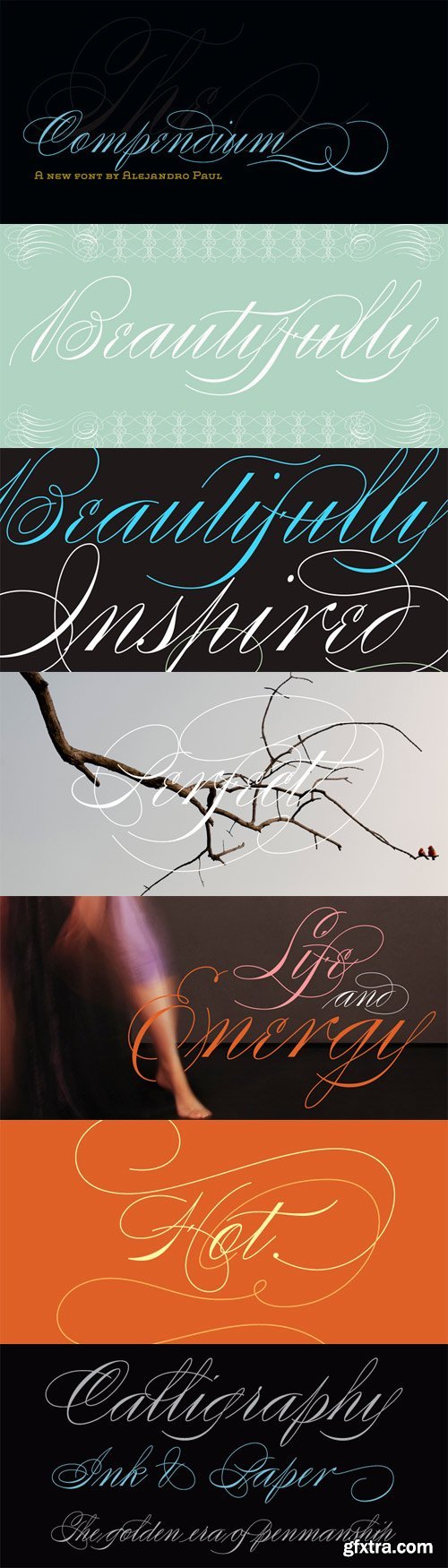
Compendium is a sequel to my Burgues font from 2007. Actually it is more like a prequel to Burgues. Before Louis Madarasz awed the American Southeast with his disciplined corners and wild hairlines, Platt Rogers Spencer, up in Ohio, had laid down a style all his own, a style that would eventually become the groundwork for the veering calligraphic method that was later defined and developed by Madarasz. After I wrote the above paragraph, I was so surprised by it, particularly by the first two sentences, that I stopped and had to think about it for a week. Why a sequel/prequel? Am I subconsciously joining the ranks of typeface-as-brand designers? Are the tools I build finally taking control of me? Am I having to resort to “milking it” now? Not exactly. Even though the current trend of extending older popular typefaces can play tricks with a type designer’s mind, and maybe even send him into strange directions of planning, my purpose is not the extension of something popular. My purpose is presenting a more comprehensive picture as I keep coming to terms with my obsession with 19th century American penmanship. Those who already know my work probably have an idea about how obsessive I can be about presenting a complete and detailed image of the past through today’s eyes. So it is not hard to understand my need to expand on the Burgues concept in order to reach a fuller picture of how American calligraphy evolved in the 19th century. Burgues was really all about Madarasz, so much so that it bypasses the genius of those who came before him. Compendium seeks to put Madarasz’s work in a better chronological perspective, to show the rounds that led to the sharps, so to speak. And it is nearly criminal to ignore Spencer’s work, simply because it had a much wider influence on the scope of calligraphy in general. While Madarasz’s work managed to survive only through a handful of his students, Spencer’s work was disseminated throughout America by his children after he died in 1867. The Spencer sons were taught by their father and were great calligraphers themselves. They would pass the elegant Spencerian method on to thousands of American penmen and sign painters. Though Compendium has a naturally more normalized, Spencerian flow, its elegance, expressiveness, movement and precision are no less adventurous than Burgues. Nearing 700 glyphs, its character set contains plenty of variation in each letter, and many ornaments for letter beginnings, endings, and some that can even serve to envelope entire words with swashy calligraphic wonder. Those who love to explore typefaces in detail will be rewarded, thanks to OpenType. I am so in love with the technology now that it’s becoming harder for me to let go of a typeface and call it finished. You probably have noticed by now that my fascination with old calligraphy has not excluded my being influenced by modern design trends. This booklet is an example of this fusion of influences. I am living 150 years after the Spencers, so different contextualization and usage perspectives are inevitable. Here the photography of Gonzalo Aguilar join the digital branchings of Compendium to form visuals that dance and wave like the arms of humanity have been doing since time eternal. I hope you like Compendium and find it useful. I'm all Spencered out for now, but at one point, for history’s sake, I will make this a trilogy. When the hairline-and-swash bug visits me again, you will be the first to know.
OTF | 1 Font | JPEG Preview | 3.9 Mb RAR
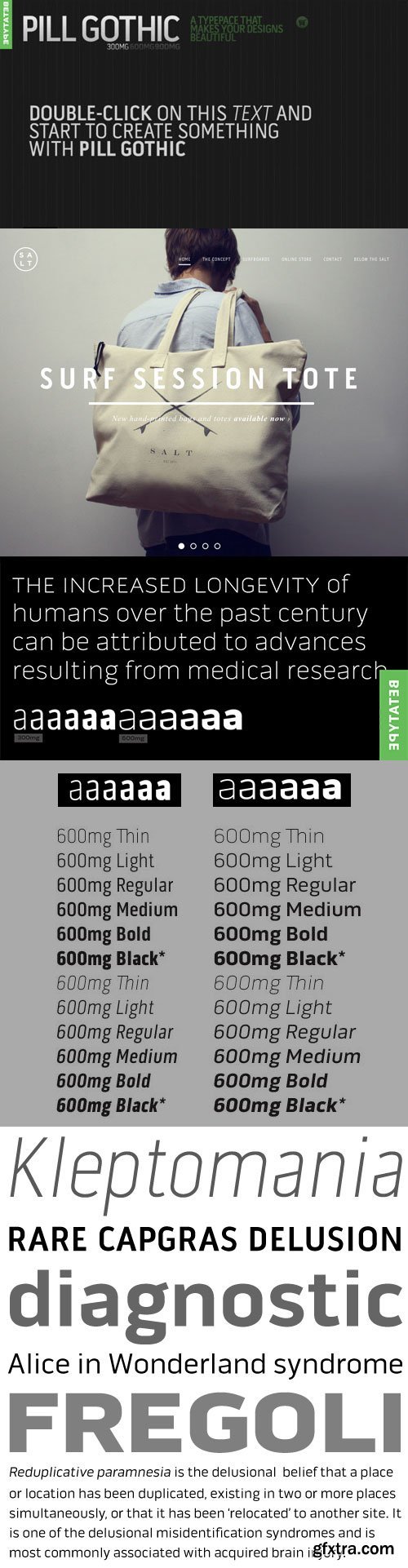
Betatype - Pill Gothic 300mg 600mg
[ The Newest & Largest Gothic Character Set ]
24xTTF Fonts | $700 | 24 MB
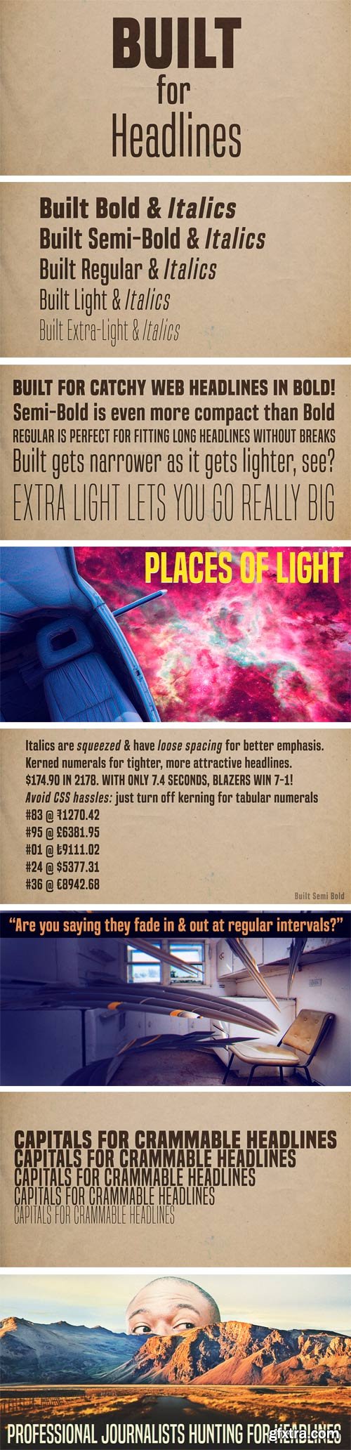
Built has one job: making solid, compact headlines onscreen. Designed with trust and neutrality in mind, Built’s wraparound shapes speak your headlines in newsy voice. Subtle curls conjure a feeling of a different news era while not coming across as particularly old-fashioned. The Built family comes in five weights, from extra-light to bold. But not your typical thin to fat linear range. When you’re designing for the screen, there are practical limitations with light fonts. These days, with variable resolutions and screen sizes, going lighter means going bigger. Much bigger. And it’s no fun if your words end up falling off the line. Built actually gets narrower as it gets lighter. Now you can can scale way up and still have room to spare. Set attractive, oversized page titles without worrying if the words will fit. Tabular (monospace) numerals are handy when you have lists of numbers to align. In headlines, tabular numerals don’t look so hot–and they waste space. Lots of fonts let you choose between proportional and tabular numerals. OpenType technology lets designers access different types of numerals, but implementing OpenType features on the web isn’t fun–it’s not always practical. Built has a simple solution: if you turn off hinting, numerals, monetary symbols and most math symbols line up. Easy. Built has fractions, primes, numeric ordinals, compact accents, the Indian rupee and the Turkish lira. As Built loses weight, its asterisk sprouts more legs, retaining it’s presence even in Extra-Light. The italics are squeezed thin and loosened up on the sides, creating cool emphasis that’s more than just a slant. Built is available in Extra-Light, Light, Regular, Semi-Bold and Bold plus italics.
OTF | 10 Fonts | JPEG Preview | 3.7 Mb RAR
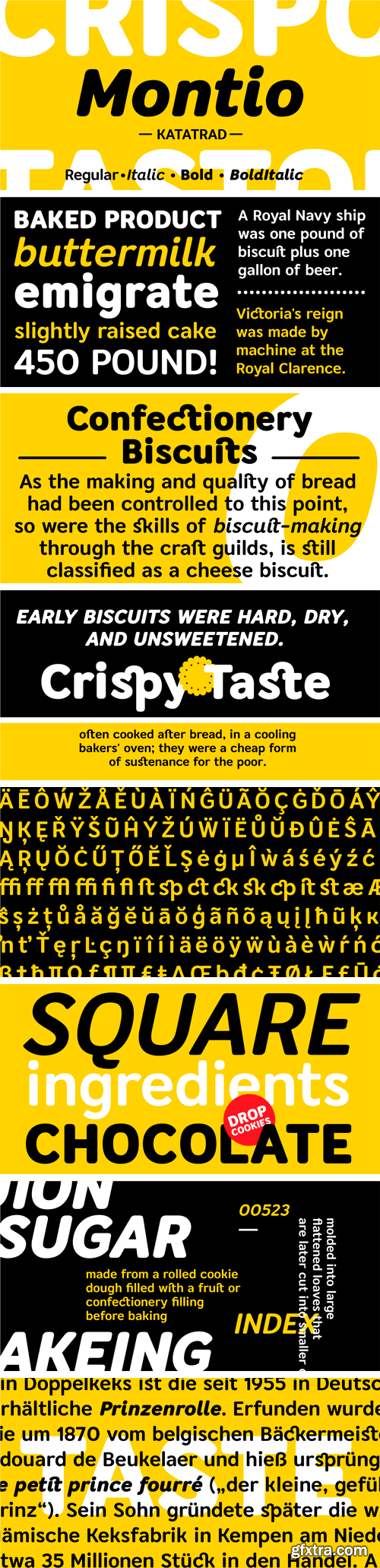
Montio is a simple Humanist sans serif typeface with rounded corners. It’s a family of 4 fonts: 2 weights and their italics.
OTF | 4 Fonts | JPEG Preview | 4.1 Mb RAR
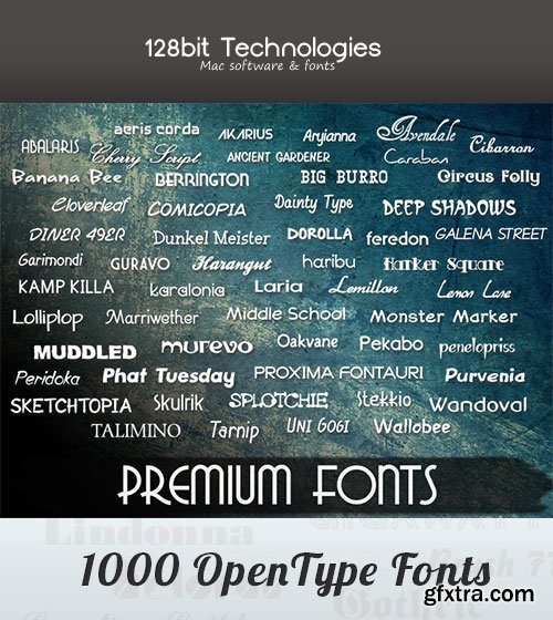

1,000 Premium Mac Fonts for Commercial Use - 128bitTech
1007 OTF Open Type Fonts work for Mac & PC | 32 MB
http://www.128bittech.com/premium_fonts.html
http://www.inkydeals.com/deal/1000-premium-fonts/
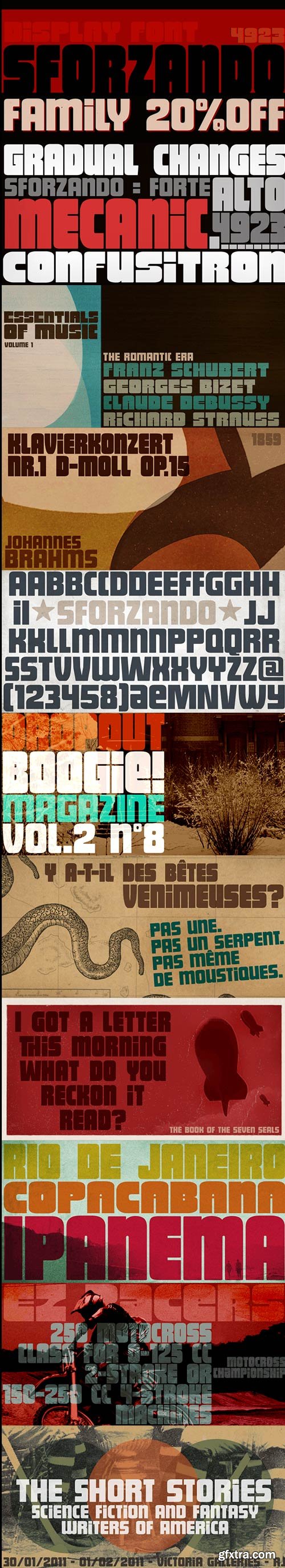
- Sforzando is a striking display font available in three variations. Each one is an all caps alphabet that brings two alternatives for each letter, amplifying your design choices. It comes with a small but handy set of alternates that help create that special, unusual touch. Vigorous and versatile, Sforzando is an excellent option for a wide range of applications.
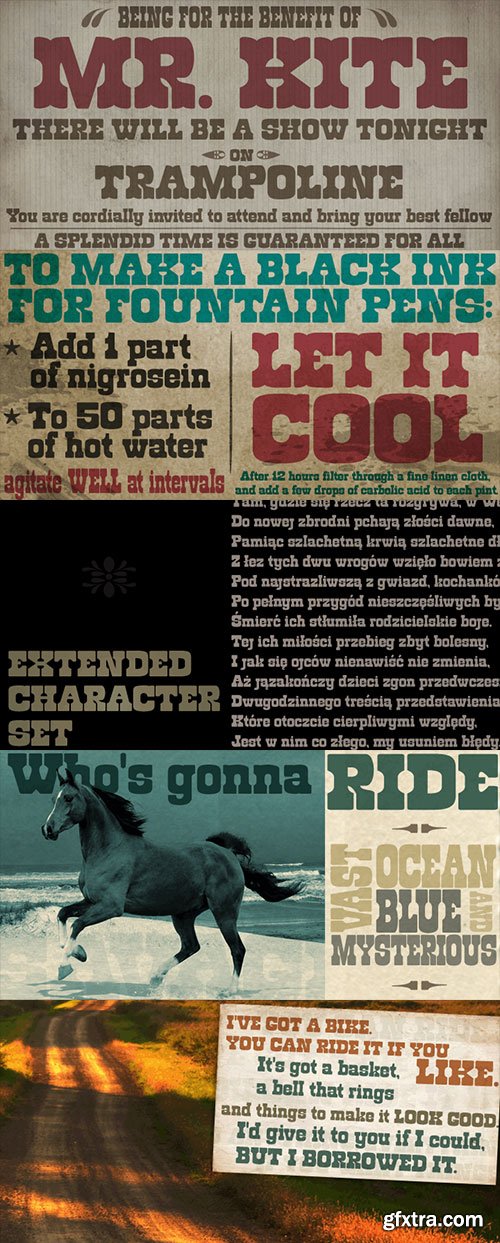
Roadway Font Family 3xOTF $45
Designers: Ricardo Marcin, Erica Jung
http://www.myfonts.com/fonts/pintassilgo/roadway/
- Roadway is an original typeface with an antique accent, inspired by Clarendon woodtypes from late 19th century. It comes in three matching varieties, with extended character sets and a lot of personality.
OTF | WoFF | 44.8 MB
Sale Page]Sale Page[/url]
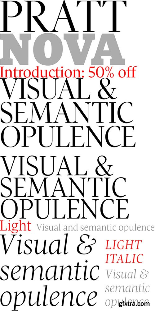
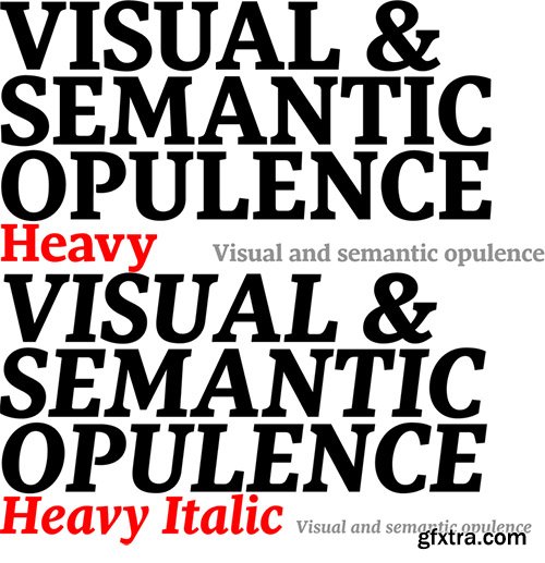
Shaped by constraint to accommodate a large character count, Pratt Nova has massive form: semi-condensed, large x-height, short descenders and capitals. And yet it transcends its restrictive origins in abundance, expressing a spirit of visual and semantic opulence, equipping the typographer with a comprehensive array of harmonized fonts, all rigorously drawn, superbly fitted iterations of a single, profoundly original design.The set of Text styles contain additional glyphs and OpenType features.
OTF | WoFF | 1 MB
Sale Page
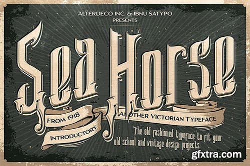
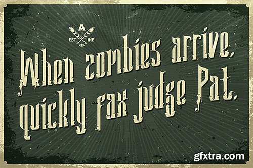
introducing our new font called Sea Horse, it's inspired by old victorian typography and sign painting. this font is perfect for your vintage greeting cards, logo, and other classical design projects. in zip file you'll find the otf, and some poster sample. if you need any help, please contact me at [email protected] thanks... and enjoy the font.
OTF | WOFF | 17.4 MB
Sale Page
Port is an experimental Didone typeface with a modern twist, inspired in the well known forms of typography masters such as Bodoni and Didot and the exuberance and elegance of calligraphy typefaces.Port melds the straight lines and strong contrasts of the Didone typefaces with the elegant lines of calligraphy in a geometric way, resulting in exuberant characters with geometric swashes that can be combined in countless ways.The result of this experiment is Port, an unique and rich display typeface meant to be used on big sizes and it’s main perk is the amount of alternative characters it features. Port is Open-Type programmed and includes hundreds of alternates, from swashes to titling alternates, ligatures and stylistic sets with each character having a thin version of itself, giving complete freedom to all your creative needs.Port is available in several flavours: Port Regular, being the base version and featuring the whole base character set; Port Regular Decorated, featuring richer forms and containing more ornamentated and more extravagant characters; Port Medium and Port Medium Regular, designed for the occasions you need a bit more thickness and the decoration variants: Port Ornaments, containing a wide set of elements meant for the creation of fillets, vignettes and fleurons, resulting in an almost infinite number of possible combinations to embellish your designs and Port Words, a set of some of the most common words used in English, Spanish, French, German, Italian and Portuguese.It’s strongly recommended that you use it on big sizes, for better performance you can also set the Photoshop text anti aliasing settings to Strong when you type, for a better understanding of all the uses of Port and the full character list I recommend the reading of the manual.
OTF | WOFF | 30.4 MB
Sale Page
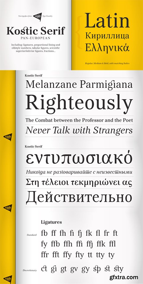
Kostic Serif is a classic transitional typeface (like Baskerville, Bookman, Caslon, Times) with tall, clean characters and a large glyph set to support all European languages - Greek and Cyrillic script included. Excellent for setting multiple pages of text and packed with OpenType features (proportional lining and oldstyle numbers, tabular figures, superscript and subscript, numerator and denominator figures, fractions and 31 ligature in 659 characters), it should meet the demands of even the most demanding typographic works. Kostic Serif is made with fairly large x-height, so the text is legible in very small sizes.Zoran began the work on Kostic Serif around 2002 and after completing Regular, Bold and matching italics, he wasn’t too pleased with the design, so he dropped further work on it to make other fonts. In 2010 Nikola came upon unfinished files for Kostic Serif, and decided to redesign the letters, while retaining basic proportions and widths that Zoran established earlier. When they were both pleased with the new look of the font, they made Medium and decided to add CE and Greek script to the glyph set, to make it pan-european.
OTF | WOFF | 13.6MB
Sale Page
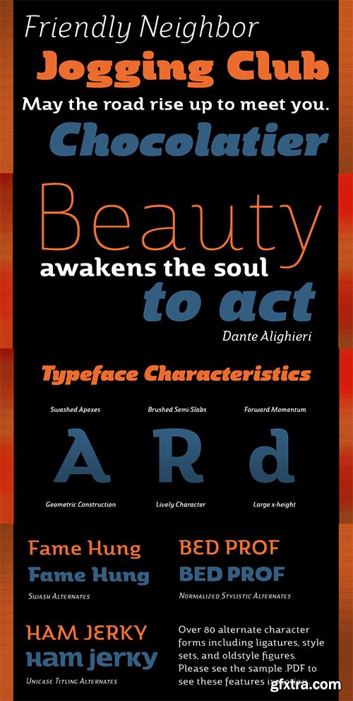
Marintas is a sleek upright italic that offers you a modern look and feel. This elegant sans serif comes across as lively, yet comfortable. Some semi slab characteristics of the font give it a face-forward momentum. These semi slabs, even with their geometric construction, are fluid shapes with a soft hint of brushstroke. The soft curves of Marintas paired with its playful but geometric semi slabs or ending strokes give the face its spirited--though friendly--eye-catching appearance.The Marintas family is comprised of 8 variants, ranging from Thin to Ultra. Its incredible versatility ranges from the delicate hairline to the extreme ultra weight. The heavier weights show some similarity to Antique Olive, and the face has an exuberant South American or Latin feel. This type of family is well-suited for advertising, retail, food and beverage products as well as for use in magazines, logotypes, and books. The fonts lend themselves to display settings, but are still very usable for longer copy. Because of its large x-height, the typeface is legible at very small sizes and as a webfont.Marintas has support for extended Latin character set. A wide range of Western languages are also supported, including Central, Eastern and Western European languages. In all, Marintas supports over 40 languages that use the extended Latin script, making Marintas a great choice for multi-lingual publications and packaging.All insigne fonts are fully loaded with OpenType features. Marintas is also equipped for complex professional typography and includes ligatures, alternate characters and fractions. The face includes a number of numeral sets, including old-style and lining figures with superiors and inferiors. OpenType-savvy applications such as Quark or the Adobe Creative Suite can take full advantage of the automatically replacing ligatures and alternates. This family also includes the glyphs to support a wide range of languages. Check out the informative .pdf brochure to see these features in action.
OTF | 1.46 MB
Sale PaGe
LeKing is a Frankenstein of vintage ornamental typefaces of the past centuries. Each character is a collage of different bits of different letters. The font has the classic elegant feel of the old ornamental typefaces, combined with a modern and edgy feel. It has 2 uppercase variations, so you can mix letters without repeating them or find the exact type that suits your needs.
OTF | WOFF | 37.2MB
Sale Page
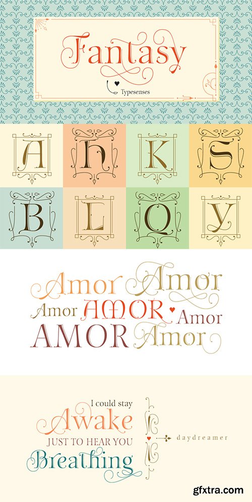
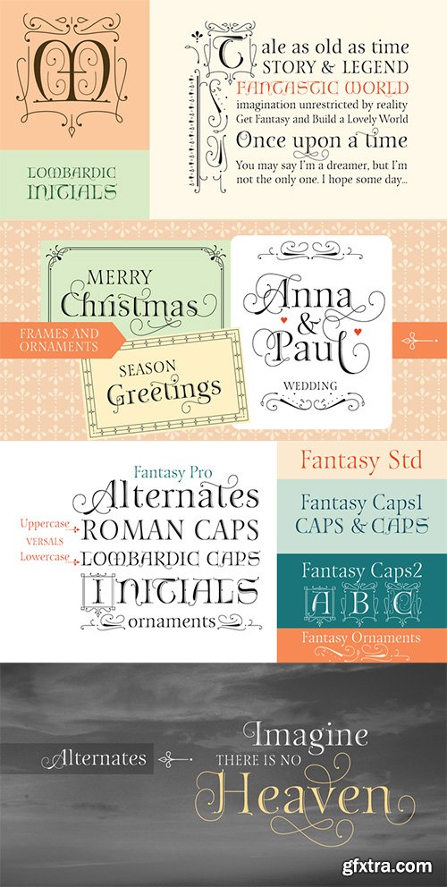
As Typesenses believes that “Letters need a touch of Magic”, Sabrina Lopez presents her new creation, a burst of innovation: Fantasy. This display font arises from the mix between Roman Style and Lombardic Decorations, with a little air of Medieval age.Fantasy works perfectly in book covers, greeting cards, invitations, weddings, posters, magazines, fashion world, logos, packagings, letterpress,etcLet your imagination fly and let’s play with all its Alternates, Ornaments, Frames, Caps y the exclusive set of Decorated Lombardic Initials. The Pro version has more than 1400 glyphs! Ornaments (Fantasy Ornaments), Caps (Fantasy Caps1) and Lombardic Initials (Fantasy Caps2) are sold in separated versions too. Additionally, there is a Standard Version (Fantasy Std) designed to be used in lines of text and smaller sizes.To make the most of the alternatives proposed, use applications that support Open Type.Get Fantasy and build a lovely world of Imagination!
OTF | WOFF | 33.1 MB
[url=http://www.myfonts.com/fonts/daltonmaag/tornac/Sale Page[/url]
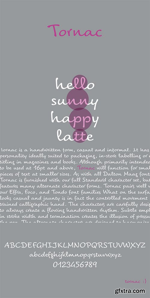
Tornac is casual and informal, with a personality ideally suited to packaging, in-store labelling or even titling in magazines and books. On the surface the font looks casual and jaunty, but this is the controlled movement of a trained calligraphic hand. The characters are carefully designed to always create a flowing handwritten rhythm. Subtle emphasis in stroke width and termination creates the illusion of pressure on the pen.Alternate characters are designed to harmonize with their preceding and following letterforms in various contexts. When used in an application which supports OpenType features, the alternate characters are automatically fully utilized in any text you set. The Standard Edition includes a complete Latin A Extended character set.
OTF | WOFF | 26 MB
Sale Page
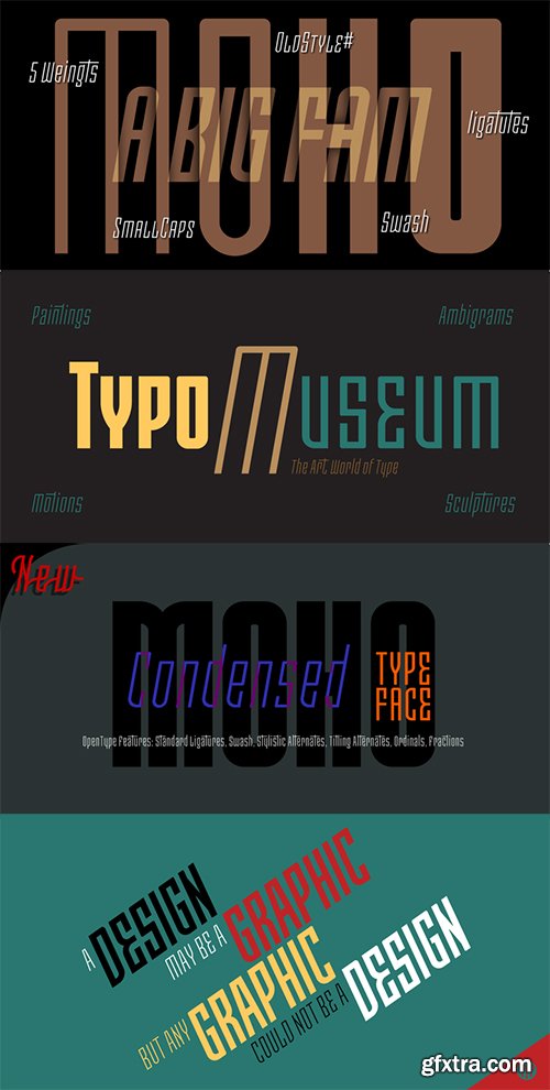
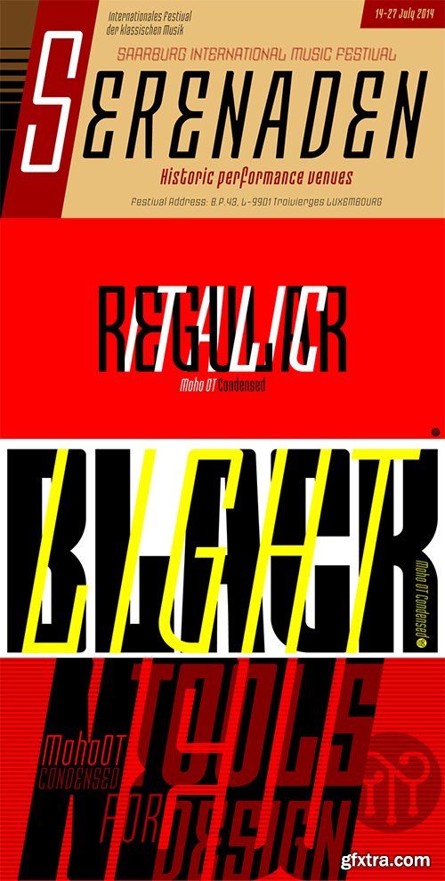
“Moho” is inspired by the Victorian sans shapes, movements and expressions of modernism art deco and constructivism, conceiving a decorative and elegant font, modern and readable display. This provides a retro look style of elegance of the 30s. Moho Condensed font family is straight, vertical, with joints and links or curvilinear or angular. Moho provides an innovation in the form of letters, to replace traditional forms of curves by straight or vice versa. Condensed Moho is a category of square letter, has an efficient OpenType programming for Moho OT Condensed, and basic for Moho Std families to compose texts in European languages ??of East and West, having wide set of over 610 glyphs. Designed to hold and typesetting over 14 pts or less increasing readability depending on the tracking. Moho Condensed is ideal for publishing newspaper and magazine design, convenient for the design covers and labels due to its space saving. Moho Condensed typefaces are closely related to the arts and fashion are very useful in creating logos and brands.
SermonBox - Seasonal Collection

SermonBox - The Series Pack Collection
Top Rated News


Would you like to be a Author?


