


OTF | TTF
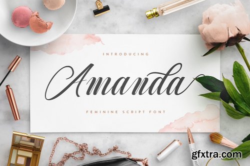
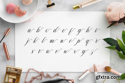
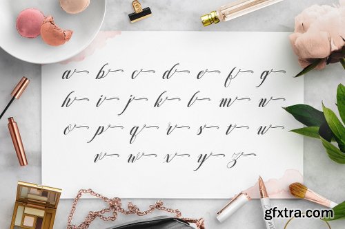
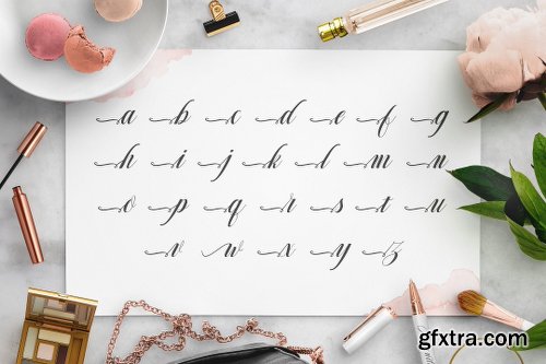
https://creativemarket.com/fontbundles/1252140-Amanda
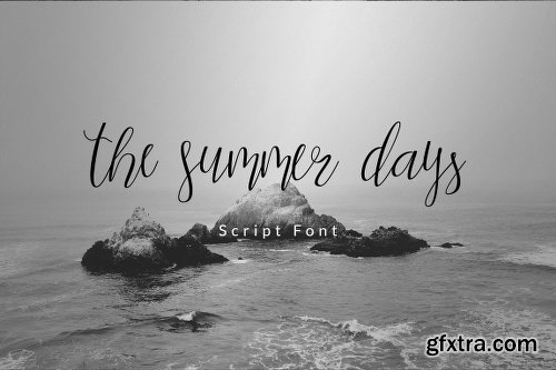


TTF | OTF
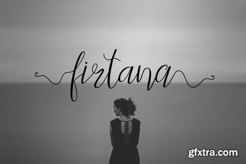
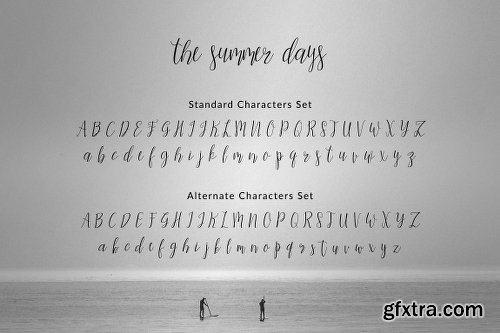
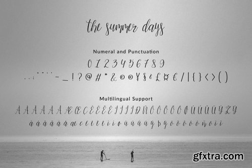
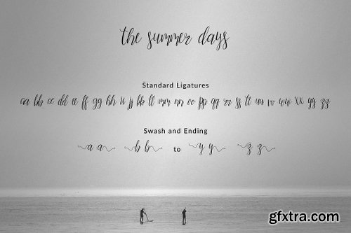
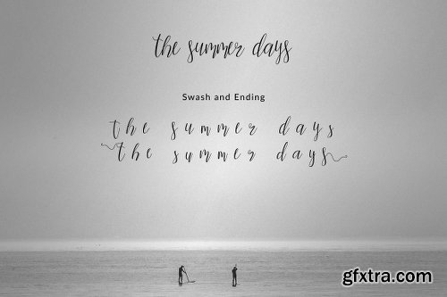
https://creativemarket.com/Firtana/2327896-the-summer-days

WOFF | OTF
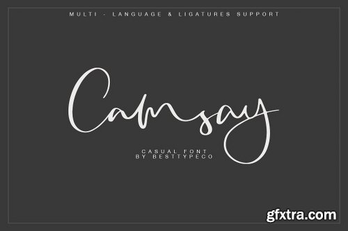
https://creativemarket.com/Besttypeco/2993207-Camsay
OTF | TTF
Simple Installations
Works on PC & MAC
Clean Results
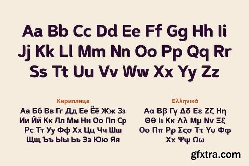
![Gotham Family [Updated] - Extended Latin, Greek, Cyrillic](https://www.gfxtra32.com/uploads/posts/2018-10/1538561010_gotham.png)
Gotham Family [Updated] - Extended Latin, Greek, Cyrillic
+ ScreenSmart & Office Version
Ours is the first century in which most mass-produced letters can correctly be called “typography.” Technically speaking, typography is the product of type, the individual, recombinable characters in a typeface that are designed for printing words on paper. A century ago, a book’s pages contained typography, but its cover, spine, and illustrations featured lettering, each of the product of an artist working by hand in a different medium. Because letters made by hand had no obligation to resemble the look of printing types, different media evolved their own aesthetics: lithographed posters, engraved banknotes, and neon signs once enjoyed unique alphabetic styles.
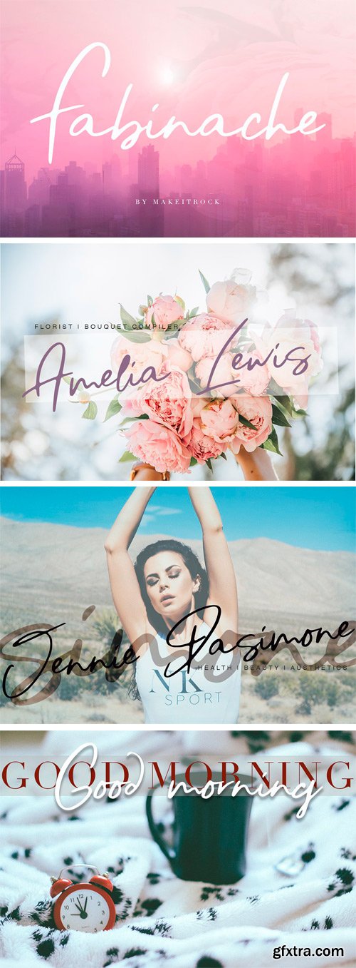
https://creativemarket.com/Makeitrock/2753824-Fabinache
This handwritten script has been attentively written, with gentle curves to produce a font thats completely distinctive and original. Perfect for adding a elegant and unique touch to your lettering projects and branding.
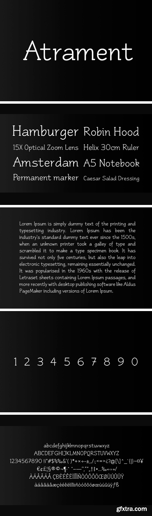
Atrament Font
Another beautiful script design by German type designer Ralph M. Unger. Atramant is casual and easy, ideal for any setting in larger sizes. Still, due to its excellent legibility, it can also be used for short text blocks in smaller sizes. Atrament was originally designed for the URW++ FontForum.
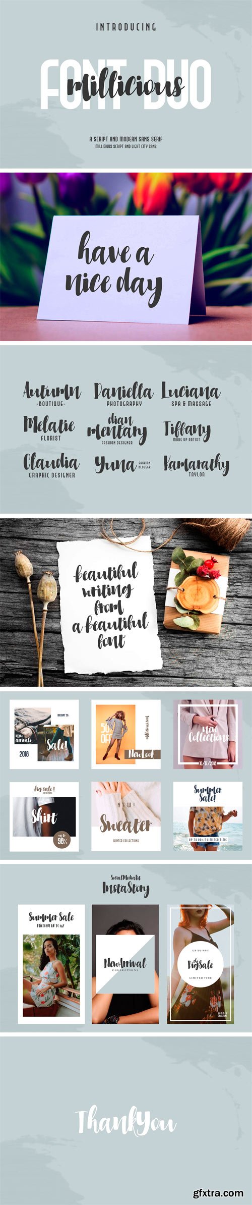
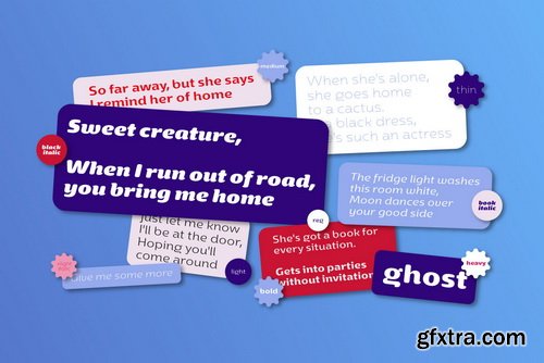
Millicious Font Duo
Hi friends:) This is my first font duo, where this font contains beautiful script handwriting fonts, and one is a modern sans serif font.
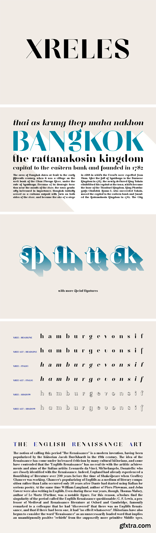
Xreles Font Family
Xreles designed by Stawix Ruecha. It was joined in TypoLyrics Exhibition and Publication 2013 in Bangkok.
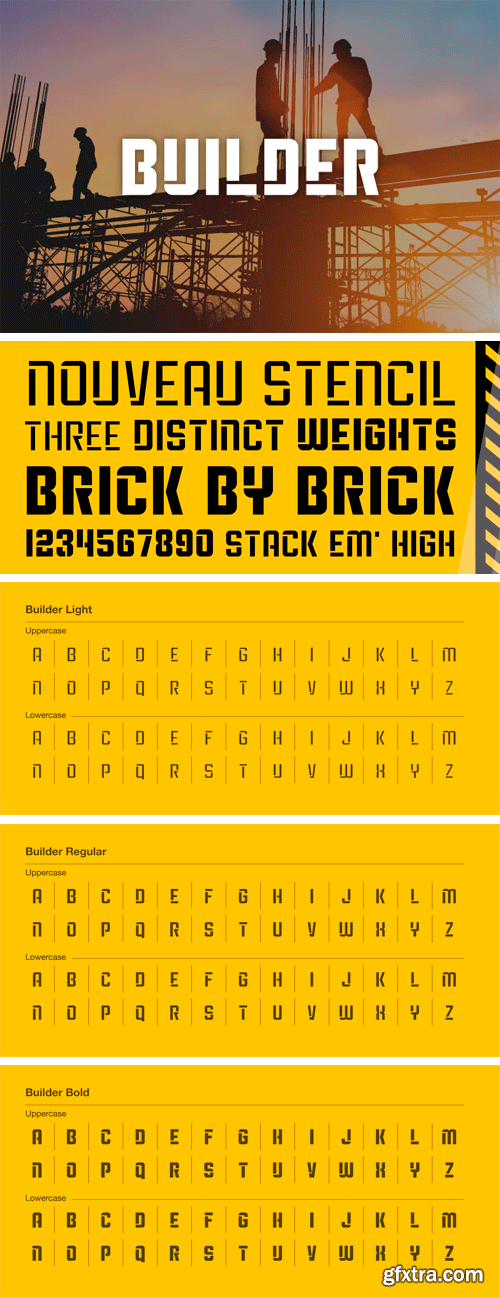
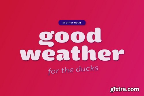
Builder Font Family
A nouveau stencil built to fit together and stack like a solid, well crafted lego set. Package comes in three weights, light,regular, and bold.
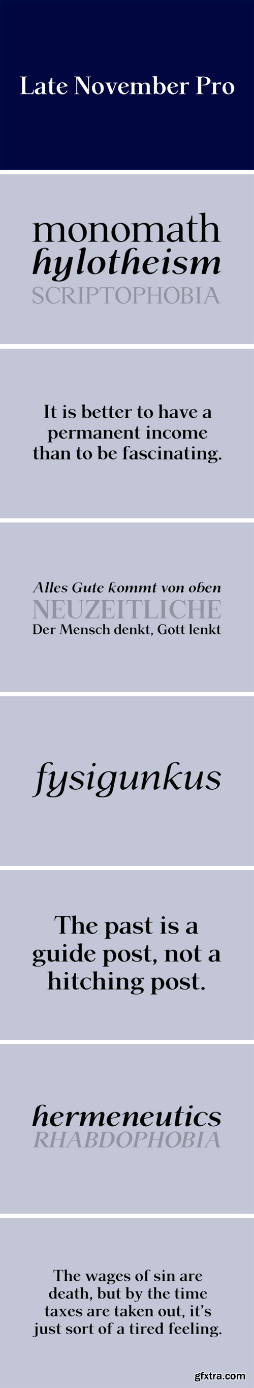
P22 Late November Pro Font Family
Late November is a transitional Antiqua-inspired type design. From the designer: "I started working with the design one dark, late November night, two years ago. After two years of work, I felt I had to draw the line and consider it finished." Designed by Torleiv Sverdrup.
OTF | TTF
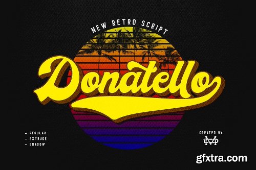
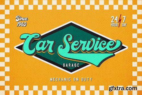
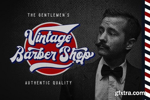
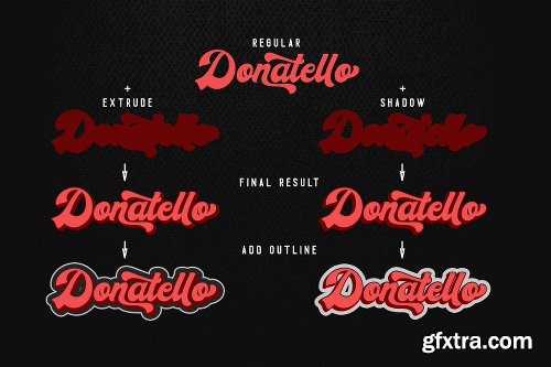
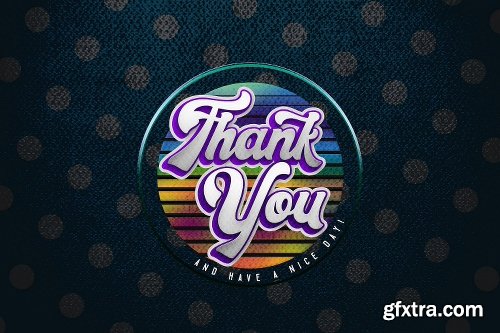
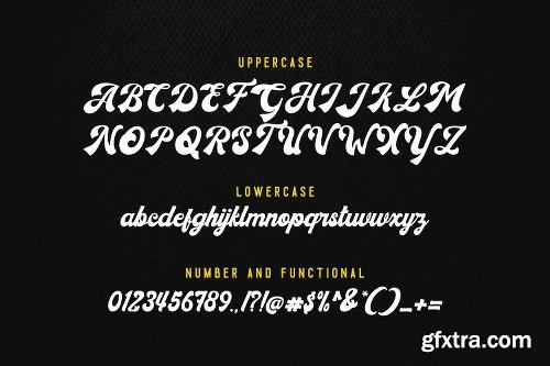
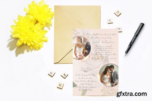
https://creativemarket.com/madeDeduk/2970790-Donatello-II-new-retro-script

TTF
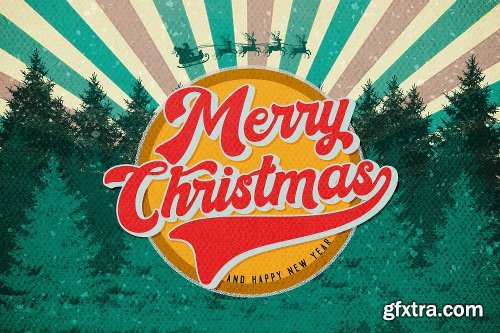
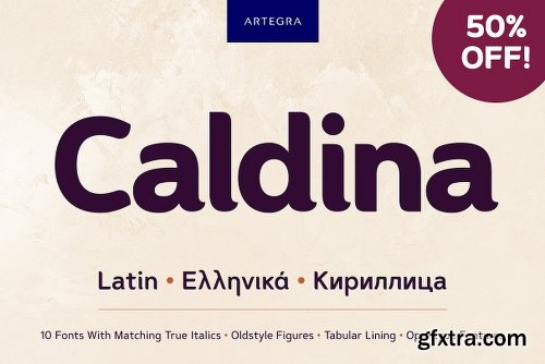
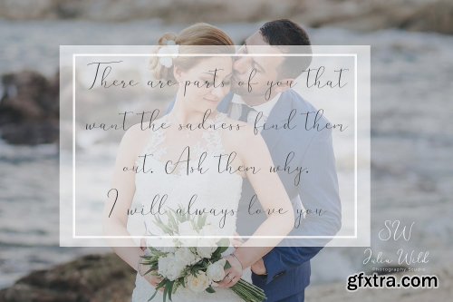
https://creativemarket.com/Artegra/2978801-Caldina
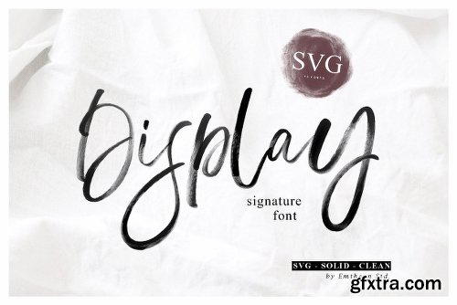
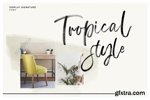


TTF | OTF
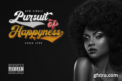
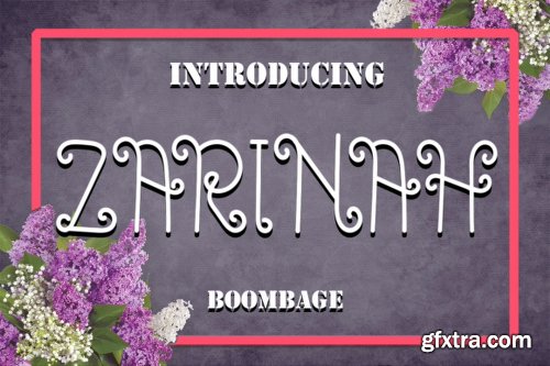
https://creativemarket.com/mdn/2928700-Display-Signature-Font-SVG

OTF | TTF
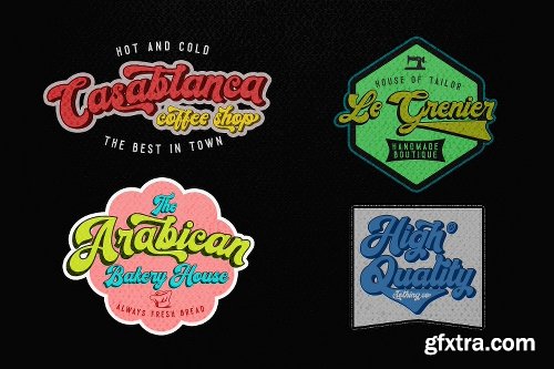
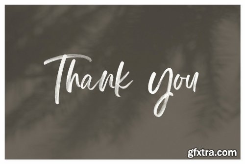
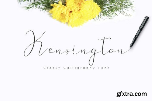
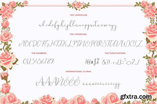
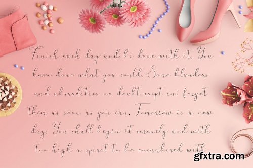
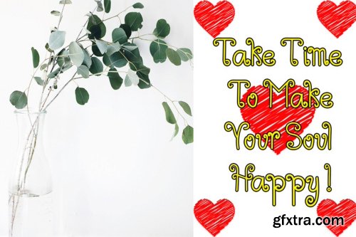
https://creativemarket.com/Prototype_Studio/2386365-Kensington-Font
OTF | TTF
Simple Installations
Works on PC & MAC
Clean Results
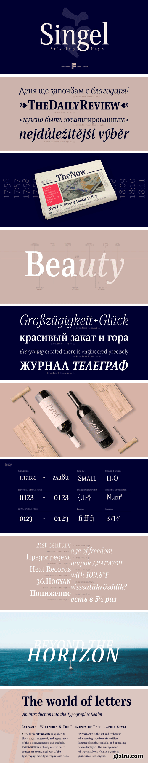
https://www.myfonts.com/fonts/font-fabric/singel/
Singel is a neoclassical serif with semi-condensed proportions. As a contemporary interpretation, this typeface combines the rationalist modulated stroke with an elegant silhouette and crisp serifs. The altogether splendid appearance of Singel, completed with a full set of Small Capitals and true form of italics makes it perfect for any luxurious and graceful design.
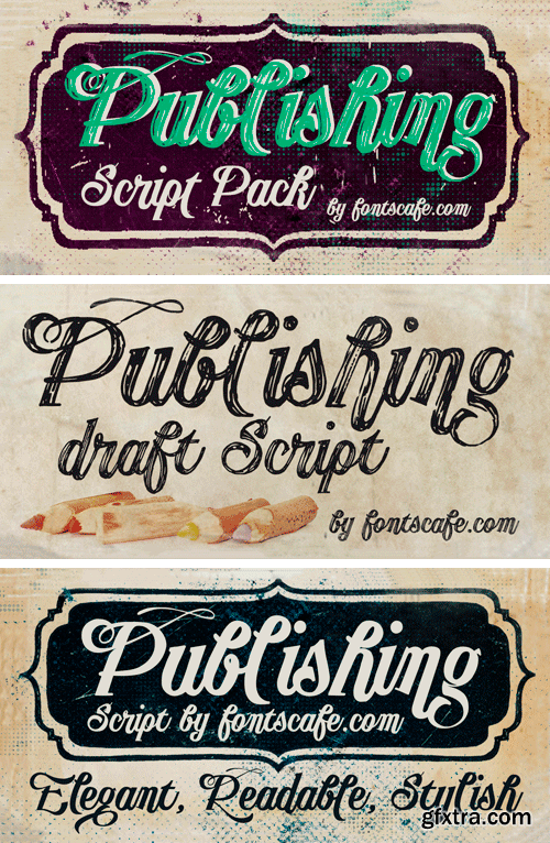
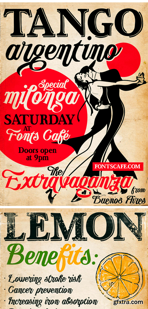
https://www.myfonts.com/fonts/fontscafe/publishing-script/
“Publishing script pack” combines the sensuality and elegance of Tango Argentino, evocative of special moments, of the new avant-garde font “Publishing Script” with the wildness and daring of “Publishing Draft Script”.
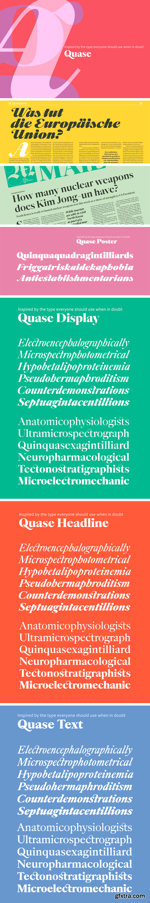
Quase Superfamily - 39 Fonts
Quase is a very free interpretation of the types found in the “Specimen of Printing Types” by William Caslon from 1785. We didn’t want to follow any of the models introduced in the Specimens, but rather gather a series of typographic aspects that we found useful and interesting from the several sizes and styles available and then give them consistency and new proportions so they could fit our very own purpose.
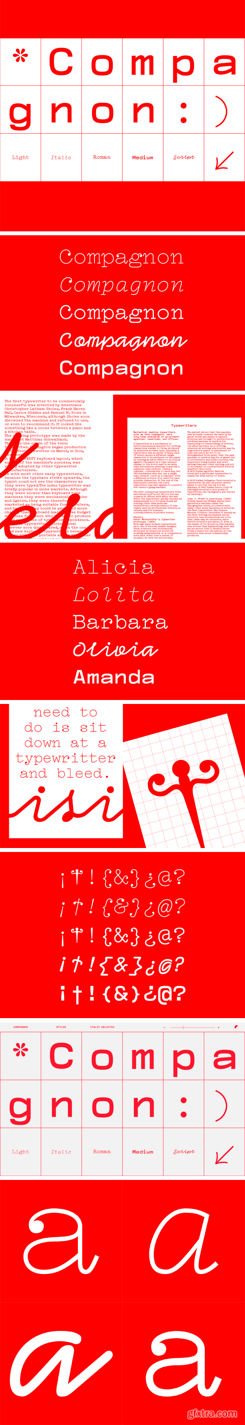
Compagnon Font Family
Compagnon is a typeface family composed of five distinctive styles. It finds its inspiration in the online archives of Typewriter Database specimens and combines different periods of the history of typewriter typefaces. Each weight is based on singular references relating to significant periods aiming to underline the evolution of typewriter characters as they are called.
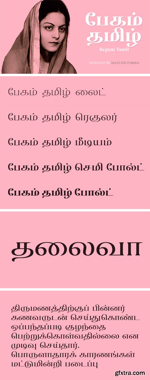
Begum Tamil Font Family
Begum Tamil is a display family optimized for Editorial Design usage. All of its vertical strokes have serifs, both in the Latin and Tamil letters – but since Begum Tamil is upright, this application is unproblematic. Although developed as a display face, its effectiveness is not only limited to headlines; Begum Tamil’s proportions are suitable for shorter-length texts in any medium. Begum Tamil is part of a larger family that support also Devanagari and Latin scripts.
SermonBox - Seasonal Collection

SermonBox - The Series Pack Collection

Top Rated News


Would you like to be a Author?


