


- Six weights and obliques
- Titling / all caps design
- Extensive Latin script support
- OpenType features
- OTF file format
- Free updates and feature additions


- Futura. The very name brings to mind jet-age splendor of the highest order, and indeed the text on the commemorative plaque left behind on the Moon by the Apollo 11 astronauts in July, 1969 is set in Futura. There is no other font that can do what it does with the same impact. You might say Futura is to Helvetica as driving a Porsche is to driving a Toyota--they both get you there, but the former does it with so much more fun.
- Futura was designed by type design luminary Paul Renner, and is used extensively in advertising and logo design, by IKEA, Volkswagen, Shell, HP and many more. Used in any headline or body situation, Futura can bring you all the magic, promise and forward-looking sans power in an iconic and powerful way, as director Stanley Kubrick knew--it was his favorite font.Commissioned by the Bauer type foundry, Futura was commercially released in 1927.


Century Gothic Font Family
The Century Gothic family has been extended to 14 weights in a Pan-European character set from
Thin to Black and their Italics. The already existing 4 weights of Regular and Bold
with their Italics are additionally still available in the STD character set.
http://www.myfonts.com/fonts/mti/century-gothic/
- A spaciously modern update to mid-century design, Century Gothic™ embodies the highly sought-after assets of the digital age with its sleek sans serif style while remaining true to the gracefully geometric look of the early 20th-century typefaces it was inspired by.
- Its clear, clean design allows for legibility at almost any size and its wide range of styles give it the stamina to thrive in bodies of text as well as in display settings. Century Gothic is appropriate and appealing for myriad typographic applications‚ from high-resolution print and large-scale signage to low-resolution text displays and mobile devices.


https://www.myfonts.com/fonts/mti/helvetica-now
Every single glyph of Helvetica has been redrawn and redesigned for this expansive new edition – which preserves the typeface's Swiss mantra of clarity, simplicity and neutrality, while updating it for the demands of contemporary design and branding.
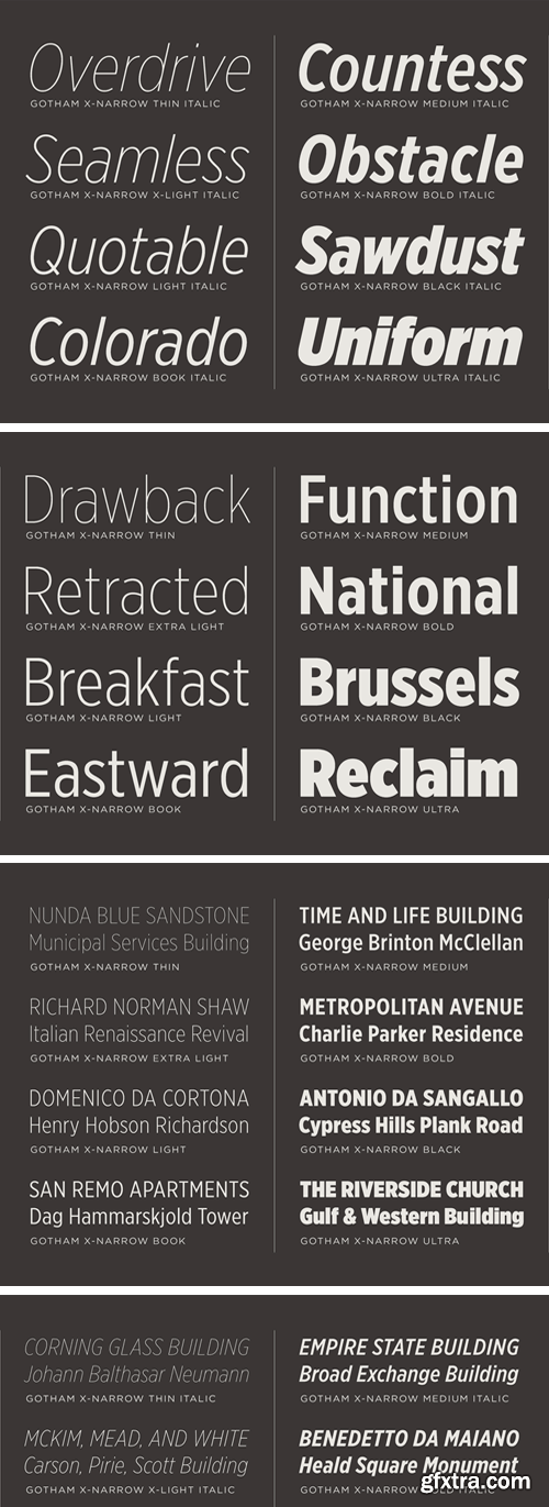
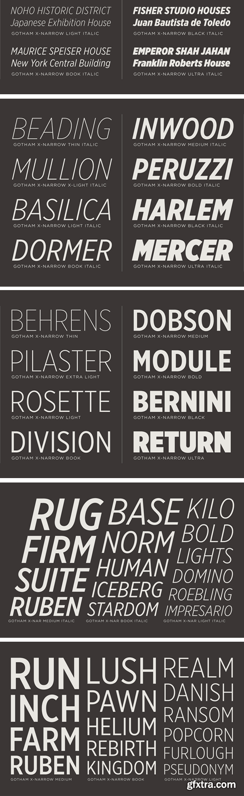
Gotham Extra Narrow Family [Updated] - Extended Latin, Greek, Cyrillic
+ ScreenSmart Version
- The narrowest of the “natural width” Gothams. As a typeface's design approaches extreme proportions, its visual themes begin to take a back seat to spatial considerations. Condensed fonts will favor consistent spacing above all else, a priority which manifests itself in Gotham Condensed through the addition of new visual strategies. On letters like C and S, stroke endings that were once sheared perpendicularly will end vertically instead; joins in lowercase letters that once appeared monolinear become palpably thinned.

GOTHAM BUNDLE - 12 FAMILIES
138 Fonts - Extended Latin, Greek, Cyrillic
- Every designer has admired the no-nonsense lettering of the American vernacular, those letters of paint, plaster, neon, glass and steel that figure so prominently in the urban landscape. From these humble beginnings comes Gotham, a hard-working typeface for the ages.
- Gotham celebrates the attractive and unassuming lettering of the city. New York is teeming with such letters, handmade sans serifs that share a common underlying structure, an engineer’s idea of “basic lettering” that transcends both the characteristics of their materials and the mannerisms of their makers. These are the cast bronze numbers that give office doorways their authority, and the markings on cornerstones whose neutral and equable style defies the passage of time. They’re the matter-of-fact neon signs that emblazon liquor stores and pharmacies, and the names of proprietors plainly painted on delivery trucks. These letters are straightforward and non-negotiable, yet possessed of great personality, and often expertly made. And although designers have lived with them for more than half a century, they remarkably went unrevived until 2000, when we introduced Gotham.
- Gotham is that rarest of designs, the new typeface that feels somehow familiar. From the lettering that inspired it, Gotham inherited an honest tone that’s assertive but never imposing, friendly but never folksy, confident but never aloof. The inclusion of so many original ingredients without historical precedent — a lowercase, italics, a comprehensive range of weights and widths, and a character set that transcends the Latin alphabet — enhances these forms’ plainspokenness with a welcome sophistication, and brings a broad range of expressive voices to the Gotham family.
 2180298")
CM - Be Mine (Valentines Day Font) 2180298
Introducing Be Mine.. a brand new font, perfect for Valentines day!


CM - Valentine Fonts Bundle - 17 Fonts 186016
JASMIUM | KOWALSKI | SUAREZ | SECESJA | GWIDON | HOLY ROLLER | MARTITA | 33 MB
This bundle includes 17 high-quality, professional, hand-drawn fonts.
Language support includes Western, Central and Eastern European character sets,
as well as Baltic and Turkish languages.


Quenta Font Family
https://www.myfonts.com/collections/quenta-font-zetafonts
Francesco Canovaro was inspired for the design of Quenta by the discovery of the handlettered masthead of Queenslander, a weekly magazine of news related to "society, sport, literature, theater and rural life", published in Queensland, Australia, during the first half of XIX century.


https://www.myfonts.com/collections/artusi-font-zetafonts
Pellegrino Artusi was a celebrated Italian food writer, who is credited with the creation of one of the most influential cookbooks in the history of Italian cuisine. Taking inspiration from his legacy, Francesco Canovaro decided to work on a typographic homage to the delicacy and finesse of Italian traditional cuisine.


https://brandingwithtype.com/typefaces/bw-pose
Designed by Alberto Romanos, Bw Pose is a modern serif font family designed to provide a stylish tone of voice. The two subfamilies are available in 6 weights from the subtle Thin to the powerful ExtraBold with matching true italics, providing a smart and elegant palette for the task at hand. It supports all European Latin languages and it includes OpenType features like stylistic alternates, ligatures, old style figures or case sensitive forms.


https://www.myfonts.com/collections/mozaic-font-tipotype
The value and individual beauty contribute to the group. Each with their own, but all together with a new identity enriched by exchange, perfected by diversity. Mozaic is sum. Mozaic is strength. It includes a very thorough coverage for a wide variety of Latin alphabet-based language families.

Mally Font
https://www.myfonts.com/collections/mally-font-sea-types
Mally is a family of humanist fonts, sans serif with 32 styles, variable with 08 normal and condensed weights and their respective italics, with 594 characters in each font, offers alternative characters, and was conceived as a variable font encompassing various weights and widths. Characterized by its excellent readability even in the smallest sizes, with a contemporary design it has a wide support of Latin languages.


126,000 Royalty-Free 3D Model

Udemy Türkçe


Top Rated News
- CreativeLive Tutorial Collections
- Fasttracktutorials Course
- Chaos Cosmos Library
- MRMockup - Mockup Bundle
- Finding North Photography
- Sean Archer
- John Gress Photography
- Motion Science
- AwTeaches
- Learn Squared
- PhotoWhoa
- Houdini-Course
- Photigy
- August Dering Photography
- StudioGuti
- Creatoom
- Creature Art Teacher
- Creator Foundry
- Patreon Collections
- Udemy - Turkce
- BigFilms
- Jerry Ghionis
- ACIDBITE
- BigMediumSmall
- Globe Plants
- Unleashed Education
- The School of Photography
- Visual Education
- LeartesStudios - Cosmos
- Fxphd
- All Veer Fancy Collection!
- All OJO Images
- All ZZVe Vectors
- CGTrader 1 CGTrader 2


