
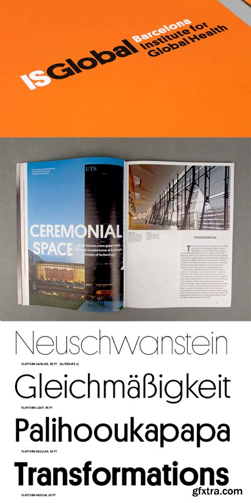
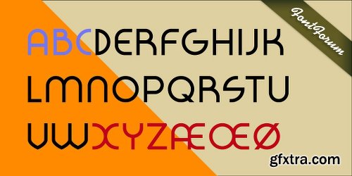
Platform Font Family $225 | 10 x TTF
https://commercialtype.com/catalog/platform/platform
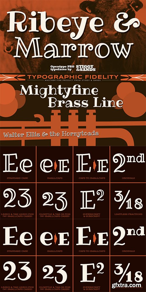
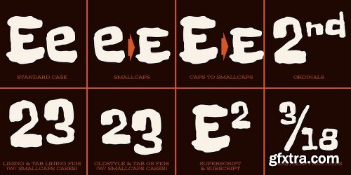
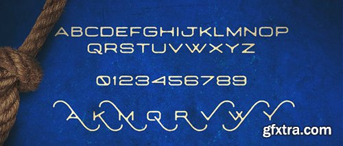
Ribeye Pro Font Family - 2 Fonts $58
The Ribeye Pro Family is reminiscent of a cartoon tattoo style of lettering, but exhibits a playfulness that breaks traditional weight distribution across its letterforms. An edgy attitude, friendly syncopation, and highly legible letterforms makes these fonts a real pair of charmers. The SmallCaps and extensive figure sets give the Ribeye Pro Family a more diverse design voice, ranging from slightly serious to downright ludicrous.
Opentype features include:
- SmallCaps.
- Full set of Inferiors and Superiors for limitless fractions.
- Tabular, Proportional, and Oldstyle figure sets (along with SmallCaps versions of the figures).
- Stylistic Alternates for Caps to SmallCaps conversion.
http://www.myfonts.com/fonts/stiggy-sands/ribeye-pro/
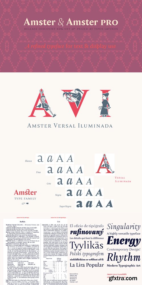
Amster Font Family Complete $988 | 21 x TTF | Turkish Support
http://www.myfonts.com/fonts/pampatype/amster/
Amster is an energetic & refined type created by Francisco Gálvez, with a sharp idea on how elegance & legibility can meet harmoniously. Amster can build a text that is highly readable as well as friendly. It has five weights of roman & cursive both with smallcaps and fully-equipped with all OT sorts and even a wonderful set of illuminated initials. Amster is a very versatile typeface, allowing for a wide range of uses: screen to print, small text to display, science to poetry. Amster speaks more than 200 languages.
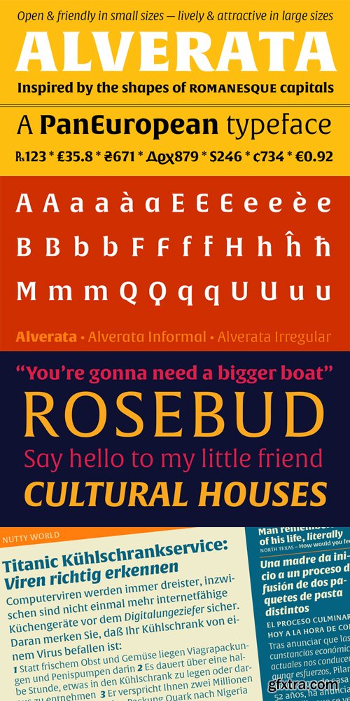
http://www.myfonts.com/fonts/type-together/alverata/
Gerard Unger’s new typeface Alverata is a twenty-first-century type-face inspired by the shapes of romanesque capitals in inscriptions of the eleventh and twelfth centuries, without being a close imitation of them. It is additionally based on the early twentieth-century model, but tweaked so as to prevent blandness and monotony. Alverata performs beautifully in both screen and on paper, delivering excellent legibility. Its letters are open and friendly in small sizes and lively and attractive in large sizes. They are robust, and show refinement in their detail. It is an extensive type family, with versions for both formal and informal applications.Visually, some written languages, such as Czech and Maltese, differ quite strongly from languages like English and German, notably because of their many accented characters. While other typefaces will show this difference, Alverata removes it. As a result, Alverata enables harmonious convergence of languages.
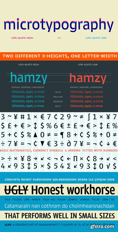
Lipa Agate Font Family $799 | 24 x TTF | Turkish Support
http://www.myfonts.com/fonts/type-together/lipa-agate/
Lipa is the name of the Slovenian national tree ‘Linden’. The typeface Lipa Agate by Croatian designer Ermin Me?edovi?, is part of a bigger type collection, comprising various type groups into one coherent system which Ermin developed over the past 10 years. Lipa Agate is the first to be released; a sans serif designed and engineered to be used in the smallest text sizes, best under 10pt, and in very bad printing conditions. It is perfect for phone books, classified ads, directories or any other job requiring economy without jeopardising legibility. To achieve this, Lipa Agate employs a range of tools, such as deep ink-traps, narrow proportions and a tall x-height. Contemporary editorial design requires a high amount of flexibility to respond to various design situations in a consistent fashion. Lipa Agate — with its 3 levels of condensation, 4 weights and 2 sets of different x-heights, ‘High’ and ‘Low’, which share the same width — fulfils these requirements wonderfully. That’s a total of 24 fonts! To make this clean and honest workhorse face complete, its large character set also includes small caps, arrows, info-numerals and much more.
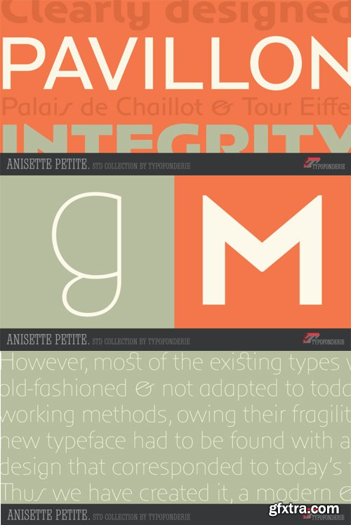
Anisette Petite Font Family $281 | 7 x TTF
http://www.myfonts.com/fonts/typofonderie/anisette-petite/
Following Anisette designed in 1996, Anisette Petite is the young sister featuring capitals of an intermediate width together with lowercases. Subtle imperfections in the r, l, and the particular g, help to create a unique typeface. The weights of the “Petite” family match exactly Anisette and provide a wider diversity of use. Designed in 2001, Anisette Petite’s lowercases shares the sobriety of geometrical typefaces and the dynamics of the tension in the curves. This geometrical sans offer strong identity to any branding and editorial projects.
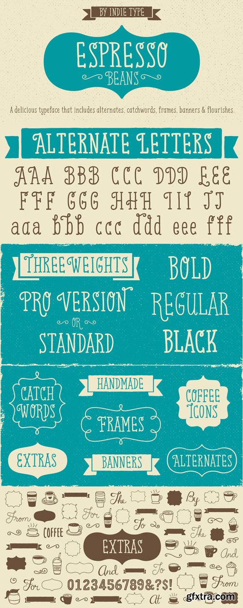
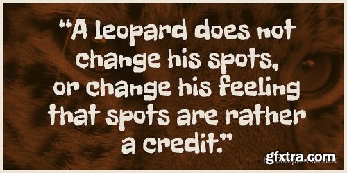
Espresso Beans Font Family $87.30 | 7 x TTF and OTF
http://www.myfonts.com/fonts/indie-type/espresso-beans/
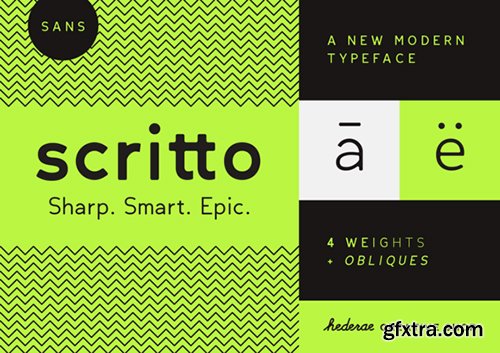
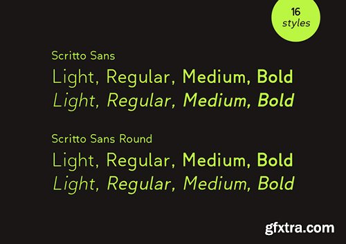
Creativemarket Scritto Sans Font Family 528411 - 8 Fonts
OTF | TTF | WOFF | EOT | SVG
Scritto Sans is a new modern sans serif font family in 4 weights with Obliques + Round version.
It is a higly clean and legible typeface very well suited for any display and text use. Its curves make it a dynamic typeface when composing a text, ideal for those who want to add modern touch to their compositions. Scritto Sans is an excellent choice for fashion magazines, logotypes and shops.
https://creativemarket.com/valeriodelledera/528411-Scritto-Sans-Font-Family

Steamer Font Family $150 | 10 x TTF
http://www.myfonts.com/fonts/erik-bertell/steamer/
Steamer is a grimy grotesque with a thick early 20th century air to it. A tireless workhorse, it is accustomed to carrying out any typographic task from continuous text to bold headlines steadily through any conditions.
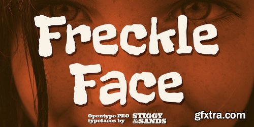
Freckle Face Pro Font
OTF
Freckle Face Pro draws its inspiration from Pillbury’s “Funny Face” drink mix packages. I loved these drink mixes when I was a kid, not only because of the great flavors, but also the fun packaging. Who knew the love affair would renew itself later by finding myself loving the lettering too! An rough-hewn appearance, frolicking baseline, and fun but legible letterforms makes this font a real crown pleaser. The SmallCaps and extensive figure sets give Freckle Face Pro a more diverse design voice, ranging from lightly comic to borderline insane.
Opentype features include:
- SmallCaps.
- Full set of Inferiors and Superiors for limitless fractions.
- Tabular, Proportional, and Oldstyle figure sets (along with SmallCaps versions of the figures).
- Stylistic Alternates for Caps to SmallCaps conversion.
http://www.myfonts.com/fonts/stiggy-sands/freckle-%20face-pro/
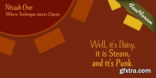
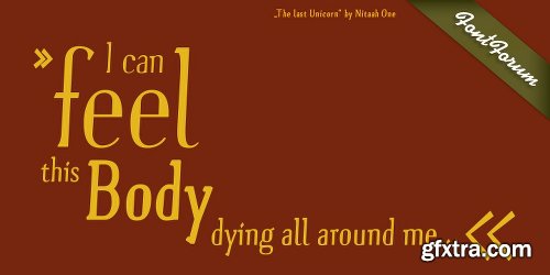
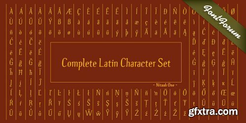
Nitaah One Font Family 4 Fonts $200
OTF | TTF
Nitaah One - a handmade Font - is a Font that is designed with a huge amount of love and passion. The classic feeling of the slim minuscules and the high stem contrast is accompanied to the rude serif shapes that are created in memory of the woodwork from the designers Grandfather. By that unusual chosen serif forms you can see and experience the handmade character of that Font and maybe you can feel a touch of that wooden shapes from the childhood past.Anyhow, this font matches to designs that unify class, technical and rudeness. So it can be imagined to used for example natural Furniture; Whiskey & Wine, Clocks, leather Fashion, Steampunk affairs and - of course - any other businesses you like to.
http://www.myfonts.com/fonts/urw/nitaah-one/
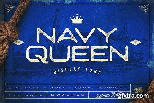
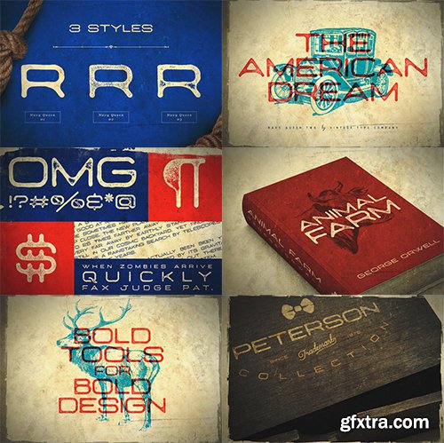
Creativemarket Navy Queen Display Font 516671
OTF
https://creativemarket.com/VintageTypeCo/516671-Navy-Queen-Display-Font
Navy Queen is a over-extended, geometrically designed sans serif display font that pays homage to simpler times. This font will act as a great addition to any vintage design project including posters, logos, crests, packaging, and so much more!
Navy Queen comes in a clean style, as well as two varying styles of distressing. It also comes equipped with support for a variety of latin languages, as well as bonus swashes.
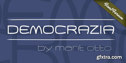
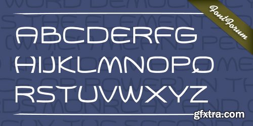
Democrazia Font Family 2 Fonts $78
OTF | TTF
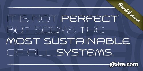
Democrazia is the agreeable typeface. It is smoothly curved and has a soft and open character. She is named after the principal, we all cherish, Democracy rooted in the Greek civilisation in the year 624 before Chr., called the Democracy of Athens. It is not perfect but seems the most sustainable of all systems. It requires interest and work to keep it in good shape. Although democracy is cherished it is easy to trample. My typeface is also fragile and shows signs of vulnerability, but has also a firm look. Like it says; you can bend me around but I won’t crack because I am free, creative and flexible. Suitable for all purposes.
http://www.myfonts.com/fonts/urw/democrazia/
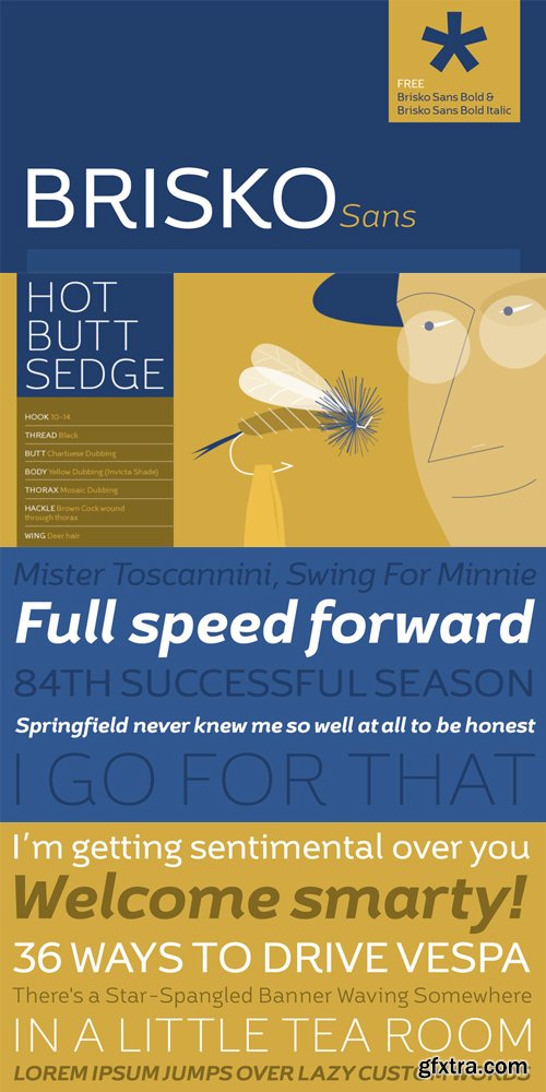
Brisko Sans Font Family $240 | 10 x TTF | Turkish Support
http://www.myfonts.com/fonts/tdf/brisko-sans/
Brisko Sans is a simple sans serif font family that comes in 5 weights with matching italics. It is suitable for longer texts, while all weights are good for any other typographic use. The whole font family contains characterful elements to distinguish it from the old standards. Brisko Sans is a fully applicable, legible and discrete font family with unique attributes. It is a good recommendation for different kinds of web and print projects.

http://www.myfonts.com/fonts/mawns/enlighten/
TTF | 1 Font | JPG Preview | 1 Mb RAR
Eurabia Font Family 1 Font $20
OTF | TTF
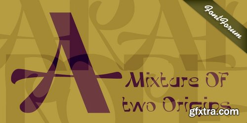
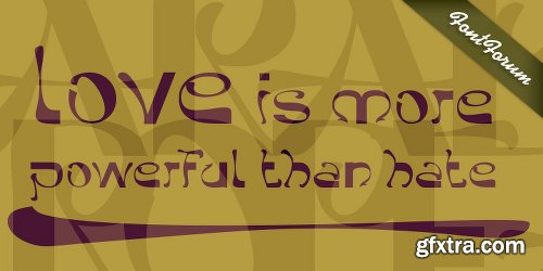
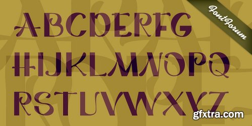
Eurabia - The actual typeface. Eurabia is a mixture of two origins. It proofs not to be an easy fitting between the two cultures. This typeface is ahead of the issues at hand. It shows that although it is causing friction, fears and wrath we shall unite in the end and form new identities. These new identities must be open minded, respectful and tolerant towards indifferences and the values of one and other. This knife only cuts both ways. Eurabia is a positive typeface, which wants to believe, against all odds, that love is more powerful than hate. In Eurabia ancient European and Arabic elements brought together and make a new fresh appearance. It works wonder well, the frolic and graceful curled lines combined with the solid firm lines. Gradual from thick to thin, from square to round. It is all well accepted in this typeface. It is suitable for poster design, adds, graphic purposes and writing.
http://www.myfonts.com/fonts/urw/eurabia/
Novara Font Family 1 Fonts $39
OTF | TTF
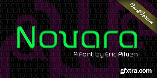
The quadratically constructed Novara conveys size and stability. The font is rather rich in contrast emphasizing its quite nuanced personality. Despite the rectangular geometry, edges and corners are rounded even stressing the quite non-stringent character of the font. Although the flow has authority and occurs broad and strong, it remains open and airy. The stocky descenders are not even looking for higher realms and convey the font the linear speed and ground-force of a train at full speed. Novara is a very modern font that is true to, like an innovative snapshot of its age, the computer and technology era.
http://www.myfonts.com/fonts/urw/novara/
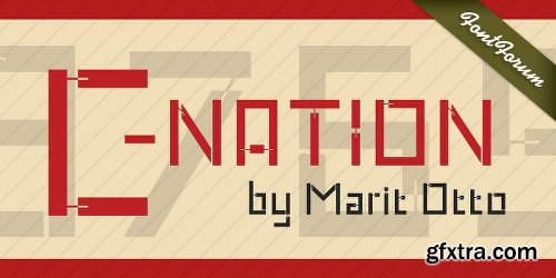
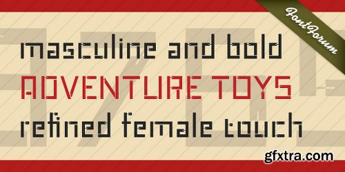
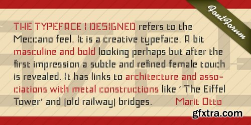
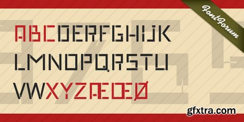
C-Nation Font Family 1 Fonts $40
OTF | TTF
Marit Otto about C-Nation: The building typeface. Although the 70ties were very liberating and progressive, still girls played mainly with dolls and sweet things and boys with all kinds of challenging stuff. They did all sorts of basic scientific experiments in mini labs and of course built cool things with Meccano building sets. As a girl I was perfectly happy with the toys I had access to. But at the same time I was very curious about all the adventure toys and discoveries my brother did. It also made me wonder why the grown up people thought that our world could be separated so easily by separating our toys in pink and blue sections. At this day of age Meccano is probably hopelessly old fashioned and far to manual. Children of today are fed by fast images and cool animations on screen, they learn, play, communicate and relax in the same space, the digital space. The special feature of Meccano was that even though it was very basic there was the promise you could create anything. It might even contribute to a logical mind. The typeface I designed refers to the Meccano feel. It is a creative typeface. A bit masculine and bold looking perhaps but after the first impression a subtle and refined female touch is revealed. It has links to architecture and associations with metal constructions like ‘The Eiffel Tower’ and (old railway) bridges. I am convinced that we all think of that as very charming man-made objects.
http://www.myfonts.com/fonts/urw/c-nation/

Silo Slab Font Family $100 | 12 x TTF and OTF
http://www.myfonts.com/fonts/typeunion/silo-slab/

http://www.myfonts.com/fonts/mawns/funkygraphy/
TTF | 2 Fonts | JPG Preview | 1 Mb RAR
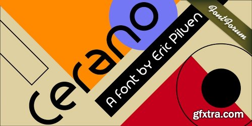
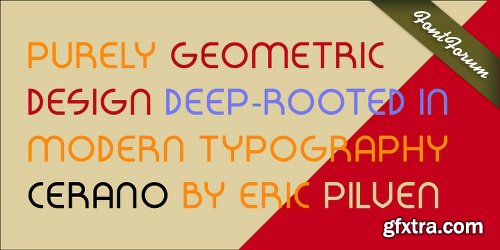
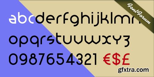
Cerano Font Family 1 Fonts $39
OTF | TTF
Cerano contains elements of the Bauhaus and Art Deco era, and maybe even reminds a bit of the sternness of Black Letter type. Still, it is new and original with a very distinguished personality. The straightforwardness of the purely geometric design deep-rooted in modern typography makes Cerano unique. Round, wide and firm, almost martial yet non-compliant, it moves through the rows called text lines. Despite being wide and firm, it is constructed by circles and rolls with perfect balance demonstrating a unexpected dynamic. Cerano is a typeface of masculine and impulsive traits, just waiting to be printed.
http://www.myfonts.com/fonts/urw/cerano/
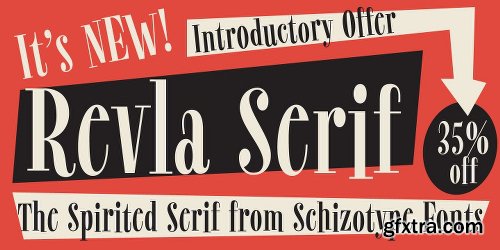
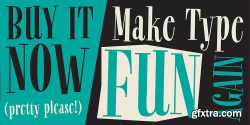
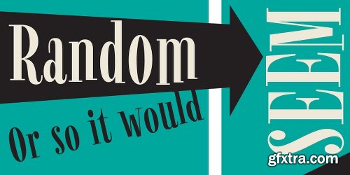
Revla Serif Font Family 1 Font $40
OTF | TTF
Meet Revla Serif, an unashamedly spirited font, with a spring in its step and a lust for life. Loosely based on a few letterforms from a mid century poster, it takes the feel of Madison Avenue print ads and runs with it.
OpenType acrobatics ensure letters don't repeat monotonously, using the contextual alternates feature. Also included for your viewing pleasure - automatic fractions, case sensitive forms and one solitary stylistic alternate, an alternative ampersand. And that’s it! Put the fun back into your text with Revla Serif.
http://www.myfonts.com/fonts/schizotype/revla-serif/
126,000 Royalty-Free 3D Model

Udemy Türkçe


Top Rated News
- CreativeLive Tutorial Collections
- Fasttracktutorials Course
- Chaos Cosmos Library
- MRMockup - Mockup Bundle
- Finding North Photography
- Sean Archer
- John Gress Photography
- Motion Science
- AwTeaches
- Learn Squared
- PhotoWhoa
- Houdini-Course
- Photigy
- August Dering Photography
- StudioGuti
- Creatoom
- Creature Art Teacher
- Creator Foundry
- Patreon Collections
- Udemy - Turkce
- BigFilms
- Jerry Ghionis
- ACIDBITE
- BigMediumSmall
- Globe Plants
- Unleashed Education
- The School of Photography
- Visual Education
- LeartesStudios - Cosmos
- Fxphd
- All Veer Fancy Collection!
- All OJO Images
- All ZZVe Vectors
- CGTrader 1 CGTrader 2


