
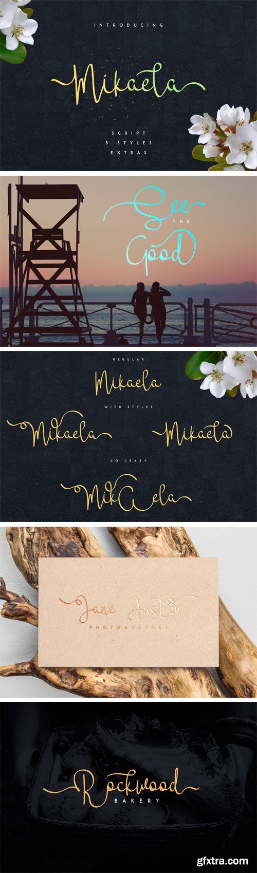
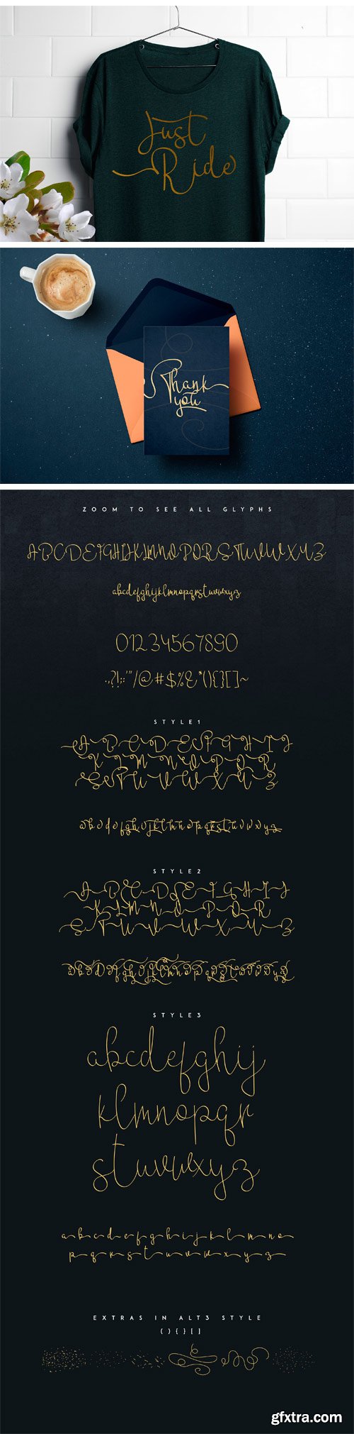
CM - Mikaela Script 1682088
Introducing: Mikaela Script ! A handwritten font with a personal charm. With clean lines, Mikaela is perfect for branding projects, home-ware designs, product packaging - or simply as a stylish text overlay to any background image.
http://www.fontsmith.com/fonts/fs-albert
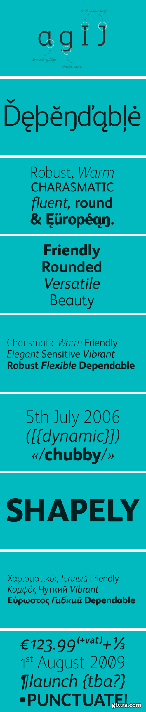
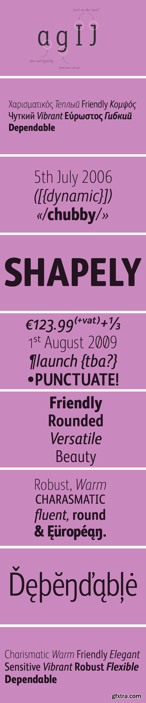
How do you make a font like FS Albert unique, distinctive? “When designing a font I try to question every letter,” says Jason Smith, “but all you need is a few that have an x factor. With FS Albert, they’re the lowercase ‘a’ and ‘g’ and the uppercase ‘I’ and ‘J’. “I remember a friend saying, ‘Why on earth have you designed the ‘a’ like that? Isn’t it too friendly for this kind of font?’ And, in a way, that’s what I wanted – honesty and warmth, because a lot of big brands at the time really needed to show a more human side.”
http://www.fontsmith.com/fonts/fs-albert-narrow
FS Albert Narrow is a narrow version of FS Albert Pro, designed by Jason Smith. But, drawn from scratch, it’s more like a font in its own right, as Jason Smith explains. “The challenge in designing a narrow version of a typeface based on an existing design is not to make it to look squashed. “There comes a point in condensing a font where it becomes broken. You can usually automatically squash something by 10% and it will still look OK. But by the time you’ve squashed it by 25% the type looks ugly and needs redrawing. So we drew it all manually in order to ensure the design integrity was kept while still fulfilling the need to save space.”
http://www.fontsmith.com/fonts/fs-olivia
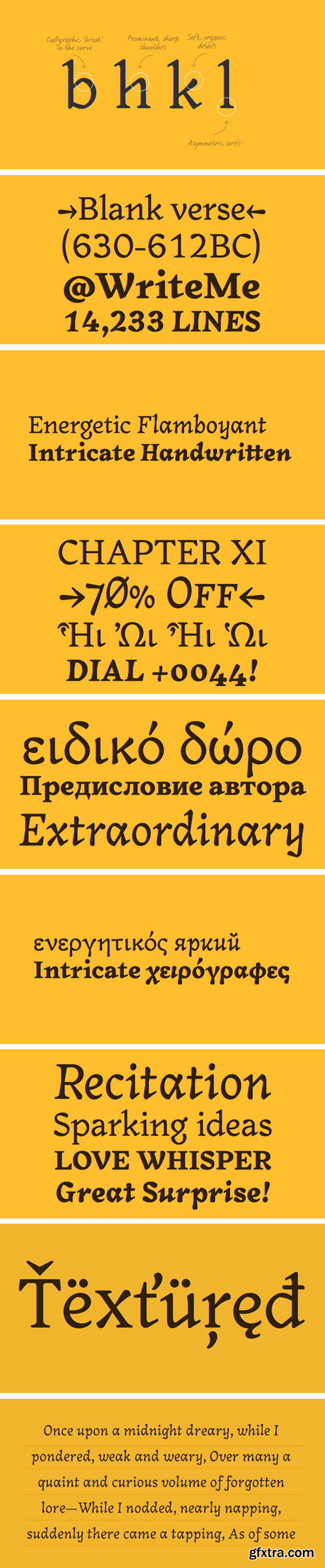
On a visit to Belgium and the Netherlands while still an MA student at Reading University, Eleni Beveratou made some important discoveries. First, there was the letter ‘g’ from the Didot family seen at Plantin Moretus Museum in Antwerp, which seemed “almost like a mistake”. Then there were strange details such as the serifs on the “l”, “h”, “k”, “b” ?and “d” in Egmont Cursive and other typefaces by Sjoerk Hendrik de Roos, found in volumes of poetry she picked up from a chaotic bookshop in Amsterdam. These were characters that stood out from the text but seemed to blend harmoniously with the rest ?of the letters. “And there it was, the spark. ?I decided to design a typeface that would capture the details of the process of writing.”
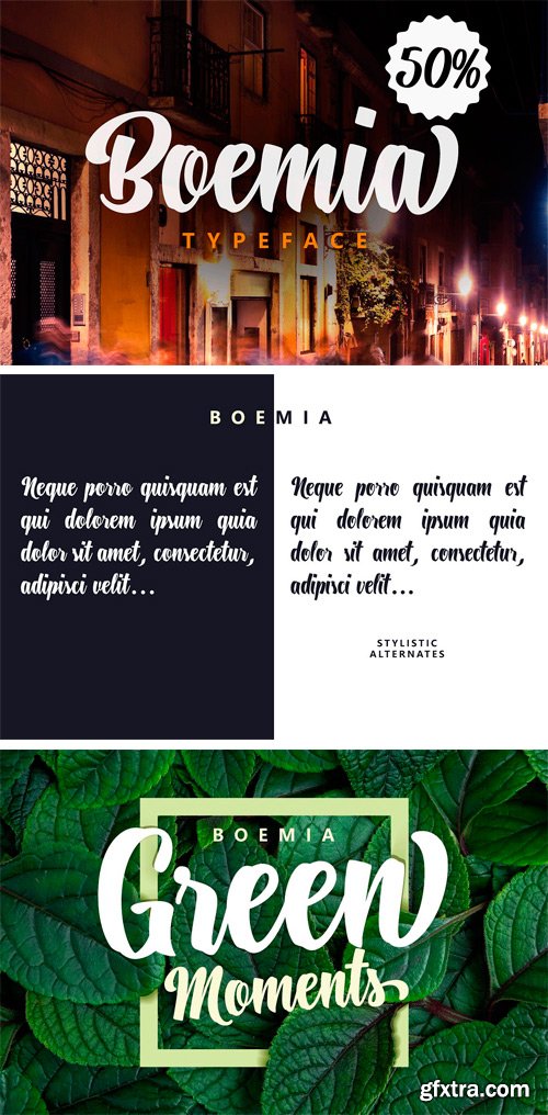
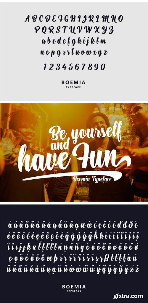
CM - Boemia 1683352
Boemia with alternate lowercase and swashes to add value to your projects. Supported languages: Central Europe, Baltic, Turkish, Romanian. OT Features: kern, stylistic alternates, swash.
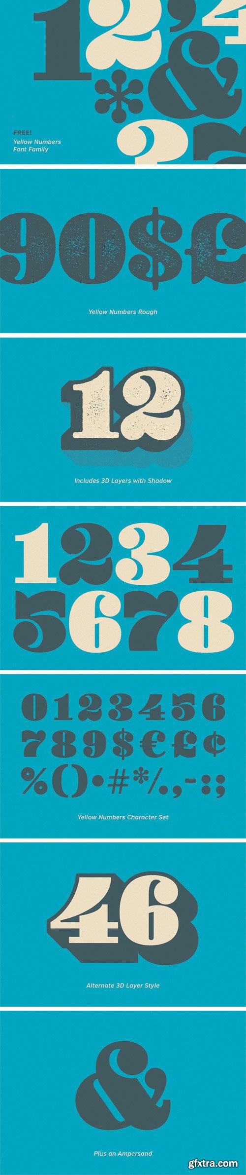
Yellow Numbers™ is a collection of fat, funky numbers and symbols in regular, soft and rough versions. Each subset has 3D and shadow layers for added pop. The rough family features 5 different distress options for every character. Desktop and webfont licenses are included.
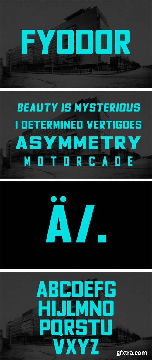
http://fyodor.blueroomcollective.co.uk/2/
Fyodor provides powerful headlines and dramatic titling for editorial projects. The typeface design features balanced oblong and square geometric spaces, inside the classic forms of the Constructivist-era typefaces. The font family comes in 274 characters with Latin, Western European, Cyrillic and Greek language support, and is available in a bold weight with regular, condensed and expanded styles, both normal and oblique.
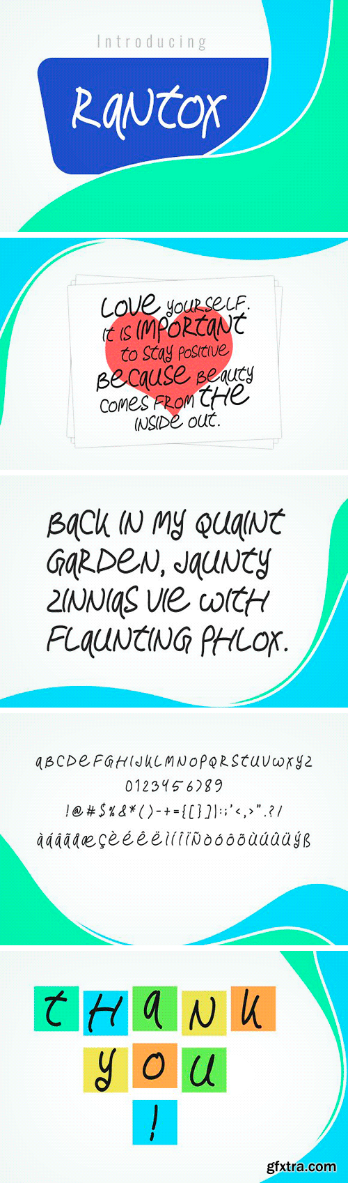
CM - Rantox Typeface 1683115
Rantox is a brand new font. I hope you like it. Very suitable for logos, t-shirts, print design, website headers, photo frames, flyers, album covers, posters, image sliders and much more.
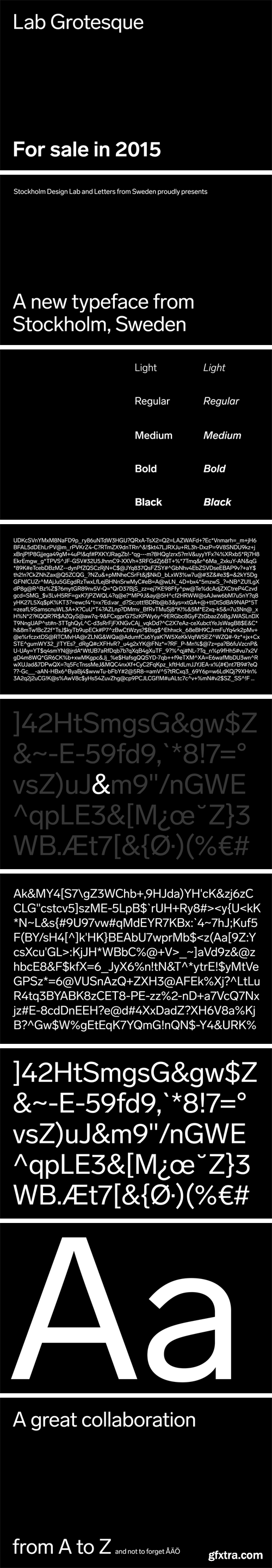
https://lettersfromsweden.se/labgrotesque/
Stockholm Design Lab is regarded as one of Europe’s finest design agencies, and employs type as a central branding element in identity work for customers such as S7, Scandinavian Airlines, IKEA and Stadium. In the landscape of grots, the subtlest of differences can bear great weight in a typeface’s tone. Looking past the repression of Helvetica, inspiration was found in the idiosyncrasies of earlier grotesks and gothics from the turn of the century. Conceptually, Lab Grotesque is built on the idea of round strokes straightening out towards the terminals. With that in mind, we made the choice of square or rounded dots possible through stylistic sets. Lab Grotesque comes in five resolute weights, complete with italics. Lab is designed with and for Stockholm Design Lab, and now it’s available for everyone. Lab Grotesque is available in Latin, Greek and Cyrillic. A vietnamese version is also available on request.


https://lettersfromsweden.se/ekselldisplay/
Eksell Display is a unique typeface from 1962, designed by the legendary swedish designer Olle Eksell (1918–2007). Olle was a prolific artist who couldn’t resist sketching out whatever ideas came to mind. His work covered a broad range, but this was the only complete typeface. The letters were drawn in Olle’s five square meter studio in Stockholm, six years after he designed the classic Mazetti eyes. We carefully digitized the letters and developed a family of four optical styles, including a stencil version. Have fun with it, we think Olle did.
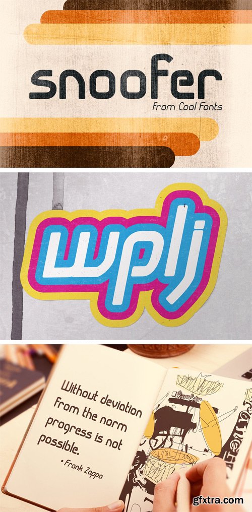
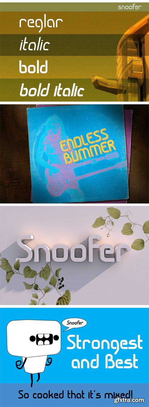
CM - Snoofer 1669750
Snoofer is a modern font that works for both display and text. It comes in 4 weights (Regular, Italic, Bold, Bold Italic). Snoofer was inspired by a character in stories my dad told me as a kid. Somehow they always ended with “... and they never left home again.”
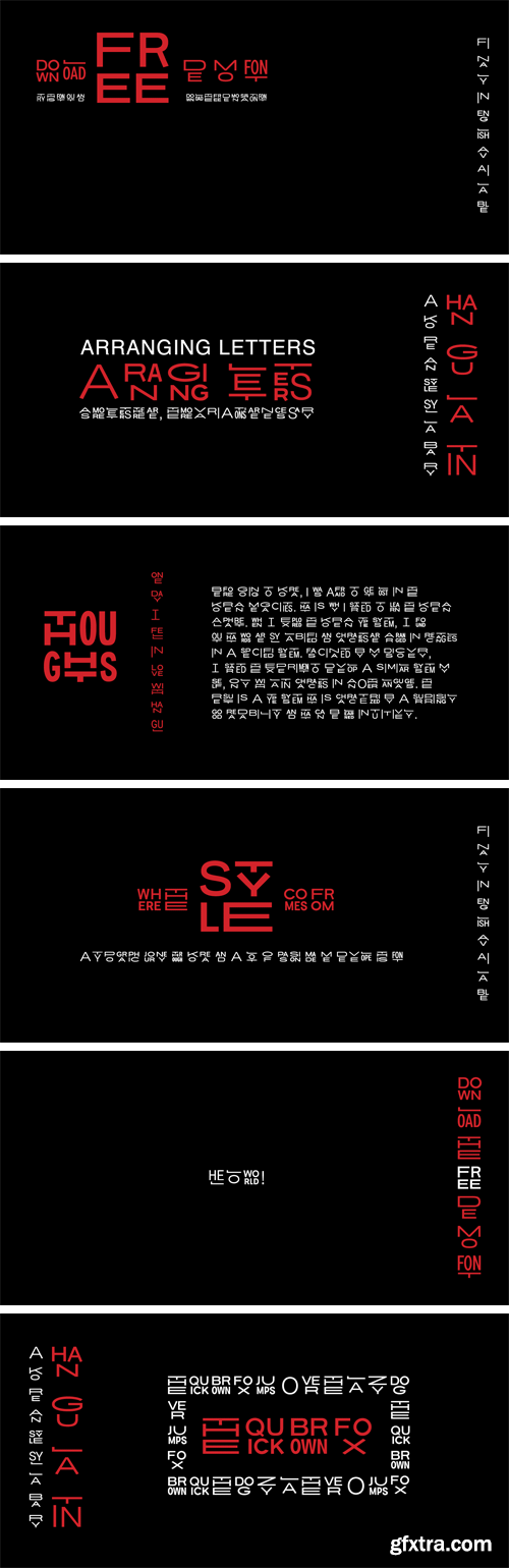
http://www.myfonts.com/fonts/urw/hangulatin-en/
To obtain maximum pleasure in working with Hangulatin, please use the typeface as follows:
1 Open an OpenType-savvy program
2 Select the "Hangulatin“ typeface.
3 Copy the following test text into your document:
HEL LO WORLD !
THE QUICK BROWN FOX JUMPS O VER THE LA ZY DOG .
If this fails to bring about the desired result, please make sure that you are using an OpenType-savvy
program and that usage of the OpenType features is activated in that program. Standard graphic programs are suited to that purpose. The same applies to Microsoft Word starting from the 2010 version upwards.To have fun and success with your new typeface, please write all words in the format shown in the sample text, i.e. all syllables need to be written in capital letters and separated from one another using spacecharacters (for single letters leave 2 spaces). If, however, a desired syllable is not to be substituted, proceed as follows:
Please check
+ to see whether it is a word from the English language;
+ whether the word has been spelled correctly;
+ whether the word has been subdivided into syllables correctly;
+ whether the syllable has been terminated with a space character (allow 2 spaces for single letters).
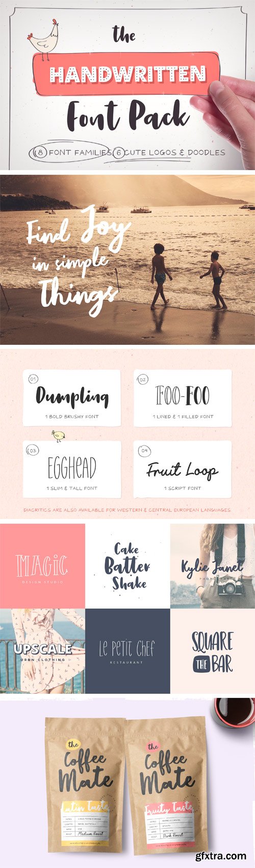
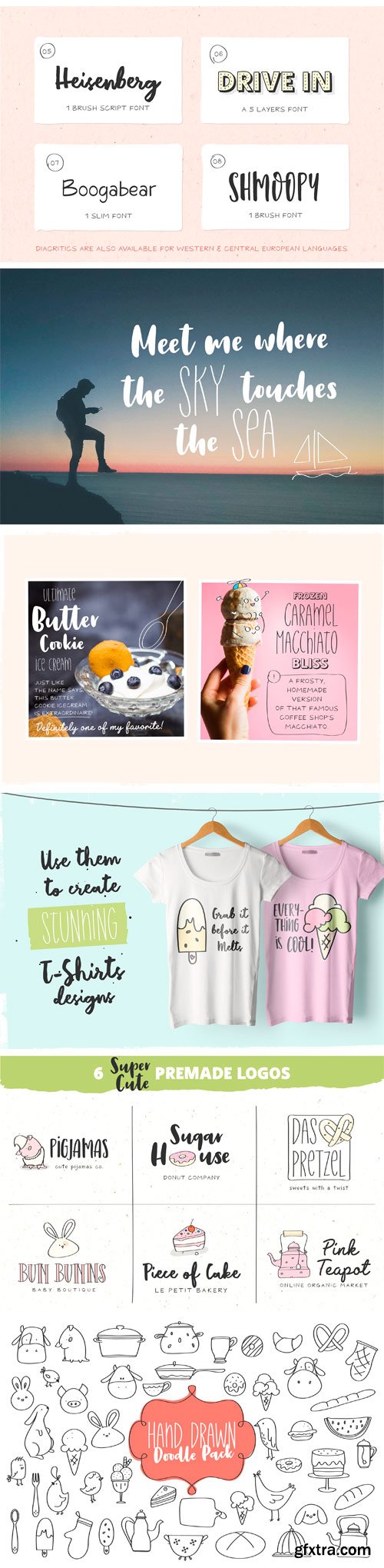
CM - Handwritten Font Pack & Extras 1681441
As a launching promotion (till 1 August) you can buy Handwritten Font Pack & Extras for the incredible price of just $18 (normal price $22). So hurry up and grab this ultimate handwritten pack and start designing that cool stuff you always wanted :) Handwritten Font Pack & Extras is a unique pack that contains 13 Fonts grouped in 8 Font Families, 6 Super Cute Logos and a Big Pack of Doodles. All the fonts are coming in OTF, TTF and WOFF format, so you don’t have to worry for not having the right format for your next design project. Both the 6 Premade Logos (Fully Editable) and the Big Pack of Hand Drawn Doodles are in PSD and AI vector format (Stroke version included – for Doodles pack).
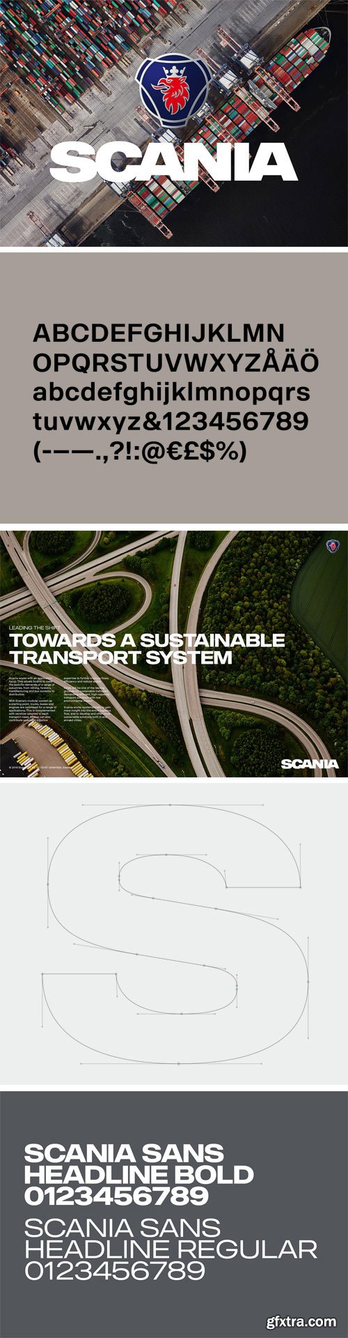
https://lettersfromsweden.se
With the aim to be the leader in sustainable transport, Scania builds its business while creating value for customers, employees and society. Delivering customised heavy trucks, buses, engines and services, focus is always on efficient, low-carbon solutions that enhance customer profitability. With design direction by Brand Union Stockholm we have developed a wide type family with 8 styles and updated the classic word mark.
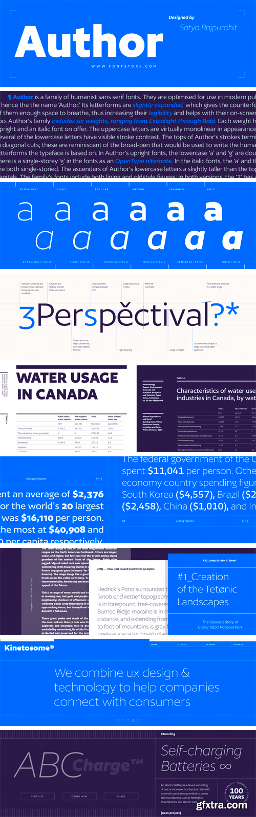
https://www.fontstore.com/font/author/styles
Author is a family of humanist sans serif fonts. They are optimised for use in modern publications – hence the the name ‘Author.’ Its letterforms are slightly expanded, which gives the counterforms inside of them enough space to breathe, thus increasing their legibility and helps with their on-screen rendering, too. Author’s family includes six weights, ranging from Extralight through Bold. Each weight has an upright and an italic font on offer. The uppercase letters are virtually monolinear in appearance; however, several of the lowercase letters have visible stroke contrast. The tops of Author’s strokes terminate in diagonal cuts; these are reminiscent of the broad-pen that would be used to write the humanist letterforms the typeface is based on. In Author’s upright fonts, the lowercase ‘a’ and ‘g’ are double-storied; there is a single-storey ‘g’ in the fonts as an OpenType alternate. In the italic fonts, the ‘a’ and the ‘g’ are both single-storied. The ascenders of Author’s lowercase letters a slightly taller than the tops of the capitals. The family’s fonts include both lining and oldstyle figures; in both versions, the ‘3’ has a flat top. Author comes from Satya Rajpurohit, the founder of Fontstore.
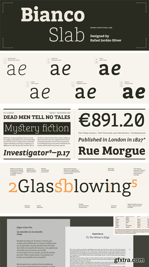
https://www.fontstore.com/font/bianco-slab/styles
Bianco Slab is a family of 12 fonts, optimised for use in editorial design. Its broad character set includes a number helpful features for quality typesetting. The typeface also it has the right personality for use in branding. A slab serif, the fonts’ design is mostly monolinear. The family’s six weights range from Light to Black, and each weight has both upright and italic fonts on offer. In Bianco Slab’s upright fonts, the lowercase ‘a’ and ‘g’ are each double-storied; these become single-storied in the italics. The upright fonts contain alternate, singe-storied versions of the ‘a’ and ‘g’, as OpenType alternates; their character sets also include alternate, rounder versions of the ‘e’ and ‘y’. Bianco Slab’s lowercase letters have a tall x-height. The ascenders just peak up above the tops of the capital letters. Each of the Bianco Slab fonts include small caps and more than three-dozen ligatures. The fonts’ default numerals are proportionally-spaced oldstyle figures; there are also lining figures, and full ranges of numerators and denominators available for easier fractions-typesetting, too. The fonts’ numerator and denominator range include not just numbers, but also lowercase letters, punctuation marks, and even mathematical operators. Each Bianco Slab font also include ten directional-arrow glyphs. The Bianco Slab family was designed by Rafael Jordán Oliver.
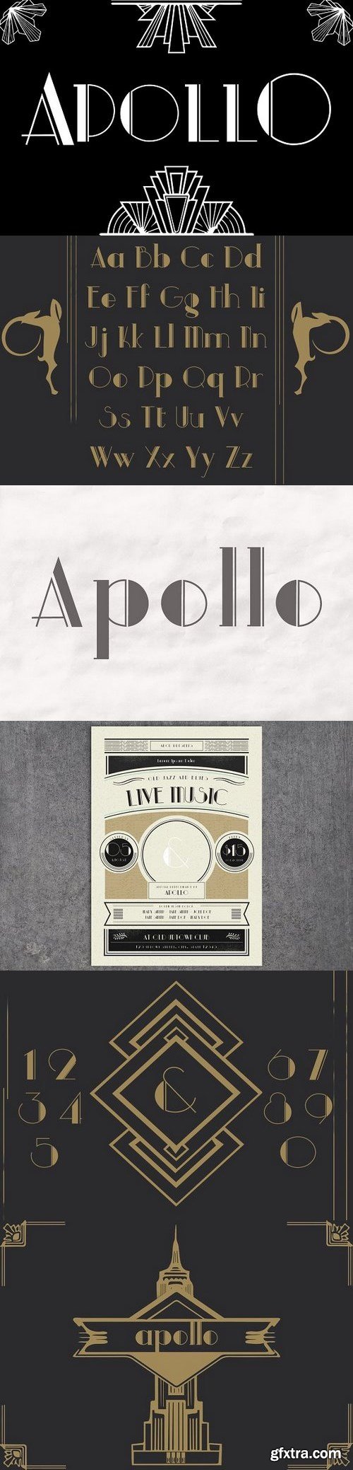
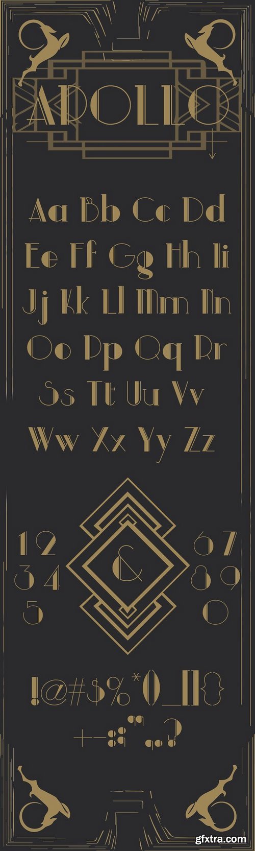
APOLLO is a modern font family. It concludes uppercase and lowercase letters with numbers and punctuation. There is classic notations along with my personal style. This font is a personal desire for a clean modern font with a retro style.
https://creativemarket.com/XXICreative/1337369-Apollo-a-modern-sans-serif
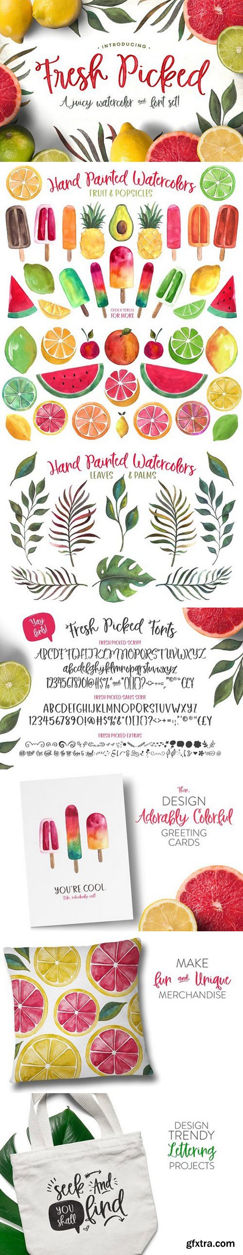
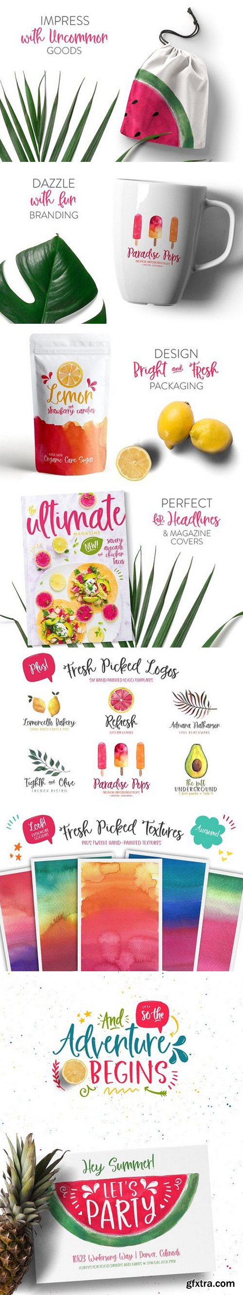
- Fresh Picked Script (Regular) - A casual, hand-drawn script font, perfect for invitations, lettering projects, packaging and logos.
- Fresh Picked Script (Bold) - Just like regular, but you know, bold. :)
- Fresh Picked Sans - A complimentary sans serif version that perfectly pairs with FP Script.
- Fresh Picked Extras - A font file containing more than 85 hand-drawn doodles, ornaments and catchwords.
- Six Photoshop Logo Templates - A handy set of 6 ready-made logos for Photoshop users. Just install your fonts, open in PS, grab your type tool, and GO!
- 58 Hand-Painted high-resolution watercolor PNG files. And the files look great on both light and dark backgrounds!!
- A set of 12, all new watercolor textures. Sized at 8.5 x 11in and 500 DPI.

126,000 Royalty-Free 3D Model

Udemy Türkçe


Top Rated News
- CreativeLive Tutorial Collections
- Fasttracktutorials Course
- Chaos Cosmos Library
- MRMockup - Mockup Bundle
- Finding North Photography
- Sean Archer
- John Gress Photography
- Motion Science
- AwTeaches
- Learn Squared
- PhotoWhoa
- Houdini-Course
- Photigy
- August Dering Photography
- StudioGuti
- Creatoom
- Creature Art Teacher
- Creator Foundry
- Patreon Collections
- Udemy - Turkce
- BigFilms
- Jerry Ghionis
- ACIDBITE
- BigMediumSmall
- Globe Plants
- Unleashed Education
- The School of Photography
- Visual Education
- LeartesStudios - Cosmos
- Fxphd
- All Veer Fancy Collection!
- All OJO Images
- All ZZVe Vectors
- CGTrader 1 CGTrader 2


