


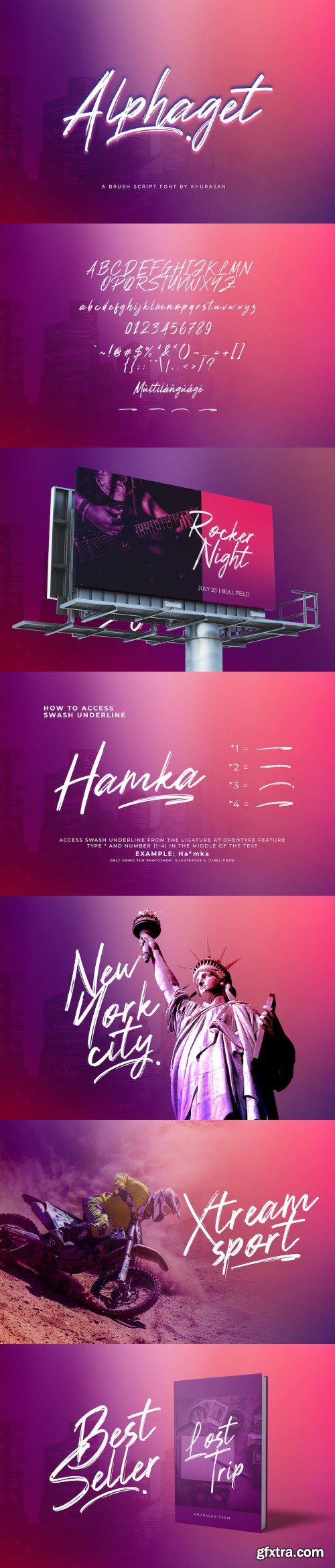
Alphaget - Brush Script
The Alphaget is a fresh brush font, elegant and modern feel character set.
The Alphaget font as well as multi-lingual support.
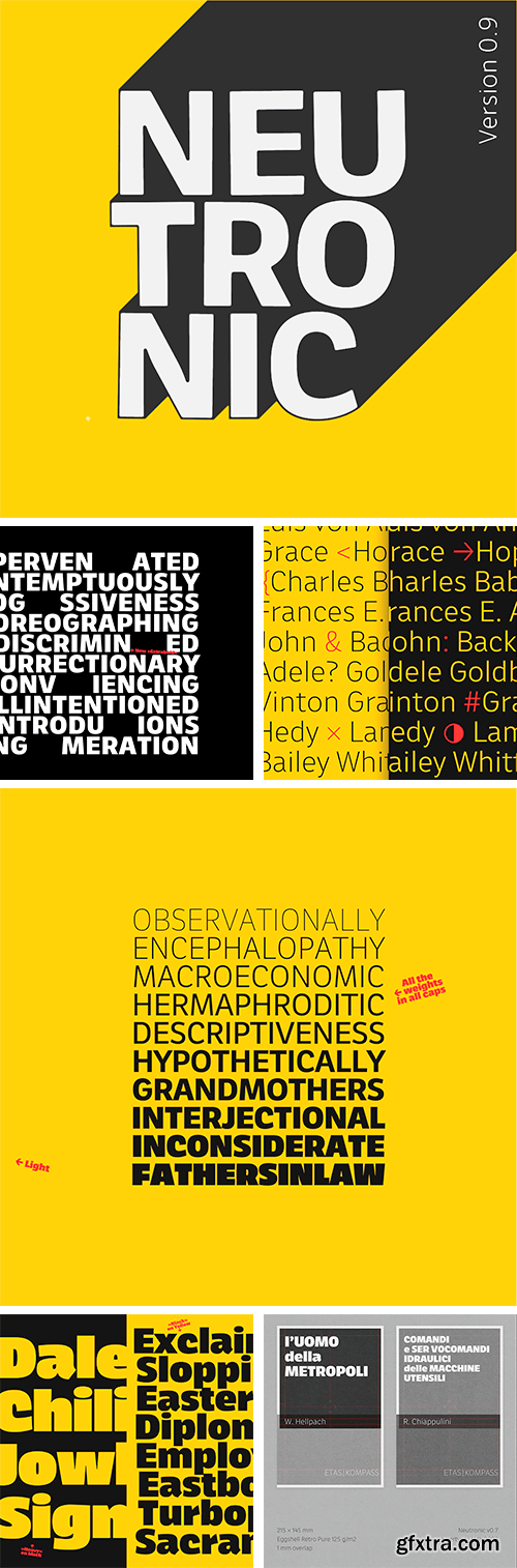
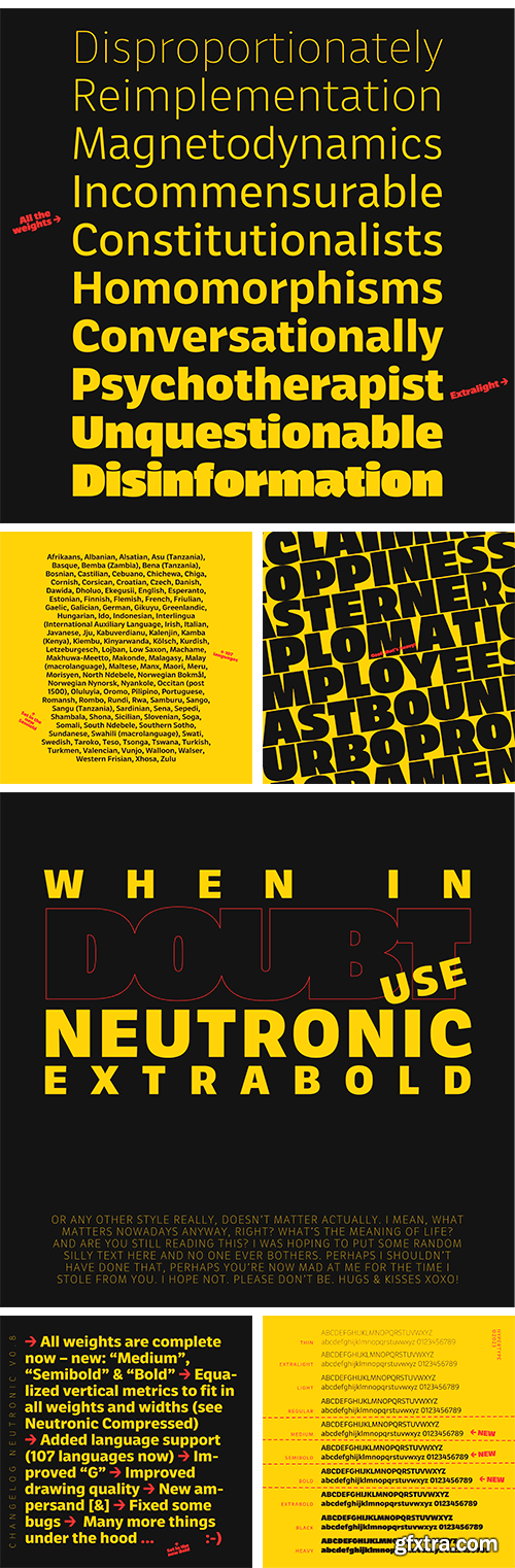
https://markfromberg.com/projects/neutronic
Neutronic is a modern, distinctive and legible Sans serif family with fresh characteristics. It started as a typographic companion of Gintronic from Mark Frömberg’s monospace font Gintronic. Mark drew it from scratch with a larger family system in mind. The entire Neutronic Family is going to be a big superfamily designed in perfect harmony spaning an extreme broad weight and width range. Minjoo Ham joined to draw Neutronic Hangeul. If you are looking for a fresh, crisp and unique looking Sans serif family, please try Neutronic.
https://www.myfonts.com/collections/modica-pro-font-monotype-imaging
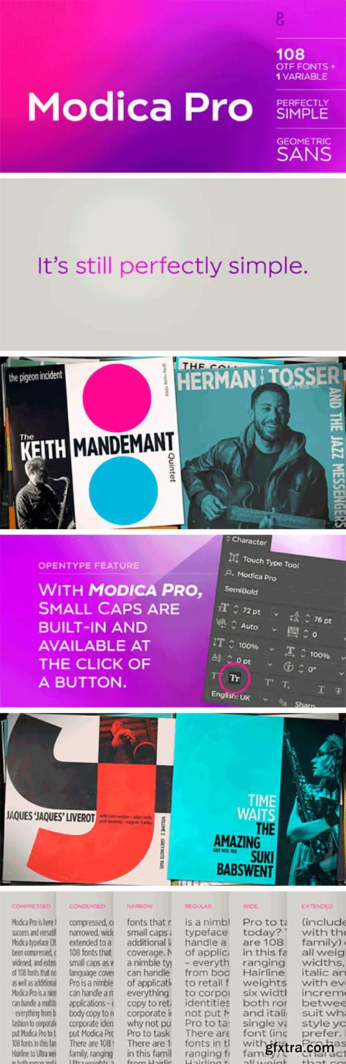
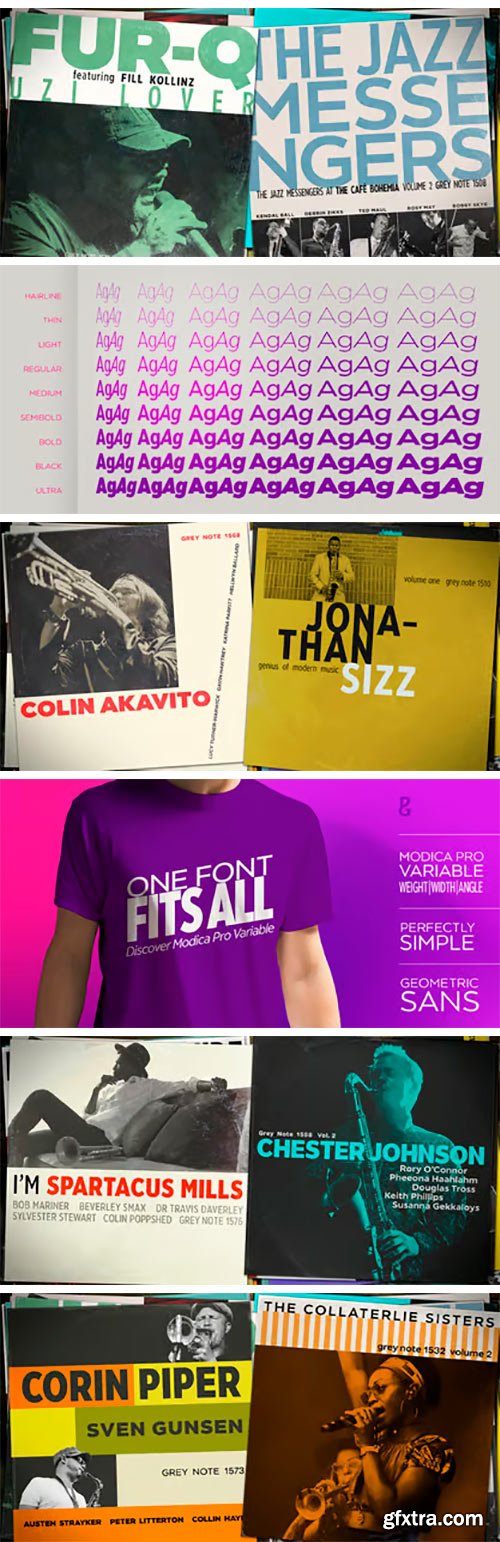
Modica Pro is here to expand upon the success and versatility of the original Modica typeface (2019). Modica has been compressed, condensed, narrowed, widened, and extended to a mega-family of 108 fonts that now includes small caps as well as additional language coverage. Modica Pro is a nimble typeface that can handle a multitude of applications – everything from body copy to retail fashion to corporate identities... why not put Modica Pro to task today? There are 108 fonts in this family, ranging from Hairline to Ultra weights across six widths in both roman and italic. A single variable font (included with the full family) covers all weights, widths, and italic angle with every increment in between to suit whatever style you prefer. Modica Pro has a character set that covers all Latin European languages.
https://www.myfonts.com/collections/fautive-font-blaze-type
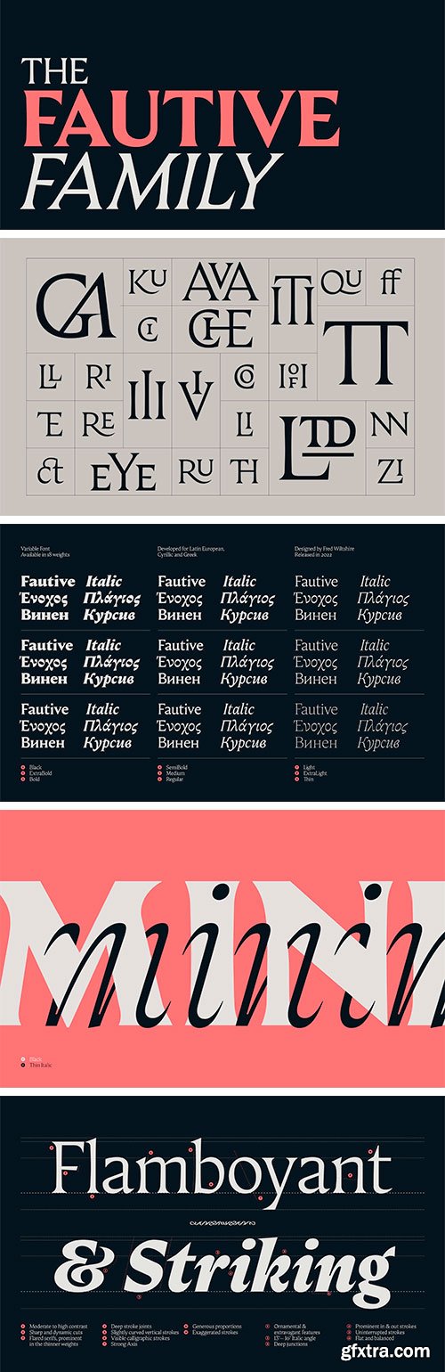
Fautive is a dynamic and lively serif, imbued with character and life. Originally based around the work of Louis Perrin, Fautive has grown into a sharp and playful typeface with 18 flamboyant styles. Each style is crafted with elegant and intricate details made to captivate the reader. It also comes equipped with Cyrillic, Greek and extended Latin. Each font comes with a large selection of ligatures, alternates, modular ornaments, a handful of illustrations and a snake. The lighter weights accentuate any flourish or movement found in the regular, whereas the bold softens these features. The italic counterparts follow a similar aesthetic, but contain more calligraphic features. Fautiveʼs exaggerated characteristics are perfect for editorial use, primarily for medium to large scale display settings, but the regular style performs well for longer paragraphs of text. With all of Fautiveʼs quirks and features, the user should be able to create exciting and lasting designs. This large font family will do wonders when used on any material where text is a key element: whether it be display, headline, text and even caption on posters, websites, books and so on.
https://www.myfonts.com/collections/mutable-font-paulo-goode
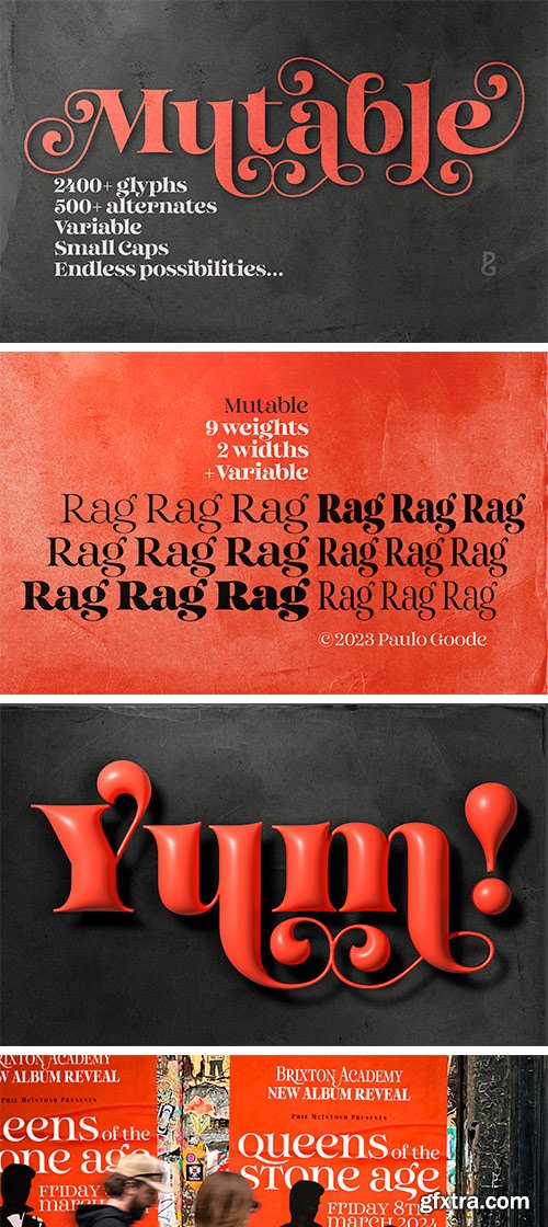
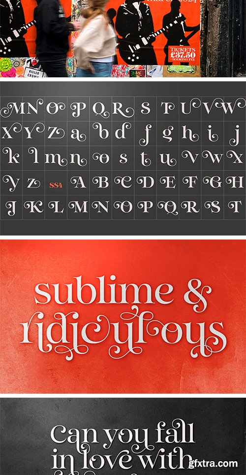
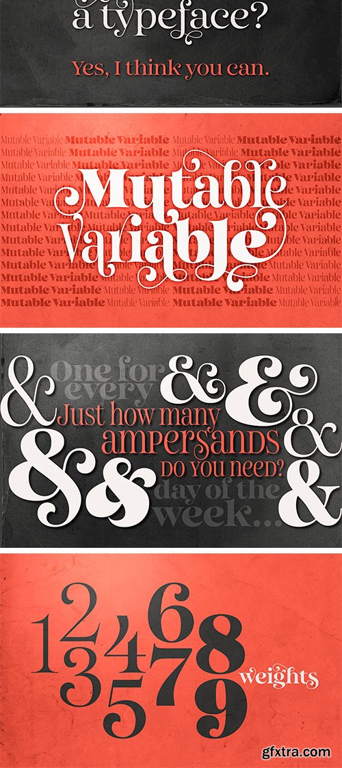
Mutable is as flamboyant and changeable as its name suggests. These characterful fonts were designed specifically for display purposes. It’s an exuberant type family that’s jam-packed with alternates and bestowed with a loud personality.

https://iwantype.com/product/11734/
Simah Zaza is an Arabic typeface that has luxury yet warm and humane feelings. It's legible, soft, clear, flexible, simple, and contemporary. The design is inspired by the Kufic calligraphic style and influenced by the Naskh style. Simah Zaza is highly crafted in order to perform well both on screen and in print. it functions well even on small font sizes. It has a wide range of use possibilities headlines, logotypes, branding, books, magazines, motion graphics, and use on the web and Tv.
https://www.myfonts.com/collections/bauhaus-arabic-font-naghi-naghachian
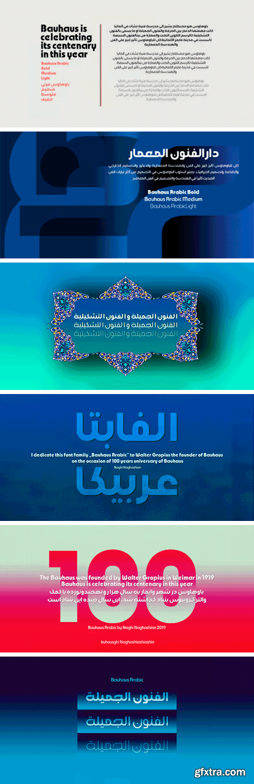
Bauhaus is celebrating its centenary in this year. For the Bauhaus's 100th anniversary year, art and design museums and galleries around the world are hosting exhibitions and events. The publication of „Bauhaus Arabic“ font family is my contribution to celebrate this event. Bauhaus Arabic is a sans-serif font family designed by Naghi Naghashian in tree weights. Bauhaus Arabic Light, Bauhaus Arabic Medium and Bauhaus Arabic Bold. It is extremely legible even in very small size. This font family is a contribution to modernisation of Arabic typography, gives the font design of Arabic letters real typographic arrangement und provides more typographic flexibility. Bauhaus Arabic supports Arabic, Persian ( Farsi ) and Urdu. It also includes proportional and tabular numerals for the supported languages. Bauhaus Arabic design fulfills the following needs: A Explicitly crafted for use in electronic media fulfills the demands of electronic communication. B Suitability for multiple applications. Gives the widest potential acceptability. C Extreme legibility not only in small sizes, but also when the type is filtered or skewed, e.g., in Photoshop or Illustrator. Bauhaus Arabic’s simplified forms may be artificial obliqued in InDesign or Illustrator, without any loss in quality for the effected text. D An attractive typographic image. Bauhaus Arabic was developed for multiple languages and writing conventions. Bauhaus Arabic supports Arabic, Persian and Urdu. It also includes proportional and tabular numerals for the supported languages. E The highest degree of calligraphic grace and the clarity of geometric typography.

Lama Sans Font Family - Latin & Arabic
The creation of Lama started with a challenge to design a font suitable for both digital and print. We aimed to make a flexible concept that would go along with many mediums including, websites, advertisements, and publications. This mission required supporting up to fifty languages that vary between Latin and Arabic. In addition to and introducing different styles from normal to compressed and wide. And as a result, the font would be eligible to fit titles, body texts, and headlines in bold sizes and small spaces.
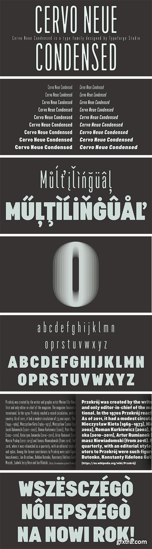
https://www.myfonts.com/fonts/blazej-ostoja-lniski/cervo-neue-condensed/
Cervo Neue Condensed is the new perfected and Condensed version of Cervo Neue, containing 18 variants. It differs from the previous version of Cervo with the higher accents over glyphs, enlarged punctuation, old-style numerals and the newly added varieties Semi Bold, Bold, Extra Bold and Black. Additionally, there is the variety of grotesque. Font Cervo is inspired by a “You And Me Monthly” published by National Magazines Publisher RSW „Prasa” that appeared from Mai 1960 till December 1973 in Poland.
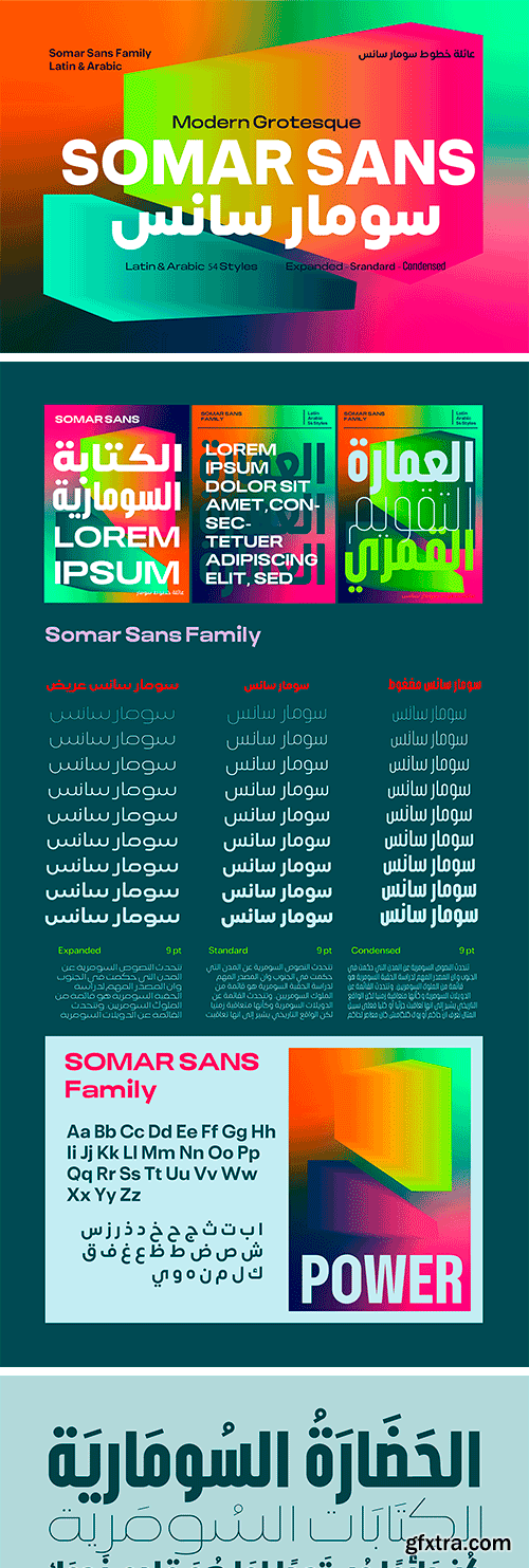
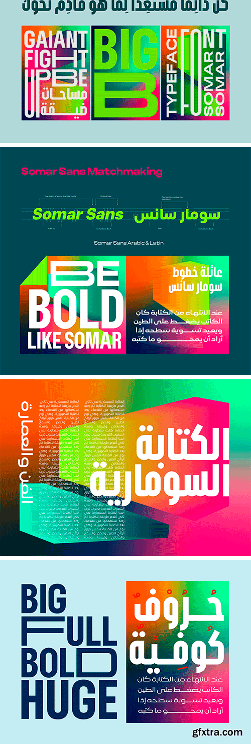
Somar Sans Font Family - Latin & Arabic
The creation of Somar started with a challenge to design a font suitable for both digital and print. We aimed to make a flexible concept that would go along with many mediums including, websites, advertisements, and publications. This mission required supporting up to fifty languages that vary between Latin and Arabic. In addition to and introducing different styles from normal to compressed and wide. And as a result, the font would be eligible to fit titles, body texts, and headlines in bold sizes and small spaces.
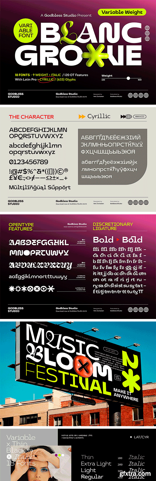
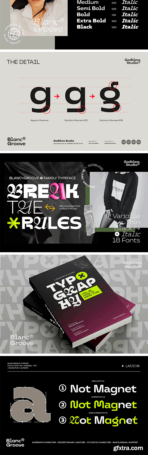
https://creativemarket.com/godblessstudio/17630982-Blanc-Groove-Variable-Font
BLANC GROOVE, a font with a futuristic and experimental concept created with a strong and charismatic character. following the current trend design style.
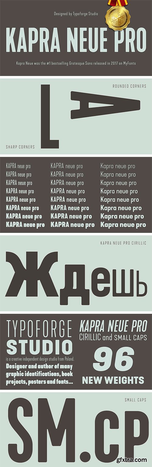
https://www.myfonts.com/collections/kapra-neue-pro-font-blazej-ostoja-iniski
Kapra Neue Pro is a younger sister of Kapra Neue – he was the #1 bestselling Grotesque Sans released in 2017 on MyFonts and grandson of Kapra. Now you really have a lot of options to choose! New family is full of everything – 96 weights contain a wide range of instances, from Condensed to Expanded, everything with rounded corners or with sharp ones. Now, font has also: small caps, cyrillic script, and old-style figures. Kapra Neue Pro is inspired by a “You And Me Monthly” magazine, published by National Magazines Publisher RSW "Prasa” in Poland, from May 1960 till December 1973.
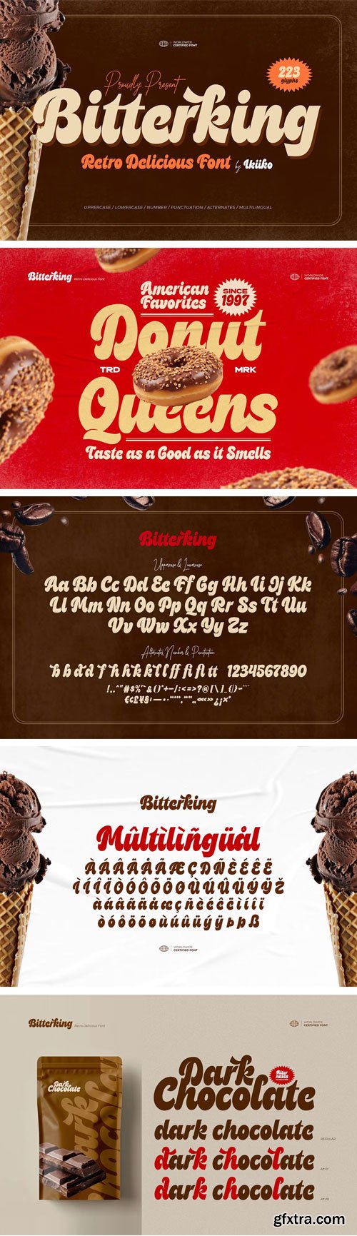
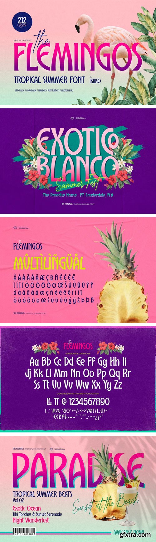
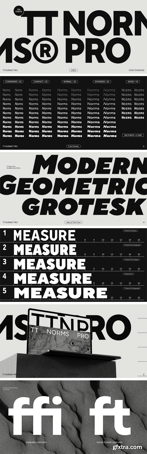
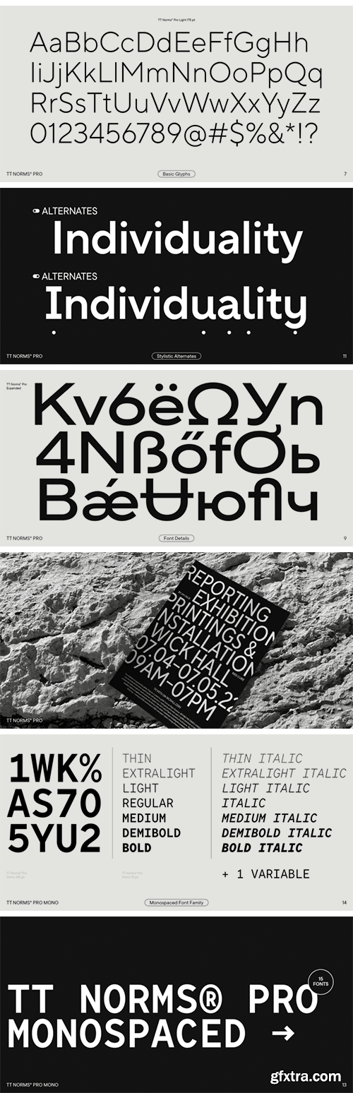
https://www.myfonts.com/collections/tt-norms-font-typetype
We have updated TT Norms® Pro! Meet the new Compact styles and the expanded character set. TT Norms® Pro 3.0 — #1 bestselling geometric sans released on MyFonts in 2017!
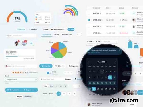

Creativemarket - Modern Font Bundle Vol.2 10366486
TTF, OTF
https://creativemarket.com/pasha.larin/10366486-Modern-Font-Bundle-Vol.2
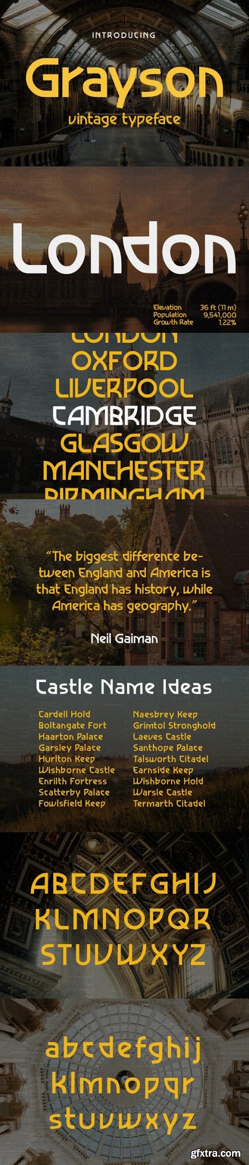
Grayson is a 1940s art deco typeface. The inspiration came from vintage store signs in London, New York, and other major cities. The font is clean and easy to read, and its letterforms are memorable which makes it perfect for branding. You can use this font for a wide variety of projects, possibilities are endless.

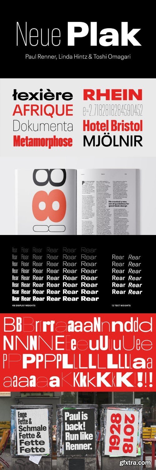
Originally designed in 1928, Plak is something of a lost gem in the type world. Despite being drawn by Futura creator Paul Renner, it never achieved the same popularity and spent decades lacking a much-needed digital revival. Monotype designers Linda Hintz and Toshi Omagari have taken its existing three weights and, after extensive research into the original wood type, extended them into the vast Neue Plak family. The typeface is available in 60 weights that stay true to Renner’s intentions, and offer the same blend of “quirky” details and “German stiffness” – as Hintz describes it. The design is an unusual mixture, bringing together a defiant outer appearance that’s counteracted by more playful details found in the lowercase r, and the large dots of the lowercase i. Other distinctive details include open or strikethrough counters, and a set of hairline widths that reduce Renner’s original design to its bare bones. Neue Plak’s display weights are crying out to be used in editorial, on packaging or in logos, while its text weight works well in both print and digital environments.
NeoSkola Bütün Kursları
Udemy Türkçe


Top Rated News
- TheBoudoirDivas All Tutorial
- 126,000 Royalty-Free 3D Models
- CreativeLive Tutorial Collections
- Fasttracktutorials Course
- Chaos Cosmos Library
- MRMockup - Mockup Bundle
- Finding North Photography
- Sean Archer
- John Gress Photography
- Motion Science
- AwTeaches
- Learn Squared
- PhotoWhoa
- Houdini-Course
- Photigy
- August Dering Photography
- StudioGuti
- Creatoom
- Creature Art Teacher
- Creator Foundry
- Patreon Collections
- Udemy - Turkce
- BigFilms
- Jerry Ghionis
- ACIDBITE
- BigMediumSmall
- Globe Plants
- Unleashed Education
- The School of Photography
- Visual Education
- LeartesStudios - Cosmos
- Fxphd
- All Veer Fancy Collection!
- All OJO Images
- All ZZVe Vectors
- CGTrader 1 CGTrader 2



















