
http://www.myfonts.com/fonts/typesetit/cherish/
A gorgeous dry brush style that adds elegance and sophistication to your design creations.
TTF | 1 Font | JPG Preview | 1 Mb RAR

http://www.myfonts.com/fonts/typesetit/arizonia/
TTF | 1 Font | JPG Preview | 1 Mb RAR

http://www.myfonts.com/fonts/pink-broccoli/evil-intentions-pb/
Evil Intentions is that lighthearted spooky font your looking for this Halloween! Inspired by an old Hanna Barbera comic Mr and Mrs. J. Evil Scientist, comes this visually shaken but friendly san serif font to stir you up. The Contextual Alternates feature in this font automatically alternates between the Capitals and alternate Capitals of the font to mix things up a bit and keep your type-settings lively, and the Stylistic Alternates feature throws a handful of playful ligatures in to even further make the letters playfully dance.
OTF | 1 Font | JPG Preview | 1 Mb RAR

http://www.myfonts.com/fonts/pink-broccoli/chop-phooey/
OTF | 1 Font | JPG Preview | 1 Mb RAR

http://www.myfonts.com/fonts/pink-broccoli/astronaut-jones/
A light hearted comic and clumsy typestyle inspired by an old pulp novel called “The Astronaut”. Several fun ornament characters can be accessed by turning on Discretionary alternates and typing “jones” for the Astronaut Head in an O, “atom” for a spirograph atom symbol, “little dipper” and “big dipper” for the constellations, as well as alternate “the”, “and”, and stacked “and the” characters.
OTF | 1 Font | JPG Preview | 1 Mb RAR

http://www.myfonts.com/fonts/ihof/p22-lucilee/
Lucilee was designed with packaging in mind. It is a sweeping italic with alternates. The ligatures can be employed to give a bit of a formal appearance. It is a joining “script” that is fluid and suitable for titling.
TTF | 1 Font | JPG Preview | 1 Mb RAR

http://www.myfonts.com/fonts/artlebedev/zheldor/
The Zheldor typeface was designed specially for the Railroad movie credits, but wasn’t used there. As a result, here comes an original type product that fits nicely into the urban environment. This vigorous, twitching and deconstructive font works well for emotional large-letter designs and non-too-serious teenage style headings. But however extreme it may seem, Zheldor also has a simple and friendly feel to it.
OTF | 1 Font | JPG Preview | 1 Mb RAR

http://www.myfonts.com/fonts/wilton/veloute/
Velouté is named after one of the original French Mother Sauces, it is a surprisingly bold and velvety script with delicate flourishes that demand your attention. Velouté's unique mix of classic, contemporary, bold and delicate detail is ideally suited for Special Invitations, Coffee shops, Restaurants, Boutiques and Menus.
OTF | 1 Font | JPG Preview | 1 Mb RAR

http://www.myfonts.com/fonts/gatf/helenium/
Informal does not have to mean aggressively modern or casual. Helenium is inspired by some hand drawn capitals that I found added to a 19th century map. It’s a great font for informal titles and headings that still keep an air or regularity and ever so slightly period elegance. It manages to be formal and casual all at once, as well as classical and modern. Helenium’s range of different weights and drop shadow effects make it useful for hierarchical titles and headings. Helenium miniscule adds greater flexibility by extending the family with a fun range of rounded lower case forms.
OTF | 8 Fonts | JPG Preview | 1 Mb RAR
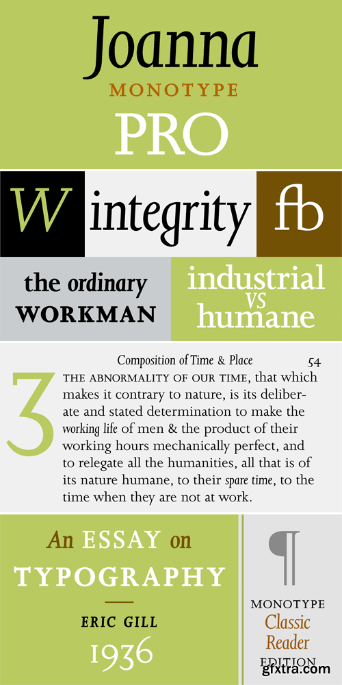
http://www.myfonts.com/fonts/mti/joanna/
OTF | 21 Fonts | JPG Preview | 1.1 Mb RAR
25 UHQ JPG | up to ~ 9000 x 6000 | 300 dpi | 253 Mb RAR
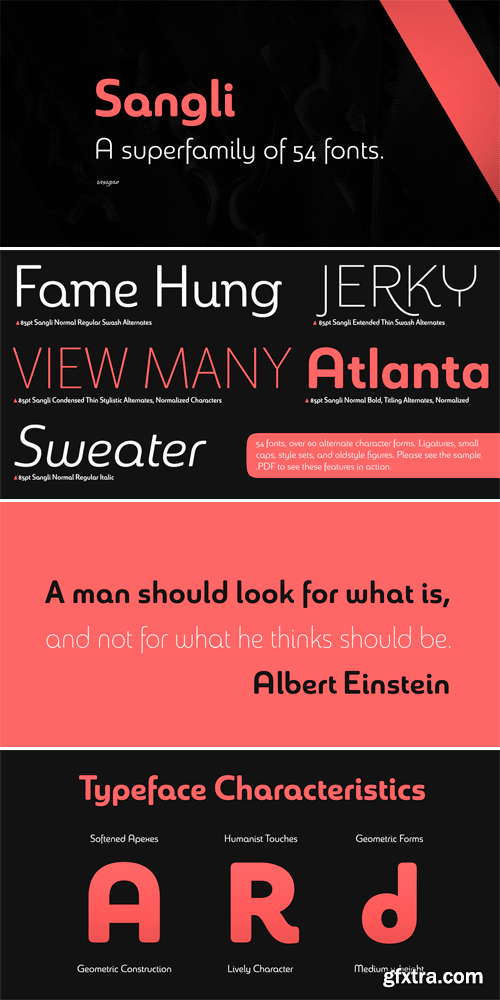
http://www.myfonts.com/fonts/insigne/sangli/
It started in 2007 with Chennai, the first of a three-part series of sans that I envisioned with slab serif counterparts. Each font would differ from the others in how the stem terminals were expressed. The initial font was extremely well received, and a revitalized and remastered Chennai made its appearance two years later, complete with new weights and new, novel OpenType features. Then came Madurai, a variation of Chennai based on the same core, only without the rounded stems. Chennai’s rounded stems made it distinctive and great for headlines but left it lacking appeal as copy--a problem that Madurai easily solved. And now comes Sangli, the final iteration of my original 2007 vision. Sangli is a happy medium. Like Chennai, it’s great for headlines--but not too distinct for copy. Sangli keeps the same core structure as the other two, but new less sharp forms give this latest font a friendlier look that’s more versatile than the original Chennai and less formal than Madurai. The font includes a whole range of six weights from light to black, along with condensed and extended options as well for a total of 54 fonts. There are plenty of OpenType features, including small caps. Alternates include normalized capitals and lowercase letters that include stems for when you want a more traditional look or when you’re writing copy. Sangli also supports over 70 languages that use the extended Latin script. Use Chennai, Madurai, and their slab serif variants interchangeably with Sangli, too, for even more options in your work. All three complement one another well. So when you need a balanced font that stands boldly on the page and commands your reader’s attention, look within and find your Sangli.
TTF | 53 Fonts | JPG Preview | 13.2 Mb RAR
25 EPS | + JPG Preview | 45 Mb RAR
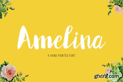

CreativeMarket Amelina Font 484890
OTF | TTF
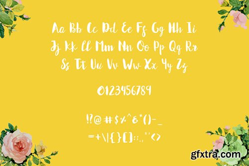
Amelina is a smooth and modern hand painted font. Can used for headline, logo, wedding invitation, labels, newsletters, posters, badges, t-shirt and more.
https://creativemarket.com/wowokprast/484890-Amelina
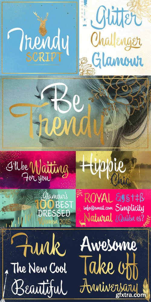
Trendy Font Family $149 | 5 x TTF | Turkish Support
http://www.myfonts.com/fonts/calderon-estudio-type-foundry/trendy/
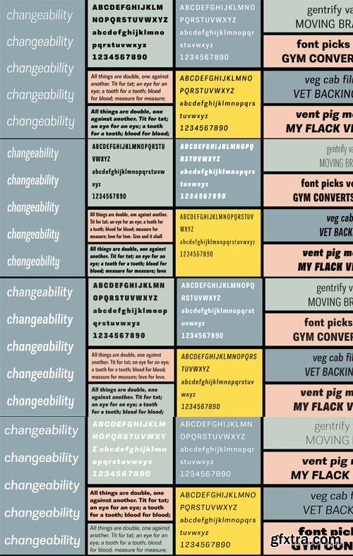
Trilon Font Family Complete Pack $2400 | 80 x OTF | Turkish Support
http://www.terminaldesign.com/fonts/trilon-complete-family/
http://www.terminaldesign.com/fonts/trilon-compressed-complete-family/
http://www.terminaldesign.com/fonts/trilon-condensed-complete-family/
http://www.terminaldesign.com/fonts/trilon-expanded-complete-family/

SermonBox - Seasonal Collection

SermonBox - The Series Pack Collection

Top Rated News


Would you like to be a Author?


