http://www.myfonts.com/fonts/emtype/ciutadella-slab/
The family keeps growing, Ciutadella Slab is the ‘serif’ counterpart of the popular Ciutadella font. The former alternate characters like ‘a’, ‘t’ and ‘&’ are now the default ones (and the former default characters are now the alternates), giving way for a typeface more suitable for texts. Thus, the new Ciutadella Slab is not only a great headline family, it will also work in texts of intermediate length and size. Especially appropriate for magazines, brochures or branding. This new addition provides even more versatility to the family started with Ciutadella and Ciutadella Rounded. It is available in Open Type format and includes Alternate Characters, Ligatures, Tabular Figures, Fractions, Numerators, Denominators, Superiors and Inferiors. It supports Central and Eastern European languages. As the sans version, the type family consists of 10 styles, 5 weights (Light, Regular, Medium, SemiBold and Bold) plus italics.
OTF | 10 Fonts | + JPG Preview
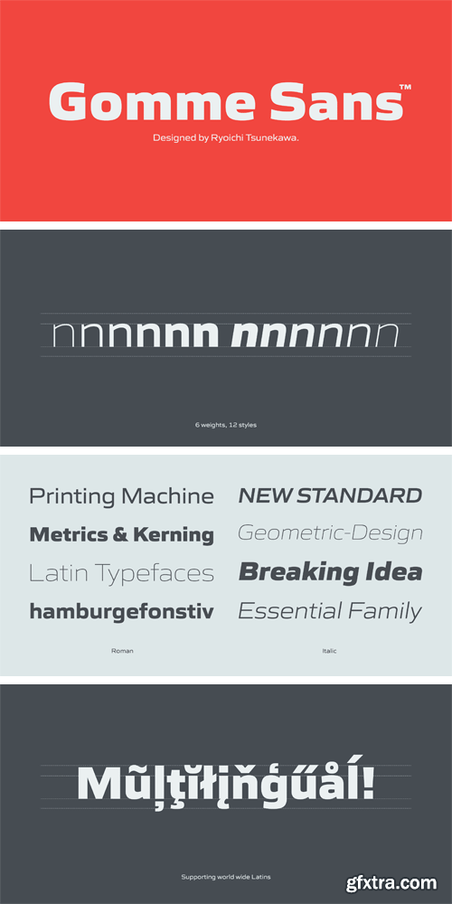
http://www.myfonts.com/fonts/flat-it/gomme-sans/
Gomme Sans is a wide and masculine sans-serif family for text designed by Ryoichi Tsunekawa and the whole family consists of 6 weights from ExtraLight to ExtraBold and their matching Italics. The basic concept of this family is not only to make an impact by masculine, squarish letter form but also to be legible and readable even on small size screen by the sophisticated design, and their large x-heights. Gomme Sans supports almost all European languages: Western, Central, South Eastern Europeans and afrikaans. And proportional figures, superior figures, inferior figures, denominators, numerators, fractions, ordinals and case-sensitive-forms can be accessed by using OpenType features.
OTF | 12 Fonts | + JPG Preview
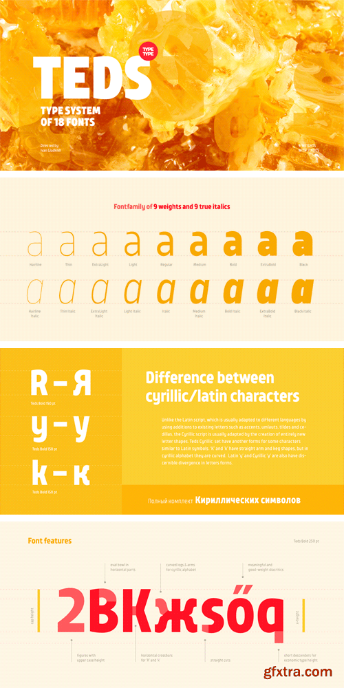
http://www.myfonts.com/fonts/type-type/tt-teds/
Teds is a geometric non-serif with narrow proportions created for universal application in any types of text. Relatively tall lowercase characters, open forms of semi-circular characters, and low contrast between vertical and horizontal lines make this font type easy to read even in small text sizes and for any type of navigation. We've created a broad coverage for the TT Teds fontfamily varying on the typeface width (Hairline, Thin, Extralight, Light, Regular, Medium, Bold, Extrabold, Black & Italics), which allows choosing the needed font for the most complicated tasks in any situation. Fonts of the TT Teds fontfamily are adapted for web and mobile applications and any other display media specializing in small-size font imaging.
TTF | 18 Fonts | + JPG Preview
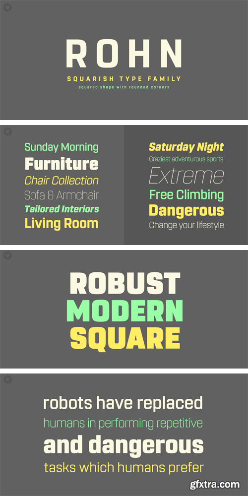
http://www.myfonts.com/fonts/nine-font/rohn/
Rohn is a modern squarish typefamily with a large x-height. Its letterforms are based on the shape of square with rounded corners. With particular details and large x- height, it is more legible at small sizes both on screen and paper. It has seven weights from Thin to Black with corresponding oblique styles and each weight includes ligatures, fractions, old style numbers, case-sensitive forms and more. Rohn is ideally suited for branding, logo, packaging, magazine, poster and editorial design.
OTF | 14 Fonts | + JPG Preview
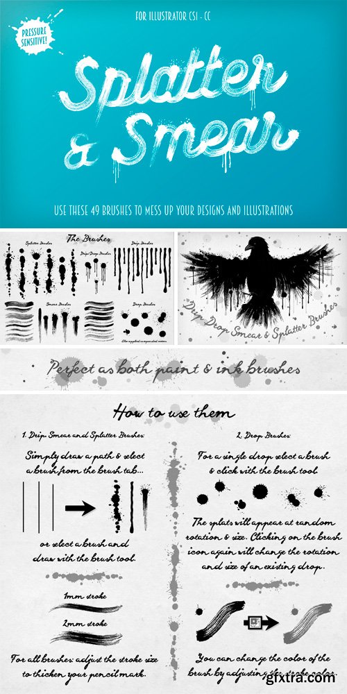
CM 242239 - Splatter & Smear Brushes
Mess up your designs with these smear, splatter and drip brushes! In this pack you'll find everything you need to create messy digital art! and with four different sets of brushes this great value pack is a bundle in itself. The brushes work well as both ink and paint. The brushes have pressure sensitivity enabled - perfect for those who use graphics tablets (Please note that this feature only works in Illustrator CS5+). Here's what's included:
• 6 Splatter Art Brushes.
• 13 Drip Art Brushes.
• 23 Smear Brushes.
• 7 Drop Brushes.
• 4 Bonus Drip/Drop Combo Brushes.
• A Selection of expanded drops and splats.
• A demo file (the bird and feather from the preview) - so you can see the brushes in action (CS5 to CC only).
• Instructions.
• Compatible with Illustrator CS1+
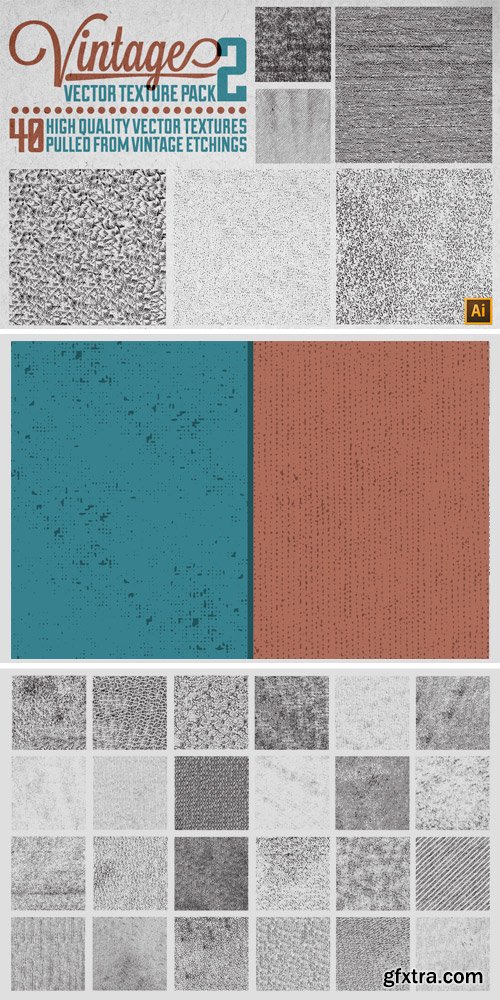
CM 19039 - Vintage Vector Texture Pack 2
Key Features: • 40 Textures • .AI & .EPS Formats • .TIFF Bitmaps: 15" x 15" @ 300 DPI (4500x4500px) • Handy-Dandy PDF Referencing Included Texture's File Names • All Textures Pulled from Sources Dating Back to the 1800s. • NOTE: These textures are NOT seamless. I've also split the .AI and .EPS files into 8 parts (5 textures in each part) to keep the file loading nice and fast, and have included a handy-dandy reference PDF so you can quickly find the texture you need!
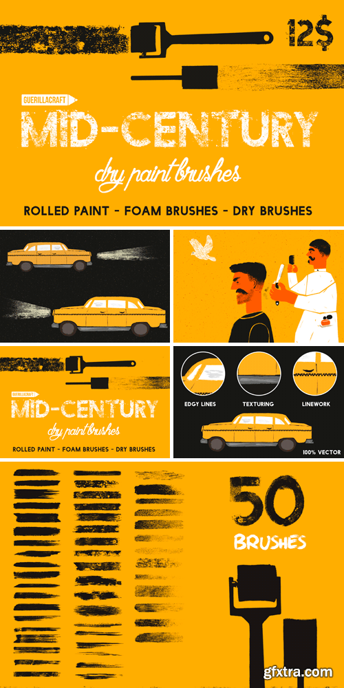
CM 526316 - Mid-Century - Dry Paint Brushes
Mid-Century dry paint brushes are new collection of brushes for Adobe Illustrator. Inspired by Mid-century illustrations I recently started making my personal illustration project. I have made a lot of rolled paint textures and use it in Photoshop. But I wanted to make it in vector, so I started creating brushes with rolled paint strokes and foam brushes. I cleaned it up and made this pack of brushes. It contains 50 hand-made brushes for Adobe Illustrator. They work great for texturing, line work or adding grunge edges to your illustrations or typography. My favourite ones are shader grainy brushes for really vintage looking shading and texturing. As a bonus you will get 5 Subtle textures in .EPS format.

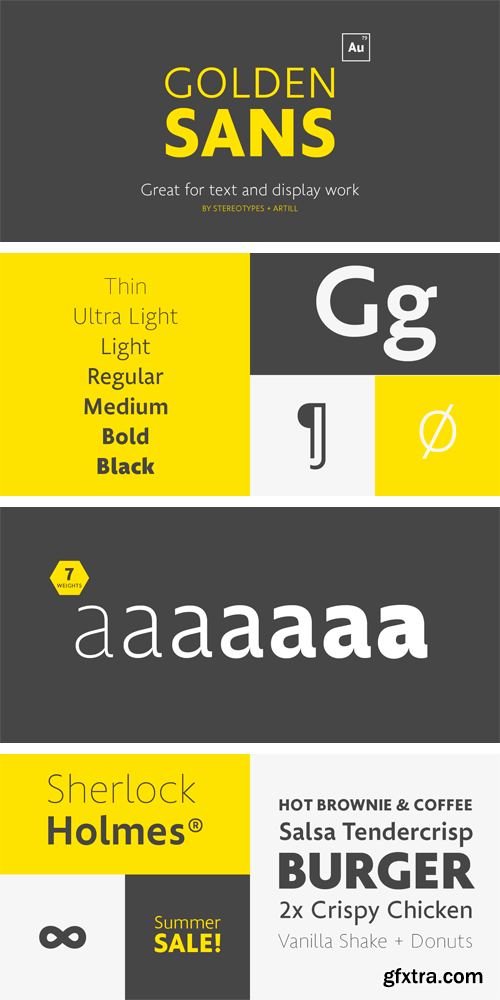
http://www.myfonts.com/fonts/artill-typs/golden-sans/
OTF | 7 Fonts | + JPG Preview

http://www.myfonts.com/fonts/pizzadude/kropicania/
Sometimes beauty comes from an unexpected angle, and has got nothing to do with good looks. Despite the sometimes clumbsy appearence, Kropicania comes with loads of inner beauty. There are several versions of each letter - both UPPERcase and lowercase - to choose from, as well as fancy ligatures for double letters. Spice up your invitations, postcards, headlines or whatever with this handmade font. At first look Kropicania appears to be just-another-handmade-font, but once you begin to play with swashes, ligatures and alternates, the magic begins! Try it out, you won't be dissapointed! If you need some extra charm and life to your project, use one of the many ornaments that comes along with this font! Stars, arrows, borders and inkblobs ... just to name a few!
OTF | 2 Fonts | + JPG Preview

http://www.myfonts.com/fonts/gatf/kinver/
Kinver owes it’s inspiration to the masthead of a 19th century handbill. It is designed to particularly complement our extensive ‘Imperial Granum’ typeface family. Bring the spirit of Victorian flair to your next design project!
OTF | 1 Font | + JPG Preview
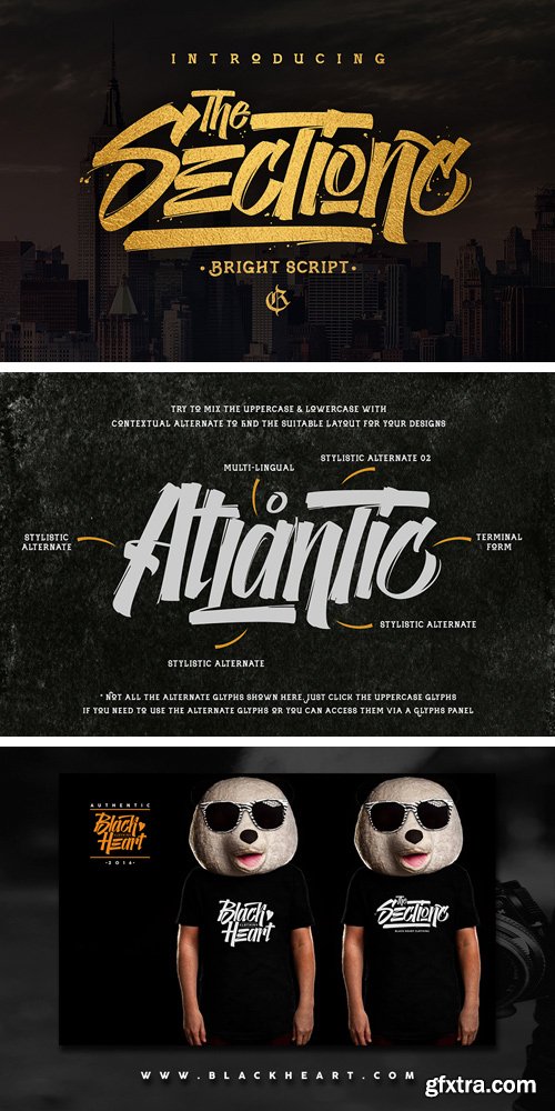
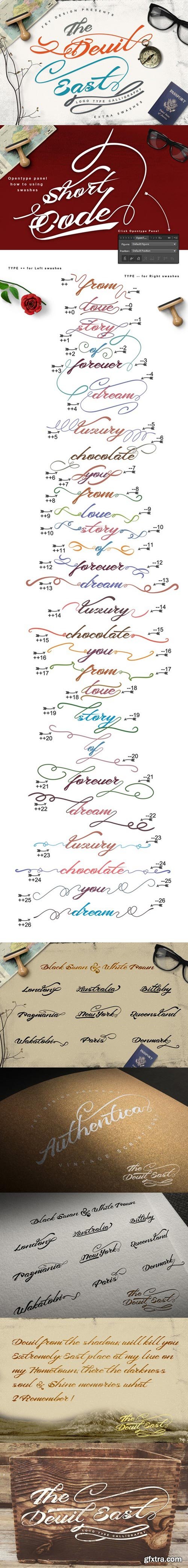
CM 698159 - The Sectione Bright
The Sectione Bright script is new font from Rvq Typefoundry, elegant feel character set. To create the beautiful combination, just mix the uppercase and lowercase then mix with the alternative glyphs and playing with swash. The Sectione Bright script includes a full set of capital and lowercase letters, as well as multi-lingual support, currency figures, numerals, punctuation & some extra glyphs. Features :
- Character Set A-Z
- Numerals & Punctuations (OpenType Standard)
- Accents (Multilingual characters)
- Stylistic Alternates
- Swash

GraphicRiver - Stonebangs Typeface 9604669
Stonebangs is Modern Vintage typeface with some Modern touch. Great for almost all of your designing needs including headline, labels, logo, etc.
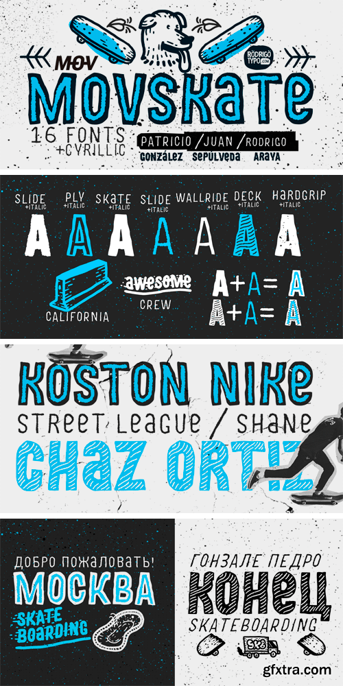
http://www.myfonts.com/fonts/rodrigotypo/movskate/
OTF | 16 Fonts | + JPG Preview
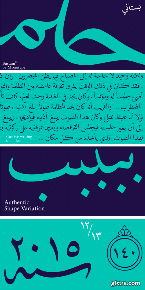
http://www.myfonts.com/fonts/mti/bustani/
The Bustani™ typeface is a typographic interpretation of Naskh, a principal calligraphic style of Arabic script. Designed by Patrick Giasson and Kamal Mansour, Bustani is the first OpenType® font to offer full classical Naskh contextual shaping, while supporting all the numerous languages that use the Arabic writing system without the need for auxiliary plugins (an OpenType compliant application is required). Through the use of OpenType® stylistic sets, Bustani features intelligence to choose the appropriate letterforms for faithful interpretation of Naskh calligraphy. Bustani supports Arabic, Farsi, and Urdu – in addition to many other languages. While primarily intended for setting literary text, the Bustani typeface can also be used in a broader variety of projects that require classic, graceful shapes. “The face shines in environments where the text is given breathing space,” says Giasson. “This includes poetry, literature and artistic publications – perhaps even adding a bit of flair to parking tickets,” he quipped.
OTF | 1 Font | + JPG Preview
SermonBox - Seasonal Collection

SermonBox - The Series Pack Collection

Top Rated News


Would you like to be a Author?


