
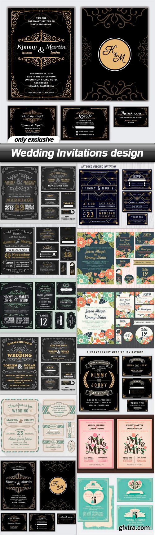

Monogram logo emblem elements design template vector 6
EPS | 22 files | 104.30 Mb
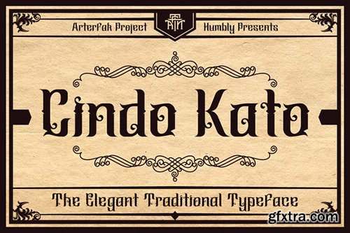
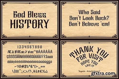
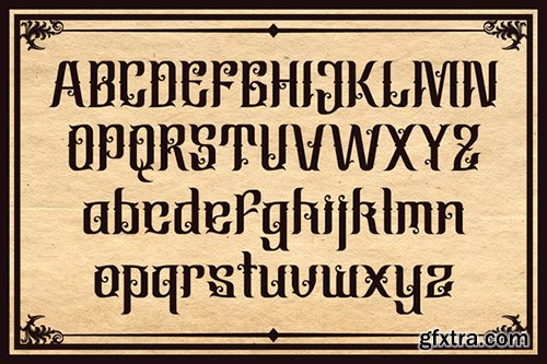
Creativemarket Cindo Kato FONT 526921
OTF
https://creativemarket.com/Arterfak/526921-Cindo-Kato

PSD | 1275x1875 PIX | fontinfo | 66.9 MB

PSD | 1275x1875 PIX | fontinfo | 46.8 MB

PSD | 1275x1875 PIX | fontinfo | 35.8 MB

PSD | 1275x1875 PIX | fontinfo | 83.2 MB
Platform Font Family $225 | 10 x TTF
https://commercialtype.com/catalog/platform/platform

PSD | 1275x1875 PIX | fontinfo | 52.1 MB

PSD | 1275x1875 PIX | fontinfo | 65.1 MB

PSD | 1275x1875 PIX | fontinfo | 66 MB

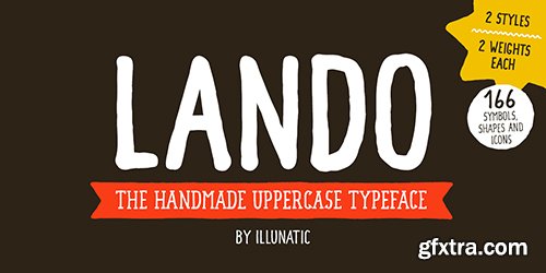
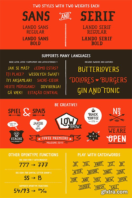
Lando Font Family - 5 Fonts $60
OTF
Introducing Lando - a handmade uppercase type family with a natural character. Lando comes in two styles with two weights each. Its characters have been drawn by hand to give them a warm and authentic look. Landos appearance is enhanced by two contextual alternates for each latin character and all numbers. In addition all fonts contain several open type fuctions such as swashes and initials, a selection of ligatures and support of open type fractions. It is rounded up by many handy extras such as shapes and icons, catch words, bullets and much more.
Lando is intended to work best in logos, posters, magazine headlines and on packagings and apparel. But it also feels comfortable with short texts due to it’s support of many latin languages.
http://www.myfonts.com/fonts/illunatic/lando/

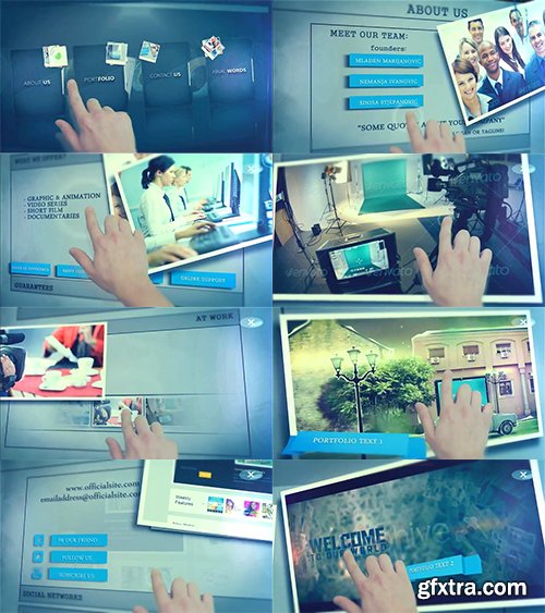
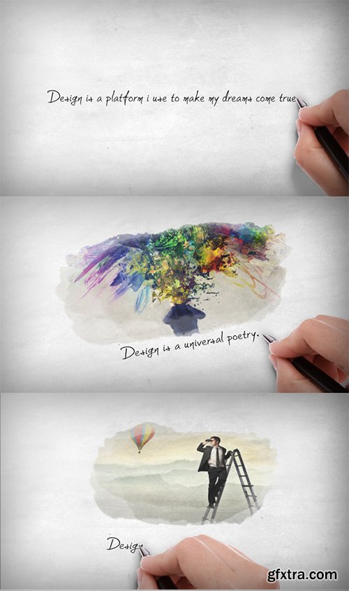
Videohive Touch Screen Presentation 6643139
CS5, CS5.5, CS6, CC, CC 2014 | 1920x1080 | Requires Plugins: No | 360 MB
Demo
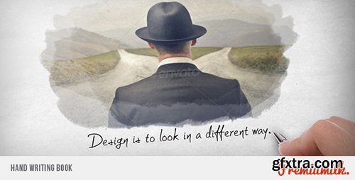
Videohive Hand Writing Book 4939840
CS5, CS5.5, CS6, CC, CC 2014 | 1920x1080 | Requires Plugins: No | 59 MB
Demo
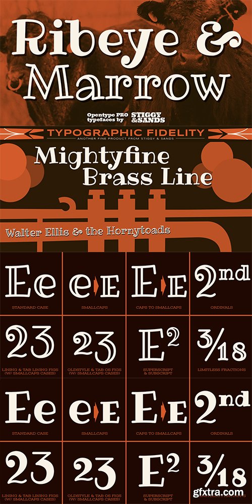
Ribeye Pro Font Family - 2 Fonts $58
The Ribeye Pro Family is reminiscent of a cartoon tattoo style of lettering, but exhibits a playfulness that breaks traditional weight distribution across its letterforms. An edgy attitude, friendly syncopation, and highly legible letterforms makes these fonts a real pair of charmers. The SmallCaps and extensive figure sets give the Ribeye Pro Family a more diverse design voice, ranging from slightly serious to downright ludicrous.
Opentype features include:
- SmallCaps.
- Full set of Inferiors and Superiors for limitless fractions.
- Tabular, Proportional, and Oldstyle figure sets (along with SmallCaps versions of the figures).
- Stylistic Alternates for Caps to SmallCaps conversion.
http://www.myfonts.com/fonts/stiggy-sands/ribeye-pro/
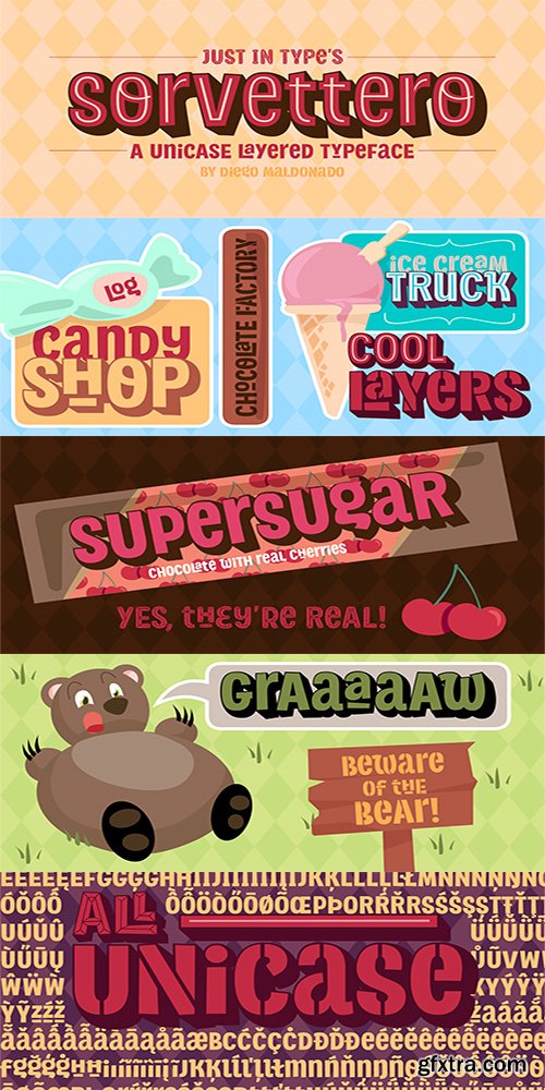
Sorvettero Font Family - 6 Font $199
OTF
Sorvettero is a sans, layered and unicase typeface inspired by some wood signs at Descansópolis, a neighborhood on Campos do Jordão, a city of Brazil. A fun and cute display project with different use purposes, like packaging, logos, signs, and whatever your creativity brings on.
Designed by Diego Maldonado, with contribution of Tony de Marco on the Diamond style.
http://www.myfonts.com/fonts/justintype/sorvettero/
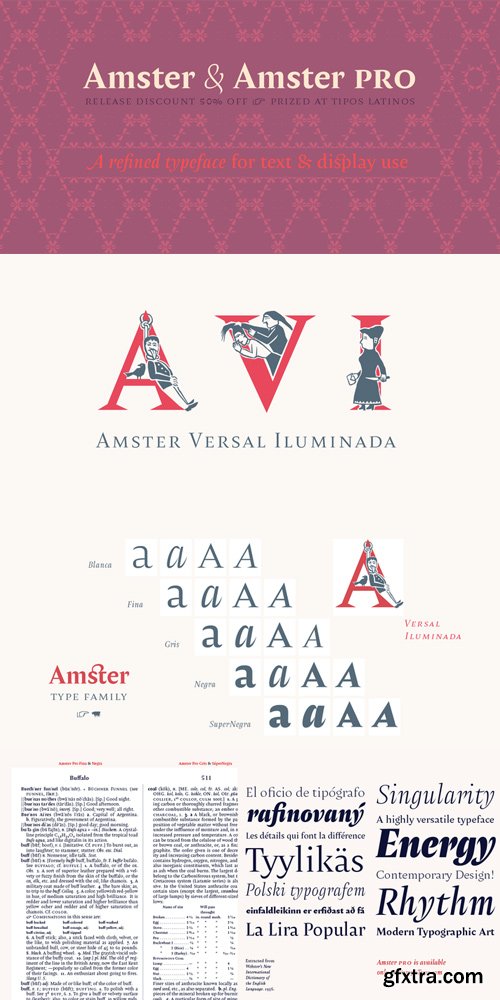
Amster Font Family Complete $988 | 21 x TTF | Turkish Support
http://www.myfonts.com/fonts/pampatype/amster/
Amster is an energetic & refined type created by Francisco Gálvez, with a sharp idea on how elegance & legibility can meet harmoniously. Amster can build a text that is highly readable as well as friendly. It has five weights of roman & cursive both with smallcaps and fully-equipped with all OT sorts and even a wonderful set of illuminated initials. Amster is a very versatile typeface, allowing for a wide range of uses: screen to print, small text to display, science to poetry. Amster speaks more than 200 languages.
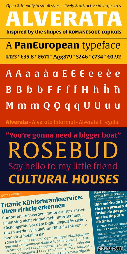
http://www.myfonts.com/fonts/type-together/alverata/
Gerard Unger’s new typeface Alverata is a twenty-first-century type-face inspired by the shapes of romanesque capitals in inscriptions of the eleventh and twelfth centuries, without being a close imitation of them. It is additionally based on the early twentieth-century model, but tweaked so as to prevent blandness and monotony. Alverata performs beautifully in both screen and on paper, delivering excellent legibility. Its letters are open and friendly in small sizes and lively and attractive in large sizes. They are robust, and show refinement in their detail. It is an extensive type family, with versions for both formal and informal applications.Visually, some written languages, such as Czech and Maltese, differ quite strongly from languages like English and German, notably because of their many accented characters. While other typefaces will show this difference, Alverata removes it. As a result, Alverata enables harmonious convergence of languages.
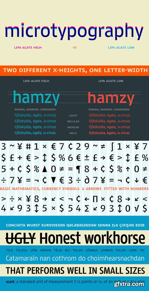
Lipa Agate Font Family $799 | 24 x TTF | Turkish Support
http://www.myfonts.com/fonts/type-together/lipa-agate/
Lipa is the name of the Slovenian national tree ‘Linden’. The typeface Lipa Agate by Croatian designer Ermin Me?edovi?, is part of a bigger type collection, comprising various type groups into one coherent system which Ermin developed over the past 10 years. Lipa Agate is the first to be released; a sans serif designed and engineered to be used in the smallest text sizes, best under 10pt, and in very bad printing conditions. It is perfect for phone books, classified ads, directories or any other job requiring economy without jeopardising legibility. To achieve this, Lipa Agate employs a range of tools, such as deep ink-traps, narrow proportions and a tall x-height. Contemporary editorial design requires a high amount of flexibility to respond to various design situations in a consistent fashion. Lipa Agate — with its 3 levels of condensation, 4 weights and 2 sets of different x-heights, ‘High’ and ‘Low’, which share the same width — fulfils these requirements wonderfully. That’s a total of 24 fonts! To make this clean and honest workhorse face complete, its large character set also includes small caps, arrows, info-numerals and much more.
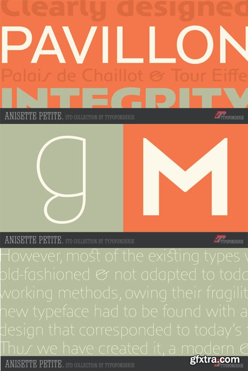
Anisette Petite Font Family $281 | 7 x TTF
http://www.myfonts.com/fonts/typofonderie/anisette-petite/
Following Anisette designed in 1996, Anisette Petite is the young sister featuring capitals of an intermediate width together with lowercases. Subtle imperfections in the r, l, and the particular g, help to create a unique typeface. The weights of the “Petite” family match exactly Anisette and provide a wider diversity of use. Designed in 2001, Anisette Petite’s lowercases shares the sobriety of geometrical typefaces and the dynamics of the tension in the curves. This geometrical sans offer strong identity to any branding and editorial projects.


INDD | 300 DPI | 21 x 29.7 px | 5.9 MB
http://anonym.to/?http://crtv.mk/g08W8


Keynote KEY | 1920x1080 | 294 MB
http://graphicriver.net/item/ospro-keynote/8047768
126,000 Royalty-Free 3D Model

Udemy Türkçe


Top Rated News
- CreativeLive Tutorial Collections
- Fasttracktutorials Course
- Chaos Cosmos Library
- MRMockup - Mockup Bundle
- Finding North Photography
- Sean Archer
- John Gress Photography
- Motion Science
- AwTeaches
- Learn Squared
- PhotoWhoa
- Houdini-Course
- Photigy
- August Dering Photography
- StudioGuti
- Creatoom
- Creature Art Teacher
- Creator Foundry
- Patreon Collections
- Udemy - Turkce
- BigFilms
- Jerry Ghionis
- ACIDBITE
- BigMediumSmall
- Globe Plants
- Unleashed Education
- The School of Photography
- Visual Education
- LeartesStudios - Cosmos
- Fxphd
- All Veer Fancy Collection!
- All OJO Images
- All ZZVe Vectors
- CGTrader 1 CGTrader 2


