Morion Font Family
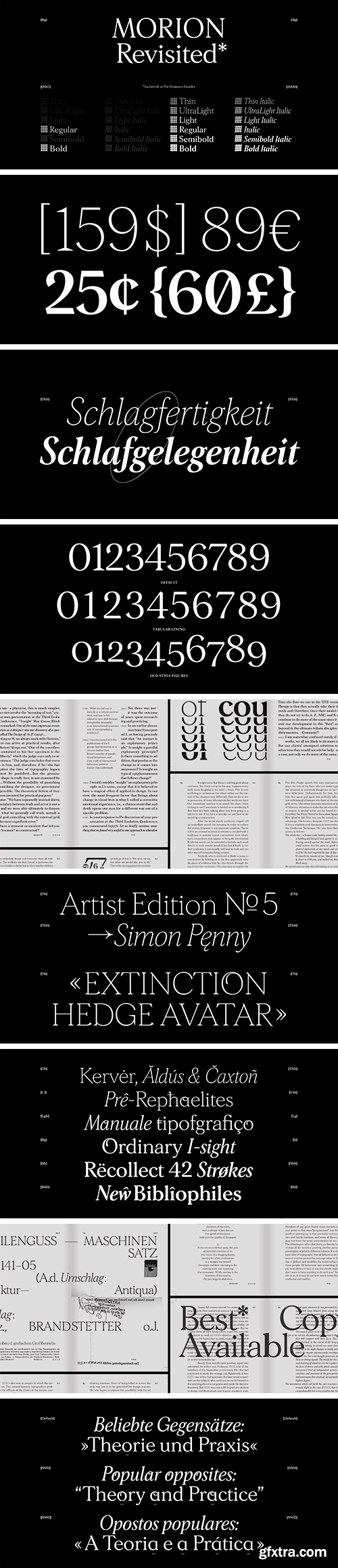
The re-release of Morion in 2020 is 6 years after the initial sketches took place. The all new version brings not only 6 weights and matching italics to the family, but the entire glyphset has been revised, extended and reconsidered. With a focus to have Morion preform better in print and smaller sizes, yet still carrying the distinct aesthetics of the original two weights. Morion is a balancing act between text and display type. Morion is capable to be used as running text at small sizes yet is equally as strong in large scale display settings. Sharp details and dynamic condensed italics give a contemporary, digital tone that is embedded in a classic transitional serif typeface.
https://www.thedesignersfoundry.com/products/morion
Since the first draft of Morion typeface in 2014, the aesthetic vision of Morion has remained true, but has undergone constant refinement and critique. We are pleased to publicly release the final typeface 3 years later in 2017. From combining two diverse stylistic elements in type-design, wedge-shaped serifs and floral terminals Morion has a slightly playful, calligraphic look that remains balanced and controlled. While Morion may function best in decorative, larger applications; OpenType features like an alternative lower case ‘a’ increase legibility in smaller text sizes. Morion is delivered in two weights and supports Latin-A Extended and was designed by David Einwaller for The Designers Foundry. We also produced 50 waterproof coats to promote the release. The rear print ‘GLOBAL’ references the international nature of The Designers Foundry and the team that worked on Morion. There is also a small text print on the left sleeve.
SermonBox - Seasonal Collection

SermonBox - The Series Pack Collection

Top Rated News


Would you like to be a Author?


