


Gotham Pro Animated Typeface
AEP | 11.6 MB RAR
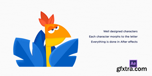
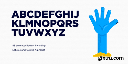
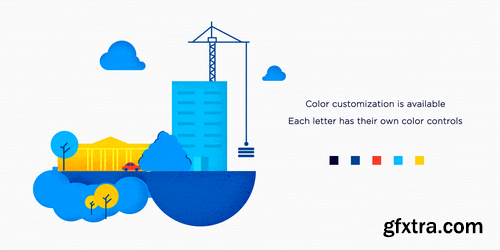
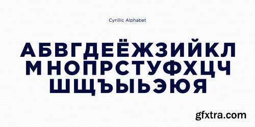
Hi, guys. I'm happy to present you the final work of our students. Final challenge in motion design school. Every student did his own 4 letters. This bundle has 48 letters including latynic and cyrillic alphabets


Gotham Bundle - 12 Families | 138 Fonts - Extended Latin, Greek, Cyrillic
Every designer has admired the no-nonsense lettering of the American vernacular, those letters of paint, plaster, neon, glass and steel that figure so prominently in the urban landscape. From these humble beginnings comes Gotham, a hard-working typeface for the ages.
![Gotham Family [Updated] - Extended Latin, Greek, Cyrillic](https://www.gfxtra32.com/uploads/posts/2018-10/1538561010_gotham.png)
Gotham Family [Updated] - Extended Latin, Greek, Cyrillic
+ ScreenSmart & Office Version
Ours is the first century in which most mass-produced letters can correctly be called “typography.” Technically speaking, typography is the product of type, the individual, recombinable characters in a typeface that are designed for printing words on paper. A century ago, a book’s pages contained typography, but its cover, spine, and illustrations featured lettering, each of the product of an artist working by hand in a different medium. Because letters made by hand had no obligation to resemble the look of printing types, different media evolved their own aesthetics: lithographed posters, engraved banknotes, and neon signs once enjoyed unique alphabetic styles.
![Gotham Narrow [Updated] - Extended Latin, Greek, Cyrillic](https://www.gfxtra32.com/uploads/posts/2018-10/1538471343_gotham-narrow.png)
Gotham Narrow [Updated] - Extended Latin, Greek, Cyrillic
+ ScreenSmart & Office Version
Gotham Narrow - a new and economical Gotham, specifically designed for text. Typefaces whose letterforms are rooted in the square and circle are known as "geometrics," and they're one of typography's great paradoxes. Their wide proportions and open shapes make them easy to read at text sizes, and a well-designed geometric can reinforce this clarity through careful attention to the design's internal proportions as well. (Gotham's large lowercase has dilated features, succinct ascenders and descenders, and a generous fit, which combine to make Gotham especially clear at text sizes and below.) But because geometrics are wider than average, they can be difficult to use in narrow columns, which is exactly where text most often appears.
![Gotham Condensed [Updated] - Extended Latin, Greek, Cyrillic](https://www.gfxtra32.com/uploads/posts/2018-10/1538373718_gotham-condensed.png)
Gotham Condensed [Updated] - Extended Latin, Greek, Cyrillic + ScreenSmart Version
Condensed typefaces are among a designer's most valuable tools, yet they're often designed as an afterthought. Many of the world's most popular typefaces have no condensed variants; others contain a perfunctory style or two, often with abbreviated character sets or missing features. Instead of extending the usefulness of the type family, such fonts create dead ends for designers, and demand inconvenient and unforseen workarounds — exactly the opposite of what a font should do.
![Gotham Rounded [Updated] - Extended Latin, Greek, Cyrillic](https://www.gfxtra32.com/uploads/posts/2018-09/1537974703_gotham-rounded.png)
Gotham Rounded [Updated] - Extended Latin, Greek, Cyrillic
+ ScreenSmart Version
Gotham Rounded is a technical letter that goes from friendly to high-tech to cheeky with ease.
![Gotham Extra Narrow Family [Updated] - Extended Latin, Greek, Cyrillic](https://www.gfxtra32.com/uploads/posts/2018-09/1537868668_gotham-extra-narrow1.png)
![Gotham Extra Narrow Family [Updated] - Extended Latin, Greek, Cyrillic](https://www.gfxtra32.com/uploads/posts/2018-09/1537868596_gotham-extra-narrow2.png)
Gotham Extra Narrow Family [Updated] - Extended Latin, Greek, Cyrillic
+ ScreenSmart Version
The narrowest of the “natural width” Gothams. As a typeface's design approaches extreme proportions, its visual themes begin to take a back seat to spatial considerations. Condensed fonts will favor consistent spacing above all else, a priority which manifests itself in Gotham Condensed through the addition of new visual strategies. On letters like C and S, stroke endings that were once sheared perpendicularly will end vertically instead; joins in lowercase letters that once appeared monolinear become palpably thinned.
SermonBox - Seasonal Collection

SermonBox - The Series Pack Collection

Top Rated News


Would you like to be a Author?


