https://www.myfonts.com/fonts/linotype/frutiger-serif/
OTF | 20 Fonts | + JPG Preview
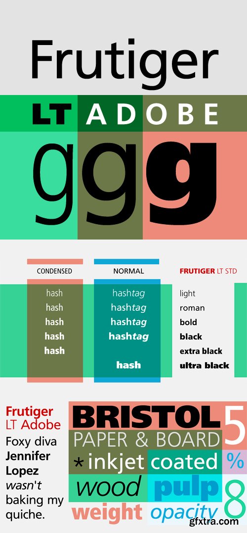
Frutiger Font Family (by Adobe)
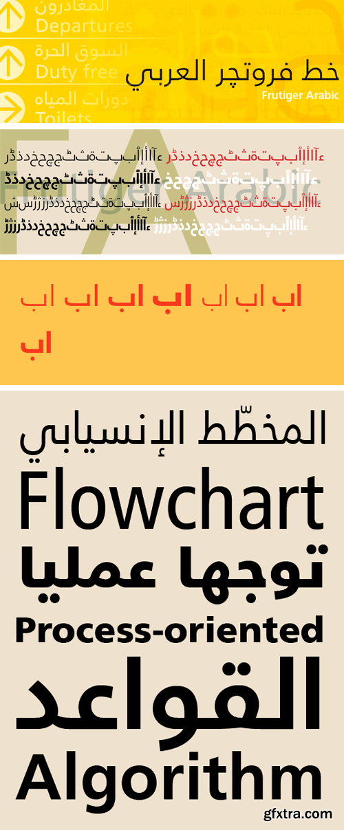
In 1968, Adrian Frutiger was commissioned to develop a signage system suited to the architecture of the new Charles de Gaulle Airport outside Paris. His final design for the client, implemented in 1975, is a simple, clean, robust sans serif type that is highly legible. In 1976, Frutiger completed the family for the Stempel foundry. Despite its original intention as airport signage, Frutiger has a universal quality that makes it appropriate for many applications; a favorite typeface among advertising agencies, it is equally successful in text and display work.
OTF | 14 Fonts | JPEG Preview | 3.8 Mb RAR
TTF
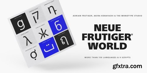
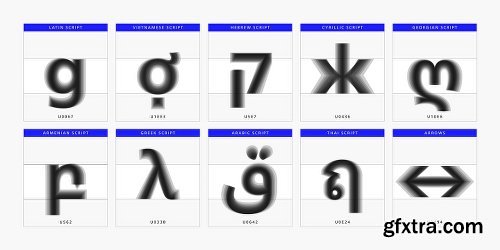
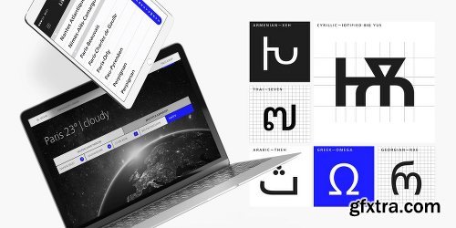
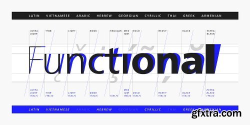
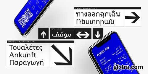
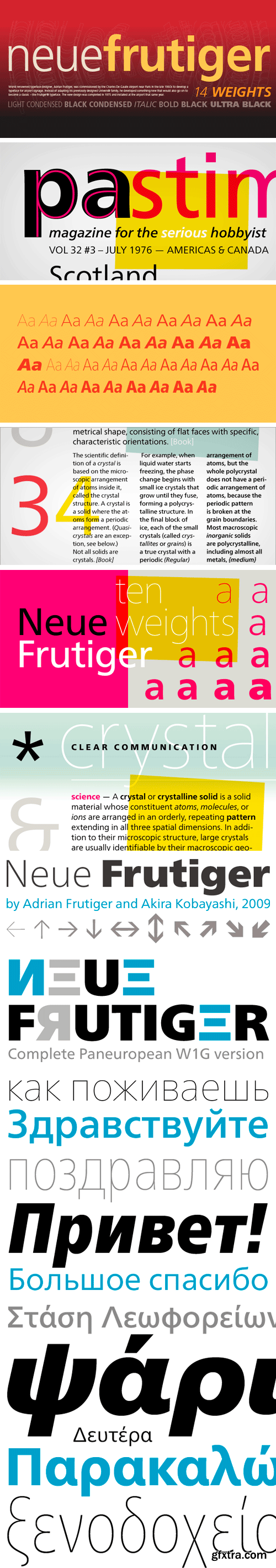
Neue Frutiger World is designed for global use with an impressive range of 10 weights, from Ultra Light to Extra Black, with matching italics. It embodies the same warmth and clarity as Adrian Frutiger’s original design, but allows brands to maintain their visual identity, and communicate with a consistent tone of voice, regardless of the language. Neue Frutiger World supports more than 150 languages and scripts including Latin, Greek, Cyrillic, Georgian, Armenian, Hebrew, Arabic, Thai and Vietnamese.
“Before Neue Frutiger World it was not an easy task for western brands to find families in Arabic, Hebrew, Thai and Vietnamese which match with their Latin,” says Monotype type director Akira Kobayashi, who led the Neue Frutiger World project. “They may find a type with closer expression, but there was no guarantee if the bold version in the non-Latin family matches the bold in their Latin. Neue Frutiger World offers a better solution.” In addition to Neue Frutiger World’s linguistic versatility, it works hard across environments – suited to branding and corporate identity, advertising, signage, wayfinding, print, and digital environments.
https://www.myfonts.com/fonts/mti/neue-frutiger-world/
http://www.myfonts.com/fonts/linotype/neue-frutiger/
The original Frutiger typeface was designed in the early 1970s by Adrian Frutiger and his studio for the wayfinding system of the Roissy Charles de Gaulle airport in Paris. Soon after the airport was opened, a huge demand for the typeface arose from companies wanting to employ it in other signage systems, as well as in printed matter. The Frutiger typeface came out as part of the Linotype library in 1977. Epitomizing functionality and clarity both in signage and as a bread-and-butter typeface in print, Frutiger became a modern classic. Neue Frutiger® is the 2009 version of the Frutiger typeface family. It was revised and improved by Akira Kobayashi in close collaboration with Adrian Frutiger. While Frutiger Next, the 1999 revision, introduced a new concept (including a larger x-height, a more pronounced ascender height, narrower letterspacing and, most notably, an italic with calligraphic traits), Neue Frutiger returns to the original 1977 design. The result is a well-balanced range of 10 finely-graded weights. Despite the various changes, the ‘New Frutiger’ still fits perfectly with Frutiger and serves to harmoniously enhance the styles already in existence.
OTF, WOFF | 140 Fonts | JPG Preview | 23.6 Mb RAR
SermonBox - Seasonal Collection

SermonBox - The Series Pack Collection

Top Rated News


Would you like to be a Author?


