

Aeonik Fono Font Family
Though we all appreciate the aesthetics of a good monospaced typeface, this can be difficult to use and apply in larger text or headlines. There are times when you’re looking for that mono vibe, you want a fake mono — you want Aeonik Fono! This unique type family is the solution for typographers seeking a monospace flavour, without any of the typesetting “inconveniences” of a truly monospaced typeface.


Aeonik Mono Font Family
Our goal in creating Aeonik Mono was to pick up on the features that make the original Aeonik a beloved choice amongst designers and transform it into a true monospaced type family for use in graphic design projects. As is customary for a fixed pitched font, each character in Aeonik Mono fits in a box of the same width, in our case, 620 units.
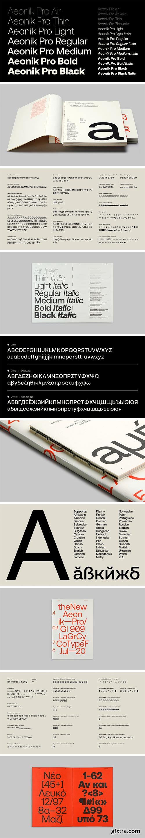
Aeonik Pro Font Family
In creating Aeonik Pro, we took our best-selling type family ‘Aeonik’ and refined it further, whilst also adding support for Cyrillic and Greek. As a result, Aeonik Pro is now sharper, tighter, and more versatile than ever. There are seven weights, ranging from Air to Black, each with oblique italics. With more than 900 characters and plenty of alternates to choose from, this workhorse type family is a must have in any designer’s toolset.

Aeonik Font Family
With Modernist roots but details referencing mechanical early Grotesks, Aeonik positions itself as a Neo-Grotesk with a Geometric skeleton; with proportions that are wider than a typical Grotesk, but thinner than a typical Geometric Sans. Structurally, this creates a fantastic balance for both display and text use.
SermonBox - Seasonal Collection

SermonBox - The Series Pack Collection

Top Rated News


Would you like to be a Author?


