
Categories: Fonts

Sharp Sans No.2 Font Family
OTF | 20 Fonts | + JPG Preview | SALE PAGE
- The Sharp Sans superfamilies are geometric sans serif typefaces that inject some much needed humanism into the Futura model. Designed by Lucas Sharp ?of Sharp Type Co in 2011, Sharp Sans Display No. 1 has angled terminals while Sharp Sans No. 2 has 90º degree terminals. With its sheared terminals and true italics (in Sharp Sans Display No.1), Sharp Sans combines the appealing typographic compensation of the grotesque, with the plump circular bowls of the geometric. The result is a typeface suited for both text & display use that breathes life into the genre of the geometric sans. While Sharp Sans Display No.1 ends its round monolines with diagonally sheared terminals, Sharp Sans Display No. 2 shears those terminals on a 90 degree angle. This small distinction became the basis for a plethora of exploration on either end. The most distinct aspect of No. 1 is its whimsical, almost slab-like true italics, which in turn give way to a full set of swash capitals in all italic weights. Sharp Sans Display No. 2, being the more geometric of Superset pair, has a more traditional oblique for its italic, as well as alternative reductionist Herbert Bayer-inspired lowercase.
- Sharp Sans Display No. 2 also has the first truly fluid OpenType homage to the famous Avant Garde interlocking capital style created out of an intelligent system of ligatures & contextual alternates which do not interfere with tracking (I suggest you track them in). The newest iteration of Sharp Sans was conceived for the Hillary Clinton 2016 campaign. Michael Beirut and the Pentagram team chose Sharp Sans Display No.1 as the main typeface of the campaign identity, but such a monumental project required a sturdier and more utilitarian typeface. The new Sharp Sans is completely redrawn and shaped by the rigorous typographic demands of modern visual communications. What sets the new Sharp Sans apart is a raised x-height, and newly opened counters that make it optimal for both text and display layouts; a new, more versatile approach, of which the two Display versions were not previously designed for. We call the new Sharp Sans our "use it for everything" font. While we stand by that statement, the originals do make for a compelling display counterpart.
Categories: Fonts

Sharp Sans Font Family
OTF | 20 Fonts | JPEG Preview | 3.6 Mb RAR | SALE PAGE
- Lucas Sharp’s first release through Village debuts in the Incubator. Sharp Sans injects some much needed humanism into the Futura model. With its sheered terminals and true italics, Sharp Sans combines the appealing typographic compensation of the grotesque, with the plump circular bowls of the geometric. The result is a typeface suited for both text and display use that breaths life into the genre of the geometric sans.
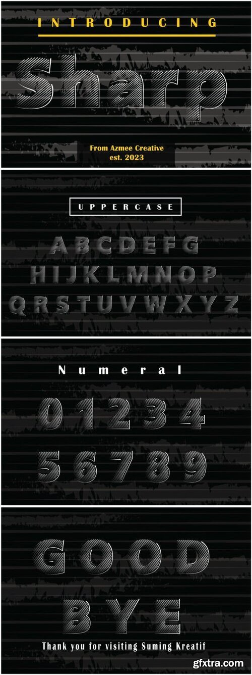
Categories: Fonts » Single Fonts

Sharp Flower is an elegant blackletter font that blends intricate, sharp edges with delicate floral flourishes. Its refined, gothic style brings sophistication to any design, making it perfect for high-end branding, invitations, and luxurious projects, where elegance and tradition meet in harmony.


Categories: GFXTRA Special » Special Fonts
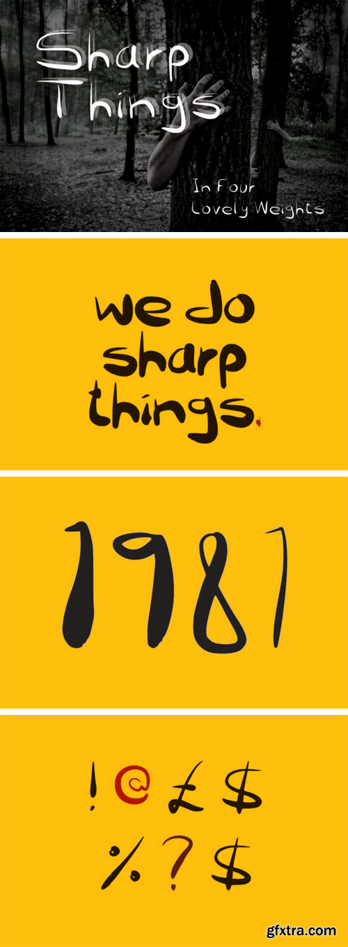
Sharp Things Font
A mixture of sharp features with some rounded elements give this a dark Halloween themed font a unique charm.
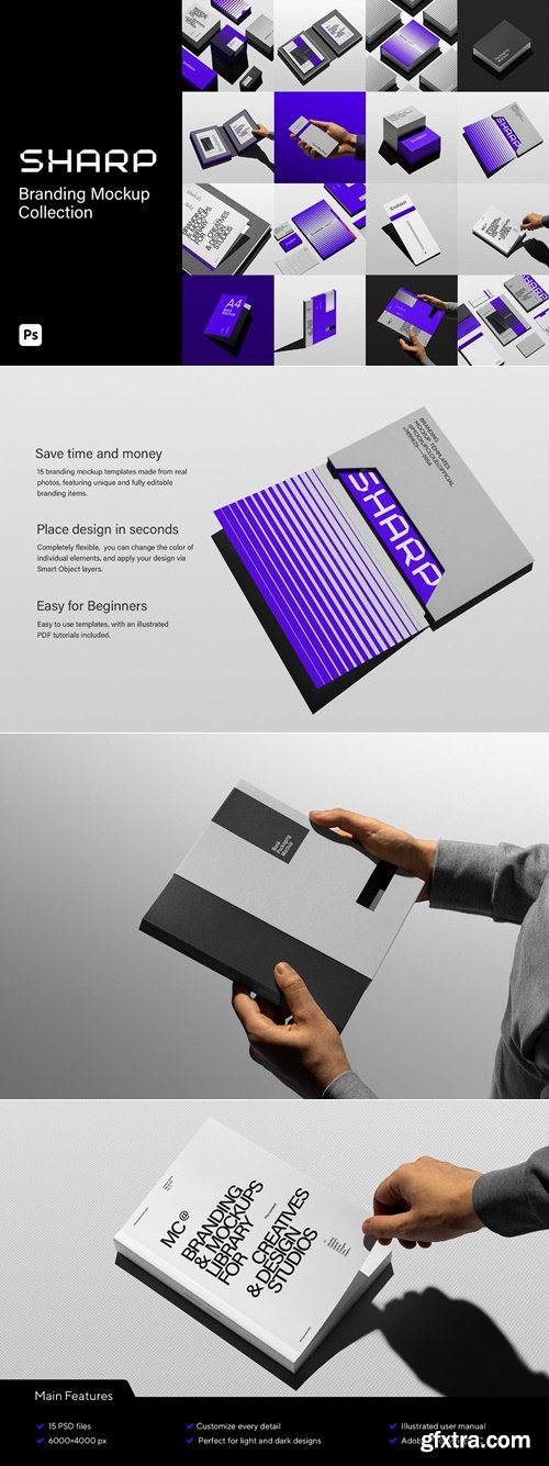
MockupCloud - Sharp Branding Mockups Kit
https://www.mockupcloud.com/product/sharp-branding-mockups-kit
PSD, JPG | 6000 x 4000 px | 1.7 GB
- 15 fully customizable mockups featuring unique and fully editable branding items in a minimalistic setting. All objects are isolated from the background and movable. You can change the color of every element. Easy to edit via the Smart Object layer in Photoshop or an online editor on our website.

Zocalo Display - Font Family $240
OTF | 8 Fonts | +Preview | 5 Mb RAR | HOME PAGE
- Eduardo Danilo’s dramatic redesign of El Universal, a leading Mexico City daily, introduced Cyrus Highsmith’s Zocalo. The original text, and display series was tuned for distinct character frequency and repetition when set in Spanish. Nicholas Kis’s oldstyle and Chauncey Griffith’s classic newsface Ionic No. 5 inspired the sturdy text while the “energetic character of Mexico City” influenced the display. Zocalo Display has sharp, slightly bracketed & tapered serifs, plus a higher contrast between thick and thin strokes, giving it great elegance and sparkle. Its crisp and energetic details shine forth in headlines and titles. In medium sizes, Display lends a vibrant panache to callouts and pull-quotes.
126,000 Royalty-Free 3D Model

Udemy Türkçe


Top Rated News
- CreativeLive Tutorial Collections
- Fasttracktutorials Course
- Chaos Cosmos Library
- MRMockup - Mockup Bundle
- Finding North Photography
- Sean Archer
- John Gress Photography
- Motion Science
- AwTeaches
- Learn Squared
- PhotoWhoa
- Houdini-Course
- Photigy
- August Dering Photography
- StudioGuti
- Creatoom
- Creature Art Teacher
- Creator Foundry
- Patreon Collections
- Udemy - Turkce
- BigFilms
- Jerry Ghionis
- ACIDBITE
- BigMediumSmall
- Globe Plants
- Unleashed Education
- The School of Photography
- Visual Education
- LeartesStudios - Cosmos
- Fxphd
- All Veer Fancy Collection!
- All OJO Images
- All ZZVe Vectors
- CGTrader 1 CGTrader 2


