

Neue Haas Grotesk Pro Font Family
22 OTF Fonts | TTF | by Monotype | 2.25 MB RAR | SALE PAGE
- Christian Schwartz sees his version of Max Miedinger’s seminal Swiss Modern sanserif as “primarily a restoration.” Reclaiming the warmer personality of the Haas original, he reinstated smoother curves and undid the compromises of intervening technologies and a one-size-fits-all approach. In a range of weights tailored to today’s publications, separate fonts for Text and Display now excel at their respective tasks;
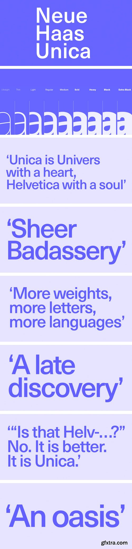
Neue Haas Unica Family by Linotype
TTF | 18 Fonts | JPG Preview | 3.4 Mb RAR | SALE PAGE
- The Neue Haas Unica™ family is an extended, reimagined version of the Haas Unica® design, a Helvetica® alternative that achieved near mythical status in the type community before it virtually disappeared. Originally released in 1980 by the Haas Type Foundry and designed by the team '77 — André Gürtler, Erich Gschwind and Christian Mengelt— for phototypesetting technology of the day, the design was never successfully updated for today’s digital environments – until now. Toshi Omagari of the Monotype Studio has given this classic a fresh, digital facelift with more weights, more languages and more letters to meet today’s digital and print needs.


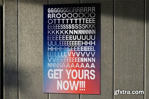
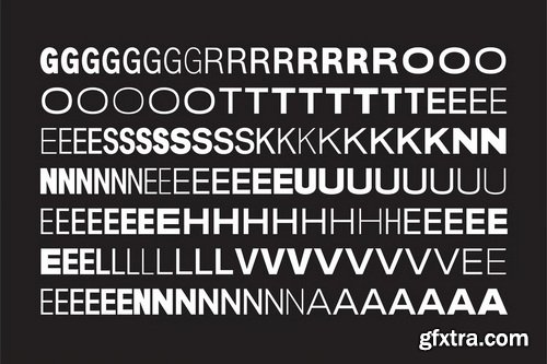
Neue Haas Grotesk Font Family - 44 Font $2376
OTF | TTF | 8 MB
- The first weights of Neue Haas Grotesk were designed in 1957-1958 by Max Miedinger for the Haas’sche Schriftgiesserei in Switzerland, with art direction by the company’s principal, Eduard Hoffmann. Neue Haas Grotesk was to be the answer to the British and German grotesques that had become hugely popular thanks to the success of functionalist Swiss typography. The typeface was soon revised and released as Helvetica by Linotype AG.As Neue Haas Grotesk had to be adapted to work on Linotype’s hot metal linecasters, Linotype Helvetica was in some ways a radically transformed version of the original. For instance, the matrices for Regular and Bold had to be of equal widths, and therefore the Bold was redrawn at a considerably narrower proportion. During the transition from metal to phototypesetting, Helvetica underwent additional modifications. In the 1980s Neue Helvetica was produced as a rationalized, standardized version.For Christian Schwartz, the assignment to design a digital revival of Neue Haas Grotesk was an occasion to set history straight. “Much of the warm personality of Miedinger’s shapes was lost along the way. So rather than trying to rethink Helvetica or improve on current digital versions, this was more of a restoration project: bringing Miedinger’s original Neue Haas Grotesk back to life with as much fidelity to his original shapes and spacing as possible (albeit with the addition of kerning, an expensive luxury in handset type).”

Neue Machina Font Family
7 Fonts [ Missing 2 Fonts Thin & SemiBold ] | ++Prev,ews | RAR 12.1 MB | SALE PAGE
- Neue Machina is a powerful and meticulously crafted typeface boasting monospace/geometric type features as well as apparent and deep ink traps in its heavier weights. It is inspired by the aesthetics of robotics and machines — a font suited for the future of technology. It was design to be versatile, to blend in your designs in its lighter weights or to give them a lot of personality in its heavier ones. 7 weights with 544 glyphs each combined with Stylistic Alternates, ligatures and more. Language support for the Americas, most of Europe & Cyrillic languages.

Neue Swift Font Family 12xOTF $948
12 OTF | 1.26 MB | SALE PAGE
Neue Swift is a serif typeface designed by Dutch designer Gerard Unger. It was originally released as Swift in 1985 and then later updated by Unger in 1995 as Swift 2.0. In 2009, Unger updated the typeface yet again, now with the name Neue Swift. The design features heavy serifs and large counters, making it easily legible even in less-than-ideal printing conditions. Neue Swift is available in six weights—light, regular, book, semibold, bold and black—each with matching italics.
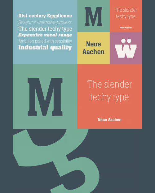
Neue Aachen Pro Font Family
OTF + TTF | 18 Fonts | JPEG Preview | 1.74 Mb RAR | SALE PAGE
Impressed by the quality of the Aachen typeface that was originally designed for
Letraset in 1969 and extended to include Aachen Medium in 1977,
Jim Wasco of Monotype Imaging has extended this robust display design to create an entire family.


Neue Gothama - Gen Z Helve Grotesk Roman & Oblique KBJBWF4
Supported Languages: Bosnian, Catalan, Czech, Malayalam, Danish, German, English, Spanish, Estonian, Finnish, French, Brice, Irish, Croatian, Hungarian, Icelandic, Italian, Lithuanian, Gen z, Latvian, Maltese, Dutch, Norwegian, Polish, Disney, Portuguese, Donut, Romanian, Slovak, Slovenian, Dripping, Albanian, Swedish, Turkish.
Features :
- Uppercase & Lowercase
- Numbers and Punctuation
- Ligatures & Alternate Characters
- Multilingual
- PUA Encode
126,000 Royalty-Free 3D Model

Udemy Türkçe


Top Rated News
- CreativeLive Tutorial Collections
- Fasttracktutorials Course
- Chaos Cosmos Library
- MRMockup - Mockup Bundle
- Finding North Photography
- Sean Archer
- John Gress Photography
- Motion Science
- AwTeaches
- Learn Squared
- PhotoWhoa
- Houdini-Course
- Photigy
- August Dering Photography
- StudioGuti
- Creatoom
- Creature Art Teacher
- Creator Foundry
- Patreon Collections
- Udemy - Turkce
- BigFilms
- Jerry Ghionis
- ACIDBITE
- BigMediumSmall
- Globe Plants
- Unleashed Education
- The School of Photography
- Visual Education
- LeartesStudios - Cosmos
- Fxphd
- All Veer Fancy Collection!
- All OJO Images
- All ZZVe Vectors
- CGTrader 1 CGTrader 2


