

https://www.f37foundry.com/fonts/f37-wicklow
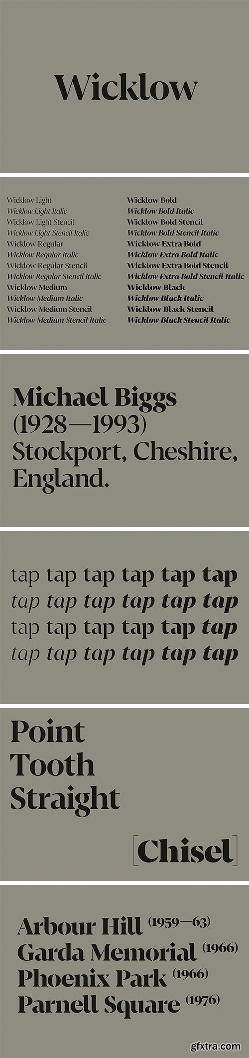
Set in stone — F37 Wicklow takes inspiration from Gaelic letter carvings by the remarkable sculptor Michael Biggs. The starting point for F37 Wicklow is Irish sculptor Michael Biggs’ intricate letter carvings on the Arbour Hill Memorial in Dublin. Biggs’ ‘Gaelic Alphabet’ mixes wonderful geometric shapes and F37 Wicklow reflects this by combining sharp, triangular serifs and diamond tittles with circular forms. It’s a typeface driven by visual contrast. Biggs used slightly different letterforms to distinguish the Gaelic and English texts on the memorial. We’ve mixed things up a bit, transferring some of the pleasing shapes from the Irish Uncial alphabet to our Roman alphabet — for example the curved ‘bay’ (b) and ‘ell’ (l). The graphic, triangular serifs make F37 Wicklow a great choice for branding as well as newspaper and editorial headlines. All the weights come with matching true italics and stencil weights.
https://f37foundry.com/fonts/f37-blanka
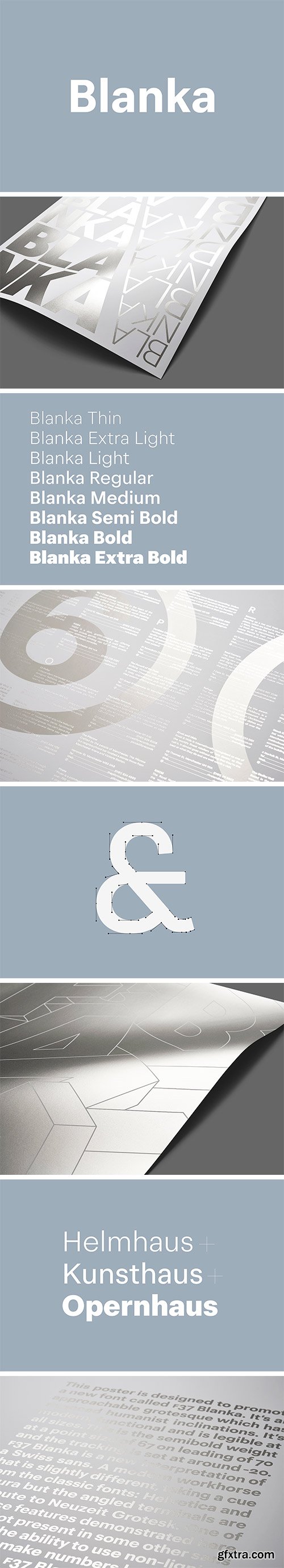
Blanka is F37’s take on a clean, classic Swiss sans. Perfect for body copy, it’s economical, functional and very legible at small sizes. It’s the holy grail — an everyday workhorse sans font that’s a little different, but doesn’t distract when used as body copy. We designed Blanka as an approachable grotesque with nuanced humanist inclinations. It takes its cue mainly from the classic pair of Helvetica and Futura. But the slightly angled terminals are a tribute to Neuzeit Grotesk. Blanka comes in a wide range of weights, from delicately light to imposingly heavy. We’ve painstakingly manually hinted the letterforms to make sure they’re really crisp and clear on screens of all shapes and sizes, regardless of pixel density or render. We like it so much, we’ve used it for our own website.
F37 Flux Font Family
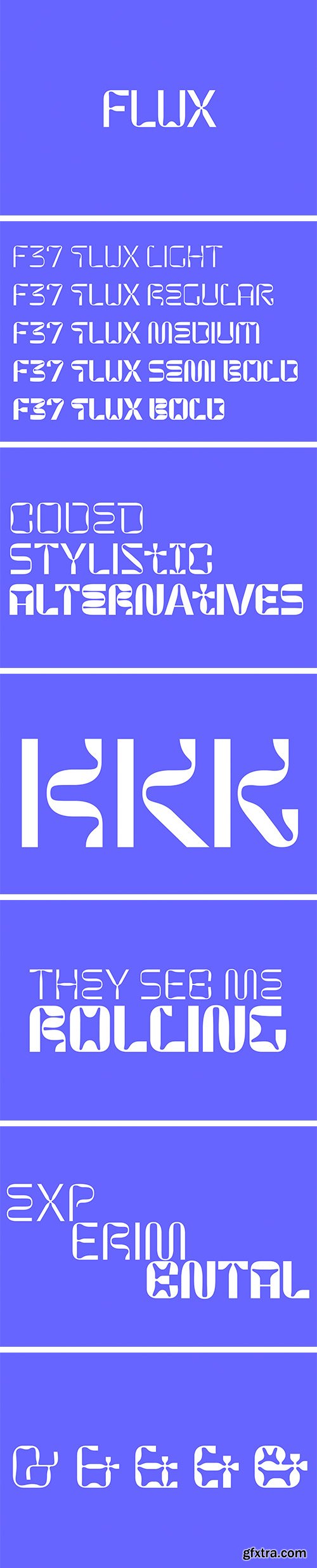
It’s inspired by the movement of machine rollers, with unusual kinks and bends that give it a playful and distinctive flavour. Smooth and organic curves lend a sense of easy movement and undulating flow. There are quirky, stylistic alternates available for each character. And to make things really simple, we’ve used OpenType coding to select these automatically, turning up the sense of random fluidity. F37 Flux comes in five weights: Light, Regular, Medium, Semi Bold and Bold.


F37 Factory Font Family
F37 Factory was inspired by lettering found in what was once a Hovis flour mill in Ramsgate. Throughout the building, which was designed by the architect E W Pugin, there was stencil-style typography beautifully etched into marble. F37 Factory was originally conceived for a commercial development project for Want Marketing and commissioned by London design studio Bold & Bold.


F37 F51 Font Family
F37 F51 is inspired by Johnson Panas’ flyer and ticket designs for The Haçienda nightclub in Manchester. Oringinally drawn by the late Tony Panas, we have digitalised and expanded his character set. Suitably classified as techno, F51 is wide, square and industrial looking. We have added a contemporary twist to the design by creating several unusual stylistic variants. F37 F51 comes in 30 weights and five different widths.
F37 Bella Pro Font Family
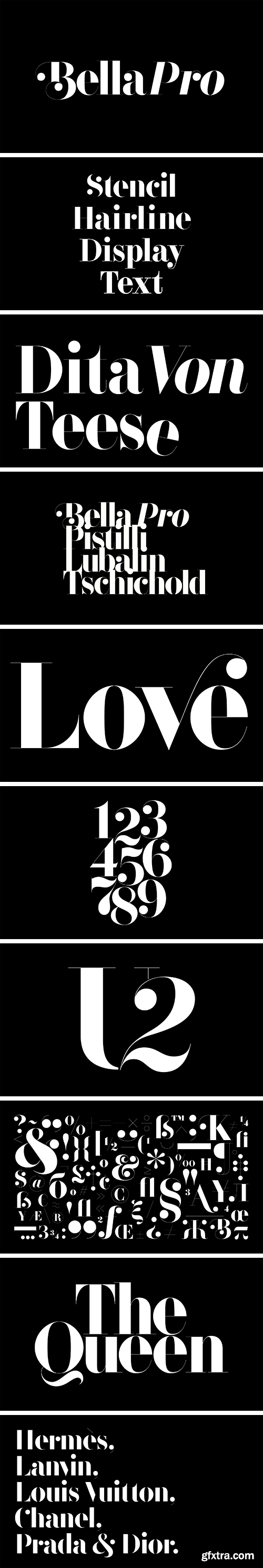
Our best just got better. F37 Bella was our very first font and is still one of our best sellers. Now, for 2020, we’ve given her a facelift, with refined, optimised proportions and plenty more weights to choose from. We’ve added true italics, enhanced OpenType features like swashes and huge language support, including Cyrillic and Greek alphabets.
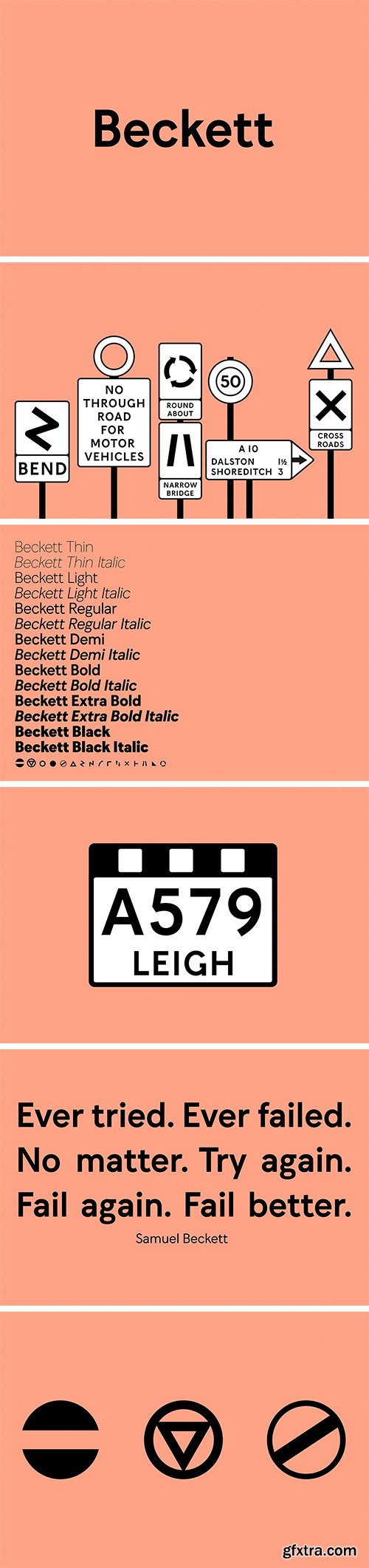
F37 Beckett Font Family
F37 Beckett pays homage to the British Ministry of Transport’s 1933 alphabet. This somewhat idiosyncratic font was used on what are now called ‘pre-Worboys’ road signs. The caps-only font showed the way from 1933 to 1958, when Jock Kinnear and Margaret Calvert’s Transport font was introduced for Britain's first motorway (the Preston bypass).
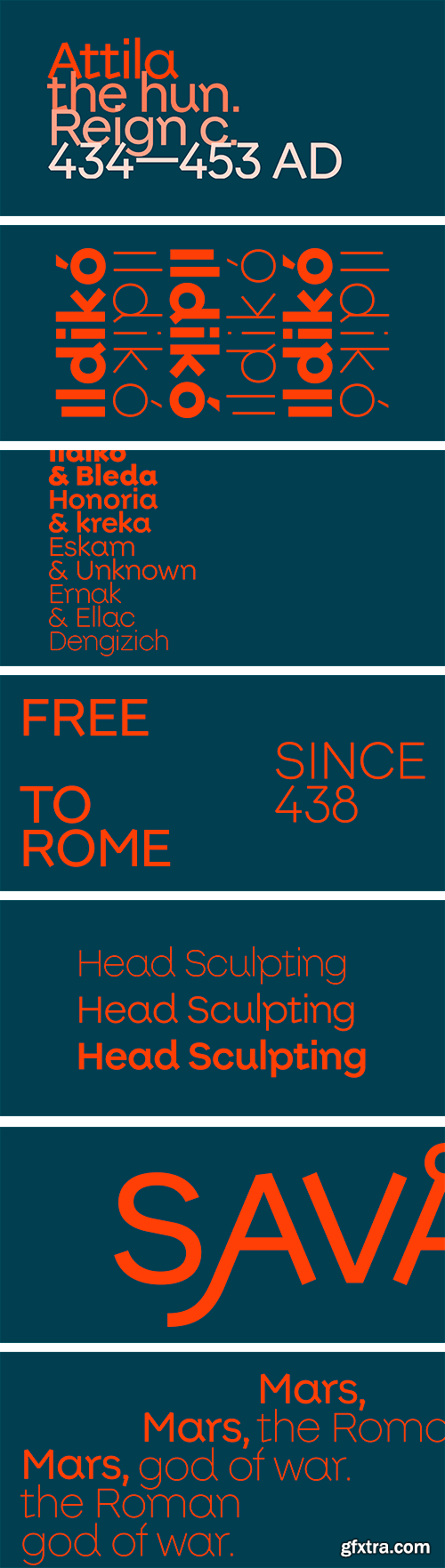
F37 Attila Font Family
F37 Attila is inspired by the 1933 German typeface Krimhilde. This unusual hybrid font was designed by Albert Auspurg, a prolific and versatile type designer, who hailed from Frankfurt. It was digitally revived and extended by Ralf Herrmann in 2018.


F37 Gruffy Font Family
A friendly, slightly offbeat sans face with enough character and points of difference to stand apart. F37 Gruffy takes inspiration from very early grotesque fonts. It’s a friendly, curvy sans-serif that comes with bags of character. With its upward curly tails, slightly over exaggerated curves and angled terminals, F37 Gruffy is fun, impactful and distinctly modern. It can hold its own with the trendy geometric sans crowd, but has ideas of its own too. F37 Gruffy comes in multiple weights and works well as a display face, but also provides reliable, readable body copy.
126,000 Royalty-Free 3D Model

Udemy Türkçe


Top Rated News
- CreativeLive Tutorial Collections
- Fasttracktutorials Course
- Chaos Cosmos Library
- MRMockup - Mockup Bundle
- Finding North Photography
- Sean Archer
- John Gress Photography
- Motion Science
- AwTeaches
- Learn Squared
- PhotoWhoa
- Houdini-Course
- Photigy
- August Dering Photography
- StudioGuti
- Creatoom
- Creature Art Teacher
- Creator Foundry
- Patreon Collections
- Udemy - Turkce
- BigFilms
- Jerry Ghionis
- ACIDBITE
- BigMediumSmall
- Globe Plants
- Unleashed Education
- The School of Photography
- Visual Education
- LeartesStudios - Cosmos
- Fxphd
- All Veer Fancy Collection!
- All OJO Images
- All ZZVe Vectors
- CGTrader 1 CGTrader 2


